Real and Abstract
Made by Mauricio Cano
Made by Mauricio Cano
Created: October 21st, 2014
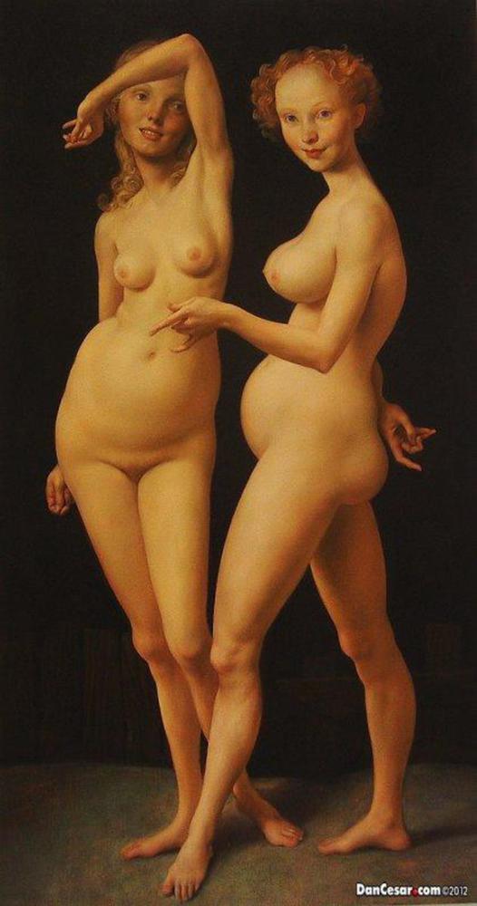
I chose this painting by John Currin because, despite appearing to be a purely realistic painting, the artist has distorted the women’s bodies; a quality which I thought brought it closer to more abstract representations of art. A special part of this painting is the way light and color were used to highlight the subjects in a way which exemplifies their nudity. The soft, warm tones of the light complement the feeling of soft, tender skin and the darkness in the back helps to focus the eye on the women’s bodies. The body shapes themselves are interesting to look at because while realism depicts objects and landscapes in the same way that we see them in every day life, Currin has altered this vision slightly and injected additional meaning. In most realistic paintings, the work is often reduced to the schemas we hold for it in our minds—a painting of a house represents a house and a painting of a person represents just that person. By distorting the bodies, Currin adds that additional layer of meaning to everyday life and makes the viewer wonder about the emotions and ideas that could be interpreted from the painting. (Even though in this case, Currin insisted his work served only as a testament to paint’s abilities to capture movement and form)
1) Description:
Obscene
Delicate
Flowing
Bold
Smooth
Organic
Curvaceous
Dramatic
strong contrast
Disfigured
Grotesque
2) Analysis
Within the context of his other paintings, it seems that the artist wants to express an emerging view of women’s bodies and sexuality. Additionally, there are hints of political meaning, given that the distorted nature of women’s bodies in his other works is often paralleled by critics to high class’ similarly distorted way of life. Through the delicate lines, smooth texture and curvaceous shapes, and several layers of color to create the skin, he displays their nudity in a way that rejects the overly pornographic view of women in media. On the issue, Currin comments that by showing his women bare, he removes the pent up energy involved with suggested sexuality (which is often how artists choose to display their women), which makes this particular painting very “asexual.” I tend to disagree that his work shows women in a new and different light, especially given that his more recent works are not at all devoid of the pornographic focus society gives to women’s bodies.
For this particular painting, however, I think he is successful in creating an intimate and delicate depiction of the female figure that isn’t entirely focused on their sexual/reproductive roles. The lack of men in the frame, the disfigurement, and the lack of behaviors that suggest reproductive undertones allow this painting to display the female body independently of the “male context” and the meanings and associations “naked women near men” often have.
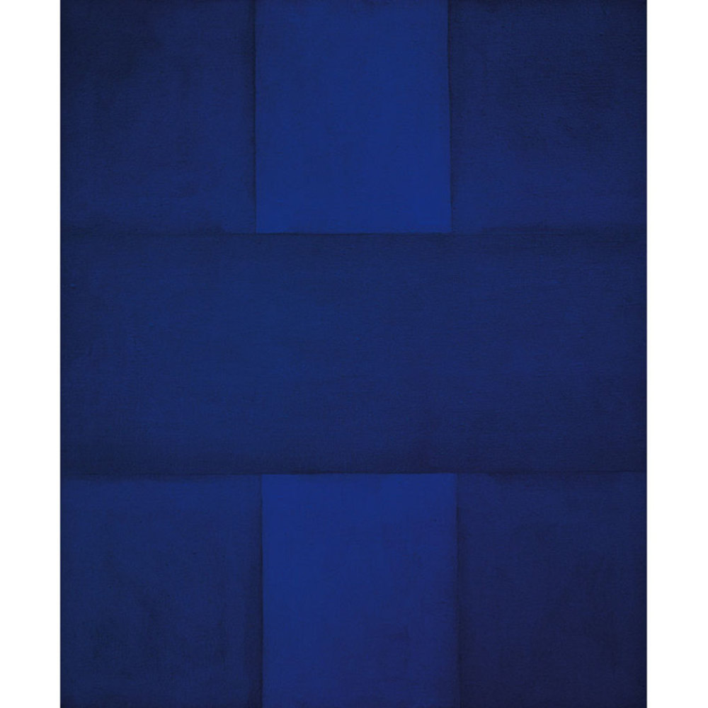
For the abstract choice, it’s difficult to see on the digital representations but I chose it because of the way the different shades of view are juxtaposed. Because this isn’t a painting of a house or a person, we skip the “schema matching” process which we would often experience with realism and begin instead to derive fresh meaning and emotion from the way the painting is created. For this one specifically, I find that the blue itself is calming and immersive, but that the slight differences in tone unsettle the eye (and consequently, how I feel) because of how much concentration it takes to be able to distinguish the different shades. Staring at the piece for a while yield more tones than those apparent at first glance and, after noticing more than a few, it’s easy to connect some of them and start to see depth and dimension. This dimension builds on the blue’s already immersive qualities and made me feel like I was getting sucked into the painting. Like the work above and despite having very strict shapes and color palettes, this piece is filled with the human element because of the little imperfections and variations which tie it to its creator. The artist (Ad Reinhardt), insisted that the work was not meant to represent emotion but rather the purity of making art just for the sake of making it; but, the feelings and symbolisms assigned to the piece are reflections of the individual’s state of mind so the intention of the artist is secondary.
1) Description:
Bold
Subtle
Fine
Smooth
Geometric
Vibrant
With this work, reinhardt hoped to make “pure” paintings made simply for the sake of art itself. In an effort to reach this purity, he stripped his paintings down to their basic geometric elements, favoring color over form. The use of a single color, in varying tones, serves in improve this purity. In a similar way, symmetry and balance help bring out the simplicity and sterility reinhardt hoped to achieve. The purity and symmetry within the work serve to create a very rich emotional experience: the subtle tones, fine lines and smooth, cool color at first induce feelings of calmness and serenity. Through careful analysis of the work, the tonal changes becomes increasingly pronounced, so much that their contrast becomes a source of discomfort for the eye. To me, this reflects in an equal emotional unsettlement which disrupts the earlier feelings of calmness.
I believe that this work is successful primarily because through the purity and simplicity of the work, I was able to experience myself and my own emotions. There is little to get distracted with in the painting, and nothing comes with preinstalled meanings. The subtle tonal change, simple geometric patterns and smooth color help create a piece that I can assign my own biased meanings to, and in the process, experience the emotional effect that contemplating these meanings has on me.