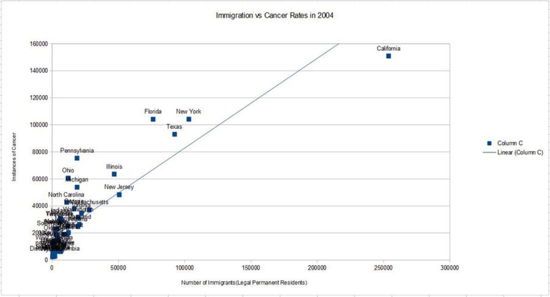
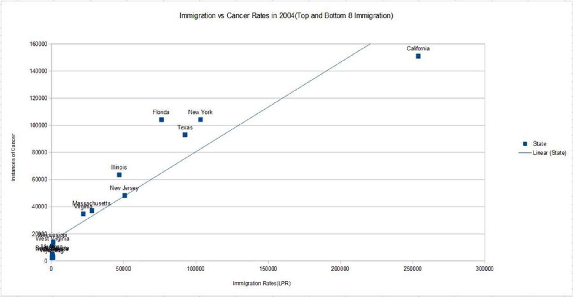
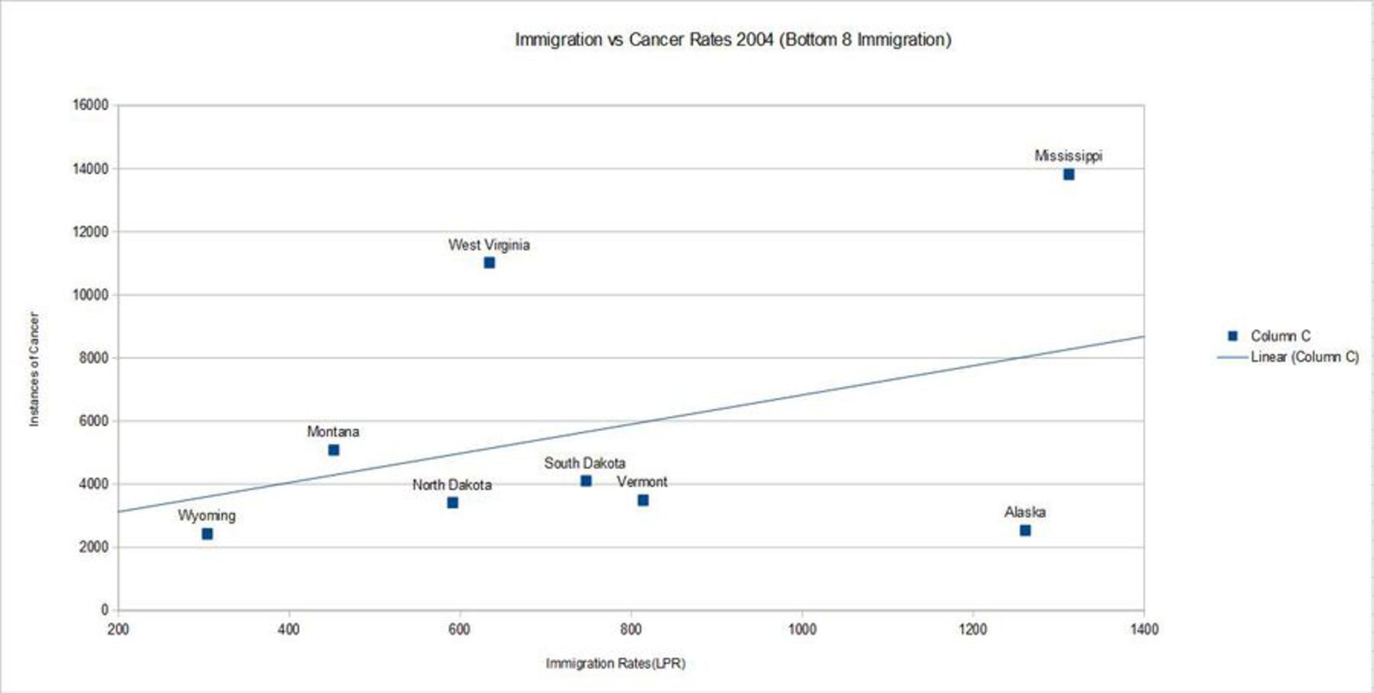
The Cheese of Truth: Cherrypicking just some of the things

Made by brandonx

Help make America great again by cherrypicking statistics to the max

Created: October 30th, 2015

0

Abstract

0
Cheese of truth
Elmir Buljubasic - https://www.youtube.com/watch?v=0gzmRehz4us
0

Product

I made several graphs that appear to show the relationship between the amount of Legal Permanent Residents by tate, and total number of cancer cases by state. It was made using data from the CDC WONDER database and the Department of Homeland Security's 2013 Yearbook of Immigration Statistics.They were then compiled graphically using OpenOffice Spreadsheet.

0
Immigration vs Cancer(All States)
2015 10 30 20 56 10 photos.thumb
0
Slightly Clearer: Immigration vs Cancer(Top and Bottom 8 in Immigration)
2015 10 30 20 57 14 photos.thumb
0
Look a Bit Closer: Immigration vs Cancer(Bottom 8 Immigration)
2015 10 30 20 57 34 photos.thumb
0

Intention

I made this because I wanted to make something to parody the most fantastic and monstrous caricature of a figure like Donald Trump.

0

Context

The Fox News graph in the project introduction page got me thinking about how misrepresentation of data, particularlly graphically, is used for various political ends. I was also inspired by the Cheese of Truth video, shown in the abstract: “Immigrants cause cancer”. This combined with my previous project, Trump Cena, got me thinking about the kinds of things I'd say if I were a Donald Trump-esque figure. This was also coupled with Trump's insightful comments regarding Mexican immigrants:

"When Mexico sends its people, they're not sending the best. They're not sending you, they're sending people that have lots of problems and they're bringing those problems with us. They’re bringing drugs. They’re bringing crime. They’re rapists. ... And some, I assume, are good people."

In any case, this inevitably led to make several graphics that relate various quantities with dubious relationship and with little regard to causality.

0

Process

First I found datasets relating to both immigration and instances of cancer within the US, sorted by State. I then entered them all into a spreadsheet program, OpenOffice Spreadsheet to be specific. I then made several scatterplots, making sure to add a mean line to fit the data.

0

Reflection

I thought this work, while somewhat funny, was also quite lackluster due to very little polishing on the graphics. While this work is meant to be hilarious, and without much of a political agenda, I see how the use of cherry-picked statistics and quantities with more seemlingly causal relationships, could be used to promote a political agenda. If I were to do this project again, I would spend more time in making the graphic, and polishing it to like those of Fox News or another professional news agency. In particular, the overlapping labels on each point detract from the overall point the graphic is trying to convey.

0

Attribution

http://wonder.cdc.gov/cancer-v2012.HTML

United States Cancer Statistics, 1999-2012 Incidence Database

http://www.dhs.gov/publication/yearbook-2013

2013 Yearbook of Immigration Statistics


x
Share this Project


About

Help make America great again by cherrypicking statistics to the max