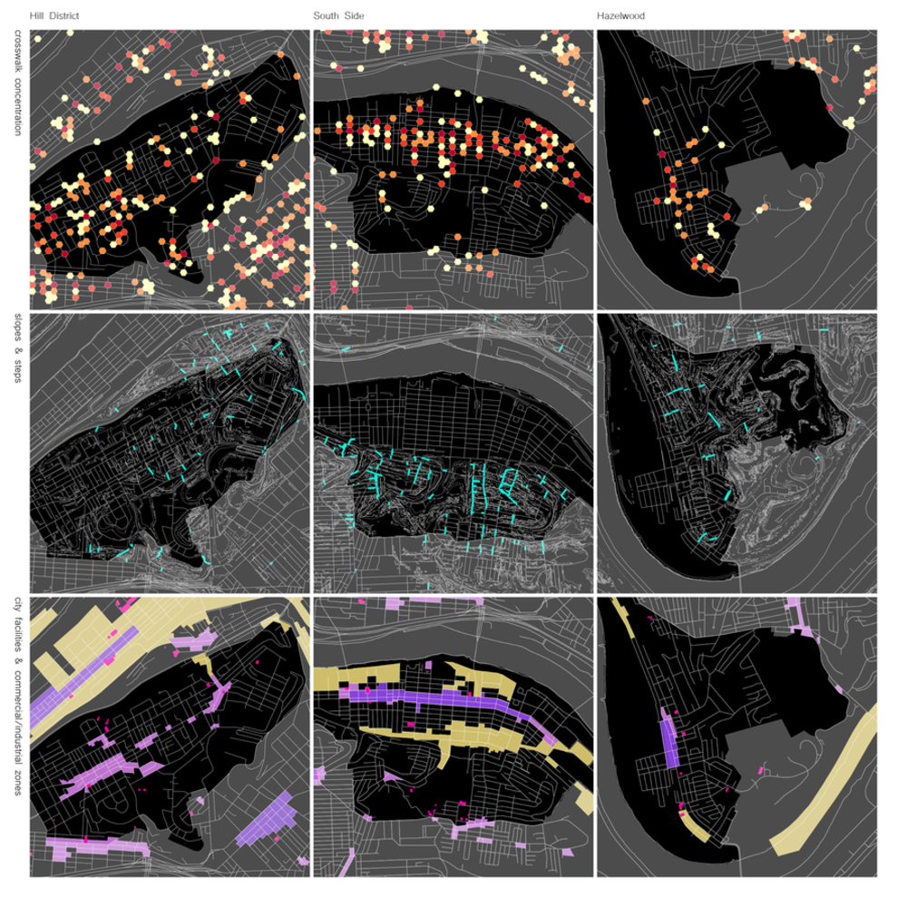
Three metric rows to look at three Pittsburgh neighborhoos for their walkability
Made by Paul Moscoso
Made by Paul Moscoso
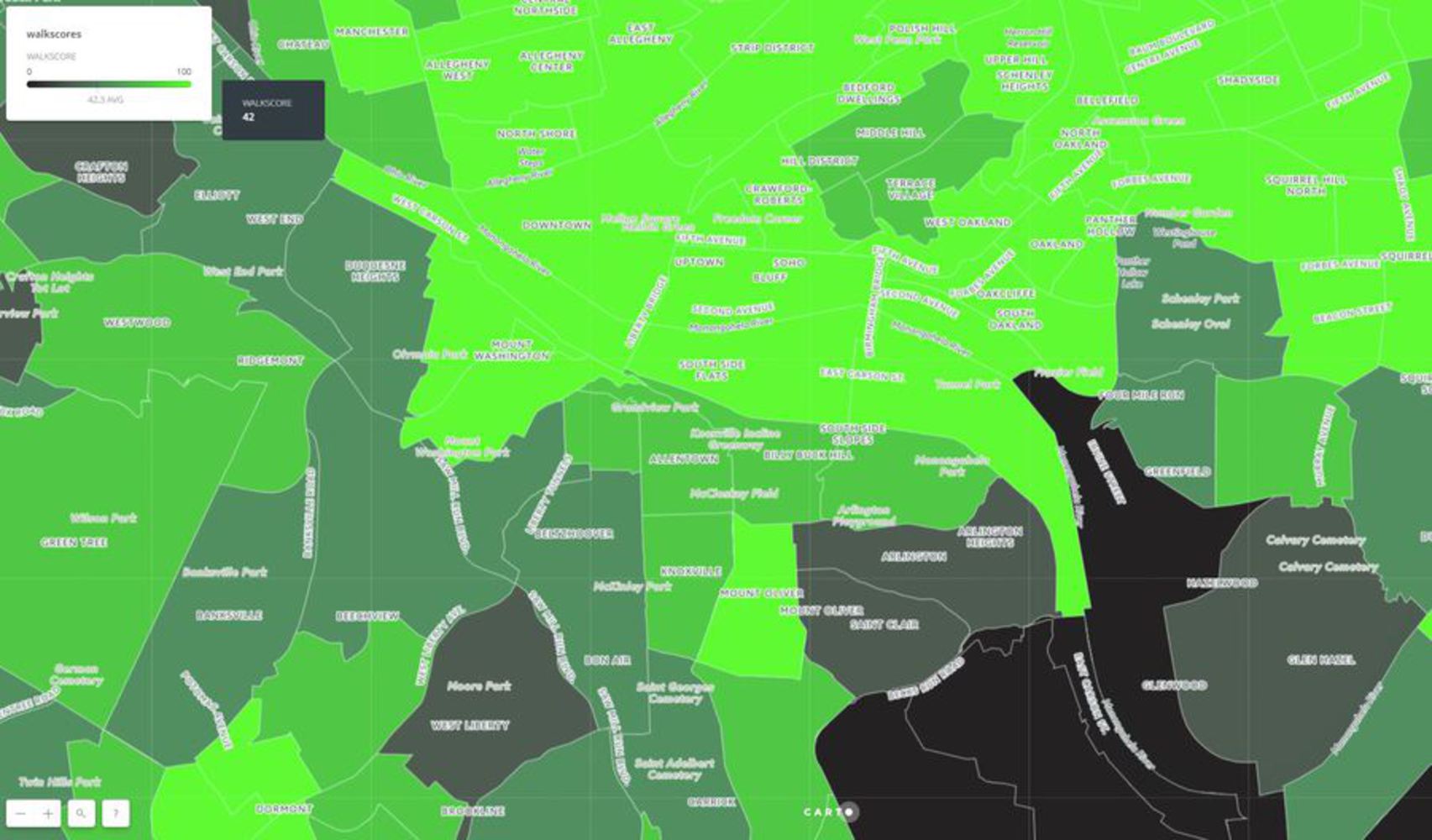
After looking at the Walk Score graphic, the idea is to explore and understand the value of different dataset in depth to produce similar objectives outcomes. For this project, the goal is to peel out why three neighborhoods of Pittsburgh have different walk scores. Then, crossing three of the datasets available from WPRC, the grid tries to compare different places and conclude if the company's result does show a valid graphic and if we can learn from a self-made datasource mapping process.
Created: October 5th, 2017
After looking at the Walk Score graphic, the idea is to explore and understand the value of different dataset in depth to produce similar objectives outcomes. For this project, the goal is to peel out why three neighborhoods of Pittsburgh have different walk scores. Then, crossing three of the datasets available from WPRC, the grid tries to compare different places and conclude if the company's result does show a valid graphic and if we can learn from a self-made datasource mapping process.