Visual Literacy
Vulnerability, bridges and people.
Made by Teddy Lee
Created: October 28th, 2014
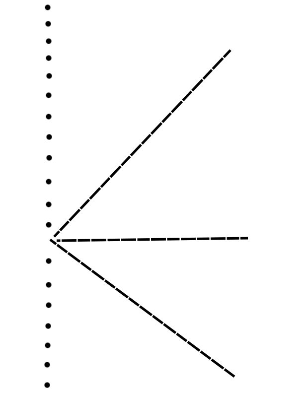
The emotion I chose to represent was vulnerability. In the first drawing, only using lines and dots, I tried to use an unsure spacing between the dots to create an uncertain, weak feeling, and the open space where the dotted lines converge is what I intended to be the vulnerability. Whenever I think of vulnerability, my mind turns to the death star from Star Wars, so the imagery of the missile going to that one vulnerable place was what inspired this expression of vulnerability. The separation of the dotted lines was supposed to be a representation of movement and attacking the small line of dots on the left. I tried to use the angling of the lines and the balance to draw the eye to that point intractably in an extreme expression of a vanishing point.
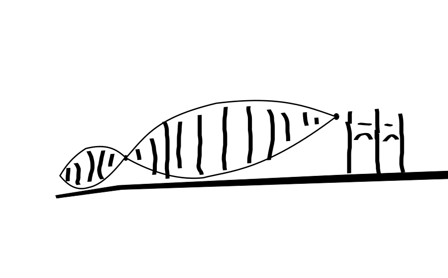
The second piece using color and shape, expressed a different type of vulnerability. In it, the portrayal of a black mask is juxtaposed with a partial circle that sits underneath the clouds, between the horns of the mask. This one I did in a very tan like pallet, I tried to make use of shapes expressed in the readings by taking a triangle shaped chunk out of the circle to create a missing area.
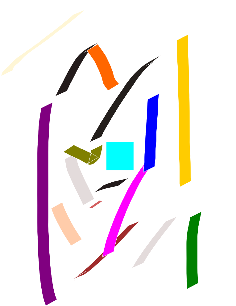
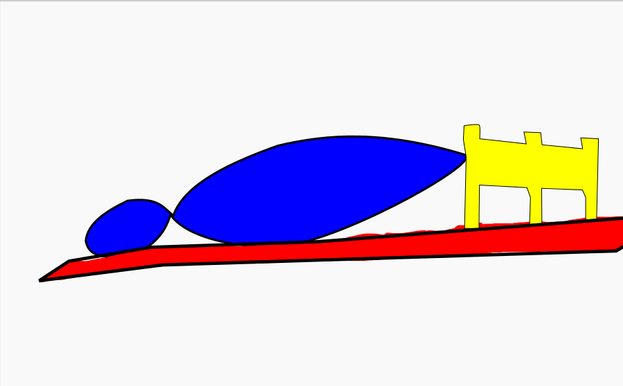
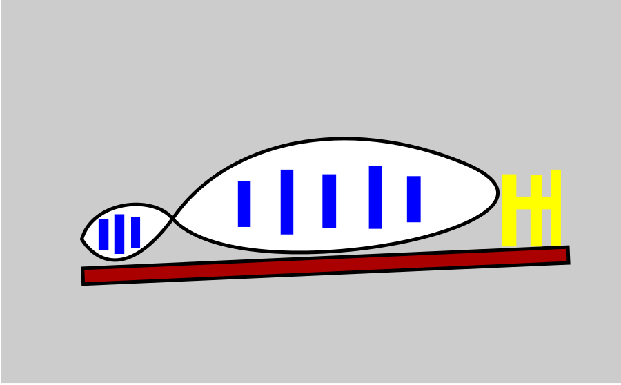
This time, I used my original Bridge drawing, and then I removed all but the essential shapes, and then filled in those shapes with the primary color that the shape was closest to in hue. By doing this I wanted to decompose the shapes and colors of the bridge in the simplist way possible while still having it be semi recognizable.
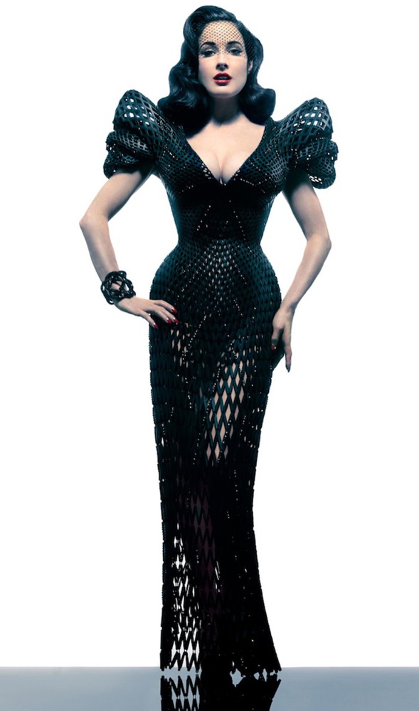
For the color image, I decided to try to draw the face similar to Andy Warhol's early drawings and I tried to make use of patterning to replicate the texture of the dress itself. I decided to forgo the arms as I couldn't get them to look right in context and I liked the focus on the patterns in the dress itself.