Walker Evans
Let Us Now Praise Famous Men
Made by Laura Lodewyk
I looked at the portraits in Walker Evans book Let Us Now Praise Famous Men. After looking at his work, I tried to replicate some of the techniques I identified.
Created: November 12th, 2014
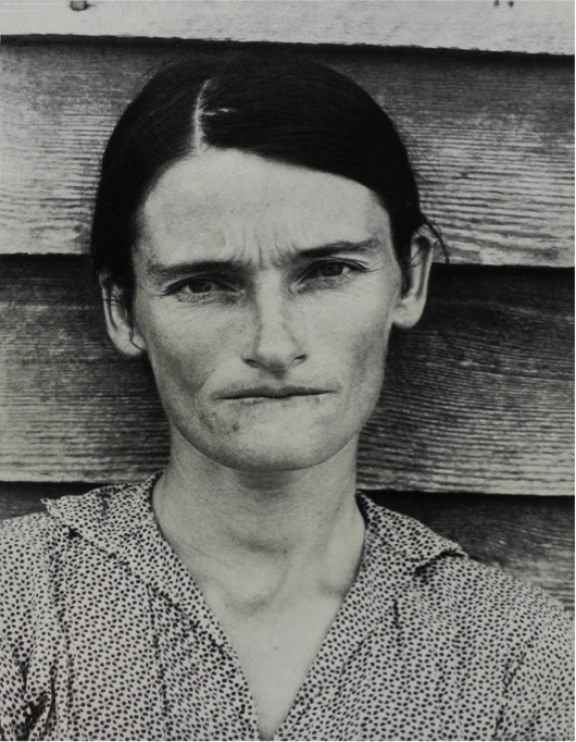
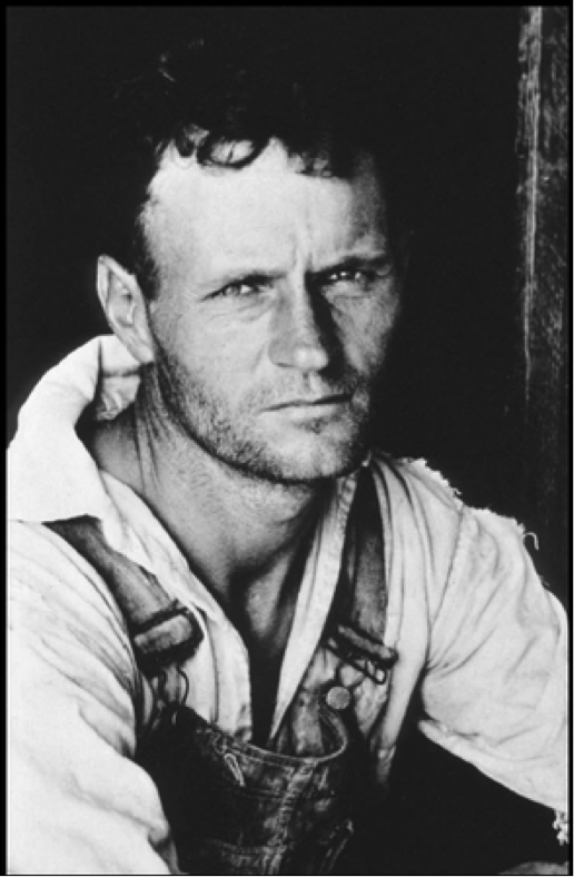
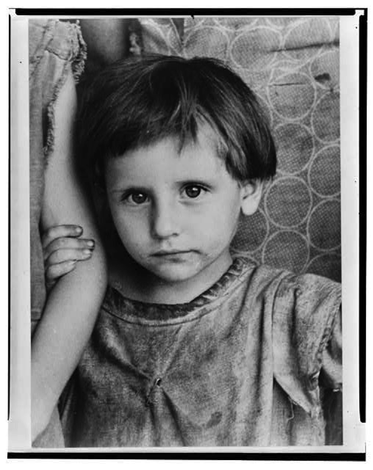
I chose to examine the portraits from Let Us Now Praise Famous Men. To me, Walker Evan’s photographs of Alabama’s tenant farmers feel very raw and emotional. His photographs seem blunt to the point of being unapologetic, and as a result, the viewer is drawn into the belief that this is the stark truth, and is forced to confront the realities of poverty. His pictures are very flat, with the subject placed directly in the center with very little depth or extraneous detail. This draws the viewer’s attention to the subject, and with little else to capture their attention, forces them to think about what the photograph is presenting. Most of the photographs are from eye-level, placing the subject as an equal and fellow human being. This is why I feel like his photographs are so powerful.

In this piece, by placing the subject directly in the center of the photograph and with very little in the background, the viewer is drawn into looking at the subjects face and eyes. I feel in particular that looking at the lines on her face I can tell how she is fighting to survive in poverty. But by placing her at eye level, instead of seeing her as someone to pity, I see her as someone who is strong and an equal, someone who I can respect.

I really enjoyed the use of light in the photograph. I felt that with the shallow depth of field and stark lighting, the viewer is forced to focus on the subject because almost everything else is in darkness. While this might mean the photograph is not symmetrical, it follows the rule of thirds, and the plank on the right side on the picture I feel balances out the negative space enough to create a good composition.

What I found most interesting in this picture was placing the camera at eye level for a child. I imagine most photographers would look down on a child, since that is how most viewers see children. This might make people feel protective, but I think that stronger emotions are invoked from this vantage point. I think it is much easier to see the subject’s face, which makes it much easier to connect at a fundamental level.
I liked this one. I was trying to replicate the way Walker Evans played with light. I like the contrast in this picture between light and dark, and I think I managed to create some of the connection with the subject that a lot of Evans' photos had. I don't think I quite achieve the same weight as Evans, and I also had to resort to a shooting studio where I could control the lights to get the same dramatic effect.
While I feel like I got a more honest emotion in this picture, I also took it a little fast, and as a result it is blurry. I also feel like it is not nearly as subtle as Walker Evan's photos, and I wish the contrast was a little less stark and her face was better lit so that you ca see her expression more.
I don't feel like this particular one is very similar to Walker Evans work, and I feel like it is a little dark, and the contrast could be higher. But, I liked they way that his shirt blends into the background, and I feel like that focuses the viewer on his face and not the background, similar to Walker Evans. I like the way he is centered but I would like if I could crop out his arms, so the only really light part is his face. I don't think that it has the same sort of weight as Walker Evans, but I like it. For this particular subject I liked comparing this picture to one of the happy ones I captured (provided below). I thought the contrast was very interesting.
I found it challenging to get this particular subject to stop smiling and relax in front of the camera. In the end I liked the picture, but I still feel like I could have gotten a more true representation of his thoughts and feelings. I like the uniformity of the background though, because I feel that it doesn't detract from the subject.
This one I think was the easiest to take, and I liked the outcome the most. I think the background is interesting without detracting from the subject, and I liked the composition. I think the subject gave me the most honest expression out of all of them, and I think that shone through, making the photo the most like Walker Evans.
Overall, I felt my subjects weren't able to emit the harsh reality of Walker Evans, but I am unsure if that was because they were not comfortable with me taking their picture, or if it was because my subjects were not impoverished farmers. I am more inclined to think it was the first, because I have looked at some of Walker Evans' other portraits, and all of them have that connection with the viewer. I also wish more of the pictures I took outside could have had the lighting I was trying to achieve. Int the end I had to resort to the shooting studio to emulate his style, and I think that takes away some of the realness of the photos.
I looked at the portraits in Walker Evans book Let Us Now Praise Famous Men. After looking at his work, I tried to replicate some of the techniques I identified.