Back to Parent

Outcome


Intention

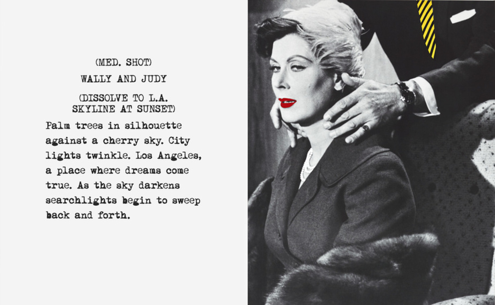
I was deeply attracted to John Baldessari's art style, including juxtaposing images with words and placing flat dots on people's faces. Therefore, I decide to borrow these ideas and apply them to advertising for big companies to make money. The underlying theme is to question today's iconography by seeing how the inclusion of iconic figures in a non-typical advertisement can achieve the advertising effect, even when the faces of the figures are blocked. 

Context

John Baldessari is an American conceptual artist. His early major works include text paintings that feature a plain painted background with printed statements about art on top. He is known for his works that juxtaposes photos taken out of their original context with additional words. He also made a lot of works where he put dots on people's faces in photos to draw attention to minor details of the photos and to what the photos are actually about. As an conceptual artist, ideas and concepts in his works are more important than the finished product - he wants to question the meaning of art, especially photography in his later works. I want to take the form and style of his works to make my own statement about what iconography is in today's world. 

Process

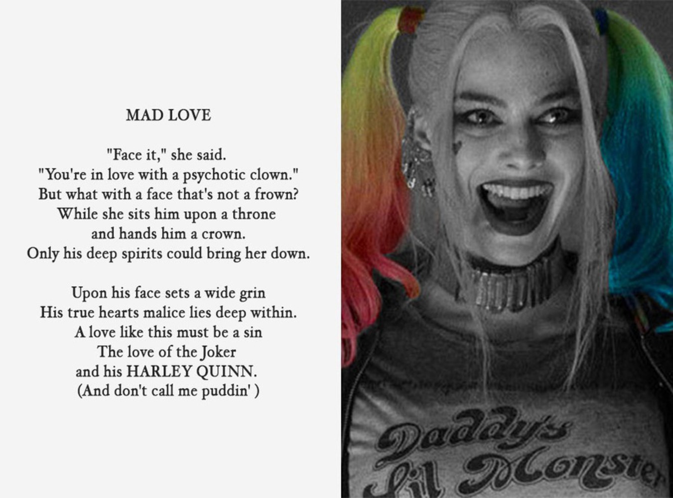
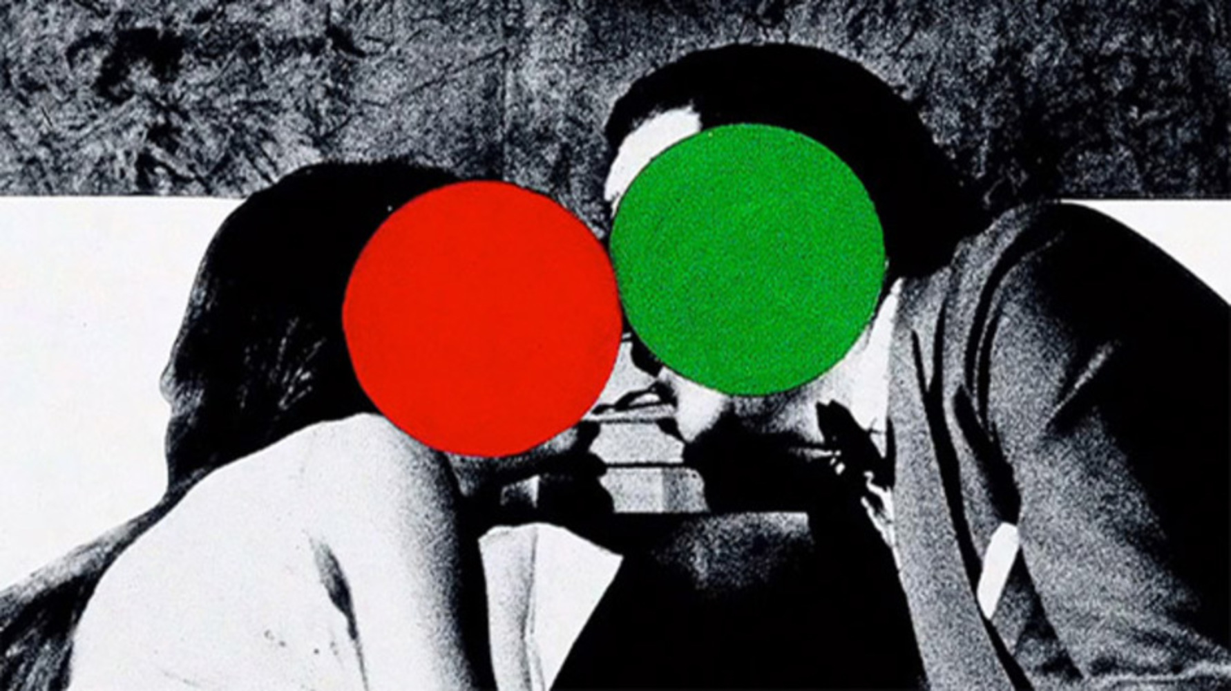
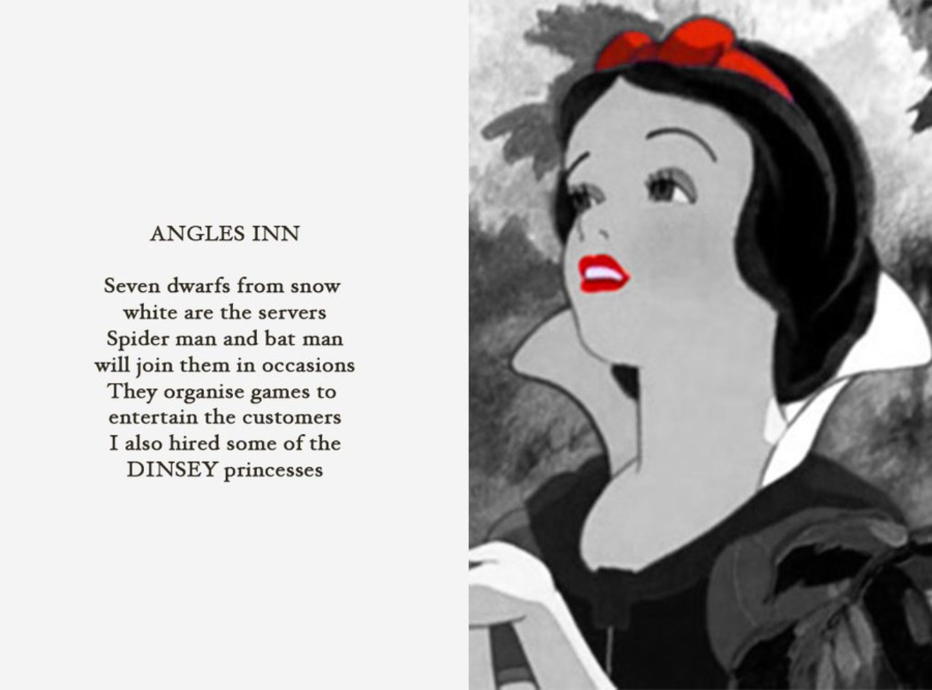
I decided to take his style of juxtaposing poems with screenshots from (animated) films.  I first decided on the subject matter, which was going to be Disney and DC comic books. I then searched for the poems on the Internet for poems related to the two subjects, and found some random poems written by users of various poetry websites. I then chose Snow White to represent Disney and Harley Quinn to represent DC. At first, I chose a picture of Disneyland landscape, but that looked static and boring. Reflecting on Baldessari's works, I decide to choose pictures that are dynamic in a sense. In the pictures, the characters are both posed and have non-static expressions. For the third piece, I took Baldessari's style of placing dots over people's faces. I chose a picture from Batman vs. Superman because they are also two of the most famous cultural figures. I chose a composition with certain tension, where the two are interacting with each other, but in a peaceful way. 
Snow white product.thumb
Show Advanced Options
Harley quinn product.thumb
Show Advanced Options
Batman vs. superman product.thumb
Show Advanced Options

Product

I used Photoshop to do all of the work. In the first two pieces, I put random poems found on the Internet on the left half of the canvas and famous characters on the right half. I have masked the characters and left only the most iconic parts colored. In this way, the audience will be directed to see these features, and consider if those are the things that really symbolize the characters. In the third piece, however, the most prominent features of the characters, their faces, are blocked with colored dots. The audience will then be directed to look at other parts of this  photo, but they can still recognize who the characters are and what the photo is about even without looking at the faces. The two styles work in contradiction as they process the prominent features in contrasting ways, but they also work in unison as they all pose the question of how we see iconic figures in today's world.

Critique

I think that I have implemented my idea pretty successfully. They serve the purpose of questioning iconography well, and I like my pieces in general. The general compositions are directly taken from John Baldessari, and they look good with the selected poems and pictures. However, there are some things to be improved. For example, in the piece about Harley Quinn, I chose to leave her hair colored because I felt that was her iconic feature, but it doesn't serve as a compositional focus that well.  Also, the variety of available pictures restricted what I could pick.

Personal Reflection

The most significant thing that I took away from this project was that I learned about and used plagiarism in art and was forced to think about how to use other artists' style to pose my own question. I was also restricted by the money-making aspect of this assignment and had to relate my art to commercialism in some way. I also learned about composition and dynamic effect of pictures. However, I probably would have chosen different texts to go with the images to better fit the question of iconography and to achieve better advertising effect.

Baldessari.thumb
Show Advanced Options
Dots.thumb
Show Advanced Options
Drop files here or click to select

You can upload files of up to 20MB using this form.