Iconography
Made by Claire Chen
Made by Claire Chen
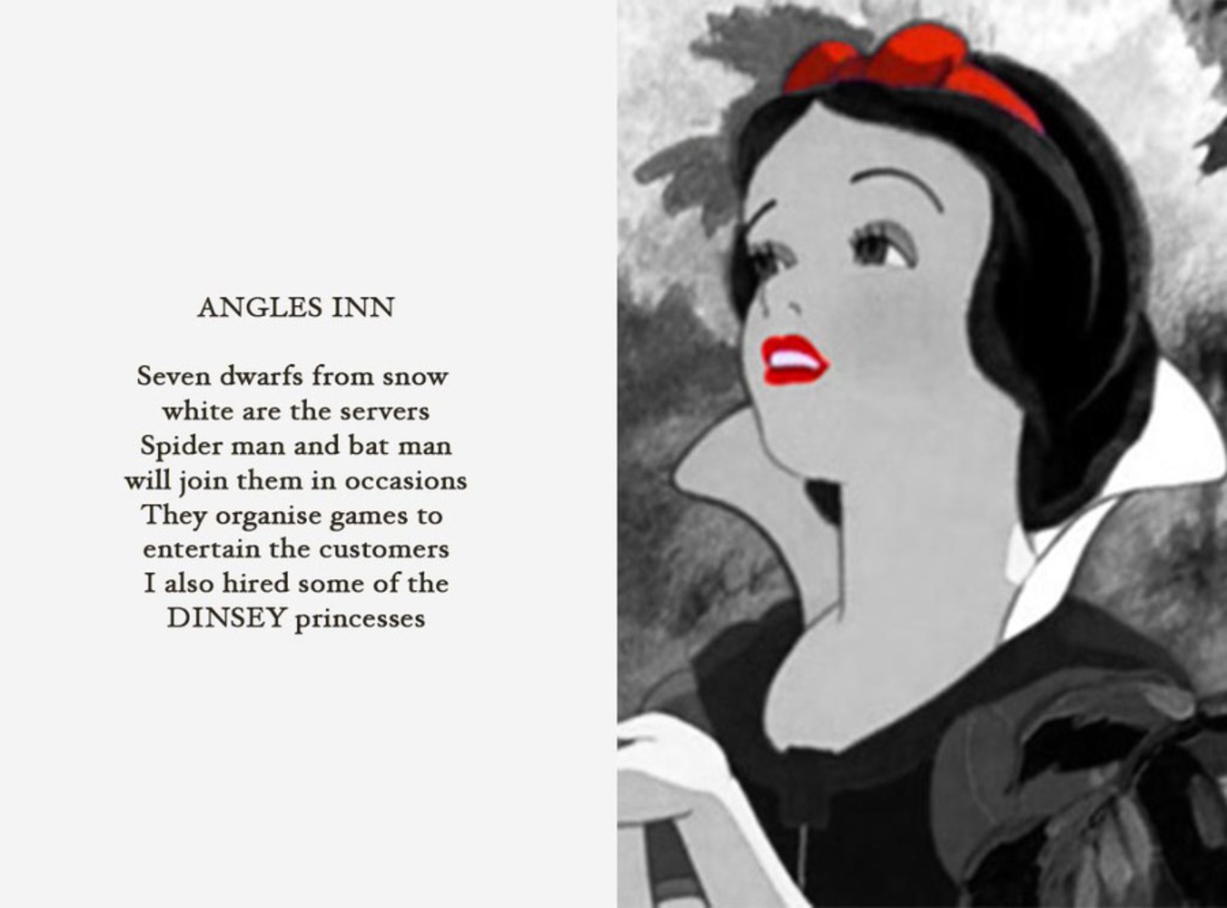
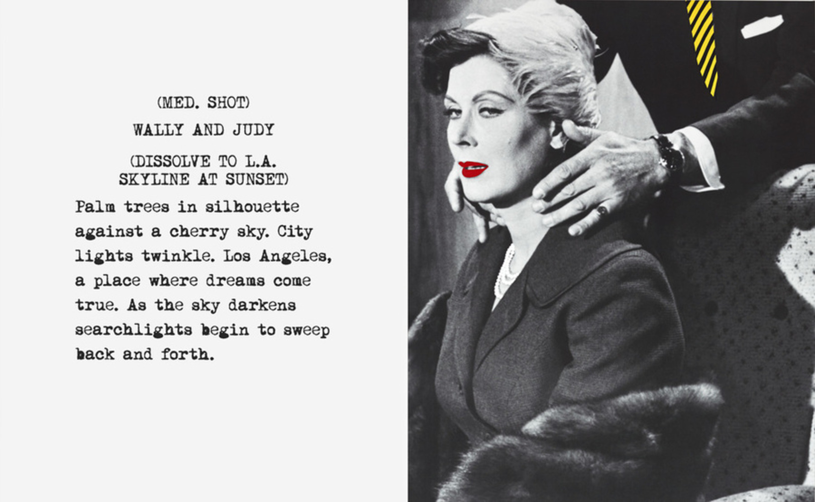
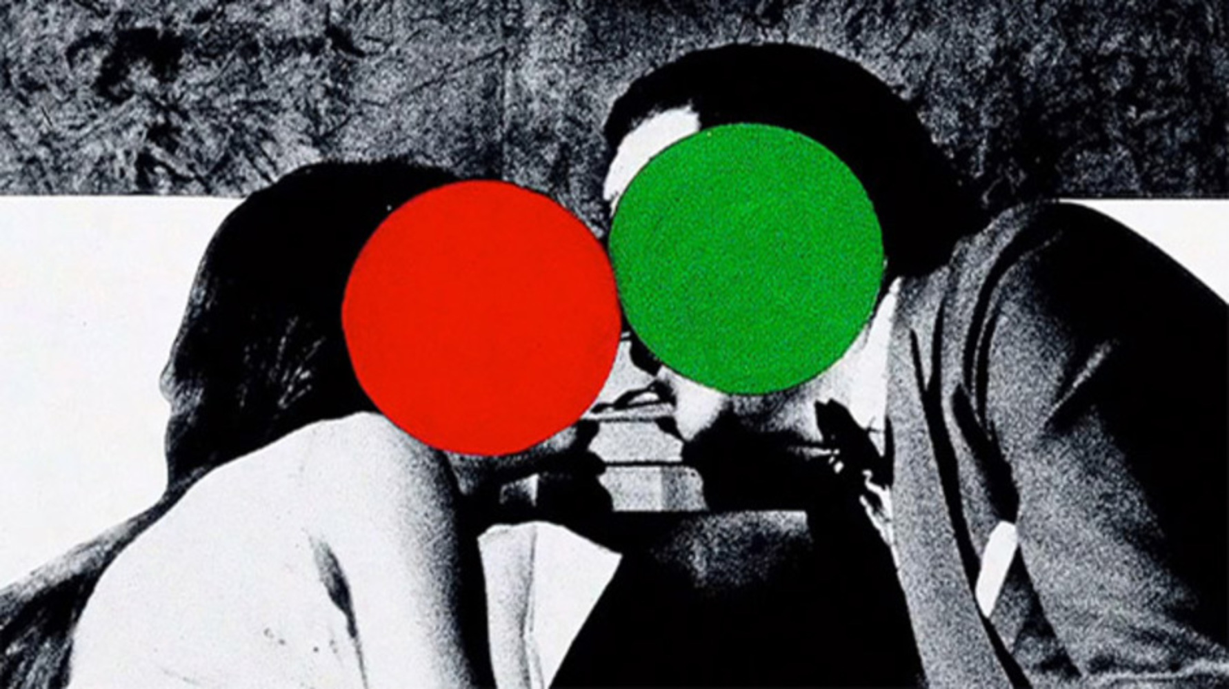
I want to borrow the style of John Baldessari to play with the idea of how people recognize iconic figures in today's advertising world.
Created: September 8th, 2016
New creative industries are empowering new modes of collaborative consumption, creation and reuse of media. This often relies on successful collaborations between cross-trained artists, designers a...more
I want to borrow the style of John Baldessari to play with the idea of how people recognize iconic figures in today's advertising world.

