Back to Parent

Outcome


The goals

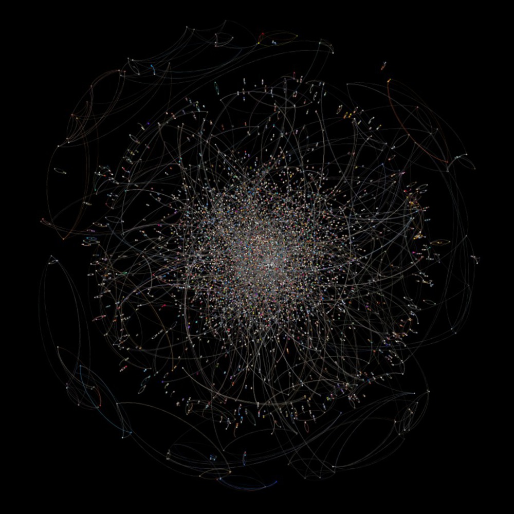
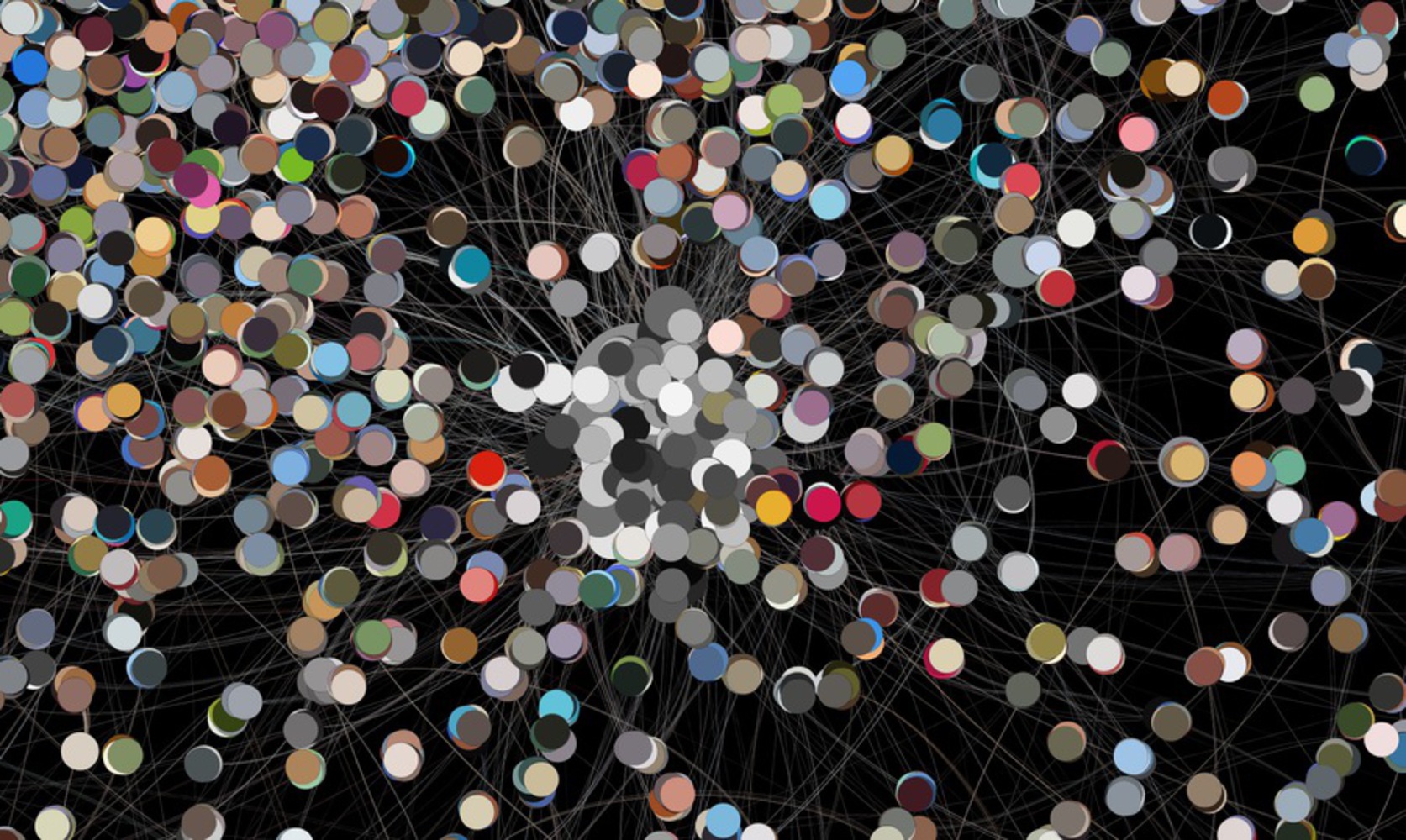
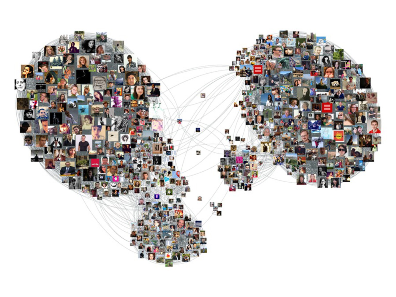
As an active Instagrammer, I mainly post to share my photography work and thus, I will really be attracted by the posts that have nice colors. This becomes the motivation for this analysis. What color relations do the posts have? Do people have a clear color preference?

Dataset

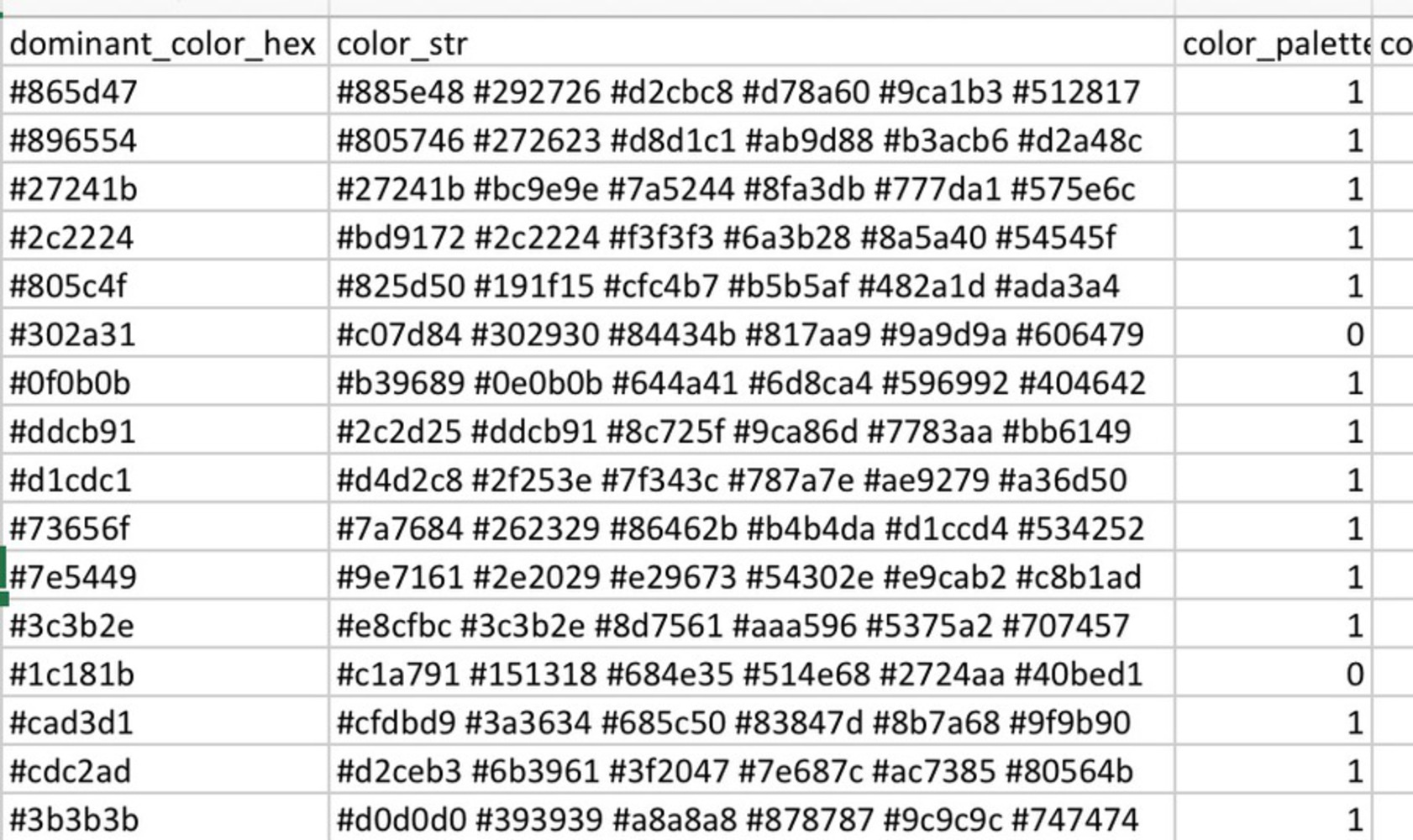
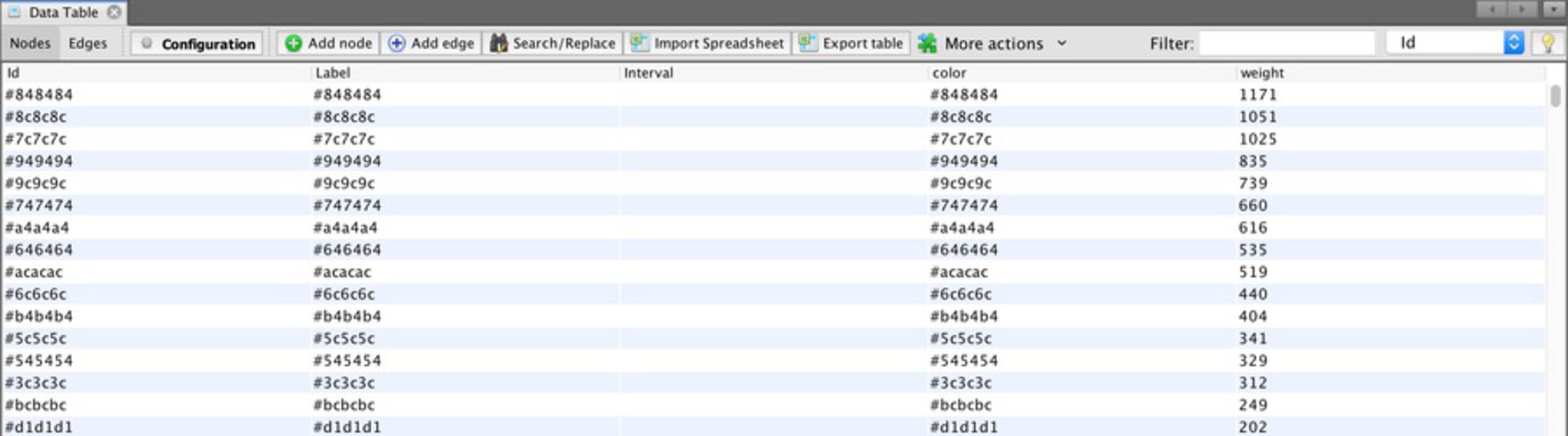
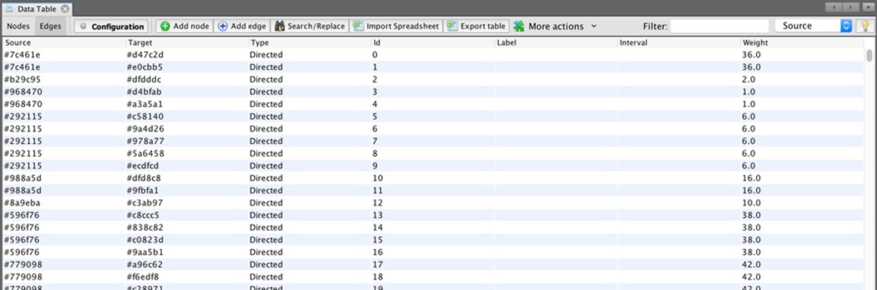
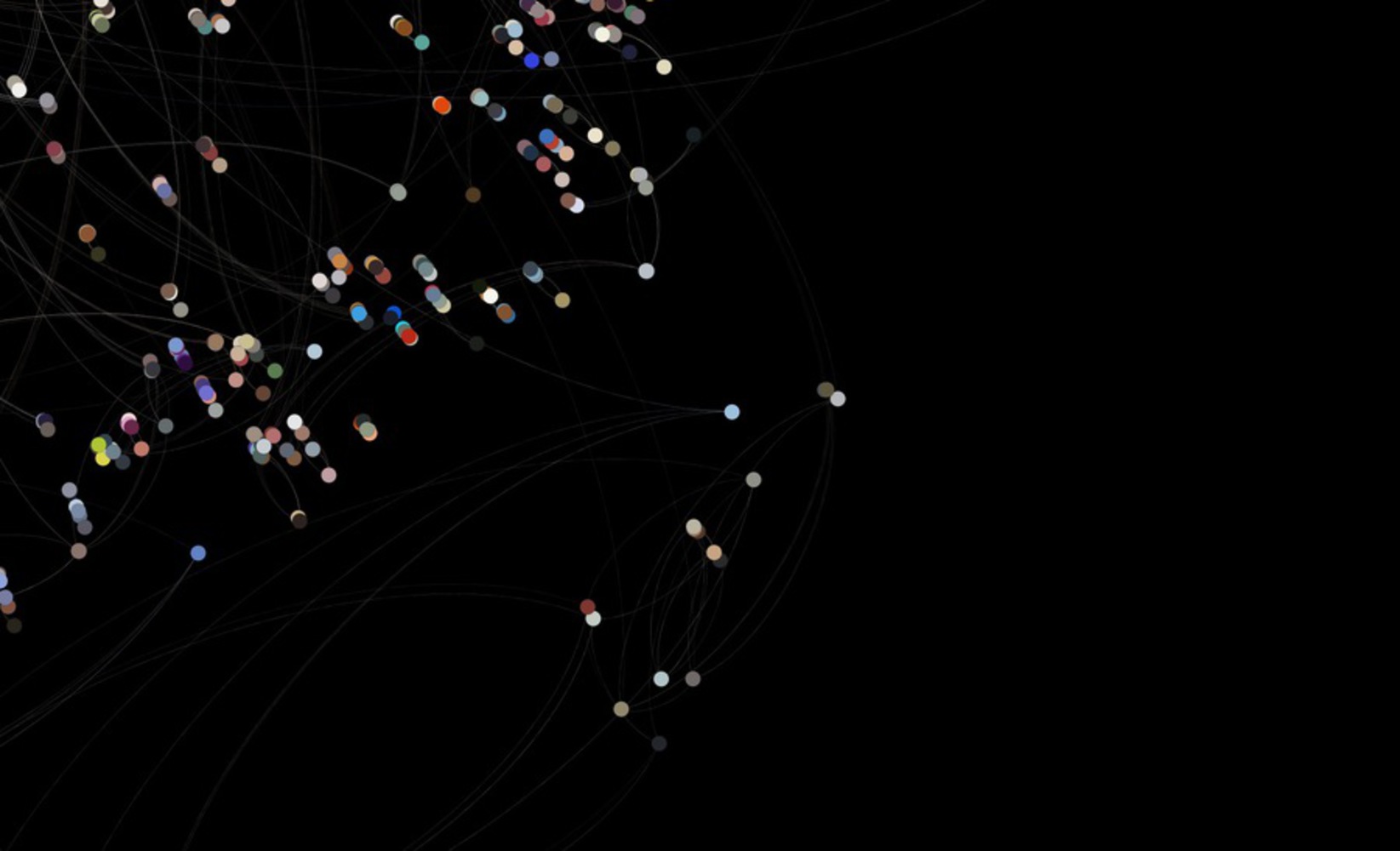
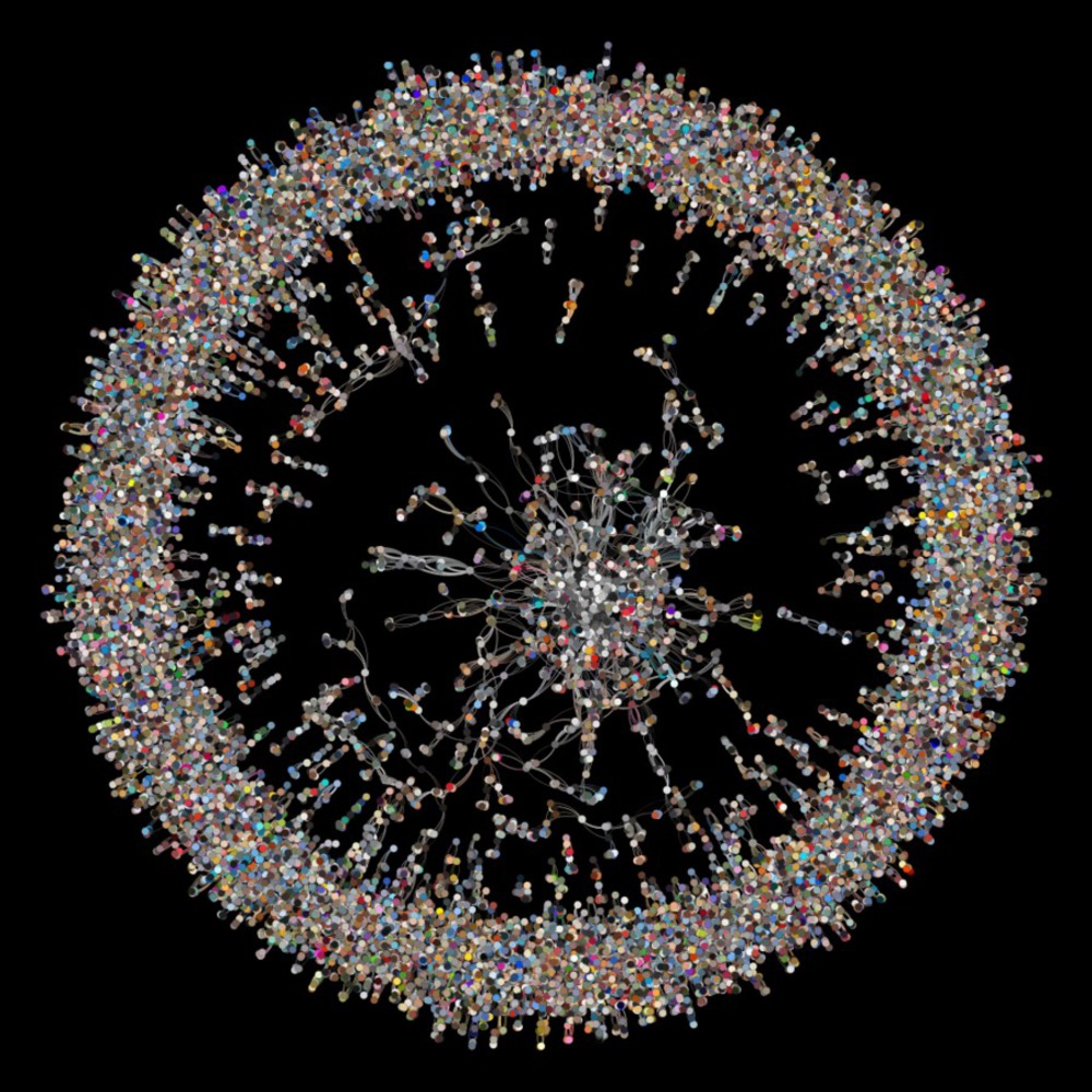
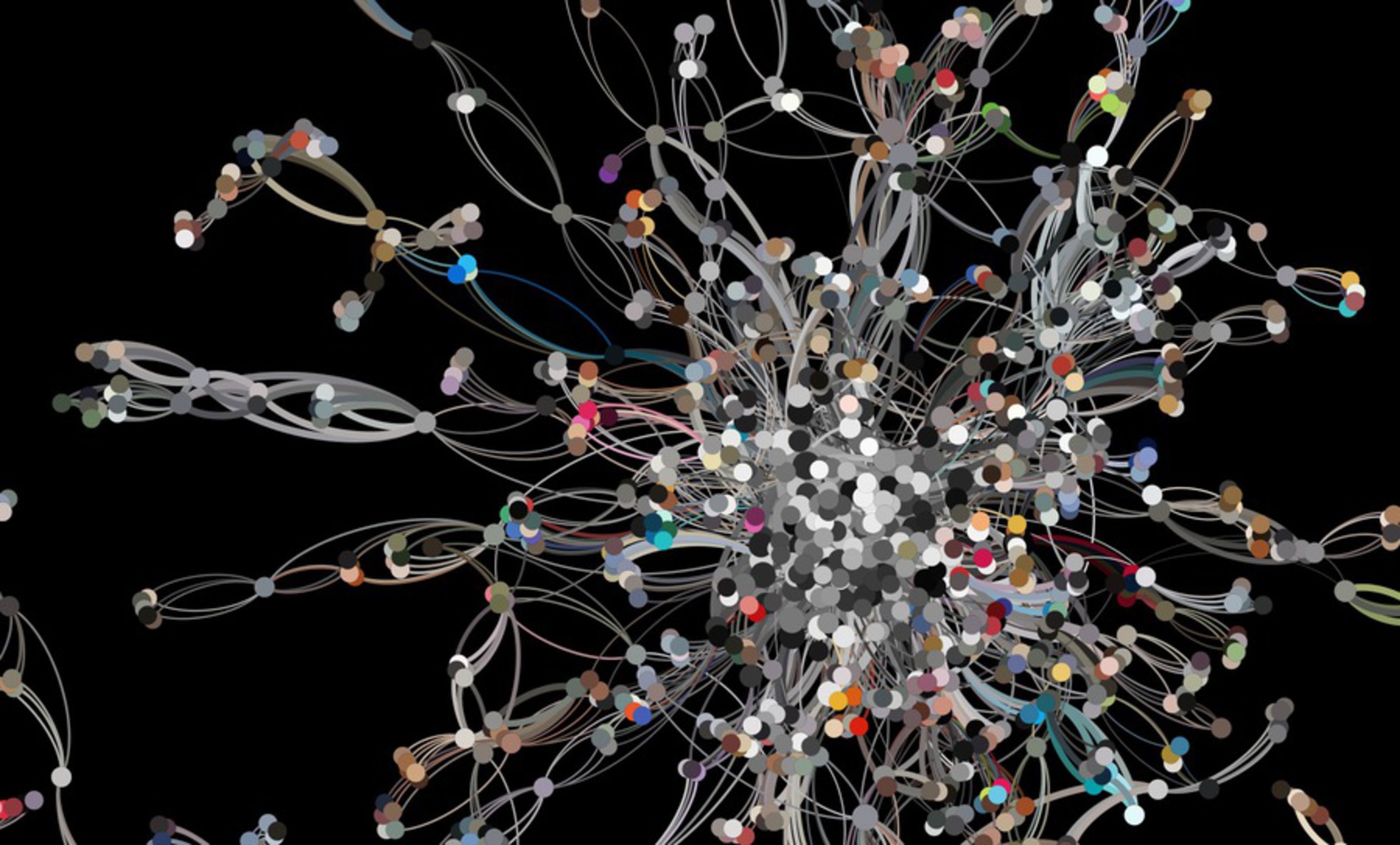
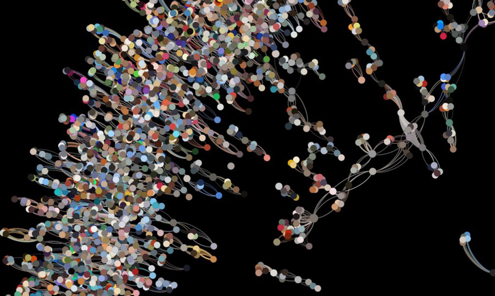
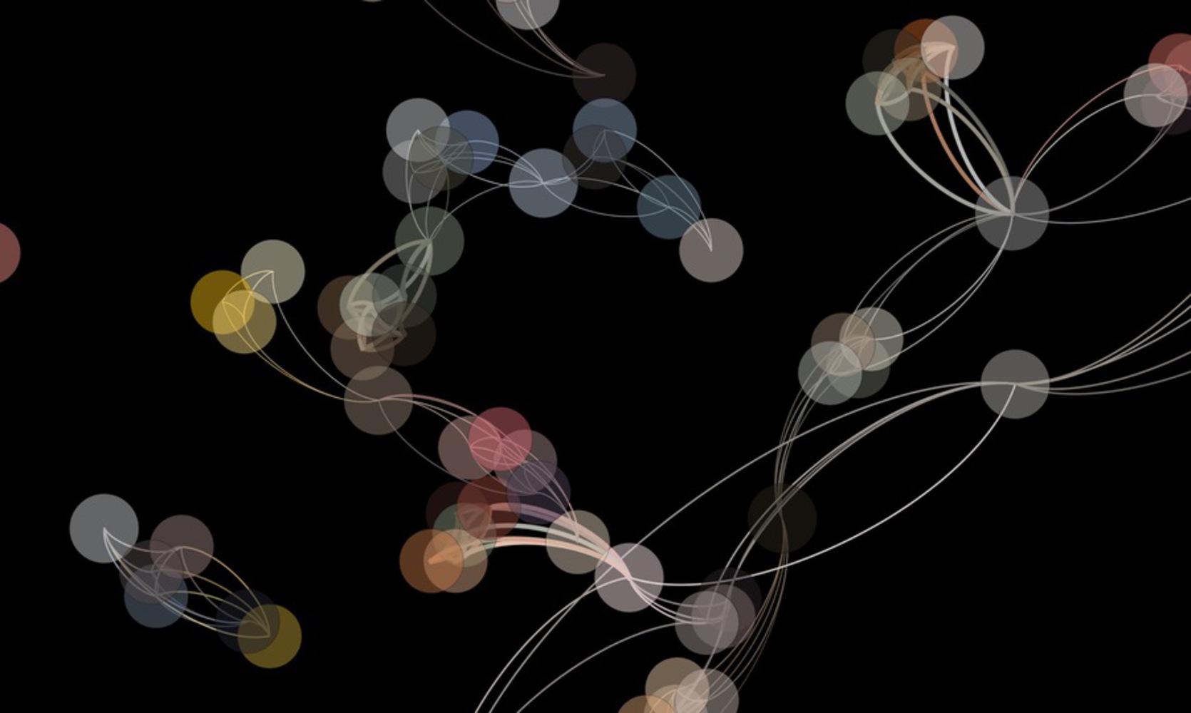
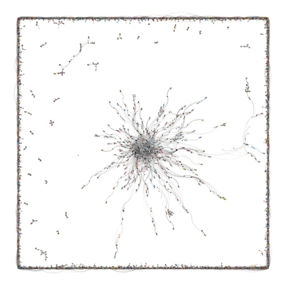
The dataset is a weekly Instagram posts collection. I choose to work with the dominant color and the color component data. The colors become the nodes and when the colors accumulating, more connections are built among the images that used the same color. 

929ceaab 0809 4898 ab40 d90af7925c9e.thumb
Show Advanced Options

Approach and process

Gephi is used to process and represent the data. The plugin in Gephi allows the nodes are shown by the color codes from the meta-data set. The results reflect the real color pattern of the images on Instagram.

ForceAtlas 2 layout reduces the algorithm complexity. Replace the attraction and repulsion forces by a scaling parameter.

The Yifan Hu layout is used to process large networks. The repulsive forces on one node from a cluster of distant nodes are treated as one super-node.

Both layouts use the same nodes and edges, through the different layouts, more observations can be made.

9f68326c 0cc7 4ee6 9c32 c68b5cc865d2.thumb
Show Advanced Options
5fd0de66 98ba 47cb 8437 29c054e3ba72.thumb
Show Advanced Options

Representation and Visualization

2 1png.thumb
Show Advanced Options
2 2.thumb
Show Advanced Options
1186b443 1d8c 435e 90ba 4a7c70fc617c.thumb
Show Advanced Options

ForceAtlas 2 layout forms several clear concentric circles and the outside circles are less dense than the inside ones. There is a clear gravity center which is an aggregation of grey color nodes. These nodes have greater weights than others and have more and stronger connections. Towards the edge, the gravity becomes weak and the connections are less and can barely be seen.

1 1.thumb
Show Advanced Options
Ac49cb43 9936 4fc4 bca2 7141678d9884.thumb
Show Advanced Options
Fa36a735 5ac7 4396 be38 f473b2fc228c.thumb
Show Advanced Options
35a61831 28dc 4427 89dc 3759521306f3.thumb
Show Advanced Options

Yifan Hu layout represents the same dataset in a different way. The center is still the strong grey colors while the shell-like circle is the concentration of all the connections that are small and not so strong but large numbered. This representation shows that certain colors are heavily used while most colors are not so often used but they are dominant in overall weight.

Lessons learned

Gephi is a good tool for data clustering and the logic of nodes and edges make the analysis more easy to follow. However, due to the complexity of the connections and too many colors, it's hard to observe a clear and straightforward conclusion.

Other related questions should be studied to better support the color social network. For example, what if all the similar color nodes aggregate visually and what are the general color preferences by Instagrammers? I need to create a totally different edge file. To make this idea work, I need to keep only dominant colors of each post and the connections are the posts with the same color or similar colors. However, I realized this may not be tangible because the visual similarity may have a totally different color code but the clustering can only base on the color code. The further analysis can be really interesting but requires more complex filtration of the dataset.

Colordistance 720.thumb
Show Advanced Options
Slack imgs.thumb
Show Advanced Options
Drop files here or click to select

You can upload files of up to 20MB using this form.