Back to Parent

Outcome


Intention

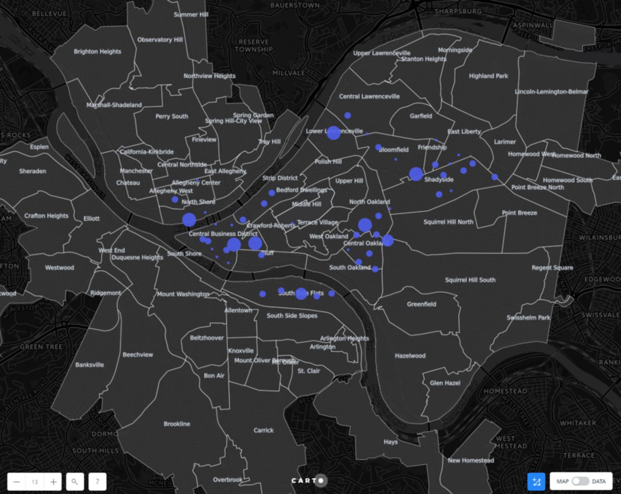
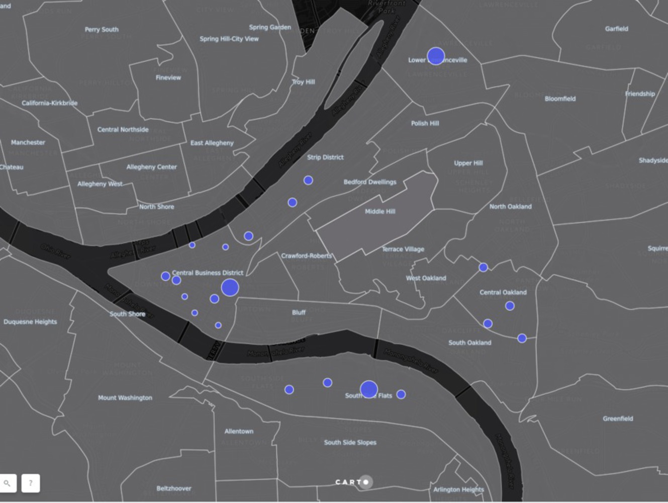
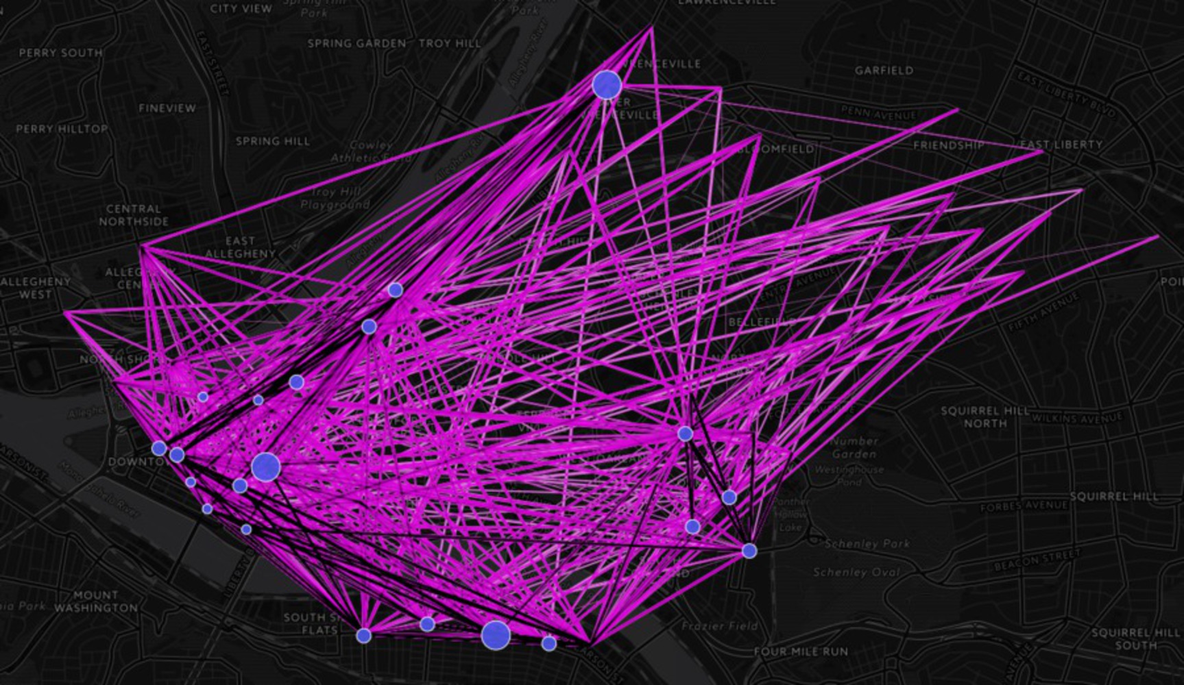
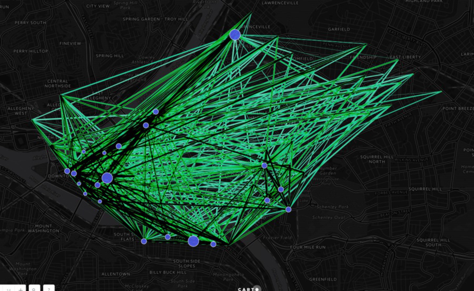
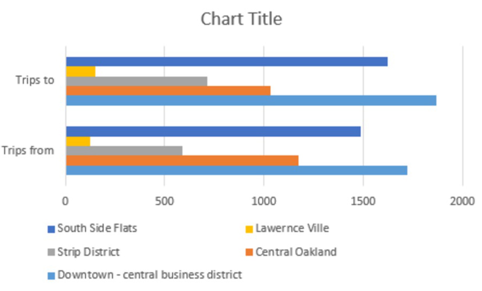
The Intention of this project was to study the how healthy bike share network is structured in the neighborhood. Which neighborhood, makes more use of it and how are the movements of the bike. Are the trips made only from a particular neighborhood or only to. Is there a balance in the bike taken out from a neighborhood to bikes brought back. 

This is a further exploration of the initial exploration done for Moving module. The link below is the exploration done previously in the ideate gallery. 

http://ideate.xsead.cmu.edu/gallery/projects/healthy-ride-trip-data-analysis-e9b3d9b1-8207-4b30-8fd8-9646bda5da96


Initial Analysis

To answer the following question I first mapped the stations on the Pittsburgh map. to check which neighborhood has most number of stations to see the where the need is more. 

1.png.thumb
Show Advanced Options

It can be seen from the map, that there are more number of bikes stations in downtown, followed by shady-side then central Oakland and South side flats have almost same number of station. 

But does these number of station, say that the bike mobility is more in these neighborhood? 

To further explore this question I made a network map of to and from trip activities of bikes.  

Show Advanced Options
324234.png.thumb
Show Advanced Options

From the network map it can be seen that there is a dense network in Downtown, south side flats, Central Oakland and Laurencville. Surprisingly, the network for shadyside is not as dense, where as it has more number of bikes.  

Further, to check which neighborhood is more healthier, I made two overlapping maps to check the trips made to and from the neighborhood. 

From tiprs.png.thumb
Show Advanced Options

Above map shows trips made from the marked stations 

To trips.png.thumb
Show Advanced Options

The above map shows the trips made to the neighborhood. 

Show Advanced Options

From the above ovelapped map , it can me seen that the to and fro is relatively same. 

To and fro sidtribution.png.thumb
Show Advanced Options

Further, as I map into a graph, the idea gets clear that the the too and fro from stations or neighborhood is pretty much balanced. 

The maximum trips are done by Central Business District followed by Southside Flats, Central Oakland and Strip District and then Lawernce Ville. It is surprising to see Lawerence in this bar chart as it has very few stations and it seems like there is a demand in people wanting the use of these bikes. 

This also answers the questions that maybe there is a balance in supply and demand of cycles in term of availability at a particular station 

Future Work

Further Pittsburgh bike maps data could be overlapped to see, whether these most used neighborhood are well connected or not.  

Drop files here or click to select

You can upload files of up to 20MB using this form.