Matrix of Outdoor Activities in 3 Pittsburgh Neighborhoods
Made by Tamara Cartwright
Made by Tamara Cartwright
The goal of this analysis was to analyze the correlation between the wealth of a neighborhood and its public sport activities.
Created: October 5th, 2017
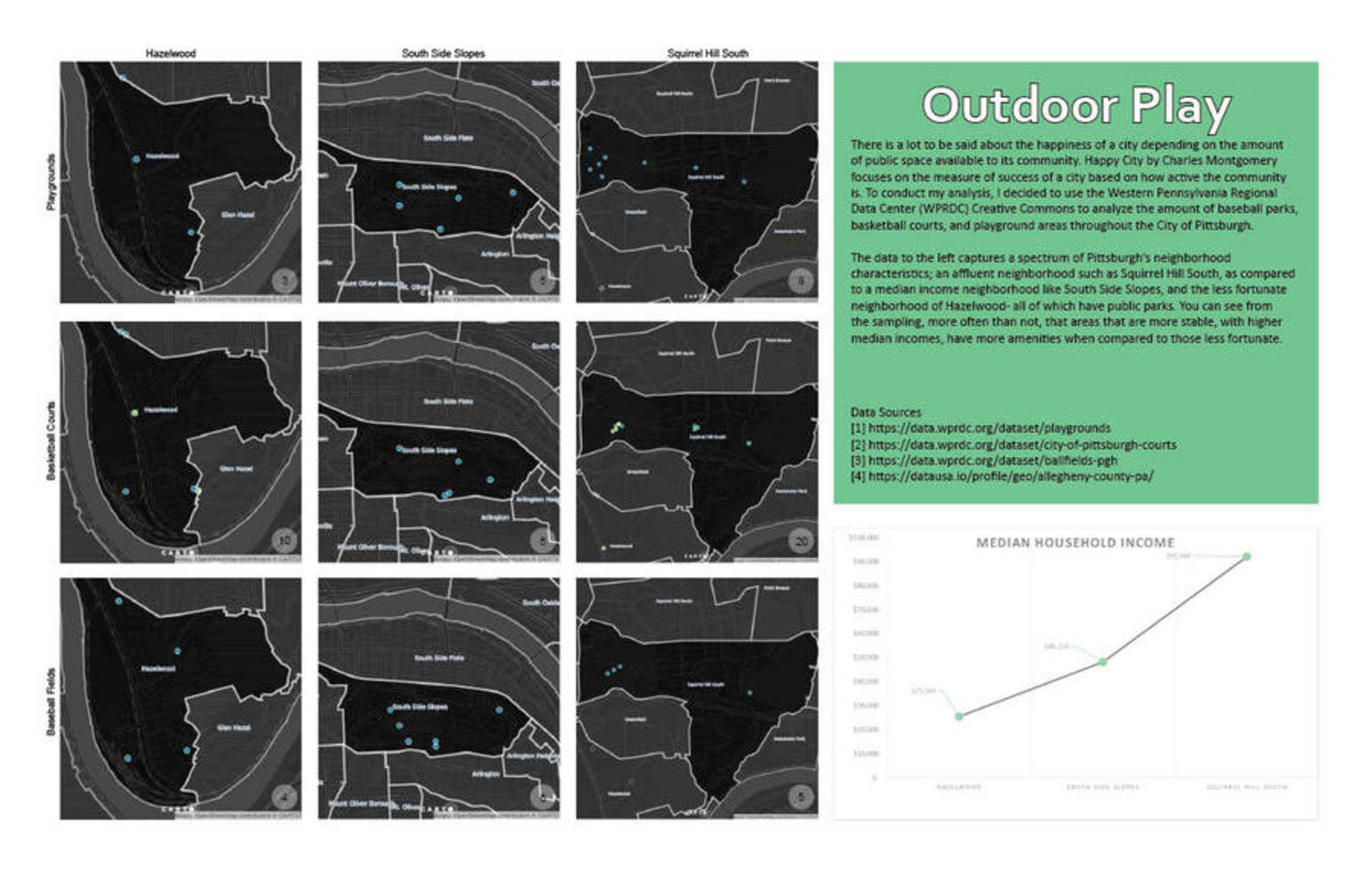
There is a lot to be said about the happiness of a city depending on the amount of public space available to its community. Happy City by Charles Montgomery focuses on the measure of success of a city based on how active the community is.
To conduct my analysis, I decided to use the Western Pennsylvania Regional Data Center (WPRDC) Creative Commons to analyze the amount of baseball parks, basketball courts, and playground areas throughout the City of Pittsburgh.
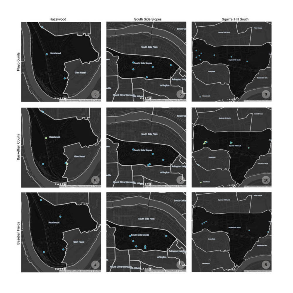
[1] Playgrounds- a collection of playgrounds throughout the city of Pittsburgh. This data was important to my analysis because it appeals to the younger generation and is often the start of our active/ sporty lives.
https://data.wprdc.org/dataset/playgrounds
[2] Pittsburgh Courts- a collection of basketball courts, tennis courts, ice rinks throughout Pittsburgh. For the purpose of my analysis I cleaned the data to only include basketball courts.
https://data.wprdc.org/dataset/city-of-pittsburgh-courts
[3] Ballfields- contains data on baseball/softball fields throughout the city of Pittsburgh. As someone personally interested in baseball, I thought it would be great to see how many are actually found in Pittsburgh. These fields usually take up a lot of land and I did not expect to find many in Pittsburgh. A lot less people use a field as frequently as they use playgrounds and courts.
https://data.wprdc.org/dataset/ballfields-pgh
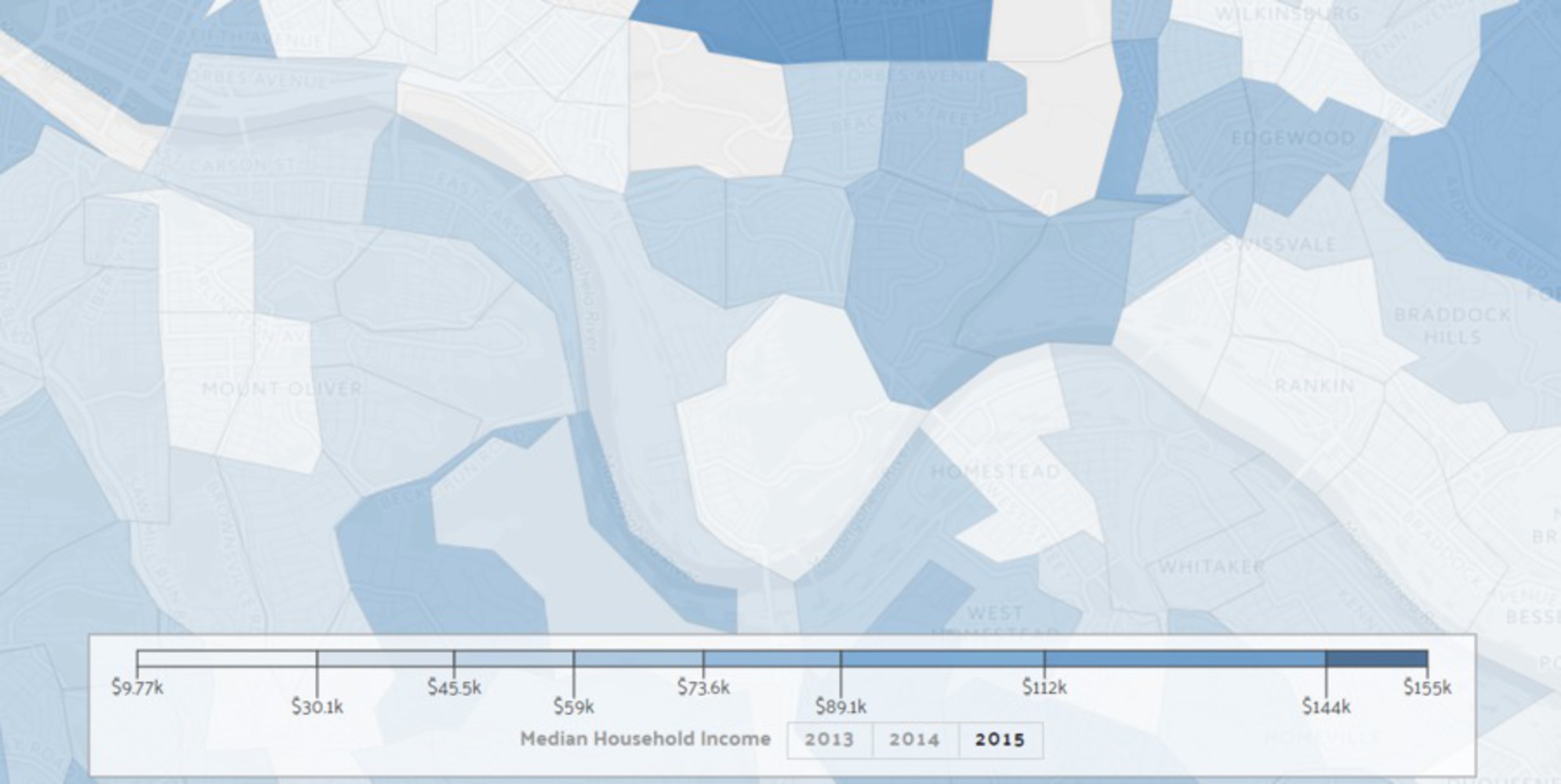
[4] City Data collected from the American Community Survey collection of 2015 which tells the tale of the economic situation of the neighborhoods within Pittsburgh. The Median Household Income per census tract was added and divided to give a median for the neighborhoods I analyzed.
https://datausa.io/profile/geo/allegheny-county-pa/
The data below captures a spectrum of Pittsburgh’s neighborhood characteristics; an affluent neighborhood such as Squirrel Hill South, as compared to a median income neighborhood like South Side Slopes, and the less fortunate neighborhood of Hazelwood- all of which have public parks. You can see from the sampling, more often than not, that areas that are more stable, with higher median incomes, have more amenities when compared to those less fortunate.
For the sampling I aggregated the data collected in the first part of the assignment to the specific neighborhoods I wanted to focus on. The dark blue dots represent one park, where as the lighter dots represent a collection of 2+ instances. As you can see, areas in Squirrel Hill South have multiple fields.
Many of this can be a reflection on the number of residents per neighborhood and access to a larger group; I did not look into or consider these prior to my analysis. Instead, I began the first part of the analysis by first collecting the open data from WPRDC's website, assessing which district in the city had the most ballparks and then zoomed in to the three neighborhoods of choice from there.
From this exercise I learned that it is hard to find a middle ground between representation of data and accuracy. It was really hard to capture the amount of courts in one park because of the way my data was organized. I could not simply change the size of the dot to represent the density. This of course was a fault on my end that I would correct in future. I also discovered the difference between static representation and interactive maps. I found that the interactive map better represented the data across all neighborhoods at a scale was was easily understood. I was disappointed with the scale and quality of representation I obtained when exporting my map to a still image, however increasing the size of the symbol only ended up masking others below and around. This is one of the many areas I see carto lacking in quality. Pretty maps do not always = pretty maps.
Caricature and exaggeration is a choice that should be made upfront based on the story you are trying to tell. By making that choice earlier on in the process after the initial analysis, it will be much easier to determine the best route for representation.
The goal of this analysis was to analyze the correlation between the wealth of a neighborhood and its public sport activities.