Replicating Cecil Beaton
Made by Brian Li
Made by Brian Li
Created: November 20th, 2014
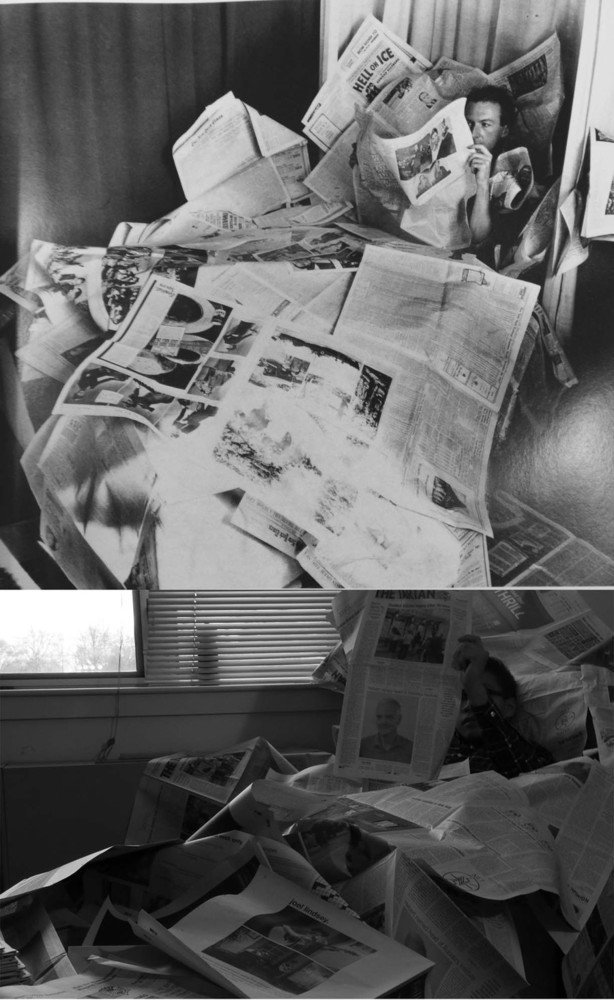
Cecil Beaton plays with a lot of contrast and interesting textures in his photos. In one photo (that I've replicated below) he uses newspaper in a whimsical way. I really liked this concept, and replicated several of his other photos featuring a newspaper element also.
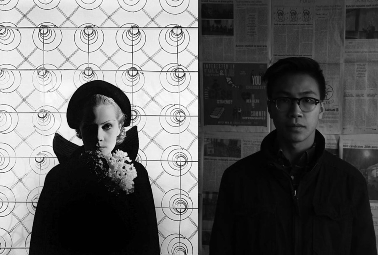
The main challenge with this photo was trying to create the level of contrast seen on the left. I assume that Beaton might have used some artificial light source to brighten the right side of the subject's face. However, since it was still relatively light outside, I tried to create the same effect with natural light, and was not so successful. However, the contrast was enough such that you can still see a distinct edge between the subject and the texture of the background. The black jacket definitely helped in this regard. We took this photo first with some other articles of clothing, and the piece did not feel as balanced. Although not a perfect replication, this shot still gives the same intense feeling as the original.
The original photo was actually one that I took from a book, which makes it look glossier than it actually is. This picture was actually quite difficult to set up. I had to find a way to arrange the newspaper in a way that looked purposeful. I thought the original photo was a little flat, so I bunched up some newspaper for a more textured effect. Also, I had to move a lot of miscellaneous objects out of the way, as it distracted the eye from the already busy photo. I noticed that the subject was in one of the darker corners of the frame, so the dark shirt contrasted nicely against the newspaper.
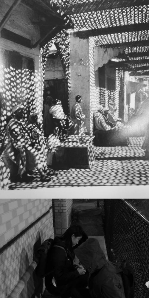
I think this was actually one of my best replications. Using a lamp, I artificially lit the space from the direction I wanted, and was able to create this contrast that was very similar to the original photo. Again, I used newspaper the separate the subject from the surrounding ground, which allows the photo to catch a little more light. However, the whiteness of the wall behind the subject is a bit distracting, and the photo would have been more successful if it was darker.
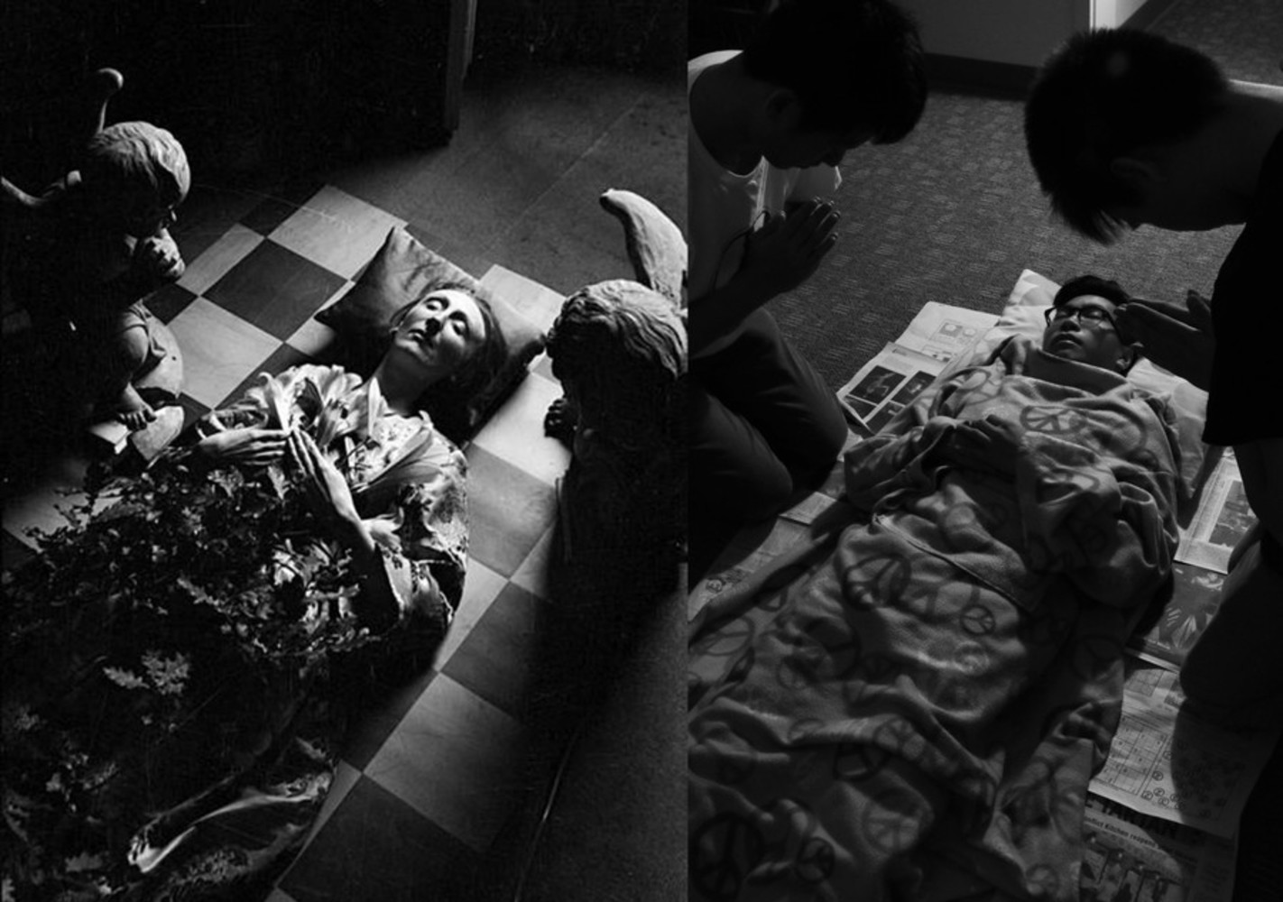
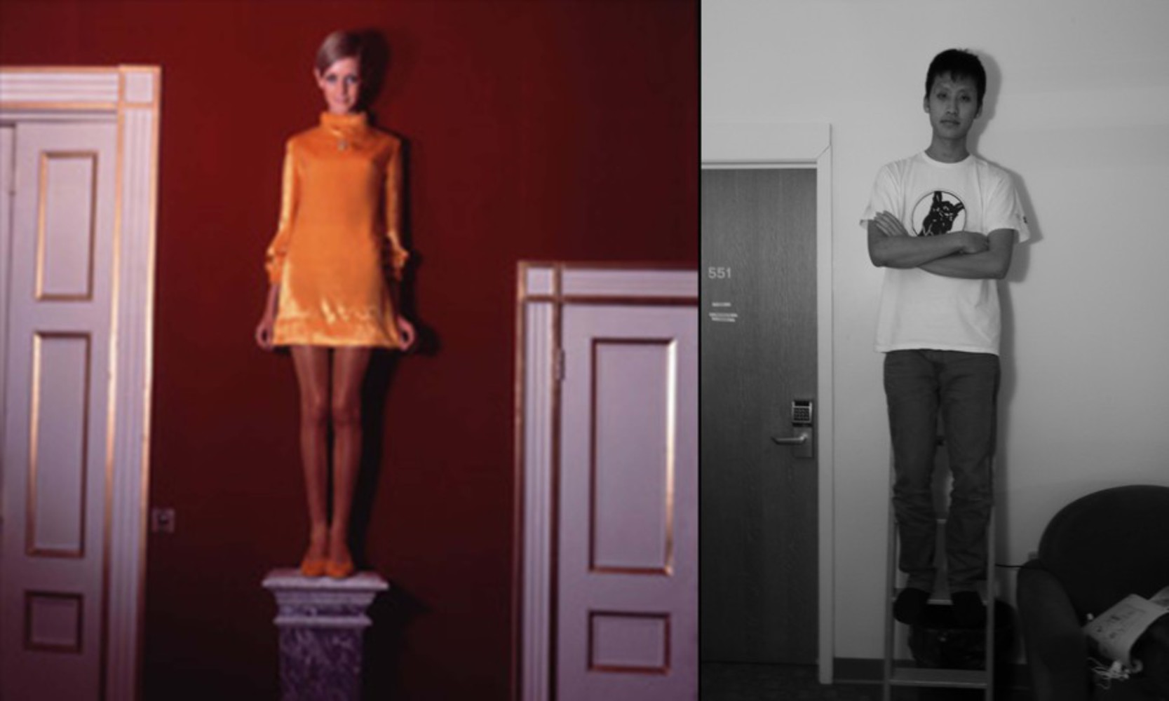
Although the original photo was not in black and white, I still really liked it for the composition, and the shadow work. The simple monotone wall allows a clear shadow to be cast upon it, which is a key part of this picture. Even though the objects on the left and right of the subject are not of the same height, this picture still feels balanced, due to the direction of the lighting and the slight tilt of the camera toward the right.