Responding to Artwork
Made by Judy H
Made by Judy H
Created: December 1st, 2014
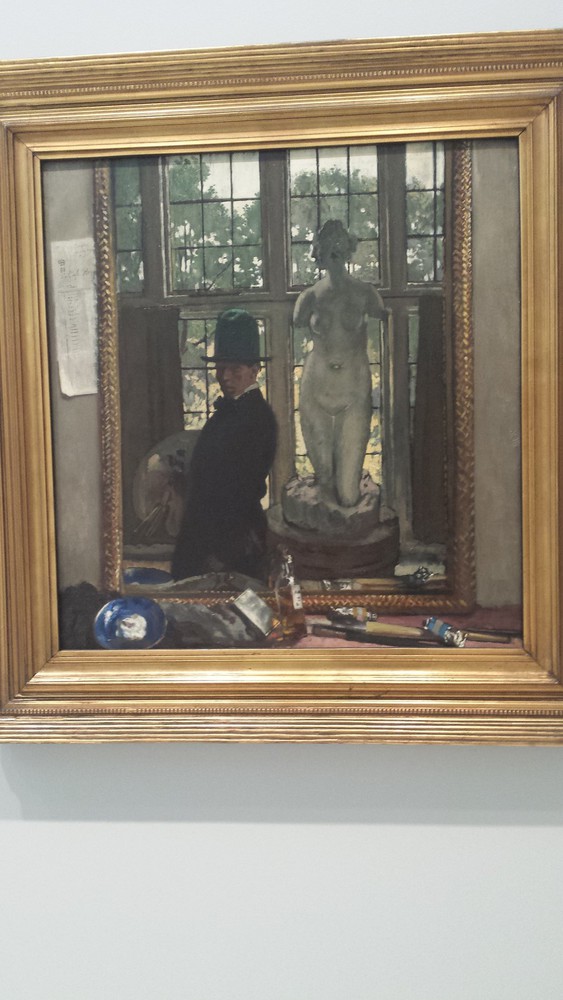
The first piece I chose is titled "Myself and Venus," painted by Sir William Orpen. Something that drew me to this painting were it's grey and subdued tones. Nothing in the painting is a vibrant color and even the palette that he is holding in the painting only contains grey tones. Looking at the title of the piece, I felt that the artist was comparing himself to Venus who is known to symbolize beauty. Her white statue is lit by the light from the window whereas in contrast, the artist paints himself in the darkness with a lot of shadows on his face so you cannot see him clearly. It's also interesting to see how the artist painted the frame of the mirror he was looking at to paint his self portrait. The way the painting is framed, it's almost easy to imagine yourself looking into a mirror. I wonder how the artist felt painting this because he must have looked into the mirror multiple times to paint this portrait and each time he had to look at his own features very carefully against those of the statue of Venus. To me, the painting felt very raw and real because of the other details that artist put into the work. For example, he makes and effort to include details on the (receipt?) that is tucked into the left side of the mirror from "The Cafe Royal." He also paints the tools that he set on down in front of the mirror such as paint tubes and brushes. Even though I feel a slight hint of sadness because I feel like the artist is comparing himself to Venus, there is something about this painting that I feel is very honest.
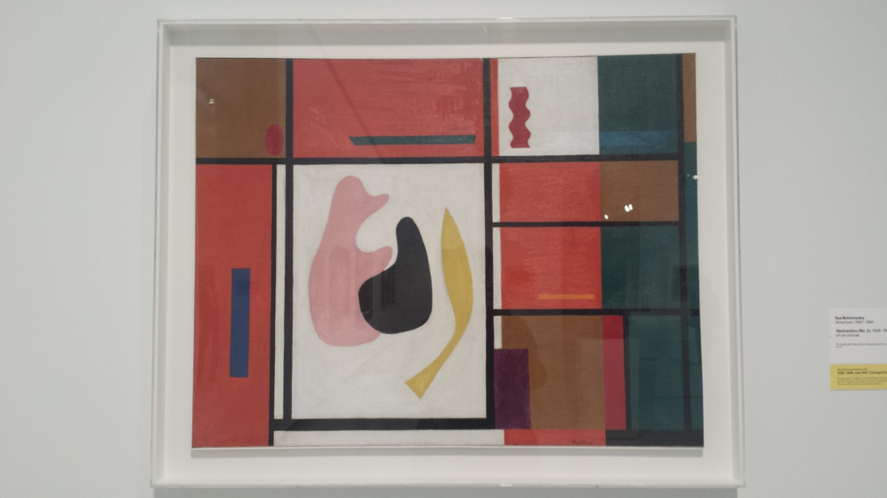
The abstract painting that I chose was "Abstraction (No.3)" by Ilya Bolotowsky. I chose this abstract painting because compared to the others in the museum, it seemed to have a bit more complexity to it. Something that particularly stuck out to me were the more rounded, organic shapes in the center in contrast to the angular lines and rectangles. Because I looked at this painting after looking at the realistic one, I definitely didn't appreciate it as much. If I had looked at other abstract painting first, I might have felt differently about this piece. At a closer look into the painting, I could tell that the lines were creating by laying tape (or some straight object) against the canvas and painting over the edge to create the crisp straight lines. To me this devalued the piece because I felt like the artist didn't put as much effort into the piece as the painter of the realistic portrait. I also didn't quite understand the colors that were presenting in this piece. While the darker reds, greens and brows seem to compliment each other nicely, it is a stark contrast to the the pick, yellow and blues. Then again, I could see why they were separated as such since the pink, black and yellow shapes were very different from the angular rectangles. The fleshy pink tone of the center object reminded me of the profile of a caricature of a person sitting with his hands together - almost like in a praying position. However, I'm not sure how I should have felt about the painting because there was very little context for me to go off of.