The weight of "Composition Concrete"
Made by Aliya Blackwood
Made by Aliya Blackwood
Critical response to Stuart Davis's Composition Concrete
Created: October 6th, 2015
THE WORK
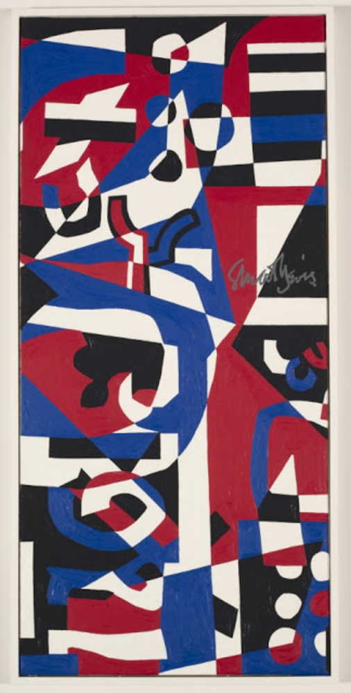
Commissioned in 1957, "Composition Concrete" was a mural for HJ Heinz Company's research center. The size and boldness of the colors seem to swallow the viewer in. Purposely using patriotic colors yet layering black amongst the other colors.
EXPERIENCE AND RESPONSE
Initially, the work was daunting, the portrait format towering over me and somehow filling up the wall completely. The large areas of shapes such as the triangle at the top center and trapezoid in the bottom right, are not perfect. They are made of layers of the other shapes but don't line up perfectly. There is no perfect circle, each of them angled.
The "1957" in the bottom left corner, is also misshapen. The "57" section seems to have been flipped upside down. This may be to emphasize Heinz's motto "57 Varieties."
The colors are said to be intentionally patriotic, but the black sections seem to weigh down the composition. The black seems out of place compared to the other colors. Towards the middle right of the piece, amongst a black background "ICU" in white, blue, and red respectively can be seen. This may be a commentary on the cold war, the colors referring to the USA, the red "U" referring to suspected communists, and the black sections across the piece highlight the darker moments in the USA.
One can tell by the strokes that the sections are done with outlines, then they are filled in. Black areas have lighter black patches and look like they were painted over. The piece itself looks rather heavy, the black cutting through the patriotic sequences.
The artist referred to his work as realistic. Perhaps the work as a whole is an acceptance of America as it is, even with its darker half.
PRODUCT
I wanted mimic the color scheme of the original piece but reflect my confusion as to what the author truly meant. The smudged areas are meant to represent the layers of hidden meanings in the original paintings that I hope I uncovered a bit of.
I used a program called Freshpaint to mimic oil paint brush strokes.
REFLECTION
I am not sure that I was able to capture my reactions well in the work, but I tried to connect it to the original work through the colors. I tried my best to understand the meaning behind Davis's nonrepresentational work and the message he was trying to send through his color choice.
Critical response to Stuart Davis's Composition Concrete