Visual Re-compositions with Dots, Lines and Shapes

Made by Rikky Roy Koganti

Created: November 24th, 2014

0

Man-Made Object 

Dots and Lines

0

I used dots to represent the light sources, and the most prominent areas of light in the photo. The thickness of the dots also tries to emphasize differing intensities of the light. The outlines of the ceiling's fans blades are made to be symmetrical, with the cluster of dots acting as a separator and a middle line. It helps to bring a sense of balance into the photo. The straight lines are meant to emphasize the rays of light emitted from the light sources, with the thickness also being representative of the intensity of the light. In this regard, I used Arnheim's suggestion of using different weights. In this composition, I used lines to both represent the physical attributes of the original photo, as well as the more abstract parts when it came to the light rays. Dots were used for both purposes as well, since the cluster of dots depicts an approximate shape of the light source, while the number and thickness represents the amount of light emitted. 

0

Dots, Lines and Shapes

0

In this composition, I opted to represent the shadows in the original composition instead of its more physical elements. Even the shadows had differing hues, due to the multiple light sources and the distance of the fan blades from the light sources. As such, the middle of the shadow tends to be darker and it gets lighter nearing its boundaries. Similarly, I decided to use a lighter shade to represent the whole shadow, with a darker shade in the middle, in order to show the different intensities. Also, the different positions of the fan blades from the light resulted in the darker parts of the shadows differing in size and shape for each shadow. In addition, I changed the color of the background from white to a lighter shade of grey to better emphasize the change in contrast. 

0

Human Motion

Dots and Lines

0

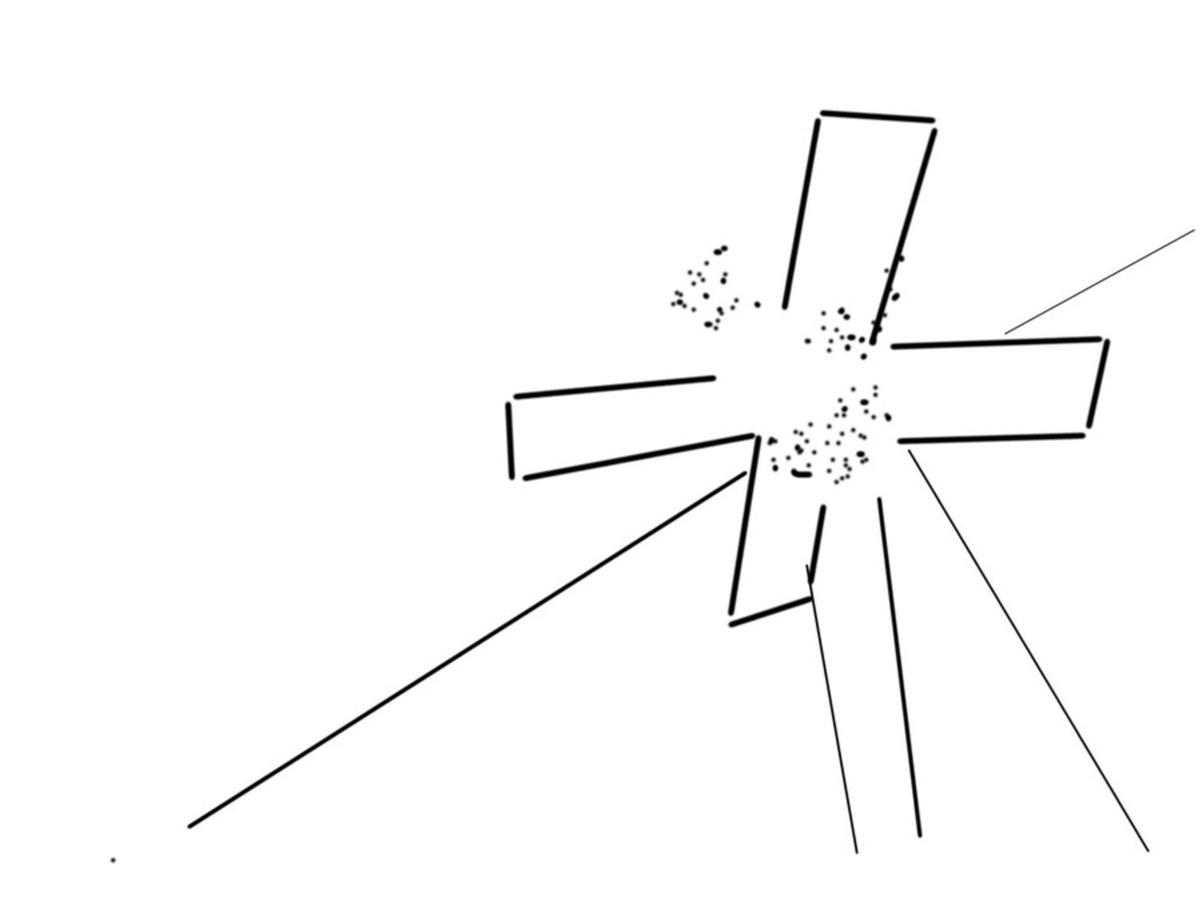
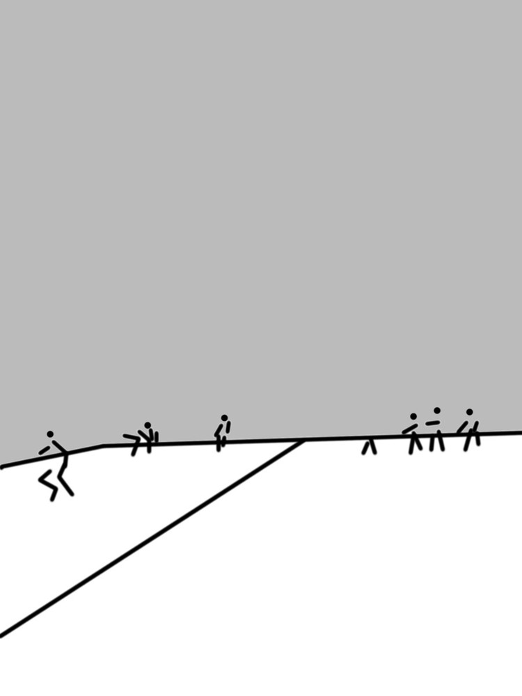
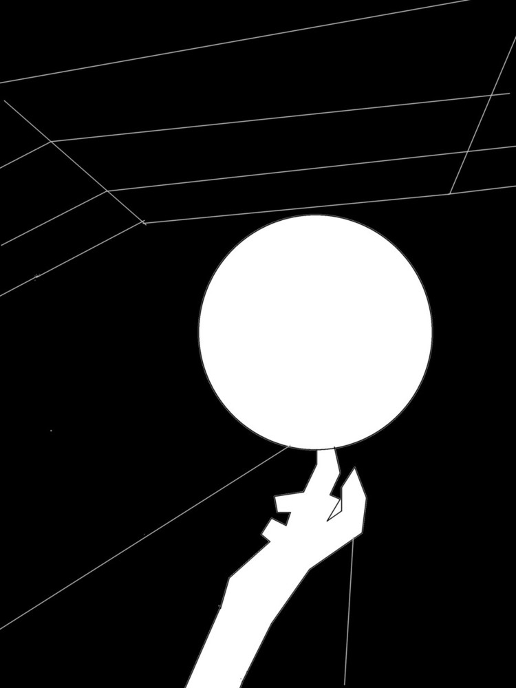
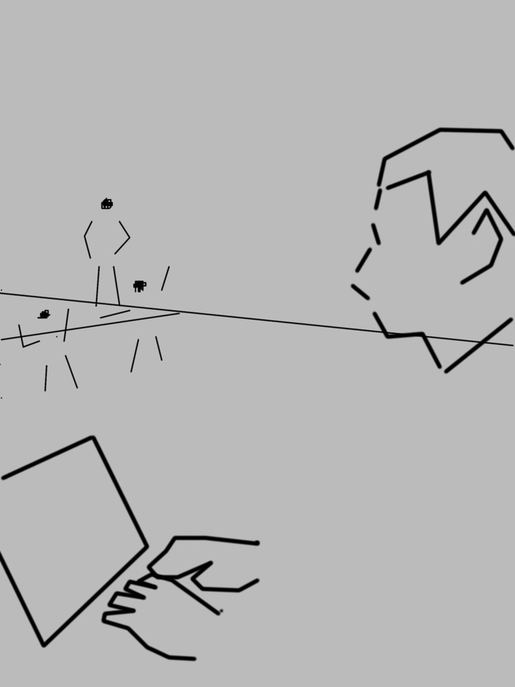
In the original composition, there were many different elements to the photo. There was the infrastructure on the ceiling, the windows, the shadows on the ground, and hand spinning the basketball in the center. However, another element to the photo were the players in the background, around the basketball. In this composition, I wanted to focus on them, using lines and dots to represent their outline, and the court they were on. I then colored the back walls and ceilings grey and had nothing on them, to better emphasize the players in motion themselves. I used lines to only represent the limbs of the various players, as those are what are in motion. The empty space near the bottom of the photo, where the spinning basketball was, helps to balance out the empty space in the top, allowing people to focus on the center of the composition, at the players. 

0

Dots, Lines and Shapes

0

In this photo, I went for the other main motion in the original photo, the hand spinning the basketball. I used lines and shapes to represent the outline of the basketball and the hand, while blacking out the background in order to bring focus onto the motion. The lines connected to the ball and hand were represented by lines and shadows cast in the original photo, and their placement made it seem as if they were supporting both the hand and the basketball. The lines at the top, represent the ceiling, and I tried to make them as balanced as I could, and the horizontal spacing between lines larger to the top. This was meant to add a sense of depth, as in the original photo. 

0

Human Emotion

Dots and Lines

0

I used lines to show only the outline of the main subjects head, and his hands at this laptop. This was because those two were the main points of focus in the original photo that represented emotion in the photo. The face shows a lack of attention to his surroundings and is slightly tilted downwards, looking at his laptop. His hands represent his actions, which is a focus on the laptop. The stick figures in the background show that there is a lot of activity in the background but despite this, the main subject is focused on his laptop instead. Moreover, the lines in the background have a smaller thickness in order to show his apathy to the background. 

0

Dots, Lines and Shapes

0

This time, I only had the head and the laptop, and I blacked out the background in order to bring attention to his apathy of his surroundings. I didn't draw in the hands as I thought showing just the laptop would have a greater impact in showing that it is his sole focus. The squares at the top, are an imitation of Josef Alber's work. However, in this case, it is meant to show a depth, and almost like the surroundings are being viewed through a pinhole camera in the distance. I was hoping that this further emphasizes the distance between the main subject and his surroundings. However, I also wanted to depict how he still has a bit of attention to his surroundings but they are in minuscule focus. 

x