BTS: Billboard Ranking vs. YouTube views

Made by Rachel Gu

Lie about the general trend of BTS popularity.

Created: November 2nd, 2015

0

Product

I created the following product: 
0
Final Product
Us world billboard ranking vs. views on youtube.thumb
0

I first gathered the data from YouTube on google spreadsheets:

0

But I couldn't get the graph to format properly, soI moved everything to http://plot.ly. I then created this graph:

0

But, it looked rather bare, so I moved it into Adobe Illustrator and added pictures of the members who composed each song around each data point to end up with the final product. Ideally, the graph is supposed to convince you that ranking higher or lower, just not in the middle, on the billboard, and having less members compose the song, will increase its YouTube video count.

0

Intention

The overall intention is to take data and create a visualization that lies about it. In my case, I wanted to misrepresent the reasons why certain BTS videos got more views than others. There are four ways I misrepresented the data: I only depict half of it because I only included the music video views and excluded the dance video views, I scaled the billboard rank axis to show very high ranks from 1 to 30, I used portrayed the members who composed the song as a "weight", and I compared two variables whose relationship is not causation but more or less correlation. When looking at more data about the videos, the year it was released, the dance version data, and etc., I think the general trend the number of views for each video (music video version + dance version) follows is fairly reasonable.

0

Context

The clear contributor of misrepresented data in visualizations is definitely Fox News. The examples we looked at in class include:

0
Truncating the Y-Axis
Truncating the y axis.thumb
0
Numbers Don't Add Up
Numbers dont add up.thumb
0
Sub-Sampling values/Misleading Labels
Graph2.thumb
0

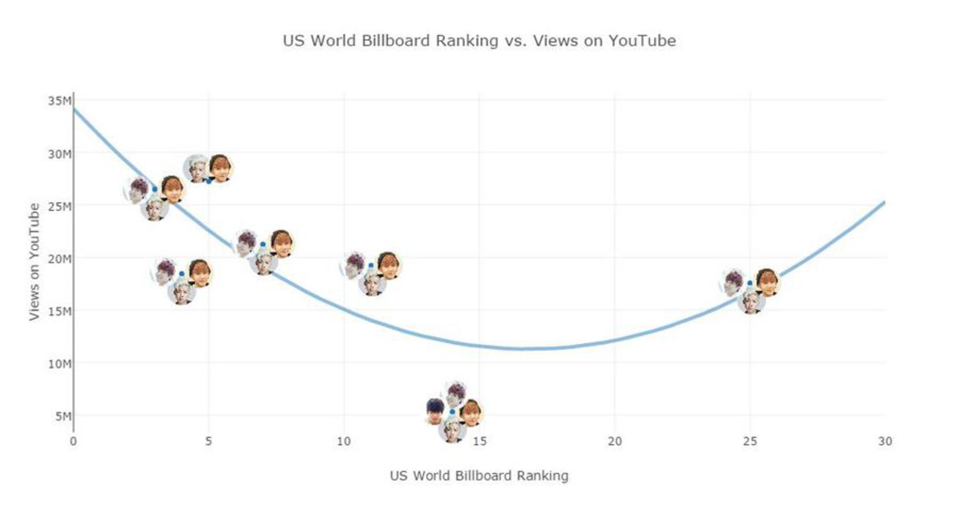
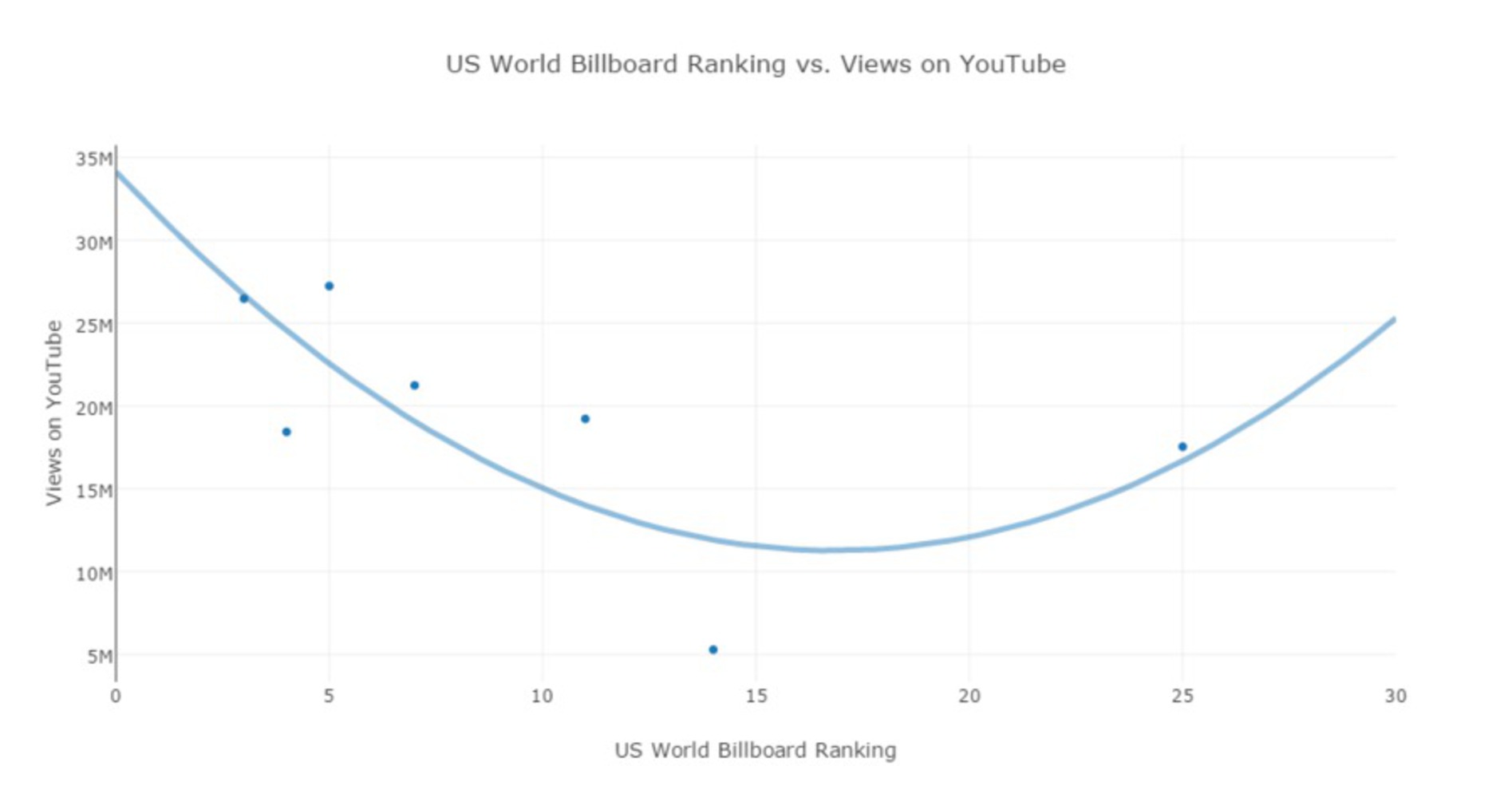
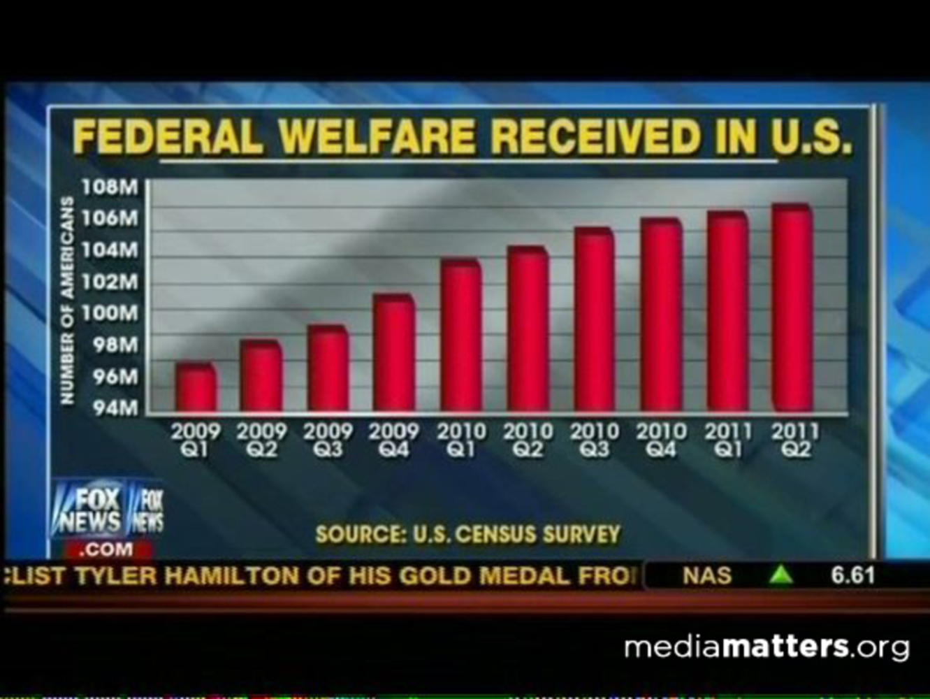
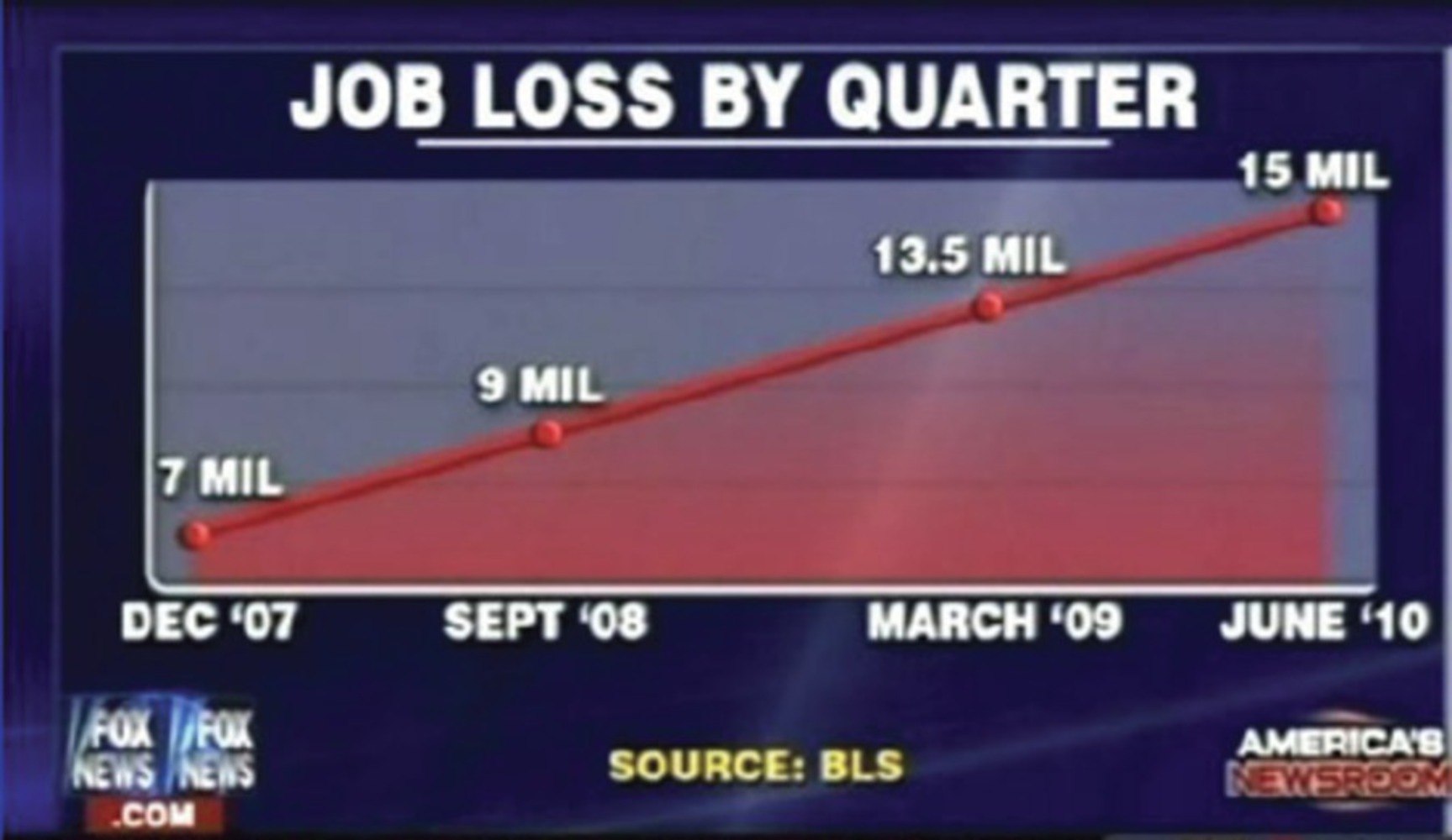
I tried to incorporate some of those ideas in product, such as the truncated y-axis. I also had a misleading label in the sense that I only showed billboard ranks from 1 to 30, whereas Fox News labeled the x-axis of the last graph by "quarter." 

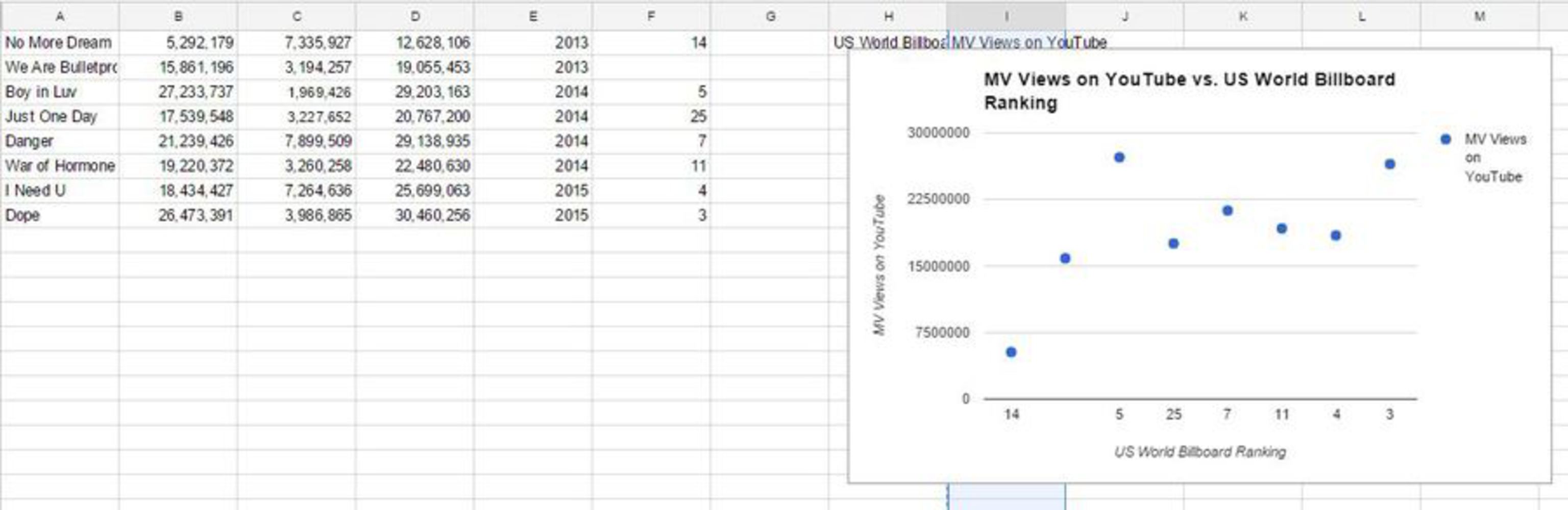
I chose do to something related to K-pop because I know a lot of big fans who keep up with all the new songs, K-dramas, and the personal lives of many K-pop idols. I unfortunately(?) fell out of love during high school due to the image of beauty held in Korea. Many have similar hairstyles, fall into specific personality types, and get plastic surgery and diet to create a similar image. Though they are very talented, each new group just seemed to be a revamped version of an older group (though, I'm not quite familiar with the current K-pop scene). I decided to do a project that let me look into the current K-pop scene, and it also fit into the current culture night preparations for which a few of my friends are participating.

0

Process

From the above reasonings, I decided to do something related to Asian pop culture. I decided on BTS (Bangtan Boys) for two reasons: I "learned" the dance during a GBM, and they had interesting data on YouTube. Like many K-pop videos, they have a music video version and a dance version, which is sometimes even more popular. It is also important to note that I only took the data from the official BTS videos, from 1thek and bangtantv. The first way I misrepresented the data was I only took the music video views. I compared it against the song's placement on US World Billboard, which I chose because YouTube is not popular in Korea, and many views on YouTube are from around the world. Initially, I wanted to portray how views on YouTube increased for BTS if corresponded to a higher or lower rank on the billboard instead of a middle rank, I portrayed the trend for songs that placed in the top 25. I then noticed that the song with the smallest number of views actually had the most members that composed it, so I depicted the composing members as a weight that decreased the view count.

0

Reflection

I struggled with coming up with an idea to misrepresent at the beginning. I looked through the links provided, but was either uninterested in the data or couldn't come up with a way to lie about it. When I finally decided on this idea, I first plotted the data and then began to manipulate the visualization to misrepresent it. I overthought the misrepresenting part, so I threw out ideas before really considering them. I think the final product I made is fairly plain. While I did put a lot of effort into creating the graph and adding more artistic elements, I should have worked smarter. My visualization is also confusing because it portrays 3 variables that don't all connect, that is, the number of composing members and billboard rank connect to the views on YouTube, but the number of composing members and billboard count are not related to each other. If I were to do it over again, I would actually probably pick a different topic, but if I stuck with the same topic, I would change the way I represented it, making it more simpler and intuitive because I think as it is not it is difficult to understand.

x
Share this Project


About

Lie about the general trend of BTS popularity.