CMUWS Lineup Statistics
Made by Sienna Stritter
Made by Sienna Stritter
This project dramatizes the impact the sophomore class has on the success of the Carnegie Mellon Women's Soccer Team.
Created: November 2nd, 2015
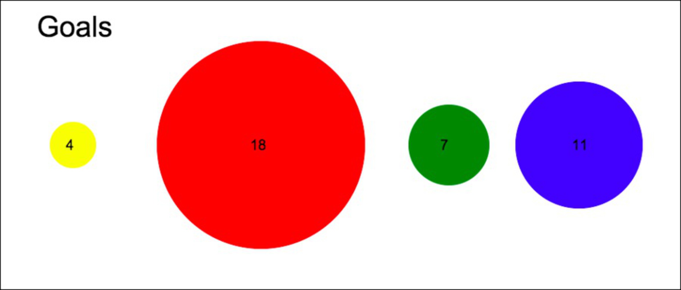
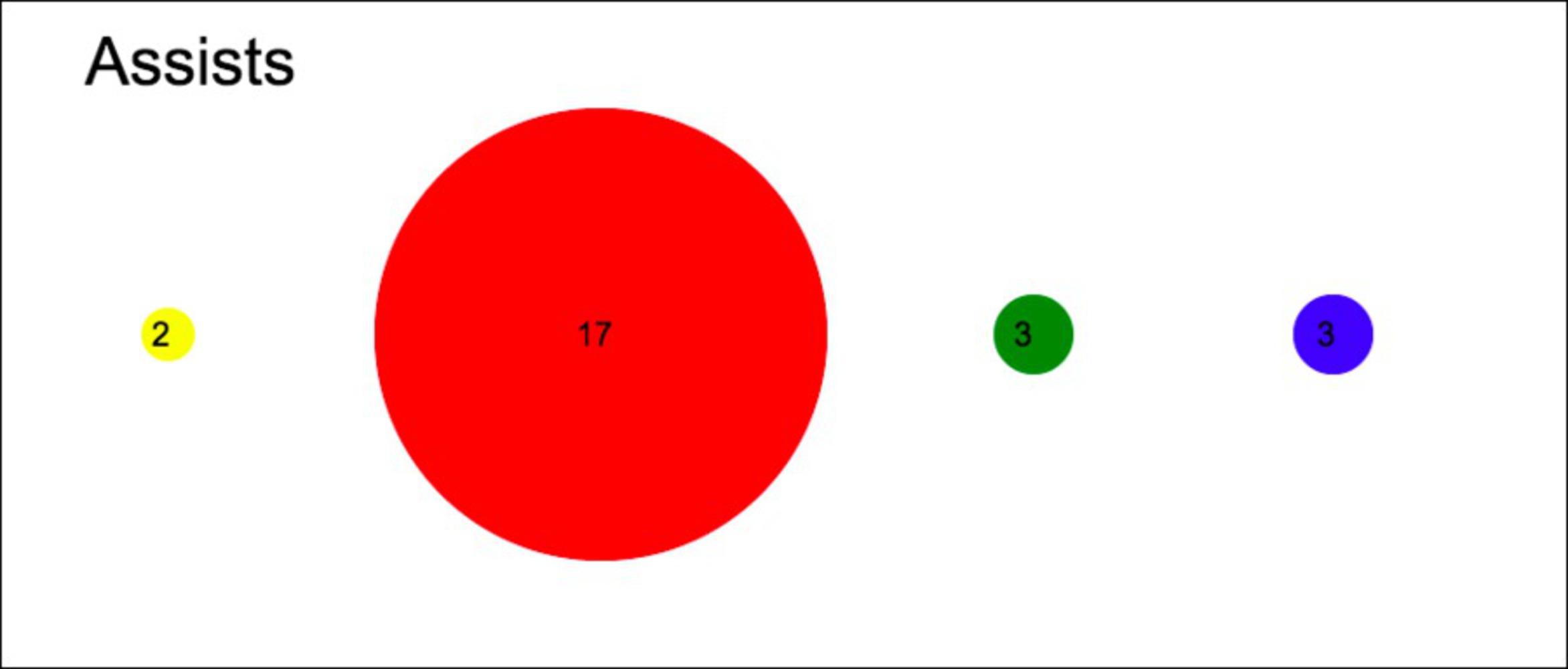
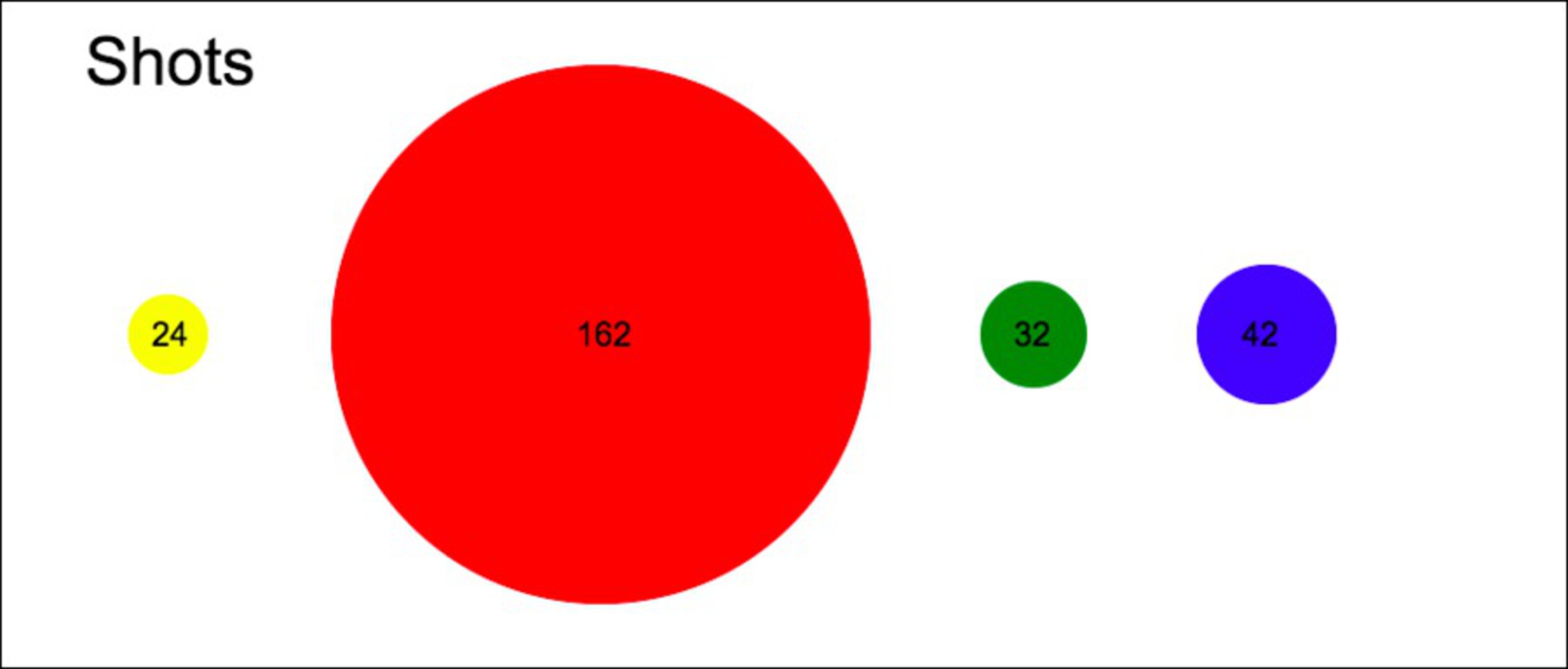
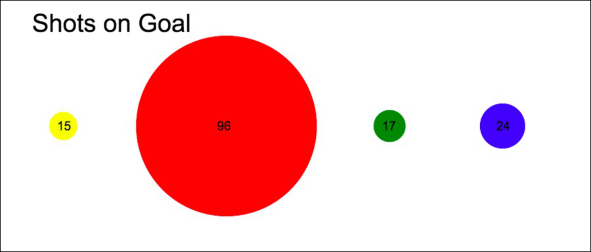
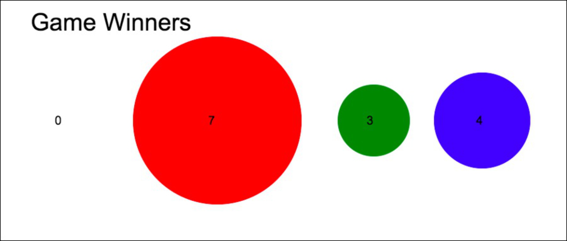
I created bubble plots to represent various statistics from the different classes of the Carnegie Mellon Women’s Soccer Team. I accumulated totals for goals, assists, shots, shots on goal, and game winning goals for each class. Then I created an HTML Canvas and wrote JavaScript code to create circles. I specified the x and y coordinates of the circles, as well as the color and radius. I made the radius of each circle correspond to the grade’s accumulated total. Yellow represents the freshmen class, red represents the sophomore class, green represents the junior class, and blue represents the senior class. Below are my bubble plots. The code I used to create these is attached at the bottom of the documentation.
I am a sophomore on the CMU varsity women’s soccer team and we look at our stats a lot. People call our sophomore class the “heart of the program” so I wanted to present the individual statistics in a manner that made the sophomores look even more awesome that we really are. By creating an ambiguous visualization of the data, I made it look like all the sophomores are superstars who absolutely carry the team and provide most of the important statistics for the team. These plots make it look like the sophomore class is by far the most impactful and dangerous when it comes to playing offense.
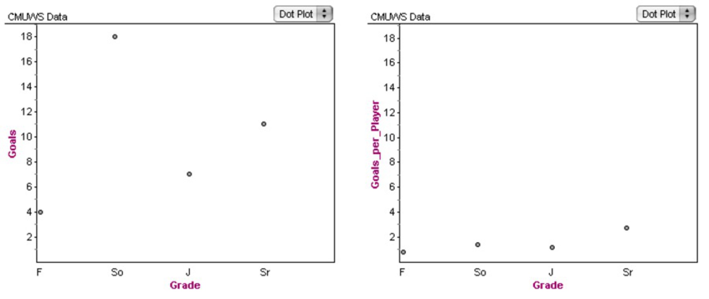
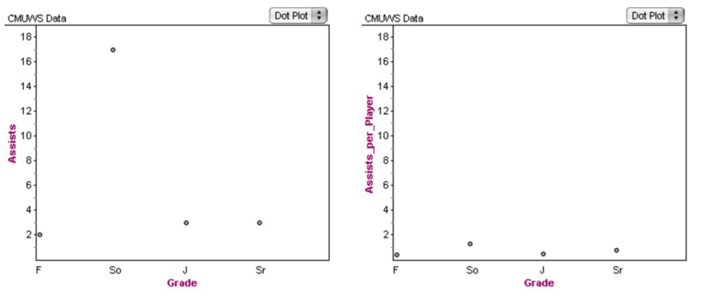
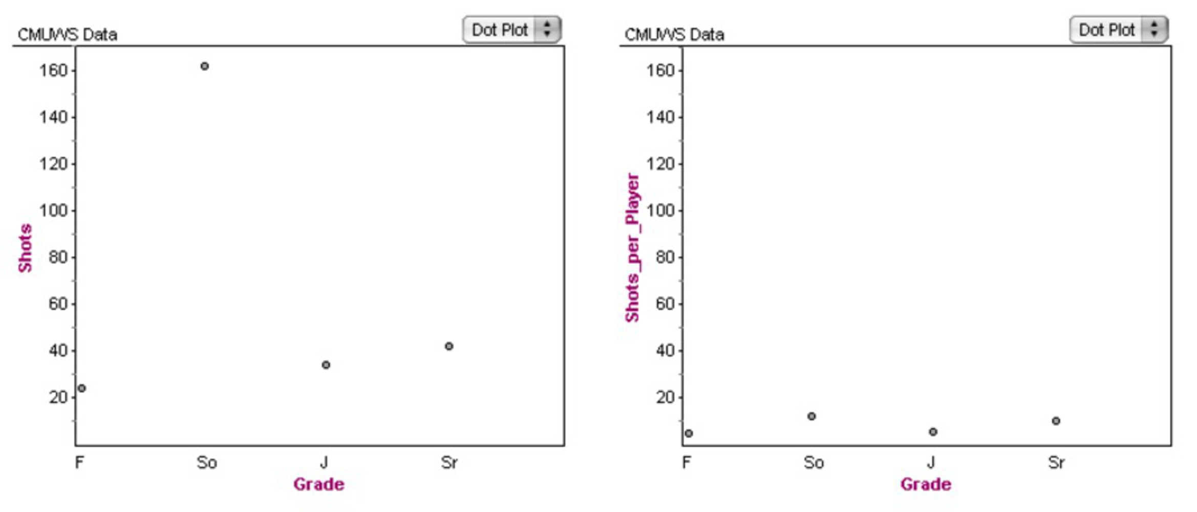
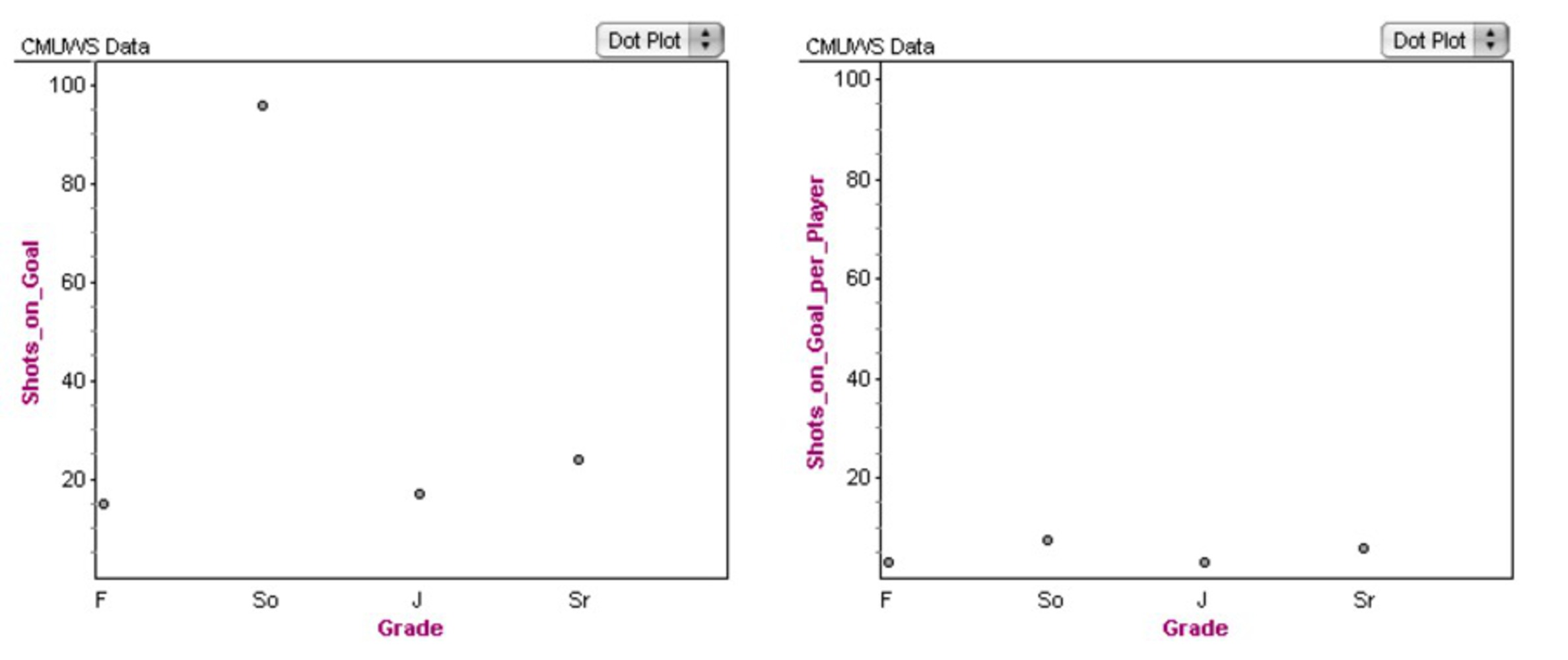
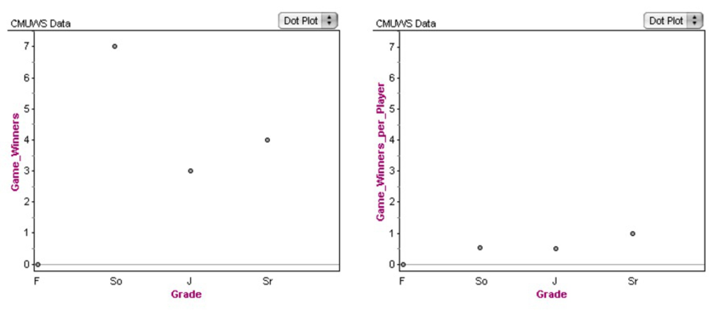
The trick, though, is that of the 28 members of our team, there are 13 sophomores. So the bubble plots do not tell the whole story – it makes sense that the sophomores score many more goals than the seniors, because there are over three times as many sophomores as seniors! In order to show how much my bubble plots distort the data, I also created the following series of graphs. For each statistical category, the graph on the left shows the total for each grade (F = freshman, So = sophomore, J = junior, and Sr = senior). The graph on the right, which is adjusted to have the same scale, shows the average number for a player in each class. We can see from these charts that the skill or impact of players across the grades is relatively consistent. Sure, in some cases, sophomores still have the highest statistic per player, but the effect is not nearly as dramatic as when we consider the raw totals.
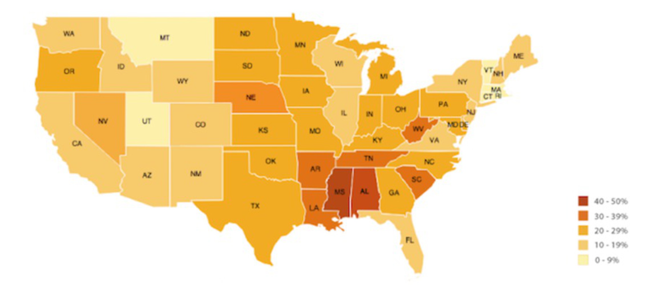
My inspiration for this project came from reading about the difficulties with mapping data. In her post “That Map Just Lied to Me,” Katie Richard criticizes the following map. She points out that “Delaware and Texas have the same percentage but Texas’ problem seems to have greater weight because of its size” in the graph below.
I created a related effect in my data visualization. In this example, the map implies that Texas has a bigger problem, when in reality, it has the same percentage as Delaware. In my examples, I imply that the sophomores have a much bigger impact on the team, when in reality, statistical contribution is relatively uniform across the grades.
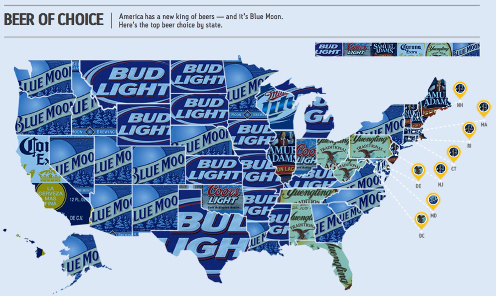
Below is another problematic map visualization: the top beer choice by state. It doesn’t reveal much about the top beer choice in the US because it doesn’t account for the population of each state. It’s possible that a very small portion of the country lives in Washington, Oregon, Idaho, Nevada, Utah, Arizona, New Mexico, Colorado, Nebraska, Alaska, Louisiana, Minnesota, Georgia, South Carolina, North Carolina, Virginia, or New York. So even though we see a lot of the Blue Moon logo, if almost the entire population of the US lives in Oklahoma, it’s possible that the top beer choice of the country overall is actually Coors Light even though it’s only represented in a small area on the map. This map can only speak to the most popular beer in the country if we assume that the population is evenly distributed throughout every state. Similarly, my bubble plots create a distorted representation since they do not take into account the differences in class size.
As soon as I learned this project involved finding our own data set, I knew I wanted to use our soccer statistics. These are numbers I look at every week anyway, and there’s quite a bit of information there. The most intuitive way to sort our team data was by class, and that’s when I realized there was potential to misrepresent the data because of the huge differences in class size.
I started by totaling stats for each grade in each category and creating the simple plots shown on the left hand side of the Intention section. It was clear that the sophomores dominated each statistic, but this was not an interesting or beautiful representation at all. So I decided to create the bubble plots, which show more dramatically (and aesthetically) the differences.
One of the challenges I encountered was that for some of the data sets, particularly game winning goals, the values were too small to show any meaningful differences in circle size. So, I decided to scale all the radii by the same scale factor. This maintained the relative sizes but made the bubbles easier to see and read.
This project was really fun for me because I got to use real data that is actually relevant to my life. I thought it was interesting how easy it was to make it look like the sophomores absolutely dominate the other classes in terms of contribution. It made me realize how easily a viewer could be misled. I think it’s more natural to question whether the class sizes are the same when looking at my bubble plots, but when considering one of the two maps referenced above, I can see how it would be easy to wrongfully assume that the population is uniform. This project helped me learn, then, that when viewing a graph or plot or any visual representation of data, it is important to question what factors are being accounted for and which are being ignored.
My inner critic is partially satisfied with this work. I think it’s very functional – it does distort the data and could definitely convince a viewer that the sophomores contribute much more to the team. However, it’s not a particularly beautiful data representation and if I could do it again, I would try to make something more aesthetically pleasing. It would also be interesting to explore the possibility of making it interactive in some way, since the current visualization is rather static and boring.
All of my data was taken from the Carnegie Mellon Athletics website. The individual statistics for the CMU Women's Soccer Team can be found at http://athletics.cmu.edu/sports/wsoc/2015-16/teams/carnegiemellon?view=lineup.
The referenced article by Katie Richard is from https://wiredcraft.com/blog/data-visualization-mapping/.
The map of beer choice by state is from http://datavizblog.com/2013/10/28/data-visualization-deconstructing-the-map-of-beers-using-small-multiples/.
<!DOCTYPE html>
<html>
<head>
	<meta charset="UTF-8">
	<title> CMUWS Stats </title>
</head>
<body>
<canvas id="myCanvas" width="940" height="400" style="border:1px solid #000000;">
</canvas>


<script>
var canvas = document.getElementById('myCanvas');
      var context = canvas.getContext('2d');

      context.beginPath();

	  //Legend
	  context.fillStyle = "yellow";
	  context.fillRect(100, 100, 20, 20);
	  context.font = "20px Arial";
	  context.fillStyle = "black";
	  context.fillText("Freshmen",132,117);

	  context.fillStyle = "red";
	  context.fillRect(100, 130, 20, 20);
	  context.font = "20px Arial";
	  context.fillStyle = "black";
	  context.fillText("Sophomore",132,147);

	  context.fillStyle = "green";
	  context.fillRect(100, 160, 20, 20);
	  context.font = "20px Arial";
	  context.fillStyle = "black";
	  context.fillText("Junior",132,177);

	  context.fillStyle = "blue";
	  context.fillRect(100, 190, 20, 20);
	  context.font = "20px Arial";
	  context.fillStyle = "black";
	  context.fillText("Senior",132,207);

	 //SHOTS
	 context.arc(100, 200, 24, 0, 2 * Math.PI, false);
	 context.fillStyle = "yellow";
	 context.fill();
	 context.fillStyle = "black";
	 context.font = "20px Arial";
	 context.fillText("24",90,207);

	 context.beginPath();
	 context.arc(360, 200, 162, 0, 2 * Math.PI, false);
	 context.fillStyle = "red";
	 context.fill();
	 context.fillStyle = "black";
	 context.font = "20px Arial";
	 context.fillText("162",345,207);

	 context.beginPath();
	 context.arc(620, 200, 32, 0, 2 * Math.PI, false);
	 context.fillStyle = "green";
	 context.fill();
	 context.fillStyle = "black";
	 context.font = "20px Arial";
	 context.fillText("32",608,207);

	 context.beginPath();
	 context.arc(760, 200, 42, 0, 2 * Math.PI, false);
	 context.fillStyle = "blue";
	 context.fill();
	 context.fillStyle = "black";
	 context.font = "20px Arial";
	 context.fillText("42",745,207);

	 context.fillStyle = "black";
	 context.font = "40px Arial";
	 context.fillText("Shots",50,50);

	  //GOALS
	 context.arc(100, 200, 4*8, 0, 2 * Math.PI, false);
	 context.fillStyle = "yellow";
	 context.fill();
	 context.fillStyle = "black";
	 context.font = "20px Arial";
	 context.fillText("4",90,207);

	 context.beginPath();
	 context.arc(360, 200, 18*8, 0, 2 * Math.PI, false);
	 context.fillStyle = "red";
	 context.fill();
	 context.fillStyle = "black";
	 context.font = "20px Arial";
	 context.fillText("18",345,207);

	 context.beginPath();
	 context.arc(620, 200, 7*8, 0, 2 * Math.PI, false);
	 context.fillStyle = "green";
	 context.fill();
	 context.fillStyle = "black";
	 context.font = "20px Arial";
	 context.fillText("7",608,207);

	 context.beginPath();
	 context.arc(800, 200, 11*8, 0, 2 * Math.PI, false);
	 context.fillStyle = "blue";
	 context.fill();
	 context.fillStyle = "black";
	 context.font = "20px Arial";
	 context.fillText("11",790,207);

	 context.fillStyle = "black";
	 context.font = "40px Arial";
	 context.fillText("Goals",50,50);

	  //ASSISTS
	 context.arc(100, 200, 2*8, 0, 2 * Math.PI, false);
	 context.fillStyle = "yellow";
	 context.fill();
	 context.fillStyle = "black";
	 context.font = "20px Arial";
	 context.fillText("2",90,207);

	 context.beginPath();
	 context.arc(360, 200, 17*8, 0, 2 * Math.PI, false);
	 context.fillStyle = "red";
	 context.fill();
	 context.fillStyle = "black";
	 context.font = "20px Arial";
	 context.fillText("17",345,207);

	 context.beginPath();
	 context.arc(620, 200, 3*8, 0, 2 * Math.PI, false);
	 context.fillStyle = "green";
	 context.fill();
	 context.fillStyle = "black";
	 context.font = "20px Arial";
	 context.fillText("3",608,207);

	 context.beginPath();
	 context.arc(800, 200, 3*8, 0, 2 * Math.PI, false);
	 context.fillStyle = "blue";
	 context.fill();
	 context.fillStyle = "black";
	 context.font = "20px Arial";
	 context.fillText("3",790,207);

	 context.fillStyle = "black";
	 context.font = "40px Arial";
	 context.fillText("Assists",50,50);

      //SOG
      context.arc(100, 200, 15*1.5, 0, 2 * Math.PI, false);
      context.fillStyle = "yellow";
      context.fill();
      context.fillStyle = "black";
      context.font = "20px Arial";
      context.fillText("15",90,207);


      context.beginPath();
      context.arc(360, 200, 96*1.5, 0, 2 * Math.PI, false);
      context.fillStyle = "red";
      context.fill();
      context.fillStyle = "black";
      context.font = "20px Arial";
      context.fillText("96",345,207);

      context.beginPath();
      context.arc(620, 200, 17*1.5, 0, 2 * Math.PI, false);
      context.fillStyle = "green";
      context.fill();
      context.fillStyle = "black";
      context.font = "20px Arial";
      context.fillText("17",608,207);

       context.beginPath();
       context.arc(800, 200, 24*1.5, 0, 2 * Math.PI, false);
       context.fillStyle = "blue";
       context.fill();
       context.fillStyle = "black";
       context.font = "20px Arial";
       context.fillText("24",790,207);

         context.fillStyle = "black";
	 context.font = "40px Arial";
	 context.fillText("Shots on Goal",50,50);

	 //GAME WINNERS
	 context.arc(100, 200, 0*20, 0, 2 * Math.PI, false);
	 context.fillStyle = "yellow";
	 context.fill();
	 context.fillStyle = "black";
	 context.font = "20px Arial";
	 context.fillText("0",90,207);

	 context.beginPath();
	 context.arc(360, 200, 7*20, 0, 2 * Math.PI, false);
	 context.fillStyle = "red";
	 context.fill();
	 context.fillStyle = "black";
	 context.font = "20px Arial";
	 context.fillText("7",345,207);

	 context.beginPath();
	 context.arc(620, 200, 3*20, 0, 2 * Math.PI, false);
	 context.fillStyle = "green";
	 context.fill();
	 context.fillStyle = "black";
	 context.font = "20px Arial";
	 context.fillText("3",608,207);

	 context.beginPath();
	 context.arc(800, 200, 4*20, 0, 2 * Math.PI, false);
	 context.fillStyle = "blue";
	 context.fill();
	 context.fillStyle = "black";
	 context.font = "20px Arial";
	 context.fillText("4",790,207);

	 context.fillStyle = "black";
	 context.font = "40px Arial";
	 context.fillText("Game Winners",50,50);

</script>

</body>
</html>
This project dramatizes the impact the sophomore class has on the success of the Carnegie Mellon Women's Soccer Team.