Data and Reality

Made by swilhelm

In this multifaceted misrepresentation of data, I plan to warp the data to "make sense" in multiple ways: simplifying data and showing the reality behind the data.

Created: November 2nd, 2015

0

Product

I created data that is misleading in an unconventional way, by creating a visualization, then manipulating it through sound. I used Tableau, a data manipulating software, and found a dataset compatible with the software, which was a dataset of reported car accidents. 

0

Through the software, I created the visualization below. Each column is a reported accident. The circles are labelled and color coordinated. 

0

I manipulated the data through sound. I created an eerie sound to match the harsh reality behind the numbers. 

0

Intention

The main focus of this project was to represent the impact of the data. Each data point is more than a set of representational values, but instead represent serious events in people's lives. I hoped to use sound to increase the impact of the visual data. Additionally, I manipulated the data between the visualization and sound to a simpler form, as in a form that is a lie but will make sense to a wider set of people. I am not really impacted by charts and graphs in the media. If I were to watch Fox News, I probably would not notice the false trends of data in terms of the significance behind what they were trying to show. I never pay attention to the magnitude behind the data. I only notice what is bigger or increasing, not the scale or importance of the data. 

For this reason, I wanted to add more of an impact to the data. I wanted to make a sound that built off of itself, symbolizing just how many accidents this song was representing. Instead of comparing data, I wanted to show the emotion behind data adding up.

0

Context

For the most part, it's different from the visualizations seen in class and elsewhere. The visualizations, especially in media, aim to present you with false information. Their goal, for the most part, is to make some comparison look significant and agree with their viewpoint. In my project, I chose to make the project emphasize the significance of the data, and how the data is received, that is what the layman would absorb from the data. For the latter point, my project relates to visualizations that leave out details and make generalizations in order to make the data more easily digestible.

0

Process

  Searching for datasets took a while. Then searching for a compatible dataset to Tableau added more restriction. But luckily I found a dataset that I thought would fit well with my goal. Much research went into learning Tableau, the data visualization software.  I explored the different types of visualization and found one that could mimic sheet music visually. In this case, I chose three data points: Age, Sex, and Junction location. Just as they are represented in different colors on the visualization, I decided to have each data point be an instrument. Age is Trombone, Junction is Euphonium, and Sex is English Horn. I chose these instruments as they best emulate car horns and have an abrasive sound, representing a car accident.

0

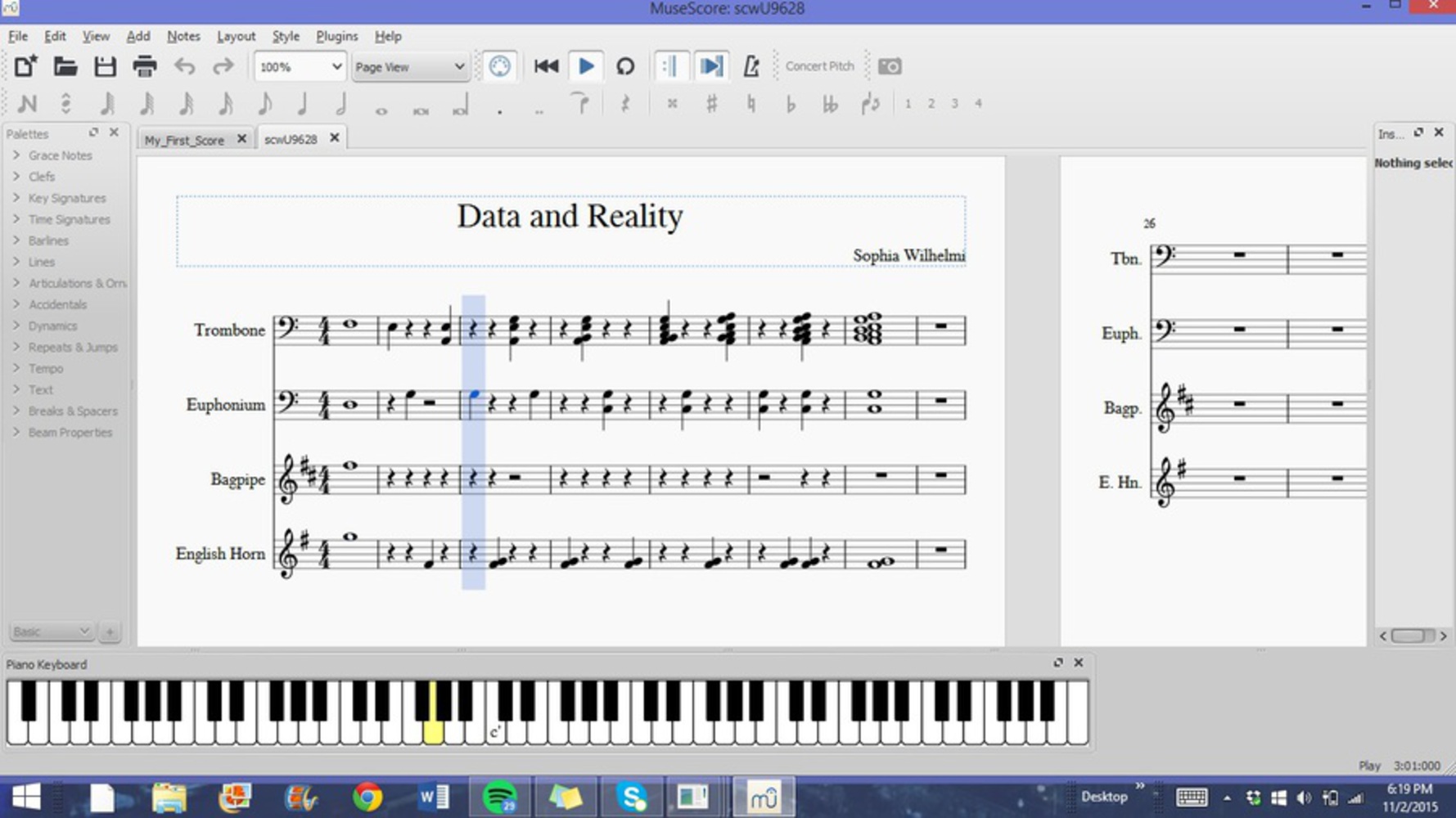
I started the piece with a manufactured "car horn", one you might here right before impact of a car accident, especially if multiple cars are honking their horns. After that, I went through the visualization as if it was sheet music, with a twist. The first three notes are following logically, that the blue circle is high, showing a higher age, and the orange circle is a little higher still, therefore that is how they are represented with the notes of the trombone and euphonium, respectively. The next three notes take the first note from their instrument and play it with the second point of that datapoint (age, sex, or junction). As you can see, once an age has been played (note on the trombone staff), it is played with all other ages, every time an age is played. This adds to the fact that so many demographics are represented by being involved in car accidents, and that they do add up, just as the sound builds off of itself. The sound gets louder and more menacing as well, as the notes start to clump and clash with each other. I stopped collecting data onto each respective staff as the sound seemed to reach its climax. This represents how some data is left out because it doesn't fit well with the intent of the artwork.

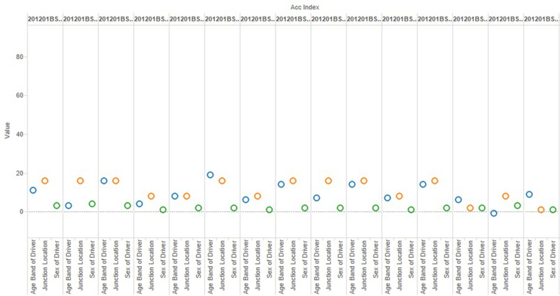
The data that I lied about: The Sex data did not make sense to me. The numbers of Sex of Driver ranged from -1 to 3. These were all recorded in 2012, and I doubt that the gatherers of these statistics are that progressive to be anything but gender binary. Therefore, I just selected the closest number, 1 or 2, to signify boy or girl. In the sheet music you can see that the English Horn therefore only plays two notes. This shows how confusion of the data is often simplified to make sense to the masses, often losing some of its honesty. 

0

Reflection 

I learned quite a lot about datasets, and visualization software. I learned also that compatibility is key for the software to be able to accurately read the data. From there, I learned how to manipulate data to create a slightly untruthful, but more meaningful, sound as representation of the data. I would switch the colors to match the instruments, and the instruments to match the fact that the sex of the driver was often lower than the rest. I would also like for this to be accompanied by a moving visualization, where the colors move so that they end up all on the left side, as if they had crashed together. I think it would be easier to understand how the sheet music was created, by jumbling the notes datapoints (age, sex, and junction) together, and then in the end playing all notes at once, in a crash of sound. 

Musically, I would add more intruments and datapoints, to further exemplify how many demographics of people are affected by car accidents. 

0

Attribution

Reference any sources or materials used in the documentation or composition.

1. Tableau - http://www.tableau.com

2. Tableau Software Tutorials - https://www.youtube.com/user/tableausoftware

3. Tableau Compatible Datasets - http://semanticommunity.info/Data_Science/Tableau_Public_Data_Sets

4. MuseScore

x
Share this Project


About

In this multifaceted misrepresentation of data, I plan to warp the data to "make sense" in multiple ways: simplifying data and showing the reality behind the data.