Fix You
Made by Christina Reimond
Made by Christina Reimond
Created: December 4th, 2014
The song I have chosen to represent using a visual composition is called “Fix You” by the band Coldplay. This song is somber both in music and lyrics, but has an uplifting refrain and end. The song consists of many soft sounds and sequences of notes that sound as though they are being progressively built up, and then drop down again.
This song reminds me that times in life can be hard, but home, family, and friends are always there to lift you up and guide you. This is obvious in the lyric “lights will guide you home”, but the music itself also gives me the feeling of being lifted up, and that everything will be okay.
When studying abstract art techniques, I found myself particularly drawn to Wassily Kandinsky and his work. “Several Circles”, “Decisive Pink”, and “Graceful Ascent” are three of his works I found particularly inspiring. The feeling of motion created by shape in “Several Circles”, the use of color to draw a viewer’s attention in “Decisive Pink”, and the softness and combination of color and shape in “Graceful Ascent” are all fascinating to me. It also is very interesting to observe how Kandinsky’s experimentation and concepts of shape and color progressed, just in these three paintings. Because of my interest in these works, I decided to experiment with abstract art through shape and color for this assignment.
The softness of the music and the building upward of the notes in the song I have chosen especially made me think of Kandinsky’s “Graceful Ascent” (which is featured as the cover photo), and so I look to his work for inspiration for this assignment.
I draw a great deal of my reasoning about placement of shape and color from Rudolf Arnheim’s Art and Visual Perception, Chapter 1: Balance, and Kandinsky’s Point and Line to Plane, as will be mentioned in the discussion of my outcome below. I also found information about Kandinsky’s views on color here.
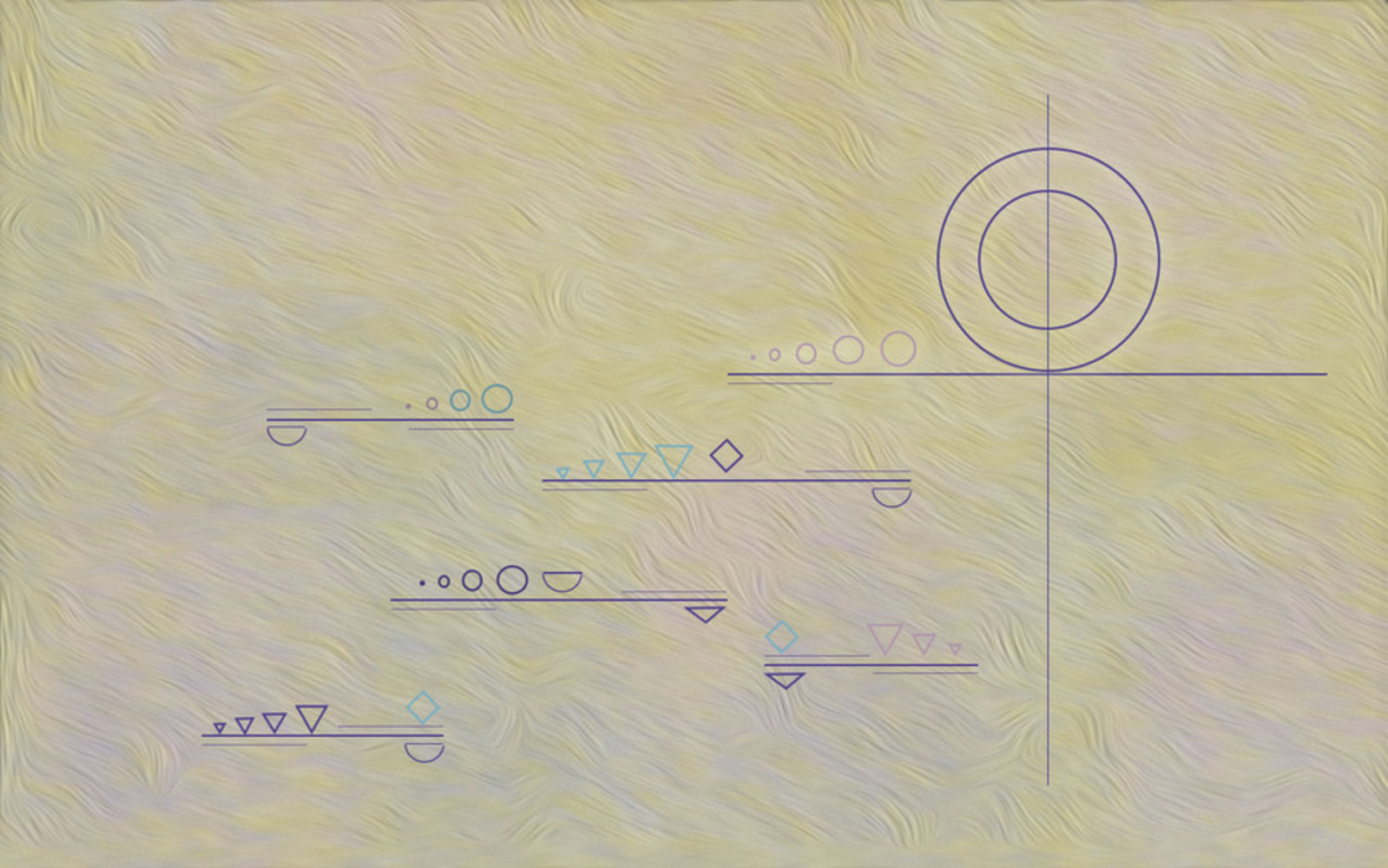
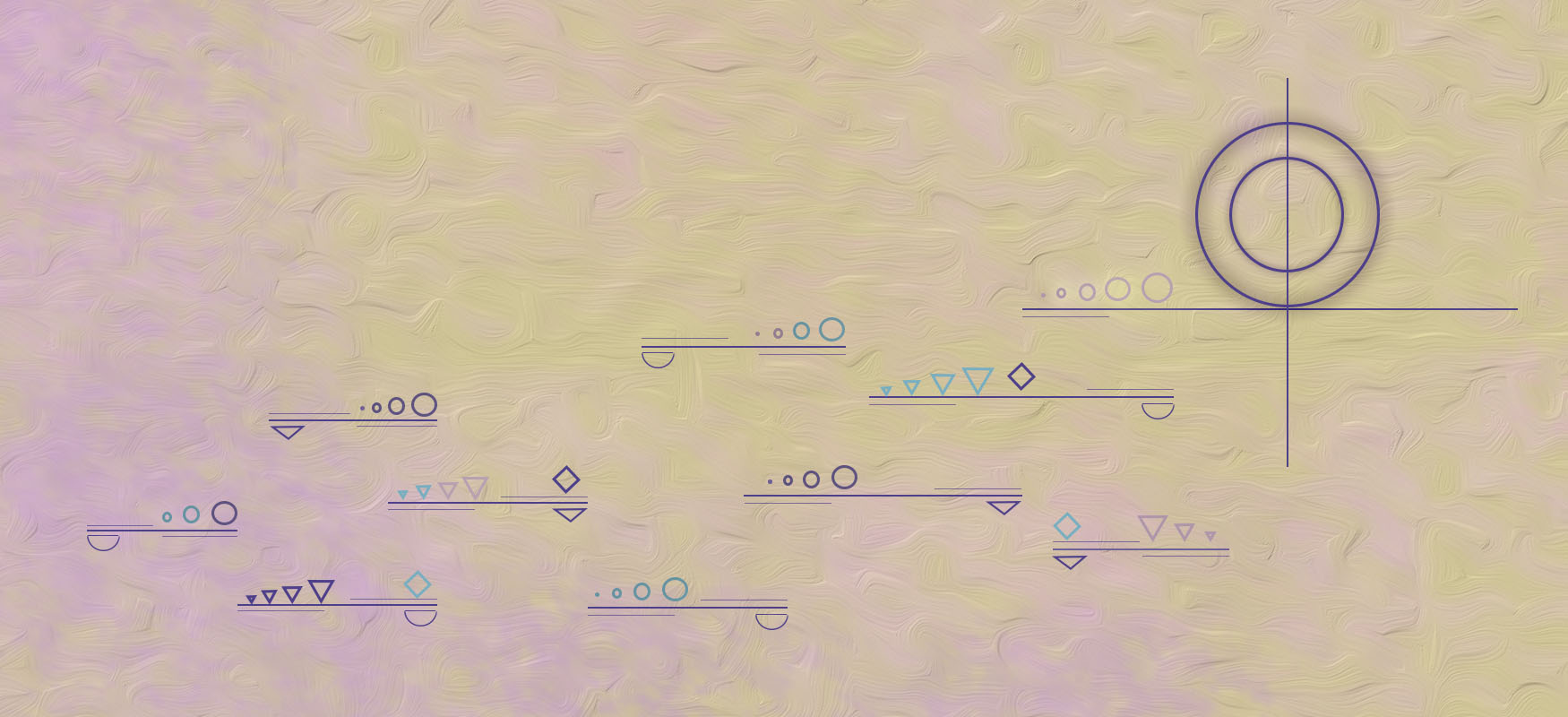
"Fix You" serves as a visual representation of the song of the same title by the band Coldplay. The artist, Christina Reimond, began the journey of creating this piece by, in fact, envisioning a journey; one that begins in a dark place, but leads toward home, hope, and light.
Stemming from fascination with Wassily Kandinsky's works, particularly "Decisive Pink" and "Graceful Ascent", and also drawing inspiration from his theory of color and shape, which he put forth in Point and Line to Plane, the artist sought to capture a song, both its music and its story, through the techniques of modern abstract art. Kandinsky's ideas connecting color and shape to emotion are especially of interest in this piece.
Using circles to represent home, hope, and completeness, and other shapes to represent progress toward this goal, this work depicts a trek from darkness upward along step-like, slightly unbalanced, platforms to completeness, light, and balance. The shapes depicted transition from deep purple triangles to light pink circles from start to end, signifying both healing and progress.
This work draws a viewer deep into the world of color and shape, to communicate a story of hope and home, one which should be kept in mind throughout one's own journey.
I approached this project by listening to the song I had chosen and drawing shapes that came to mind which capture the music and feelings evoked by the song. A circle immediately came to mind as capturing home, since it is complete and whole. Other shapes came to mind as being incomplete: triangles, diamonds, and half circles. I also found myself layering lines in platforms, almost in a step-like manner, which both gave the impression of moving upward (the uplifting sense), and of the music transitioning up in intensity during the refrain. This is a similar idea to Kandinsky’s in “Graceful Ascent”.
With these shapes in mind, I approached creating the visual composition. I began with the idea that I wanted to create a composition that gives the sense of moving upward, toward a particular point that represents light and home. I started with the background, which I knew I wanted to have a soft quality without being dull. I chose yellow-gold and light pink for the base, to create both softness and light, then added a deeper purple-blue to create shadow to the left and at the bottom of the composition. I then applied an effect that not only gives an interesting texture and softness to the image, but also gives the feeling of pushing down and to the right, against the motion that we wish to go upward and to the right. This is a reminder of being weighed down that is present especially at the beginning of the song.
Kandinsky describes yellow as “warm”, light red as emanating energy, and violet as “extinguished[...]sad”. This fits perfectly in how I am trying to portray moving upward from darkness into light. I used the colors in a subtle manner so as to make the transition upward out of darkness a gradual one.
I then added platforms to give the impression of moving upward. I chose a deep purple for them to tie into the shadow-like purple along the left and bottom. The platforms become wider as you move upward, to give a greater sense of stability the higher you go. I placed light lines underneath and above the left and right sides of the platforms to increase the sense of moving upward or downward along those directions. Finally, I added half circles and triangles underneath these platforms. These shapes actually function to throw the platforms off balance and make them appear more unstable.
To represent “home” I placed two circles on the top platform, since these feel complete. One circle is centered inside the other to give a feeling of stability and depth. There is also a slight aura emanating from these circles so that they draw in a viewer’s eyes, and give a feeling of warmth. Rudolf Arnheim remarks that “bright colors are heavier than dark ones” and “the larger object will be the heavier”, so the large circles in combination with the bright aura function to draw a viewer’s eyes. I chose to place these circles to the right side of the composition for two reasons. The first is that viewer’s eyes often are drawn from the left to the right, and I wanted that to be the case for this composition as well; the eye starts at the bottom left corner then moves upward to the top right. Second, Kandinsky remarks that the “above” can be described by lightness and freedom, and movement to the right is “toward home”. So, this placement of the circles gives a feeling of lightness and home.
I then placed a vertical line through the center of the circles, marking home-- the goal and the finish line. In addition, Kandinsky called the vertical line “the most concise form of the potentiality for endless warm movement,” so this contributes to the warmth of that area of the composition.
I approached adding shapes to the composition similarly to Kandinsky’s “Graceful Ascent”, by adding them in rows of the same shape. I started with triangles on the bottom-most platform since they feel the most incomplete-- the least like a circle. This leads to a brighter colored diamond which is more circle-like at the left side of the platform; the journey home has begun. At the next platform up, the transition to a circle and a brighter color has started to take place. Similar ideas were put into play for the other platforms as well. On the top platform, home has been reached, and the shapes have become soft, more joyful, circles; the shapes have reached the end of the journey, and have been lifted up.
Both in class, and in comments on the gallery, I received a great deal of feedback that helped me to transition from the preliminary outcome which I had some concerns about, to the final outcome which I feel captures the song much more effectively.
In my initial outcome, I had some concerns about the background texture, how it darkened the composition, and how it drew a viewer's eyes downward. My concern was reinforced by many comments bringing up that problem or similar ones, and so I reapproached creating the background. I kept the same color scheme to keep the same ideas in play that I mentioned earlier, but I made the colors slightly brighter, decreased the background texture to lessen the disconnect between the background and the foreground, and changed the direction of the texture so that it no longer draws the eyes downward. I also made the purple shadowing to the left and bottom more obvious. Looking at the two compositions side by side, I am very pleased with the difference this made in the image as a whole, brightening it, and enhancing the soft glow and feeling of hope.
It also was pointed out to me that the thickness of the lines of various shapes may be too thin; they do not bring enough color to the composition. So, I increased the line thickness for each of the smaller shapes, and changed the aura of the two large circles so that they appear thicker and give off a glow that gives them depth and connects them with the background. These changes went very far to encourage a viewer's eyes to travel from bottom left to top right, and keep them from traveling back down. I also like the depth and color they add to the image. This change makes the color palette feel stronger and more effective.
Another important change that was suggested was increasing the size of the image horizontally, to emphasize the feeling of a journey toward home, and also to encourage drawing one's eyes across the image. Just this simple change adds a great deal to the feeling, intensity, and effect of the composition for me. The "journey" homeward feels longer, and this also allows more opportunities to use color and shape.
Finally, it was pointed out during the class discussion that the vertical line through the circles may be too long; it was drawing attention downward rather than upward. After experimenting with the length of the line, I found that perhaps it was throwing off the balance of the image as well, and decided to shorten the line to decrease these negative effects.
Overall, these changes increased the brightness of the image, help draw a viewer's eyes upward which increases the feeling of upward movement, add to color, depth, and interest, and bring out more of the story and emotions that I am aiming to evoke.
When I see this composition, I experience a sense of softness, hope and light. Though these feelings are subtle because of the soft colors, and the use of line thickness that is not overwhelming, they definitely shine through. My attention is immediately drawn to the bottom left, partially because of the different color present there, and then slowly is guided diagonally toward the top right by the small shapes and platforms, and also because of the depth and great presence of the two circles. The aura around them really adds to feelings of depth without being too heavy, and also holds my eyes there, considering their significance. The vertical line through the circles adds to the interest at this part of the image, and increases their stability. These circles definitely seem important and introduce a source of depth and light, as the purple has faded away, and the smaller shapes seem drawn to them. Overall, I experience a slow but steady movement from the bottom of the platforms at the left, to the circles at the top right, an uplifting and hopeful experience emphasized by the warm background colors, slight texture, and the transition of the small shapes from dark to warmer, lighter colors. These qualities of the composition indicate success in expressing the intended meaning.
Before this semester, I probably would have responded to this artwork in a different way. I would have had similar reactions: the colors are soft and warm, my eyes are drawn in a path from the bottom left to the top right, the small shapes vary in color and shape from bottom to top, and the circles at the top right seem important and interesting, while the smaller shapes seem drawn to them. However, I would have had nothing with which to compare these observations, and no terms and concepts to explain why I felt the way that I did. Previously, I had little exposure to abstract modern art techniques, and though I thought abstract art looked interesting, I had no framework for understanding or explaining it. I saw a great deal of colors and shapes, but wasn’t sure what they meant. Especially when we studied Kandinsky’s works and his theories, I began to discover a different side of the beauty of modern art; its meaning through color and shape. I now understand how a viewer’s eyes are drawn to certain shapes and colors, why certain images feel off-balance, and how different shapes and colors convey different meanings. I have learned a great deal about art and the theory behind it, and the lessons I have learned have given me the knowledge to create this piece.
~