Hero, Ursula, and Beatrice in Leonato's Garden vs. Composition Concrete
Made by Anna Tan
Made by Anna Tan
Created: November 10th, 2014
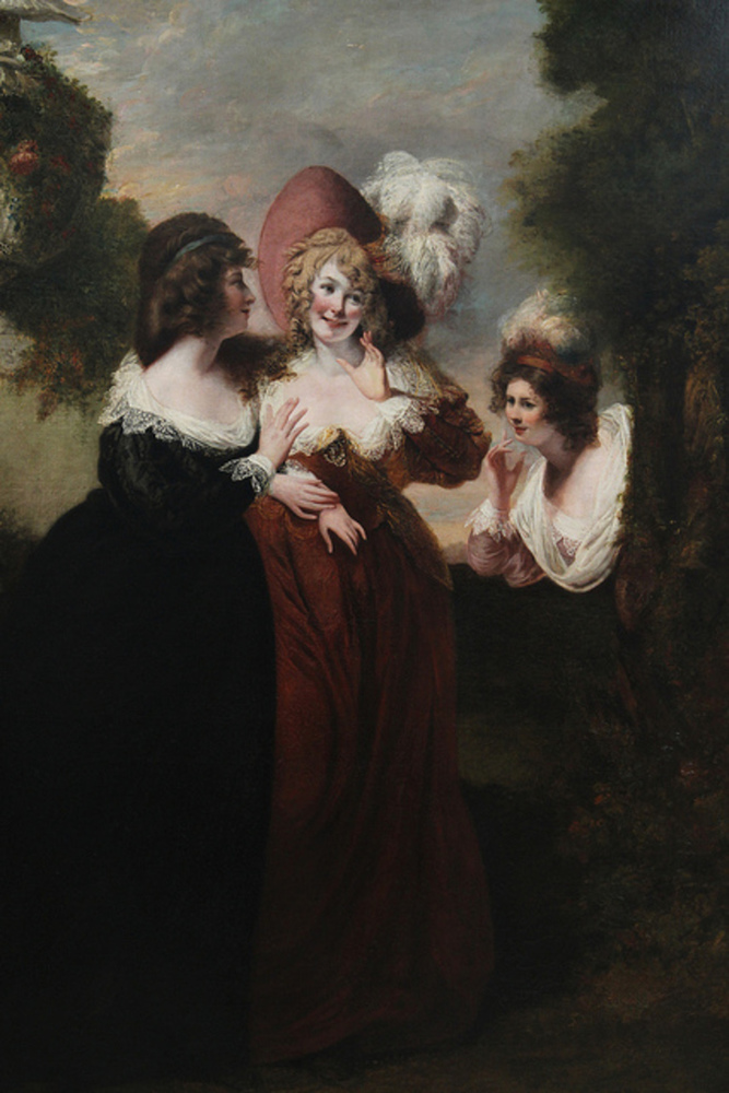
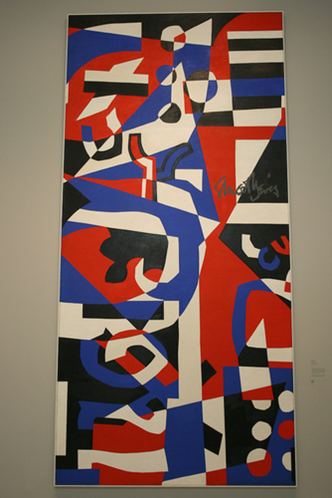
The two pieces of artwork I chose to experience were Hero, Ursula, and Beatrice in Leonato’s Garden by Reverend Matthew William Peters, the realistic painting, and Composition Concrete by Stuart Davis, the abstract painting. I found Peters’ painting compelling initially because of its lively depiction of the characters, whereas Davis’ painting was attractive because of its use of geometric shapes and bright colors.
Initially when I looked at Peters’ painting, the first words that came to my mind were happy, bright and soft. The middle character immediately became the center of my focus; the two other characters are both looking at (near) her, directing my eyes towards the middle character. The middle character, on the other hand, is looking off to the right with her face blushing, which made me wonder whether she is looking at something or if she is attempting to hide her blushing by looking away. The middle character also wears a red gown and a very obvious fancy red hat, in contrast with the left character’s black dress and a lack of large head accessories, making her appear to the the center of attention, especially with a rather gray and blurry background. The middle character’s face is also facing straight at the viewer, whereas the two other characters’ head are tilted. Her face is very lit up as if the sun is shining directly on her face. All of these combine together to let me regard her as the most important character and wonder what she have said or done that made everyone else so interested. As my eyes wandered around, I became more interested in the character on the right. Her position broke the symmetry in the painting, suggesting she isn’t supposed to be there. She appears to be eavesdropping, and her curious facial expression made me more interested in what happened earlier with the middle character. The lack of details on much of the background - the sky, the bushes, the ground - makes it easy to focus on the facial expressions of the three characters. I did notice, however, that there was a sculpture on the left edge of the painting that was fairly detailed, which made me think that they are probably in a rather opulent garden. The emptiness on the top of the painting also moves my eyes towards the top where the faces are rather than the darker bottom.
My first impression of Davis’ painting was that it was very visually interesting and random. It has four main colors: red, blue, white and black (and gray for Davis’ signature); when I first looked at it I thought that white parts were the original canvas as the background, but upon further inspection, I realized that they were actually painted white. There are many shapes in the painting. Some of them are simple, like circles, triangles and rectangles. Others are more complex; one of them looked like a door handle, and another one looked like an upside down rabbit. What really attracts my eyes were the circles; they are easy for my eyes to comprehend, yet they are not perfectly circular, making them stand out among all the other fairly regular simple shapes. Because of the circles, I thought the top part looked like a whale, where the circles are bubbles in water. The bottom right looked like a uniform because the non-randomness of the six circles looked like buttons on a uniform. My eyes also see the points of the triangles very often, likely because it creates directionality. After looking at it for a while, I thought it looked like cutouts from construction papers that are pieced together rather than a painting. Because of the lack of background and foreground distinction, it was difficult for me to tell how the shapes are overlapping and interacting with each other in a normal three-dimensional sense, especially the more complex shapes. Some of the simple geometric shapes seem to have patterns in how they interact with other shapes; the circles seem to “rotate” the colors within its circumference, but there does not seem to be consistency across all circles in how the rotation happens. The bright colors used in this painting did not seem happy to me, but rather serious and resolute. When I closed my eyes and opened them again, I was definitely more attracted to the red and blue colors. This is probably because the cones in my eyes are located mainly in my fovea, so in order for my eyes to process the visual field, I would have to focus on the colors. The artist appears to express an intense passion that is very important to him.
The two paintings are very different in the way they were painted, but they do share some similarities. The two paintings actually have two different kinds of brightness. The realistic painting is bright because the characters’ faces are shone upon, whereas the abstract painting is bright because of the intense primary colors used. This difference appears to evoke different emotions for me as the first painting felt more lighthearted and the second more serious. However, they both break the viewer’s expectations to let the viewer look at specific regions of the painting. The realistic painting breaks the symmetry with the right character, whereas the abstract painting breaks the circularity of the circles and the randomness at places. Both also use primary colors to make some sections more prominent than others. While the abstract painting is far more open-ended, both paintings rely on how human’s visual perception works be engaging.