Lines and shapes
Made by Talia Lesjack-Randall
Made by Talia Lesjack-Randall
Created: November 24th, 2014
I listed my lines and dots pictures first, then added the shapes in later.
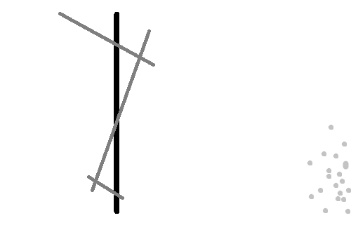
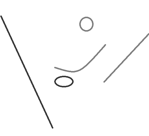
This is my human emotion piece. I tried to pull the most interesting pieces, the legs and the light on the right side of the frame, and pull out what was most interesting about them. I used a straight, thick, black line as the standing leg, despite both legs being the same size and color in the original image, because this assuredness is what the subject would like to show the world. Over top I placed some smaller, lighter lines with lots of intersections. This is to convey her insecurity, she unsure of where to go. The light on the righthand side is shown as a collection of pale dots. Kandinsky talks a lot about the silence that dots carry, but I think in this collection there is a bit more of a sort of comforting chatter. Because these dots are all the same and in such close proximity, they can be seen as calmly mixing with each other, which creates a similar soothing effect to the dim light in the original image.
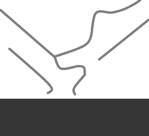
This is my human body image. I did my best to pull out each of the interesting curves from the feet, since that was my main inspiration for the original picture. The sharp lines of the legs interact well with the mixture of curves in the center. This piece for me was not so much about conveying any sort of feeling as it was sharing the many delicate curves that are formed by the feet.
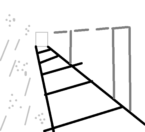
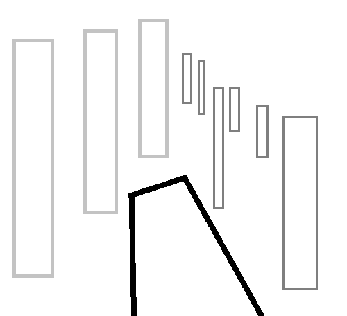
This is my architecture piece, and honestly my least favorite. The original picture is beautiful, with it's interesting lighting and straight lines. I tried to pull the things that interested me most: the dark tiles on the floor and the interaction between the soft lights and pale lines on the right with the solid and sturdy darker lines on the left. I had a very hard time recreating appropriate angles and it ended up just feeling unbalanced. When I tried drawing it as a layer on top of the original image I had a much harder time figuring out the balance and weighting. I guess I need to spend more time figuring out architecture.
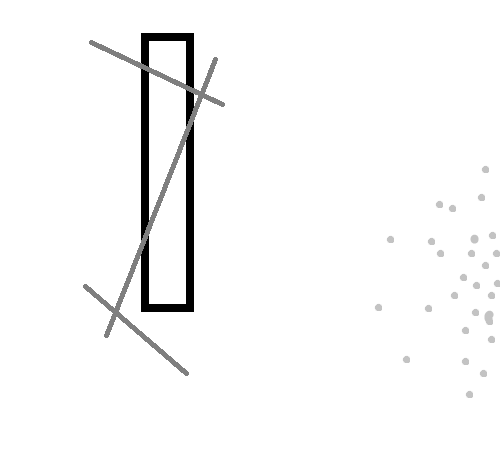
This piece has much the same feeling as the original motion piece, but I replaced the standing leg with a dark rectangle. In Kandinsky's writing he says that 90 degree angles represent calm and sturdiness, which I thought was very appropriate, especially offset by the less sure angles of the lines on top. I also increased the area of dots on the right hand side. This is because the added weight of the rectangle meant it needed more in order to be counter balanced. I really enjoy this piece.
This is my second human body image. I like this one better than the first because of it's simplicity. I used ovals to show the heels of the feet and pulled out only the one big curve of the arch of the right foot. This is a simple collection of shapes, but the angle gives it a feeling of motion, just like Kandinsky says. I chose to use two straight lines for the shins, but of different lengths and slightly different angles than the originals. This is because in order to make the distinction between the two sides I chose to use slightly different colors, but this meant a larger focus on the weight of the image. Placing the darker line took the longest, because it has such a strong effect on the balance as a whole due to it's size and color.
This is my second architecture image. I tried ignoring the original orderliness of the angles because it was causing me so much trouble and instead focus on the shapes. This made it slightly better than the first, and I was able to gain some sense of symmetry by widening the black in the center and making the lighter left rectangles larger than the small right ones, but I still don't think it was a very successful piece. I think in order to be more successful I need to do a better job of understanding the original image. Then I would feel more comfortable pulling out the key pieces.