Final Documentation:
I apologize for the large text in some areas - editing seems to have it stuck on a certain formatting.
Statement
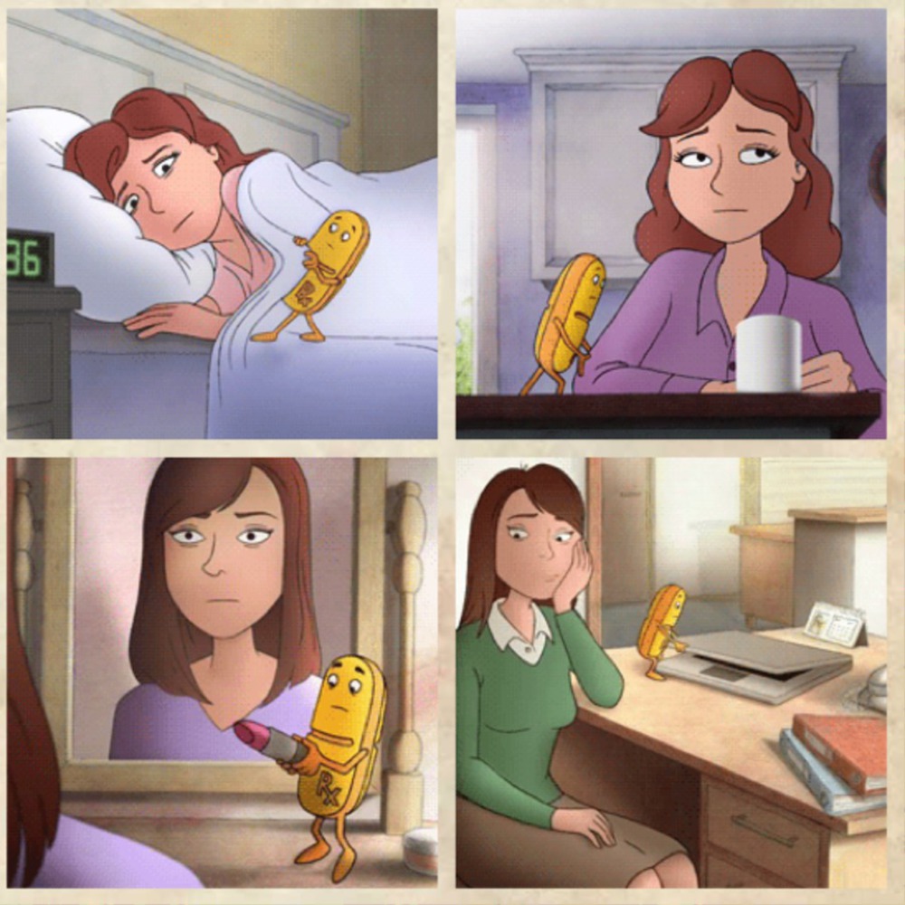
Originally, I wanted to make a piece that explored the depth of mental disorder. However, I instead decided to make a piece that was a conversation-starter about the over-simplification and over-commercialization of mental disorder in medication commercials specifically. All commercials treat their subjects the same - a sad little character or person get some medication and is able to live their lives looking a little happier. The thing that really struck me was how formulaic the commercials were, treating mental disorder as if it only has one dimension to it. They may lead people who may not need medication to use medication and to not seek out other treatments - thus simplifying the problem to "take medication and feel better." The other thing that struck me was the long list of severe side effects in every commercial, spoken as if they're just normal things that happen to people. Sometimes they were worse than having a mental disorder alone.
ContextI was inspired by Détournement/Culture Jamming. This is a movement where the "practice of ... remixing messages from the mass media and subverting ... their predetermined meanings so that new, antithetical messages can emerge and divert the package of commercial propaganda..." I really liked the idea of creating art like the advertisements, the things I disliked so much, to make a statement about the commercialization and over-simplification of mental illness, specifically depression. I wanted to create a piece of art that could be run as a bus ad, one that can be seen at a glance and understood for the common imagery put in it. This meant that I had to rid myself of the complex idea that I had before for a simpler one that could be understood at a glance - a targeted jab at the core of trying to market medication as a one-size-fits-all solution for mental illness.
ProcessI approached this exercise in many different ways. My biggest challenge was to incorporate the imagery from the commercials or other sources into my final piece in a simple manner. I wanted to create something that didn't overuse the imagery to the point that I may "cross the line" so to speak, but I wanted it to be recognizable enough that it could be interpreted at a glance. I spent some time sketching rough drafts and went through a few iterations, all of which were to complicated and confounded my point. My final design choice was to use the Monopoly Man and the Zoloft character (who knows what he is) because they were simple and recognizable.
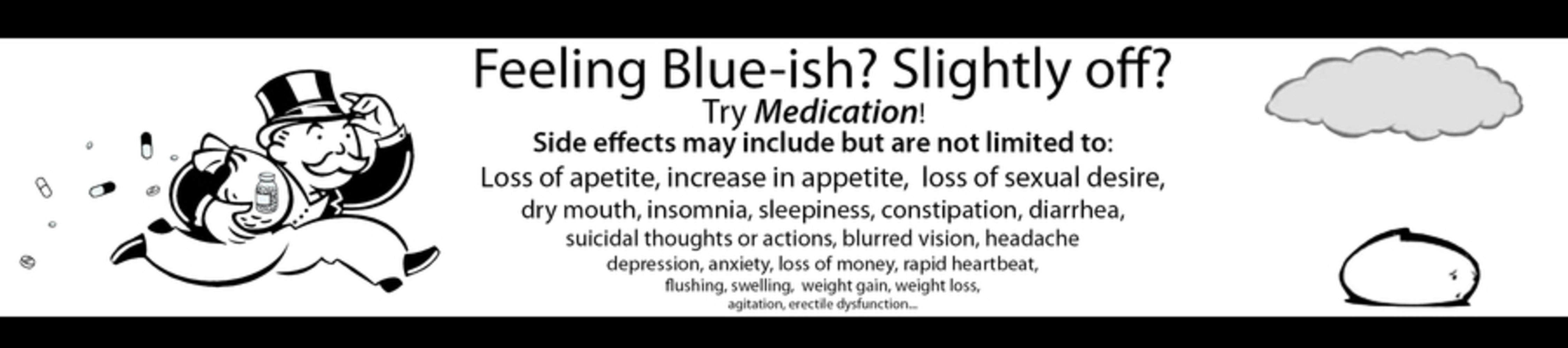
ProductI created an image to be used as a bus ad including the Monopoly Man and the Zoloft character. I chose them because they were recognizable, not to mention their clipart-like, simple appearance. I chose to show the Monopoly Man because he symbolizes greed, but also makes light of it since Monopoly is a fun family game. Instead of carrying a bag of money, however, he is carrying a bag of pills, showing that he is rushing to peddle them to anyone who may feel slightly bad. I chose the Zoloft character because it is also simple and reduces a complex, unique person to a simple, sad blob. I chose the black-and-white color scheme to further show the simplification and because it is stark and high-contrast, making it easily noticeable. The text in the middle raises questions about how necessary medication is in every situation and shows how detrimental taking a medication can be and how it is a serious decision that requires nuance and weighing of the pros and cons. Some of the side effects are real listed side effects of medications, others are not.
The image below was shrunk - here is a link to the full piece: https://drive.google.com/a/andrew.cmu.edu/file/d/0B4-1olUvFrmjVldMbEx0SmNKLUk/view?usp=sharing
CritiqueMy inner critic is somewhat happy with this work. Part of me wishes I had more skill to show a more complex image, while part of me likes the simple nature of the work. I think the form, composition, and color evoke a sense of "That's it? This is art?" because of how simple the piece is. It looks like an advertisement, and we often don't consider the art that goes into such things because we see them every day. In a way, I think that is a success as well, though. The immediate goal is accomplished: getting a person to look and to think about mental illness while reflecting on medication and raising questions within them. Questions that I hope to raise are along the lines of: "Is this portrayal of mental illness correct here? Is medication the only answer, or is it pushed on me by advertising? Can medication be just as harmful as it may be helpful?"
Personal ReflectionThe most important thing I took away from this project was the complex thought that goes on behind seemingly simple piece of art, even those that may be "stolen" or "appropriated". I learned that more effort goes into how to show a message and emulate a style than actually goes into making an actual image, especially with the digital tools available to us today. If I could do anything differently, I would make my image actually large enough to fit on a bus, and I would spend more time looking for other styles and images to take from to fit my message.