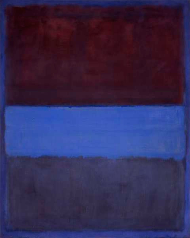
Rothko Inspired Pop Art
Made by jjlennon
Made by jjlennon
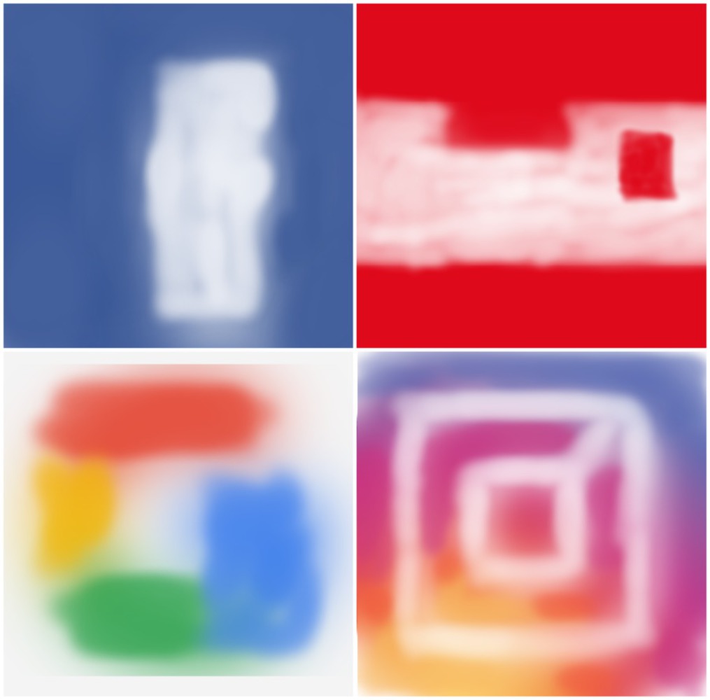
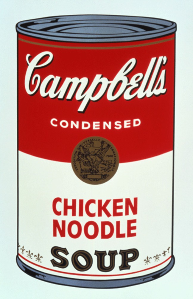
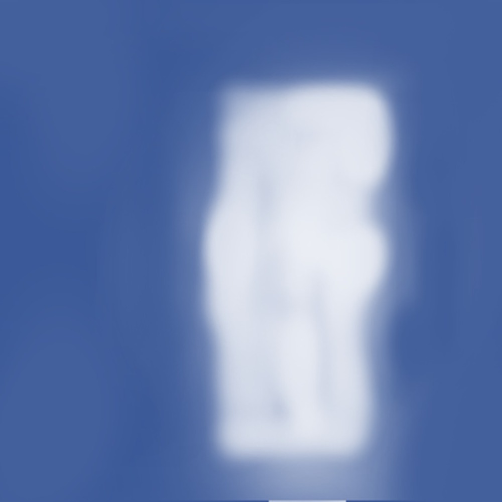
The goal of this project is to create a series of simple color patters to evoke a recognition of a popular brand instead of an emotion.
Created: September 7th, 2016
New creative industries are empowering new modes of collaborative consumption, creation and reuse of media. This often relies on successful collaborations between cross-trained artists, designers a...more
The goal of this project is to create a series of simple color patters to evoke a recognition of a popular brand instead of an emotion.