Thought Processing
Made by Naomi Sternstein
Made by Naomi Sternstein
Created: November 3rd, 2014
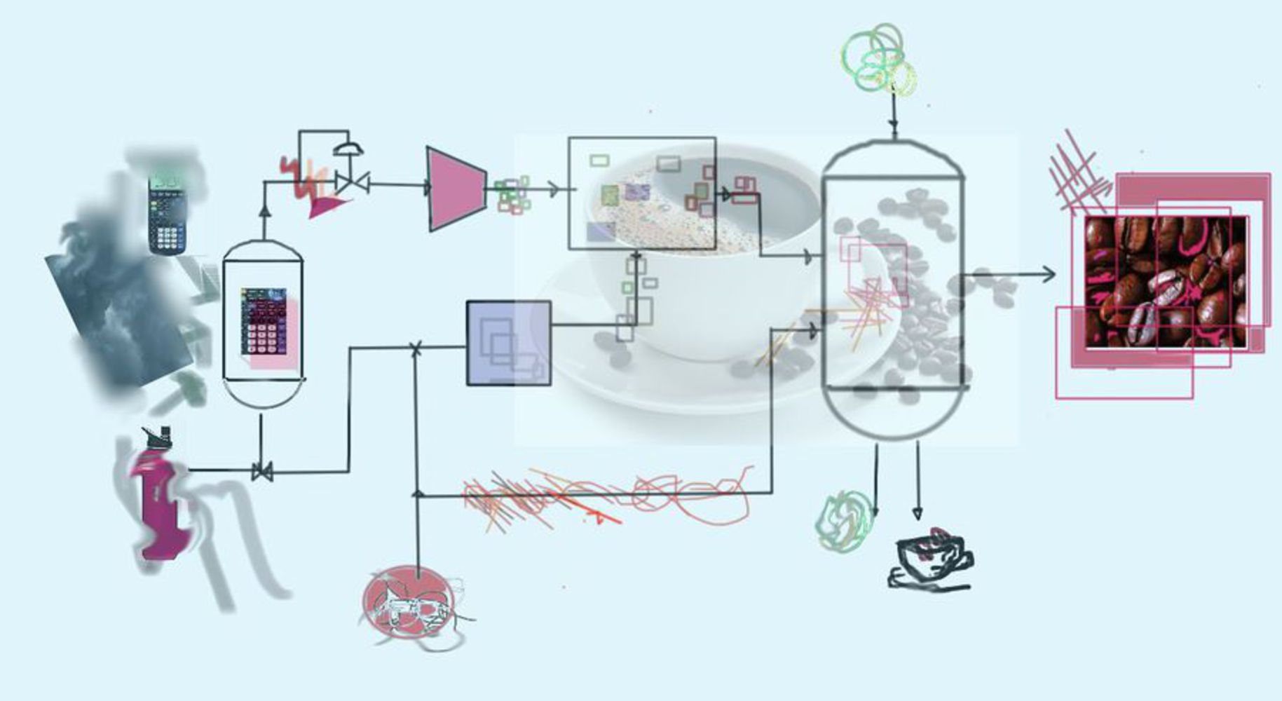
1. Final Composition: Thought Processing
***************
2. Artist's Statement
This piece, Thought Processing, uses bold shapes and markings along with reacquired images to continue the conversations started by artists of both the Abstract Expressionist movement and the PopArt movement. It is intended to create a contemporary bridge from notions of engineering and technology to those of creativity and art, through an abstraction of the common thought process in which participants of both disciplines must partake.
This is represented through a schema of a typical chemical engineering process, a flow diagram. Different thoughts and ideas are reacting together, and different inspirations are entering, leaving, and coming together. When you are creating a final project or coming to a final decision, you have to filter out the unnecessary images and sounds and textures that are entering and leaving your mind. Maybe you have a strong emotion that you wish to channel. You recycle out the parts that you might use later, for example if a color is striking to you but the shape of the object will not serve a purpose, and carry these along until you have reached your decision or goal.
Some markings are fun and eclectic, whereas other streams are more tumbled and strong, almost stressed or frustrated, such as the stream at the bottom center. If you follow the image from left to right, in the end you are left with a bight image that pops out at you, against the rest of the piece. You have reached the end; your thoughts have been processed.
*******************
3. The Process
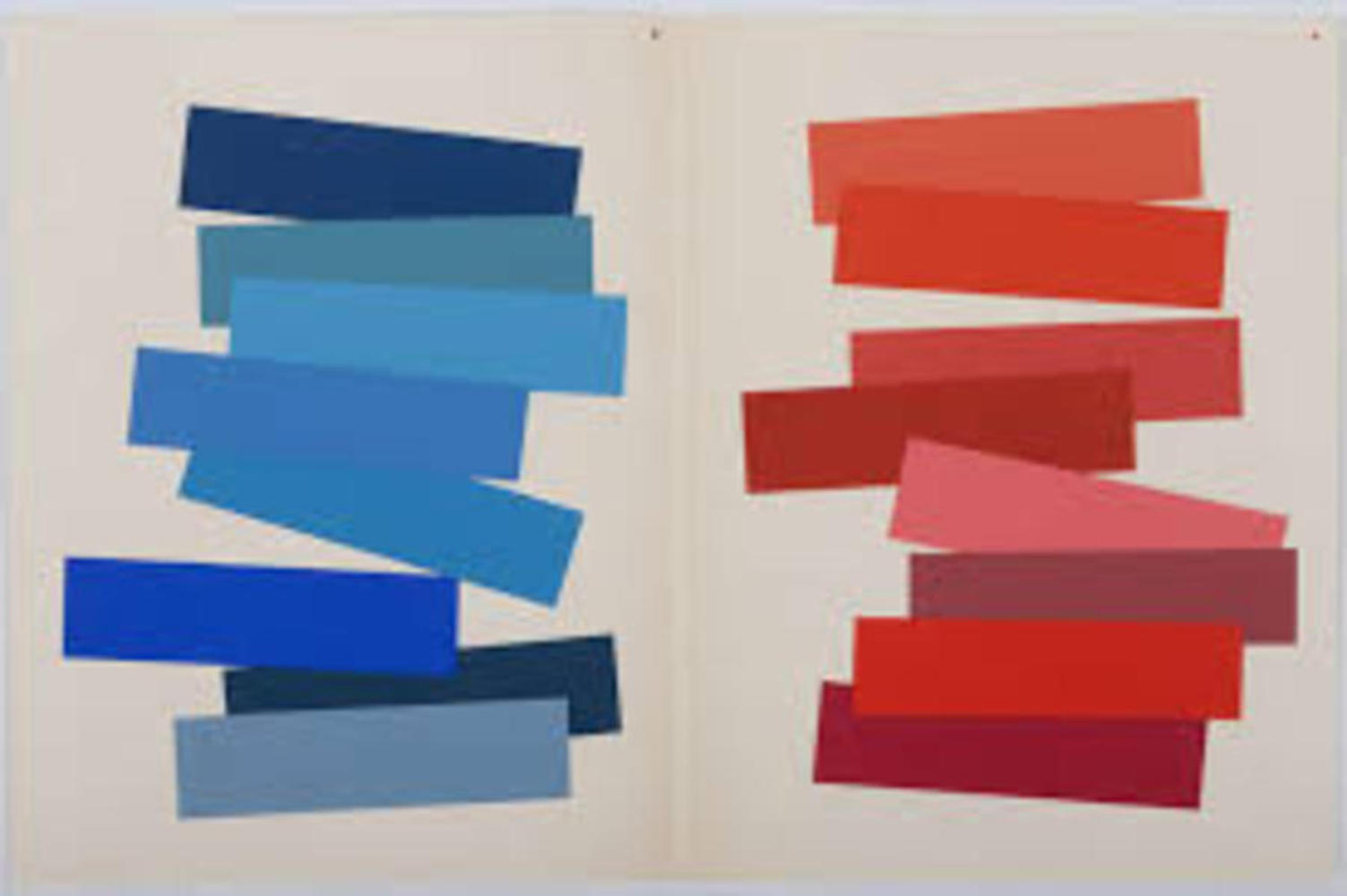
The preliminary research that I did was on contemporary Pop Art and abstract expressionist art. Artists such as Elizabeth Murray and Josef Albers really showed me how colors works together to convey movement and action and emotion. I wanted to use colors to convey a moment, and certain emotions that inspire us and make us think. Andy Warhol’s Pop Art also inspired parts of this piece. For example, in using images such as the coffee and coffee beans or calculator or water bottle, I am trying to represent something different than the object itself and the use of the object. They are a flash of color, a sound, an idea.
Examples of Artwork by these artists: (1) Josef Albers, (2) Elizabeth Murray
In creating the piece, there were two layers to each the engineering and the art concepts that I wanted to approach. For instance, there are some very obvious and concrete engineering concepts in the final piece: the flow diagram that resembles a typical engineering flow diagram. But these concepts are also represented with the more abstract: the design process of filtering out the unnecessary information, to find the helpful and important information needed in order to solve the problem or create something useful is central to this piece, conveyed not by the objects themselves but by the interaction of the colors and the marks. The concepts of drawing from what you know and outside sources, and the way an engineer combines these in their mind to work out a final output are imagined here.
An important part of this is to take note that this “process” is not solely characteristic of an engineer- an artist or designer will go through a similar thought process, they will just perhaps translate that to a different output. They will also see this as the combining, recycling, and purging of ideas and inspirations. Just as an engineer might see an object or hear a snippet of conversation and use this to create a new object or concept, so too will an artist. I think that these are things that you can sense from looking at the piece. You may not notice that ideas are flowing and being carried throughout, but there is a sense of action and movement.
Knowing that this was what I wanted to represent, the thought process on the schema of a chemical engineers flow diagram, I began with a simple black and white flow diagram. I then translated everyday sensory inspirations into colors and shapes and lines or blurred objects, and used these as “inputs.” The representation was like a collage of various overlayed images and shapes, pasted along the image of the flow diagram. I tried to select colors that I felt strongly represented the experience, or contrasted with other colors in the representation.
***************
4. Reflection
When I first look at this in the broader sense I see motion. There are different types of geometries and contrasted colors. The colors seemed washed over, and certain things seemed lost behind. Some parts seem very distinct and solid, while other are more jumbled and messy. My eyes are drawn to the far right, the only part that seems to pop out and seems clearer. It seems like there is a certain path that is trying to be followed, but something is unsuccessful in following that one path- there is a roundabout , indecisive feeling. The piece seems very balanced, but spaced out.
It is hard to be completely unbiased in whether or not this piece is successful in expressing the intended meaning, since I know the intended meaning very well. I think that it set a good skeleton for the meaning, but that it could possibly go even further and be extended. There could be even more going on, and things should be less separated. There could be even more “busy-ness”, and though there is an evident driving force to come to a decision or final idea, I think this could be even more dynamic if there was a greater sense of the necessary information fighting against the distractions.
I think that before this semester I might have gotten to caught up on the familiarities and the connotations that are typically associated with the images in this piece: for example, I might have tried to read something into the coffee beans or the calculator and water bottle. Now I know that it is not as obvious in that way, though it is more obvious in other way. What I mean by that is, I can trust my initial reactions and emotions to this piece without trying to read meaning into the water bottle.