Wi-fi Waves

Made by Ivan Wang

Wi-fi Waves is a visualization of nearby wi-fi hotspots on campus. By combining data streams like wi-fi strength and bandwidth usage with geographical location, this interface is aimed at improving the search for an internet-accessible workplace.

Created: September 13th, 2014

0

Proposal

Wi-fi Waves is an interactive map for visualizing hotspots on campus. It is aimed to address the everyday problem of finding an accessible workplace with Internet access, an issue many students (including myself) have faced. Often, it is the case that one sets up their laptop or device, attempts to connect, only to have to move to a different location. Through this interface, I hope to intuitively convey the best locations for working by simply glancing at a screen.

Built on top of Google Maps, the Wi-fi map displays four data streams:

1) Geographical location (position on map);
2) Signal strength (range of wave and fuzziness);
3) Bandwidth usage (warmer colors for more users, cooler for fewer); and
4) Restricted access, i.e. password-protected (indicated by a lock).

Each wave is animated, spreading outward from the center. In addition, by clicking on a wave, a user can view more information in a popover, including the network name, security type, and more.

0

Data Streams

The four main data streams were chosen as the most pertinent to everyday students over lesser important details, such as the name. Signal strength and bandwidth usage (as suggested by my group) are both major factors in influencing Internet speeds. In addition, an encrypted network is not useful for users looking for free Wi-fi. With these choices comes a "forceful point of view" which may bias against shorter-ranged routers or password-protected networks [1]; however, considering my audience, I believe this is a reasonable design decision.

Capturing most of this data should be fairly simple, as public networks are available to any computer. However, as my group pointed out, it may be difficult to access bandwidth data or the number of users. To do so, I would need to talk to a network administrator. Once the data is accessible, it should be straightforward to convert percentages to a color scale of blue to red.

0

Design

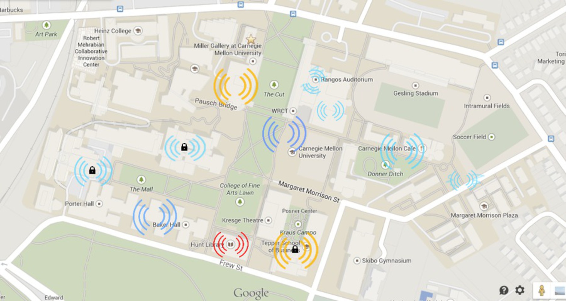
The data streams were chosen to reflect and embody what they represent. For example, fuzzy waves and locks intuitively represent poor reception and encrypted or restricted access. Furthermore, warmer colors (like red) connote a lot of activity or usage, while cooler ones (such as blue) convey a less active atmosphere, perfect for indicating availability. With these design decisions, the display is more "closely integrated" with the data, and users should understand without further explanation [2].

Should the user want to access more information, however, they can do so by clicking on individual network waves. A detailed popover would supply further information (including name, security type, radio type, and SSID). In addition (in response to feedback from comments), to address the problem of overlapping waves, the map can show an aggregate of networks while zoomed out, and become more detailed upon zooming in. At the innermost level, it can even display a 3D view of buildings (a la Google Street View), to display network locations on multiple floors. This "reveal[s] the data at several levels of detail, from a broad overview to the fine structure," allowing users to get information either at a quick glance or in depth [3].

Inspiration for the map comes from Viégas' and Wattenberg's wind map, which showed the flow of wind over time [4]. Just like their project, the Wi-fi map allows users to visualize "forces that are ethereal, imperceptible" graphically, rather than as static data. Using waves naturally appeals to our innate representation of Wi-fi, just as fluid particles on Viégas' map emulated real wind flow.

Ultimately, this display hopes to condense a lot of information into a small but readable map. Just as Google Maps seeks to represent the world without every detailed blade of grass, this project presents large sets of Wi-fi data in a small space with interactivity and levels of detail, embodying principles of graphical excellence [5].

0

References

[1] Viégas, Fernanda B., and Martin Wattenberg. "Artistic Data Visualization: Beyond Visual Analytics." Visual Communication Lab, IBM Research, 1 Rogers St, Cambridge, MA 02142, USA.

[2, 3, 5] Tufte, Edward R. The Visual Display of Quantitative Information, Second Edition. Cheshire, CT: Graphics Press, 1983.

[4] Viégas, Fernanda B., and Martin Wattenberg. "Visualizing Natural and Cultural Phenomena." Data Visualization from Data to Discovery: Art Center + Caltech + JPL. Caltech, Pasadena, CA. Youtube.

x
Share this Project


About

Wi-fi Waves is a visualization of nearby wi-fi hotspots on campus. By combining data streams like wi-fi strength and bandwidth usage with geographical location, this interface is aimed at improving the search for an internet-accessible workplace.