Dancer - Composition 4 (Simplicity)
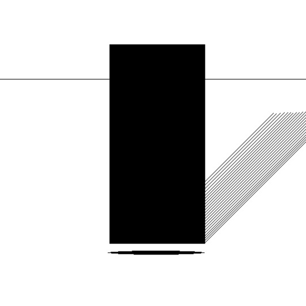
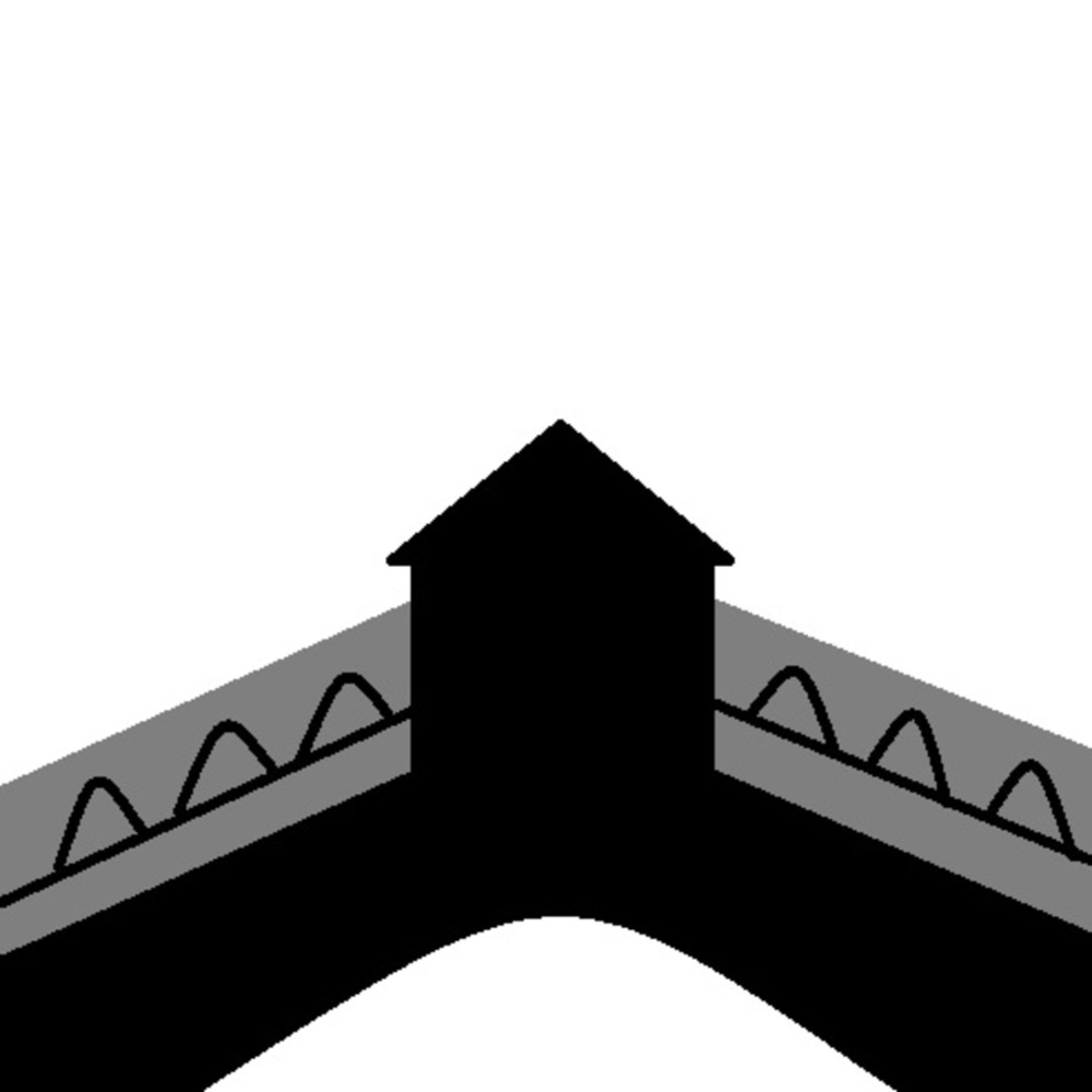
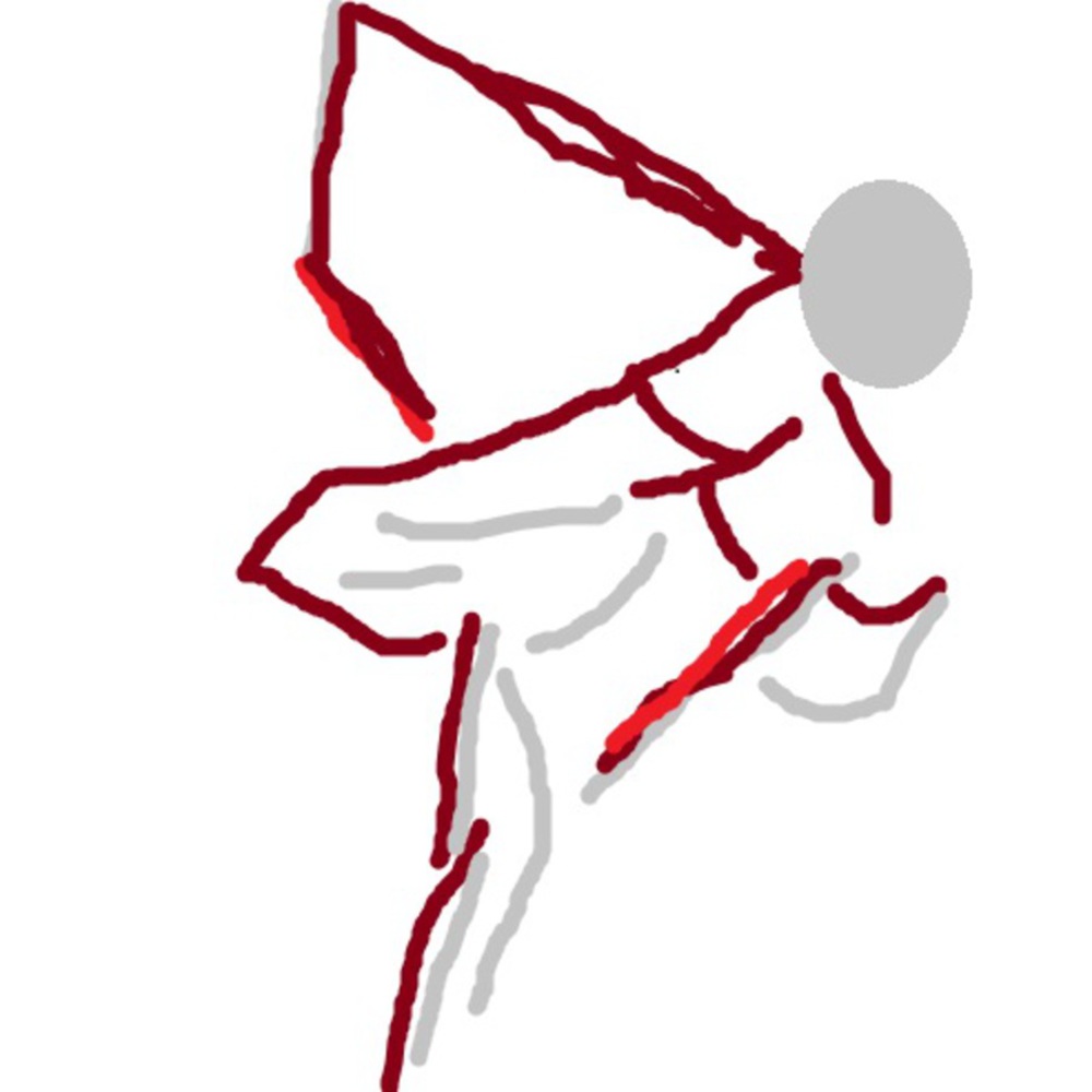
This time I went straight to rough sketching with the three base colors I use. It provides a much more crude drawing, leaving more to viewer interpretation. I personally dislike this, probably because it is too simple and my mouse makes the patterns look messy.
Reflection
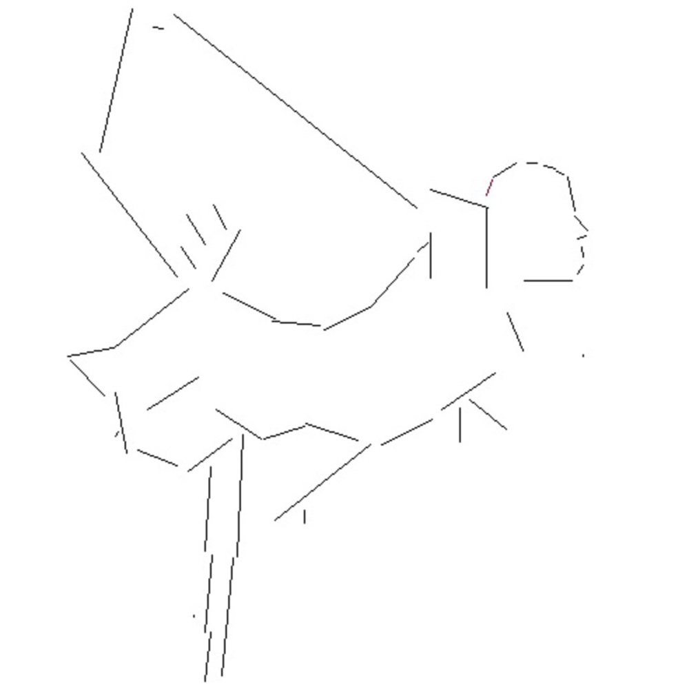
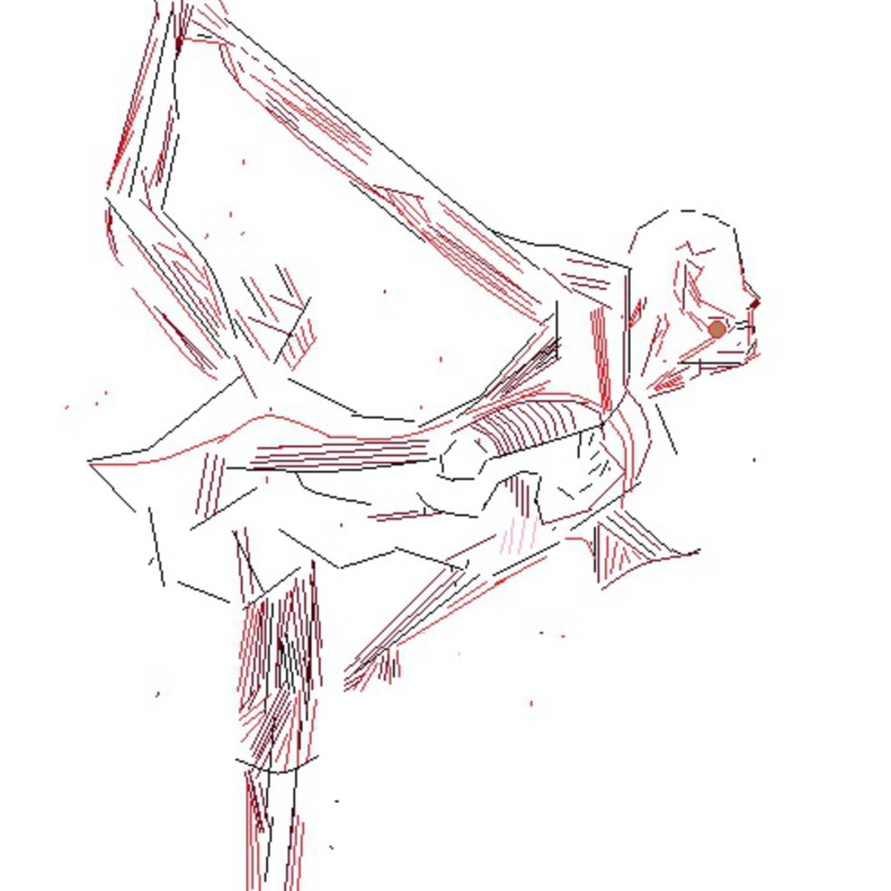
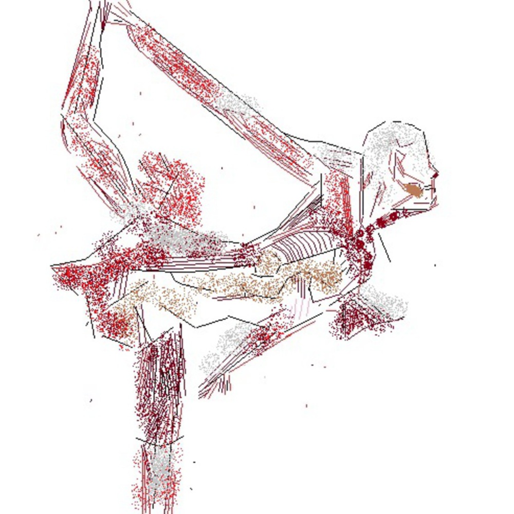
This project gave me an overall sense of fulfillment. With four compositions, it let me explore what did, and what didn't work for me. Personally, I have found that I prefer line composition to dot composition. Lines portray more movement to me, and stagnation seems dull and unsatisfying. As a result, I received the most enjoyment from illustrating the human body, as the muscle fibers are all line based structures, and I believe my composition of this piece illustrated the source material's focus well.
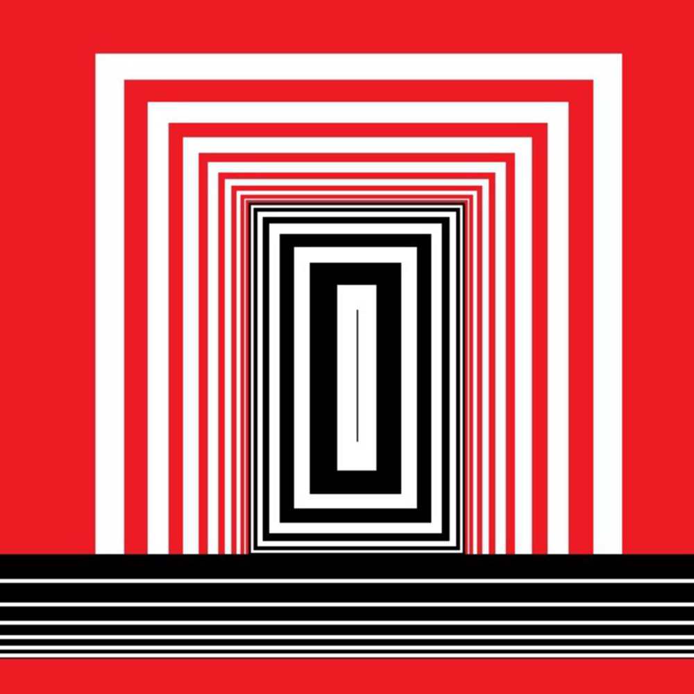
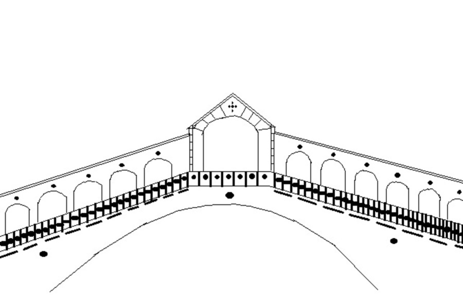
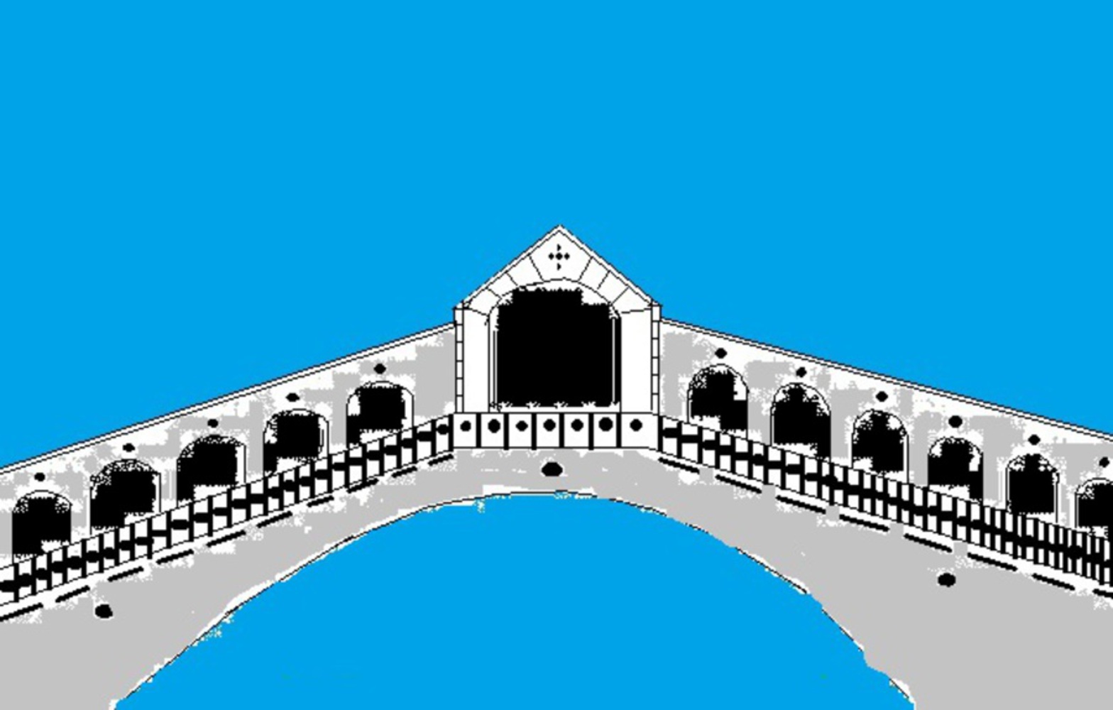
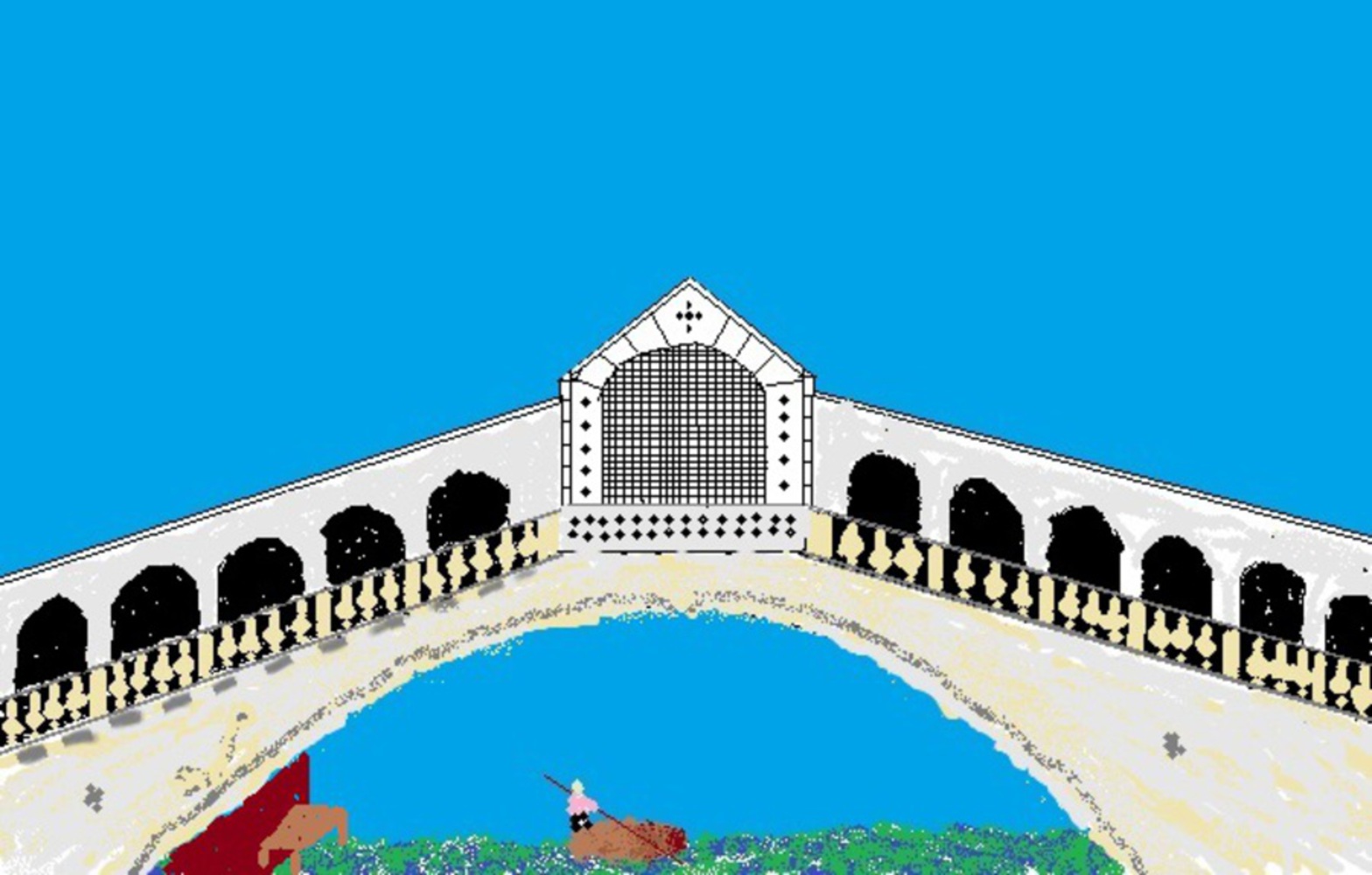
What didn't work for me was the bridge from Venice. In my complex composition for the dichotomy, I struggled with straying away from the total geometric methods used in the previous compositions. Instead of making edges more rounded and focusing on shadows, I just added more colors and contrast, when in fact there were only a few colors in the source material, and the rest were just shadings.
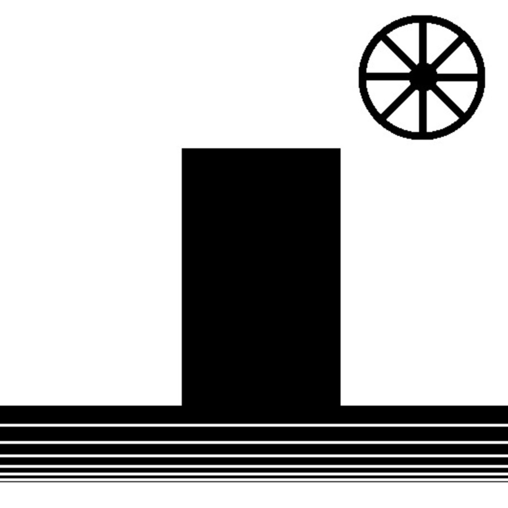
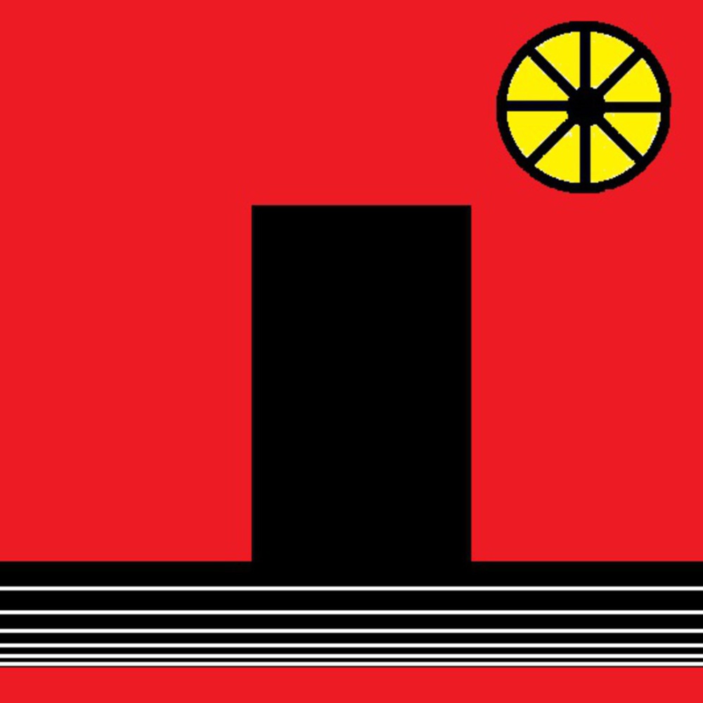
With wonder, I drew inspiration from any type of world architectural wonder (like the Pyramids). They are named so because they bring about a sense of wonder. So a lone rectangle in a field of white portrayed that for me. I added red because with wonder may come confusion and anger. Also, yellow signifies war, and wars have been spurned throughout history by conflicting philosophies about wondrous phenomenon.
Overall, this project was a beneficial to understanding what processes of illustration work for me, and which do not.