yijingc--Assignment 9

Made by Yijing Chen

Misrepresent NASA's portion of the US federal budget using multiple errors--some subtle, some not so much.

Created: October 29th, 2015

0

Foreword

Having inundated myself in the art of D3 and other forms of data visualization, I have seen my fair share of misleading graphics. There are the obvious examples of ways to mislead the viewer, such as misrepresenting axes, improper tool use (e.g., 3-D pie charts), or even just having data that does not match its graphic. There are a myriad ways of telling an explicit lie to the observer, so for this project, I sought to twist the truth in a multiple manners—some egregious, some subtle. The ultimate product is a piece of data that is layered with deceit.

People lie with data in order to prove a point that statistics do not actually show. In this project, I skew data to imply the diminishing significance of NASA and, implicitly, space exploration using multiple distortions.

Before perusing the documentation, I would like the reader to consider which ways of misrepresenting data I have used before reading onward. Can you figure out every way I skewed the data?

Product

0
0

I used my wheelhouse of D3 again to make a heavily flawed visualization that nevertheless manages to be interesting and interactive. I started with a CSV sample data set, and, through code manipulation, produced an interactive donut chart that aims to show NASA’s dwindling influence in federal spending—perhaps trying to send a message about the diminishing value of technological pursuits.

I have documented the methods used to make the final product in my code, so I will omit that for brevity (and so this documentation does not turn into a D3 tutorial). Rather, I’ll explain how I skewed the data using some of D3’s utilities.

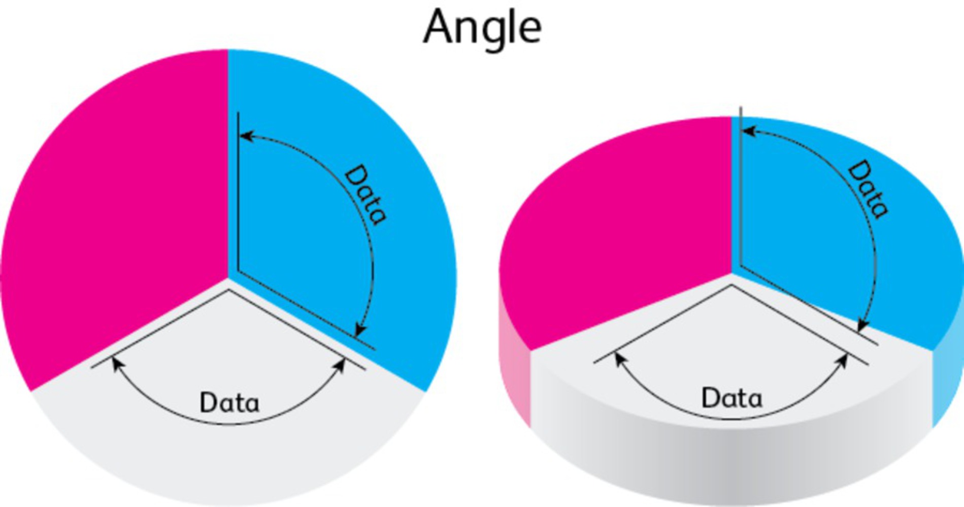
D3 allows data to be scaled from a domain to potentially arbitrary ranges. For instance, you can see that the radius and angle of the circle shrink and grow, and that the color of the highlighted slice is blue when the sector is large and red when the sector is small. These scales do not have to be linear. While non-linear scales can be helpful, they can also be misused for the purposes of skewing data. In this case, I misrepresent both quantity and percentage by changing their scales to logarithmic and exponential, respectively.

Intention

I had a very particular goal in mind when creating a visualization that lies. I had seen visualizations that used circles to represent a value of a certain size, but because circles are shapes rather than lines, doubling the radius of a circle creates a shape with four times the area. In other words, a linear change to a circle’s radius causes a quadratic change to its size, and that was subtle yet impressively misleading. If I had to create a visualization using this trick, then, it would be best to find a data set that implied use of proportions.

The first dataset that came to mind was U.S. spending on military expenditures. I had looked into datasets from World DataBank, and while they were satisfactory, I found their lack of longer, historical data… lacking. I was, quite honestly, more interested in a trend that showed more consistency (a.k.a., exploitability). Hence, I went with a frequently-discussed topic about the federal budget outside of military expenditures—namely, their funding for scientific research, or, well, NASA, as I ended up using.

Context

One inspiration for the outcome of this project is, actually, my previous experiences with circular diagrams. I have previously mentioned my inciting inspiration, but that is not to say I did not draw from other references. Both the examples in class and an interview with Mike Bostock led me to use a sort of pie chart in my product. People are familiar with pie charts and naturally interpret a sector as a percentage, while the numbers may say something different.

0

(And of course, while I would have liked to make a 3-D pie chart in D3, Mike Bostock mentions how agonizing they are to see, so D3 naturally lacks the capacity to make one.)

This visualization uses the same trickery to misrepresent the percentage of NASA’s budget in proportion to the entire federal budget. The title of the layout implies that, but the layout actually shows something different for an exaggerated effect; the percentage of the donut in color shows the percentage of NASA’s budget relative to its highest ever percentage in 1966. Even then, the representation is inaccurate, given that it exaggerates smaller percentages.

0

Process

I referenced the data from Wikipedia’s page on NASA’s portion of the federal budget. I parsed the data in Microsoft Excel and converted it into a CSV format for D3 to parse into JavaScript.

Now, that’s already misrepresentative. I shouldn’t be citing Wikipedia as a primary source without some further citation.

0

Next, I generated the layout using D3, using JSFiddle to host the content.

Here are some of the lies embedded in the product:

• The way the donut changes as the underlying datum changes seems proportional, but I intentionally obfuscate the exact way of reproportioning.

o People would first think the donut is like a pie chart and that the percentages match some whole. It does not.

o People think that there is a direct correlation between budget allotted and circle size. There is, but I never explain the function that represents the value. Because I do not show the scale, I can misrepresent the values while keeping the illusion of proportion.

• People would think that 1966 is some sort of ‘start’, ‘average value’, or ‘anchor’ to NASA's budget. It is not. It is its peak, so everything past that looks relatively smaller.

• Lastly, one more deception this visualization uses is a lack of a normalizing factor; the values for the budget are not adjusted for inflation. If I had used the proper set of values, the viewer would see a less drastic trend.

Reflection

I learned that there are many ways to show data in a grossly misrepresentative way, and there are gross uses of data visualization tools to skew data in such biased manners. It was upsettingly easy to get the visualization to say the trend I wanted. Besides the Apollo program, the budget given to NASA remained relatively stable, but the viewer would think of the dropoff as drastic and tending toward zero. Using pie charts and a slider rather than more traditional bar charts with timelines makes obfuscation easy. Making labels ambiguous at best and nonexistent at worst leaves the data presented up for interpretation, and hence it is easy for the visualizer to lead the viewer to a false interpretation. Even then, there is no use in representing data if the data itself is flawed. There is a reason “statistics” is on the same rank with “lies” and “damned lies” in presenting an argument.

I would have liked to make a 3-D pie chart to further warp the illusion of proportions, but there is only so much I can do in a 2-D environment with an insightful library creator. That would have just made the project that much more egregious.

0

Attribution

"Budget of NASA." Wikipedia. Wikimedia Foundation. Web. 29 Oct. 2015.

"D3.js - Data-Driven Documents." D3.js - Data-Driven Documents. Web. 29 Oct. 2015.

Skau, Drew. "2D’s Company, 3D’s a Crowd." Visually Blog 2Ds Company 3Ds a Crowd Comments. Web. 29 Oct. 2015.

x
Share this Project


About

Misrepresent NASA's portion of the US federal budget using multiple errors--some subtle, some not so much.