It is no surprise that I put off work, and little more a surprise that I do so by playing games. But playing games is quite a bit more for me than just a way to pass time. Playing games has become a test, something that I can train for and demonstrate mastery over lessons that I've taken from my time playing the games. So, when expressing an everyday experience, it is natural that I turn to games.
To improve, then, is my goal in playing games. I play so that next time, I can play better. So what time I do spend on games, I spend thinking about the mistakes I made and the ways I can correct them. Thus, the visualization to help improve is that of my mistakes. The clearest one stems from League of Legends, namely, where I was the instant I was killed by an enemy player.
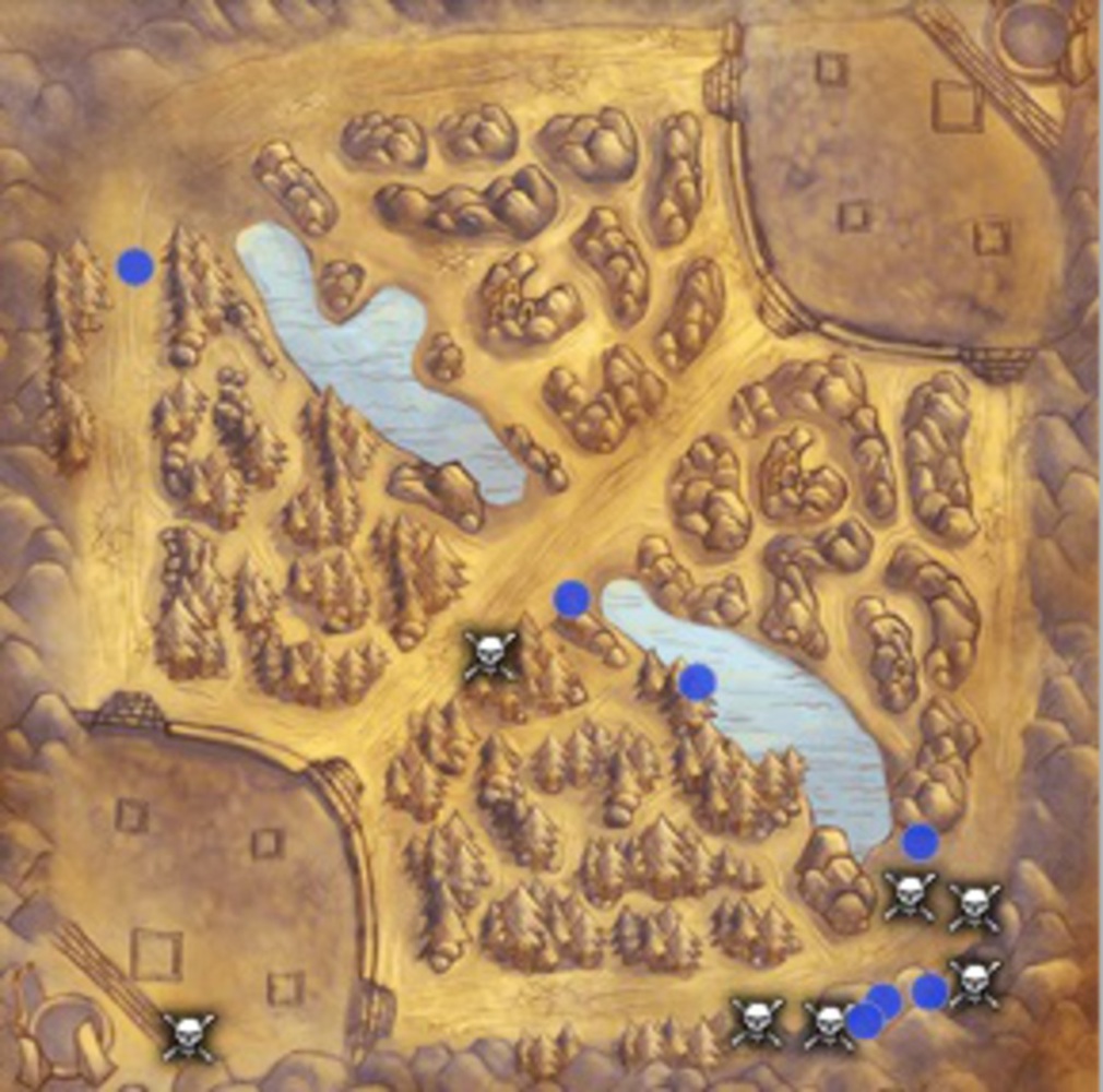
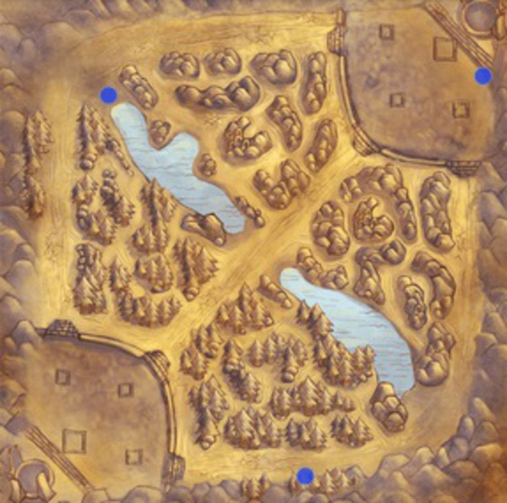
My goal with this visualization is to provide clarity in deducing where I need to improve. Thus, my design choices should be highlighting the areas in which I did poorly, rather than focusing on where I did well. Therefore, I will be focusing on where I was killed (though it is clear that such a project is extensible and could be modified to include other information) and what time of the game it was when I got killed. The data streams are therefore two dimensional, space and time. Fortunately, Riot Games as recently implemented a feature that allows one to analyze the locations of deaths, so by matching up these locations with replay data indicating the time of death, a heatmap can be easily generated.
The heatmap will be colored a mellow blue in regions where I have a low concentration of deaths (over the many analyzed games) shifting to an angrier red in regions where I die frequently (the danger zone). By analysing these with respect to time, I can produce a moving picture, so that if one region of the map is safe in the early game but dangerous in the later parts of the game, it will start blue and darken to red. I will also separate these maps based on whether or not I win or lose, allowing me to deduce how I play when ahead and behind respectively.
This particular prsentation will draw attention to the patterns that emerge as a game goes on. By viewing them side by side, trends that begin to differentiate losses from wins will be more clear. By differentiating the colors and changing the image with respect to time, the differences in safe play versus dangerous play will also become evident.
This project incorporates principles of graphical excellence because it provides a visualization of an event that has occurred countless times that has not been tracked since today. It also directly highlights trends that will, similar to the cholera map (and in both cases, the visualization will be saving lives!), be more obvious than attempting to remember what occurred. The forcefulness of this viewpoint stems from the fact that red has a very direct connotation of error associated with it, so that even subconsciously the areas of the map that are dangeerous will seem more dangerous. This also is a two dimensional display, so that it permits analysis of both time and space (even loss and win might be considered a separate dimension, but they merit different graphs). This is clearly representational, and is very much similar to the Napoleon Map - both highlight positions where loss is greater than it should have been.
My group was instrumental in deciding to pursue this project. This idea stemmed from an off-hand comment regarding my game playing, and they were able to draw out the reasons I play games and demonstrate how I could visualize the errors. They brought up that these visualizations could be organized not only in space but also in time, and the idea to split them between wins and losses I also credit to them.
Examples of such maps are below. In the first, it is clear that my laning is such that I often died around the same places that I got kills (skulls vs dots) - this is an indication that I am either evenly matched or playing too aggressively in situations where I don't need to be. In the latter, the match is a stalemate, but I don't die. This is good, and indicates that there is room to be more aggressive (dying to advance a team's goals can be a good thing) if necessary.