About
Using the discussion of foundational visual elements and visual techniques, construct a series of visual compositions to express 1) an emotion 2) the build environment 3) the human body in the following ways a) dots and lines b) shape and color c) + d) arranged as one type of visual technique and contrasted with its counterpart e.g. simplicity vs. complexity, unity vs. fragmentation, economy vs. intricacy.
Share this Pool


Discussion 6
-
visual literacy
 Kevin Ramser
Amber, these look so good! You have a really good sense of color and composition, and you obviously know your way around Illustrator. I wish you'd written about them so we could get a sense of your process, what you struggled with, and what you were thinking as you made these. Fortunately we got to hear a little about it in class. What dichotomies you were thinking about as you made the third and fourth pieces in each series?
-
Lines to Color
Kevin RamserI agree that your emotion drawings are the strongest, and I think you're on point when you talk about the pressure you feel to draw the human form accurately. But I actually like what you did with the last one in the body series by splitting up all the limbs. It looks like the start of something interesting.
-
Wonder, Venice, Body
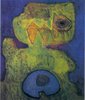
Kevin RamserI think your third composition of the dancer is the strongest, though the one before it is a close second. I like it because even though you're mostly using very thin, short lines and colored dots to suggest the form of a body, you still get a great sense of motion and fluidity. I'm interested in the emotion drawings. I like the geometry of them, but I'm not really getting wonder. I wonder what other people think?
-
Visual Literacy
Kevin RamserI really like the progression of your emotion compositions, especially moving from the first to the second iteration. You maintain the same sense of shape and movement, and the use of color is great. I think it was smart to follow your impulse to go with something less structured in order to convey mischief. The last two compositions are really nice too. My only criticism of these two is that I would have liked to see more variation in the thickness of the lines. Having some more variation in the line quality would have added to the sense of playfulness and spontaneity that you were going for.
-
Visual Literacy
 Brian Walsh
Your lion king compositions were stunning, as well as the michael jackson. There was a lot of variety in what you did with your final compositions for each base photo. Very well done!
Visual Elements and Techniques
The first set of drawings looks very clean and well-realized. You used the same basic shapes and colors in a variety of ways to convey different feelings, which was the goal of the assignment. I like that you carried some of those same forms into your second set of drawings. I don't see as much variation in the third set, since the first, third, and fourth line drawings all feel very flat. How could you have made these feel more dynamic?