Gatorade Pop Art
Made by Sienna Stritter
Made by Sienna Stritter
To "steal" a familiar logo and give it an interesting artistic twist
Created: October 12th, 2015
The goal of this project is to “steal” something and use it to create a work of art that could be sold for money. I decided to draw on the ideas of pop art in order to accomplish this. One of the things I like most about pop art is how it tends to incorporate everyday images and objects into works of art. I like the perspective that anything can be art – the subject doesn’t have to be magnificent or grand.
So, I decided to “steal” the logo of a popular company that has been made iconic and recognizable through marketing and branding. My main idea was to take something common and well known and give it an interesting twist. By using the familiar logo to create a work of pop art in the style of Andy Warhol, I hoped to catch the attention of those who are used to the traditional logo. I wanted to keep the company identifiable, yet add flair with color and repetition.
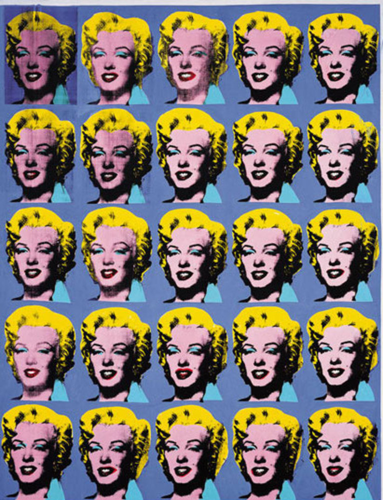
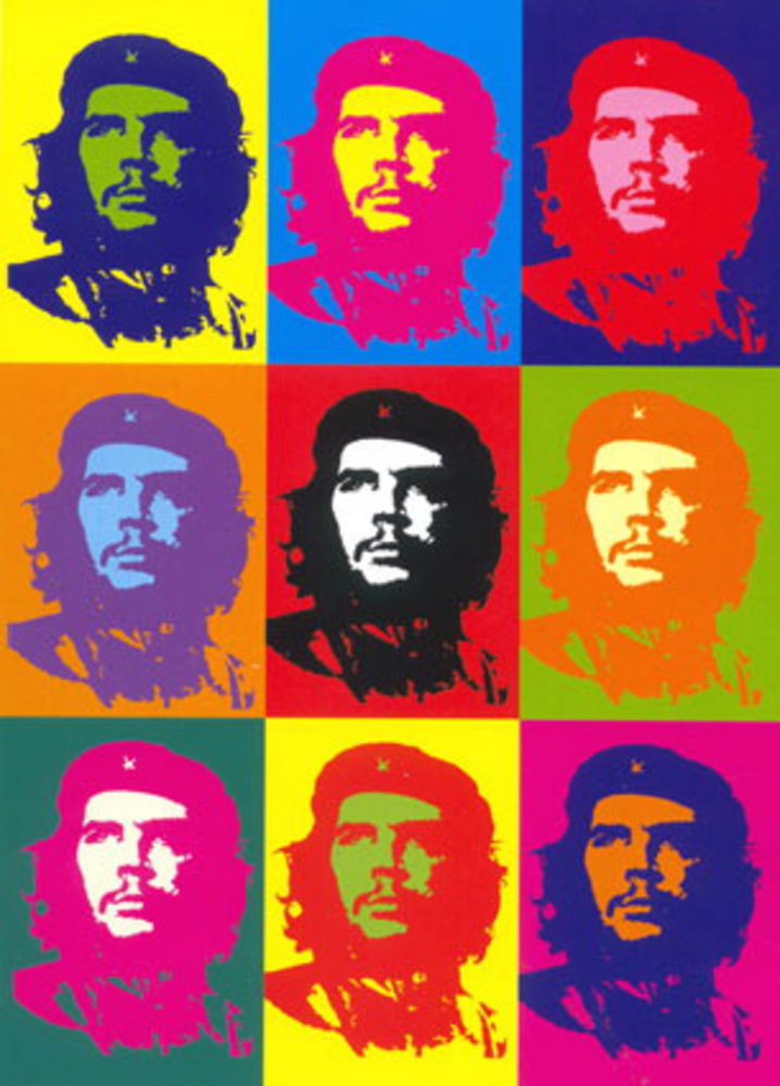
I don’t know many artists or specific pieces of art, but some pieces that I remember learning about even in elementary school are Andy Warhol’s prints of Marilyn Monroe, such as Twenty-Five Colored Marilyns, shown below. I love the bright, contrasting colors and the repetition of her portrait.
Warhol created this piece of art using screen printing. By exploiting tools and machinery, he was able to create art in a systematic manner. This allowed him to create different versions of the same image, with the same subject but different color schemes.
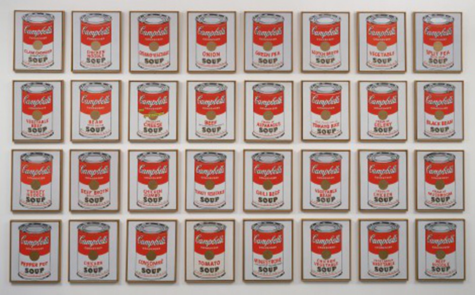
I also really like Warhol’s Campbell’s Soup Cans. Again, one image with slight variation is repeated. But what I like most about it is that the subject is an object that people see and interact with every day.
I decided to consider themes from both of these examples of pop art – the repetition, the vibrant and contrasting colors, and the use of everyday objects or brands – while making my project. I chose a brand that I (and much of the rest of the community besides student-athletes) interact with every day and attempted to manipulate its logo to mimic the prominent styles of Andy Warhol and the pop art movement.
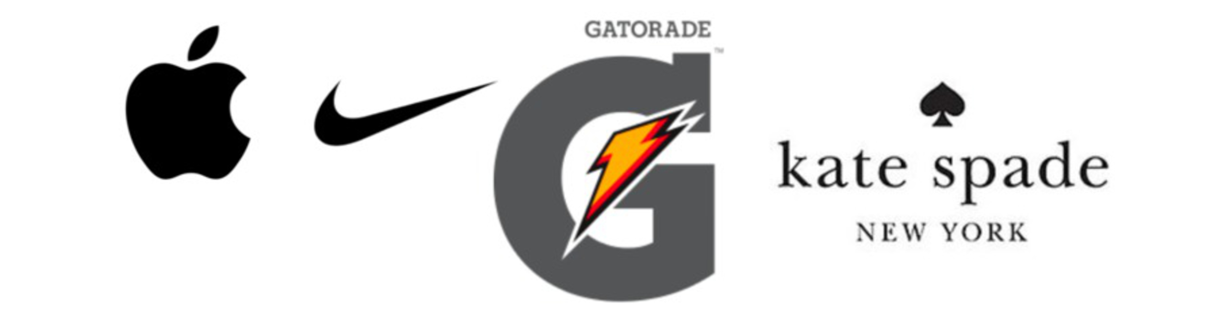
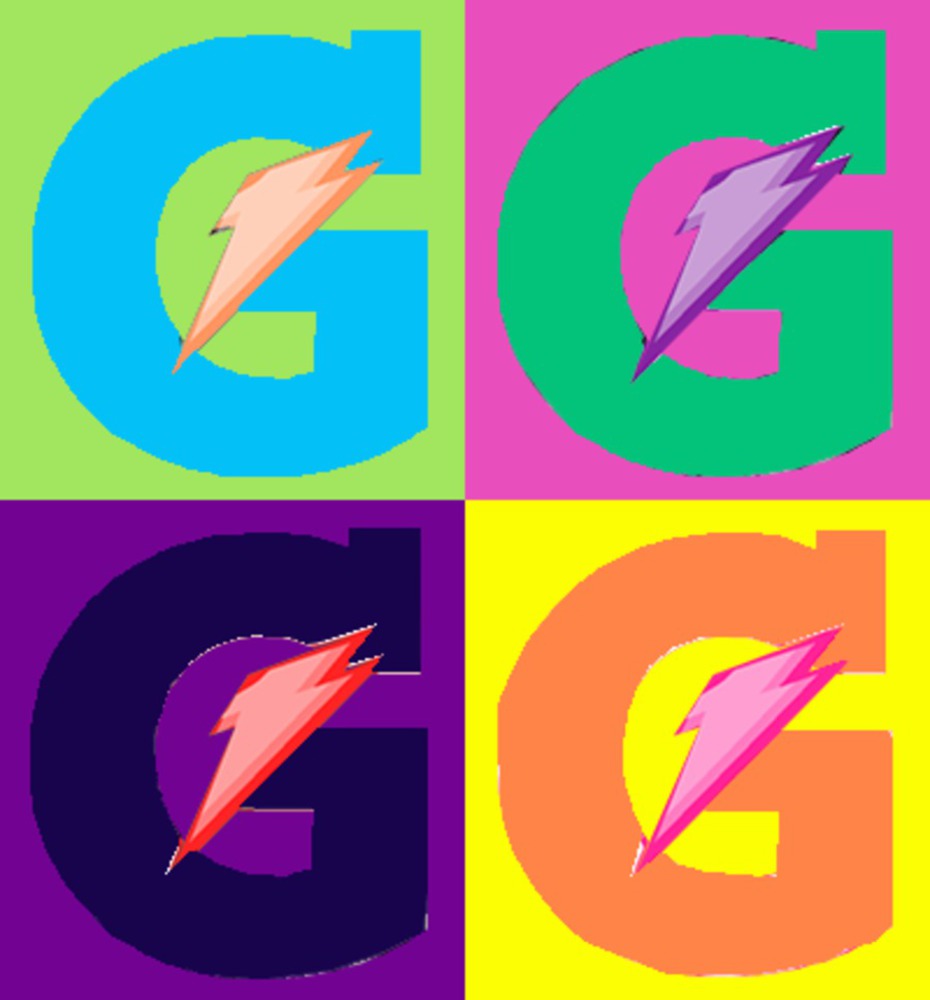
To begin, I had to pick which logo or brand I wanted to “steal” in order to produce a work of art. I thought about all the brands I use every day – the ones that instantly came to mind were Apple (my phone and laptop), Nike (my shoes and much of my clothing), Kate Spade (my wallet and favorite jewelry), and Gatorade (the water bottle I never go anywhere without). All of these have relatively simple logos, but I ended up choosing Gatorade because I liked that there were two distinct figures (the letter G and the lightning bolt) rather than just being one shape like the rest of them.
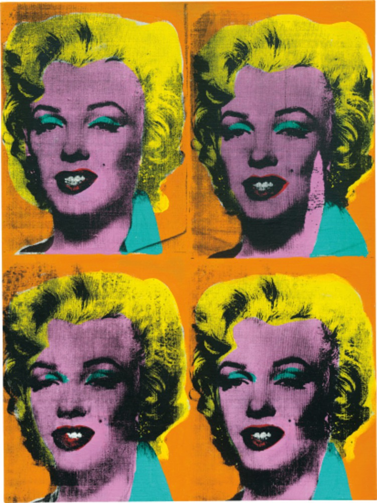
Next I had to decide how many times I wanted to repeat the image. I did some research on Warhol’s pop art, examining pieces like Marilyn Diptych with 50 copies and Campbell’s Soup Cans with 32 copies. I finally decided on Four Marilyns (which has four copies, obviously) to simplify my creation process.
I began with a simple image of the Gatorade logo and followed a Photoshop tutorial by Melissa Evans. First I isolated the G from the background of the image using the Photoshop pen tool to trace the outline of the object. After selecting that portion of the image, I copied over the G to a new layer, where I applied the Cutoff filter to give the logo some more texture and depth. Then I copied this three more times and placed the four identical images in a grid. Next, I added a background to each image using four different, new, bright colors. The last step was to use the paint bucket to apply a color to the actual “G” itself as well as to the lightning bolt.
I was pretty pleased with how the work turned out, although I cannot really imagine someone wanting to pay money for this. As the inner critic, I am bothered by some of the imperfections of the color boundary lines of the G’s and the lightning bolts. It was challenging in Photoshop to perfectly trace the outline of the shapes without having extra white space, which is why some of the lines are not cleanly colored.
My intention was to take the familiar Gatorade logo and create a work of art that maintained the recognizable identity of Gatorade but added an artistic touch. I think I accomplished this fairly well – the Gatorade logo is clearly distinguishable in the image, although the colors are radically changed. I added creativity and my “artistic twist” by using bright colors. Normally, I would never think that some of these color pairs “go well” together (blue and orange, pink and green) but I actually like the way the contrasting colors make the image stand out boldly and vibrantly.
Through this project, I learned it’s pretty difficult to produce something I consider worthy to purchase. I probably wouldn’t pay money for my own piece of art. If I could do it over again, I would spend more time carefully tracing the outline of the letter and lightning bolt in an effort to clean up some of the lines.
I think my experience creating this piece is sort of similar to Warhol’s screen-printing process. He used a different screen to apply each color, so “the application of the colors resulted in a layering effect,” similar to the manner in which I created different layers in Photoshop for the background, the letter G, and the lightning bolt. (Of course, though, in Photoshop the first color is not transposed with each of the following colors, as would be the case in screen-printing.) Additionally, Warhol could use a screen stencil multiple times and create “a different color composition each time.” This is mirrored in the way I could create one image and simply copy-paste it and change the color scheme to quickly duplicate and repeat it. In this project, using the Photoshop technology definitely helped me learn about and better understand Warhol’s industrialized, factory like process of creating art.
Photoshop Tutorial: http://www.melissaevans.com/tutorials/andy-warhol-up-your-photographs/3
About Screen Printing: https://revolverwarholgallery.com/andy-warhol-screenprints-process-history/
Images:
- Twenty Five Colored Marilyns: http://themodern.org/collection/twentyfive-colored-marilyns/1137
- Campbell's Canned Soup: https://www.moma.org/learn/moma_learning/andy-warhol-campbells-soup-cans-1962
- Apple: https://en.wikipedia.org/wiki/Apple_Inc
- Nike: https://en.wikipedia.org/wiki/Nike,_Inc
- Gatorade: https://en.wikipedia.org/wiki/Gatorade
- Kate Spade: https://en.wikipedia.org/wiki/Kate_Spade
- Four Marilyns: https://www.phillips.com/detail/ANDY-WARHOL/NY010313/23
-Gerard Malanga: https://en.wikipedia.org/wiki/Guerrillero_Heroico
To "steal" a familiar logo and give it an interesting artistic twist