Red Vs. Blue
Made by swilhelm, Janine Louie and eir
Made by swilhelm, Janine Louie and eir
Forcing depth perspective can lead to deception and not seeing the whole picture.
Created: October 20th, 2015
Red Vs. Blue aims to distort the size of two subjects so as to make them appear the same size while in reality one is much larger than the other.
We chose to focus on the deception of optical illusions. We hoped to trick and force one perspective of a situation, and then reveal more perspective and information of the situation, to reveal that it is completely different than the first perspective led you to believe. As optical illusions are mainly focused on tricking the eye and brain, we thought we would trick the mind as well.
We made this vine deceptive to show how illusions can occur in real life, in more ways than from just the brain's inability to successfully process sights and sounds. A lack of information from any aspect of life can lead to an illusion of reality.
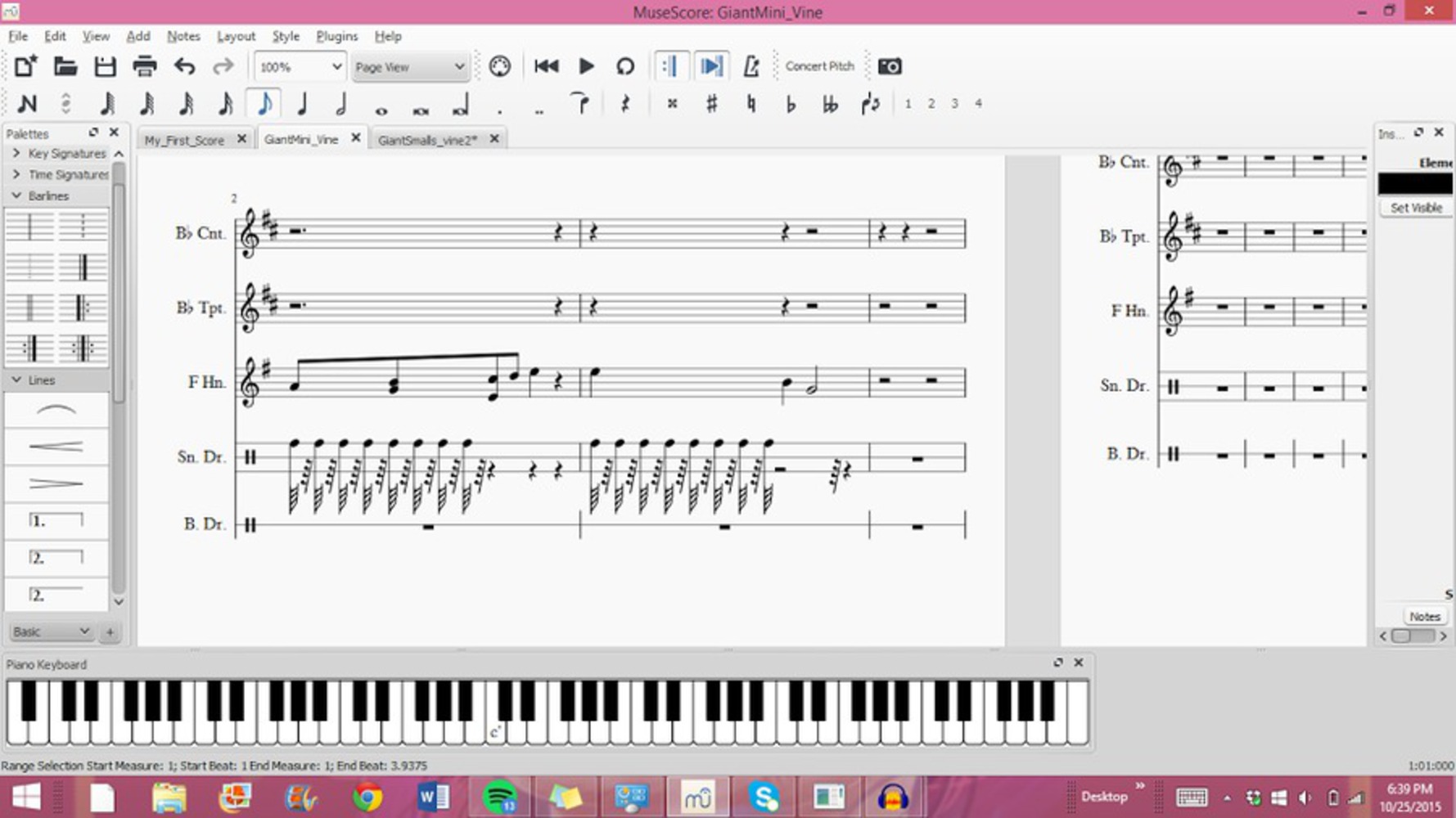
The audio element was created using MuseScore and Audacity: programs for composing and editing music, respectfully. I created a track with the B flat Cornet, B flat trumpet, Horn in F, and the Bass Drum. Our project has implications of wartime, which led me to use heavy brass and non-pitched percussion instruments.
At first, I tried to use the snare drum, as you would hear in a marching line in wars of the past. The electronic snare drum, however, sounded very inauthentic. Additionally, it was difficult to effectively use it in the short time-span.
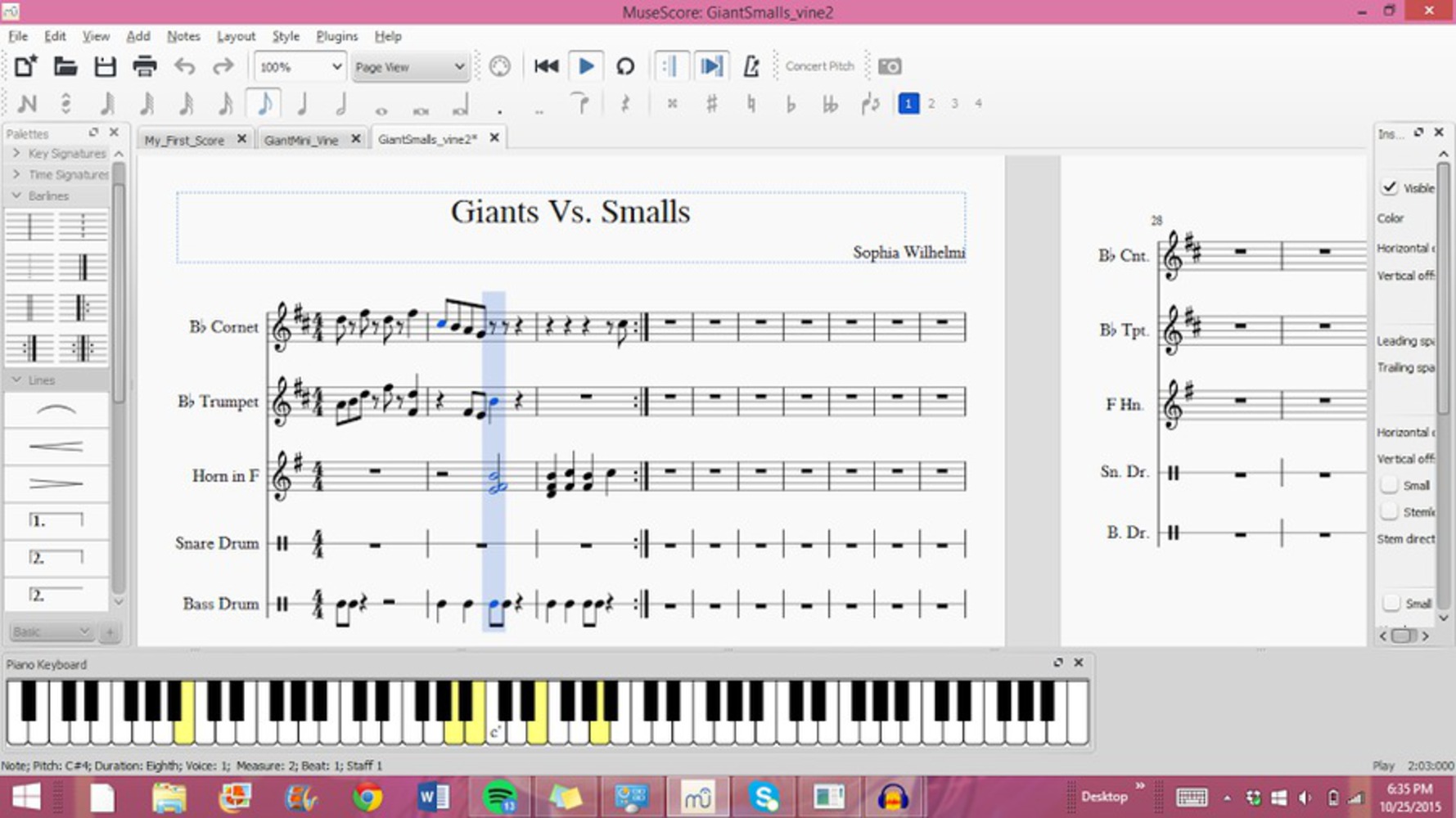
I had also started with the second half of the song, as that was the reveal of the optical illusion. I scrapped the first project and started over. This time, I had a better idea of how I would create the reveal portion of the track. I started with the cheery portion, which would be the "beginning" of the vine. For this, I used mainly the cornet, which has a sharper sound, and high notes, to represent a lighter and happier tone. I still used the brass instrument because part of the deception is that the reality was there to see, but it takes until the reveal to find out the reason behind what the eye sees. Specifically, it looks like the red and blue men are high fiving, when in reality they are pledging allegiance to different sides of a war. Likewise, the brass is used throughout, but only sounds like a war once the reality is revealed.
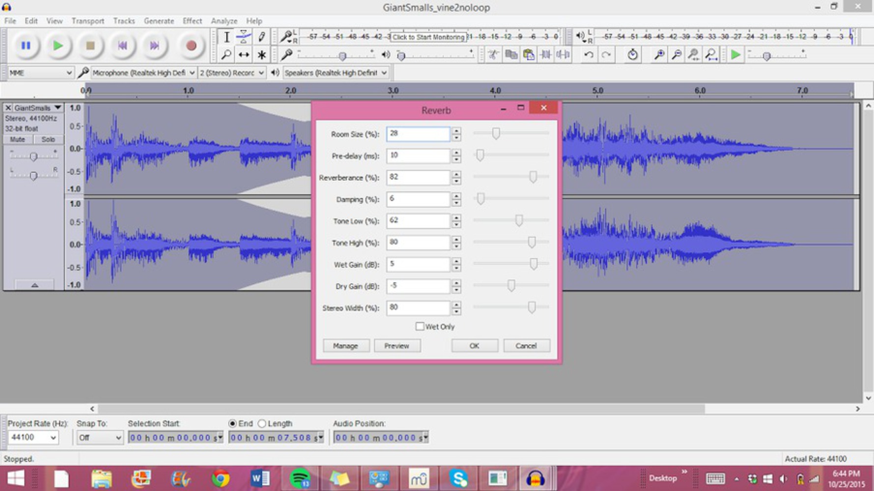
After composing the track, I used Audacity to add effects to the music. These effects included softening the music during the transition, to add to the impact and distinction to the happy and war parts, separately. For the second half, the "war part", I added reverb to the track. Reverb is used to give the sound depth and create the effect of it being in a room, and reverberating off of the walls. I thought reverb would be appropriate, as when it is revealed that it is actually war, the video shows many more red and blue people. It added vastness to the sound in its depth.
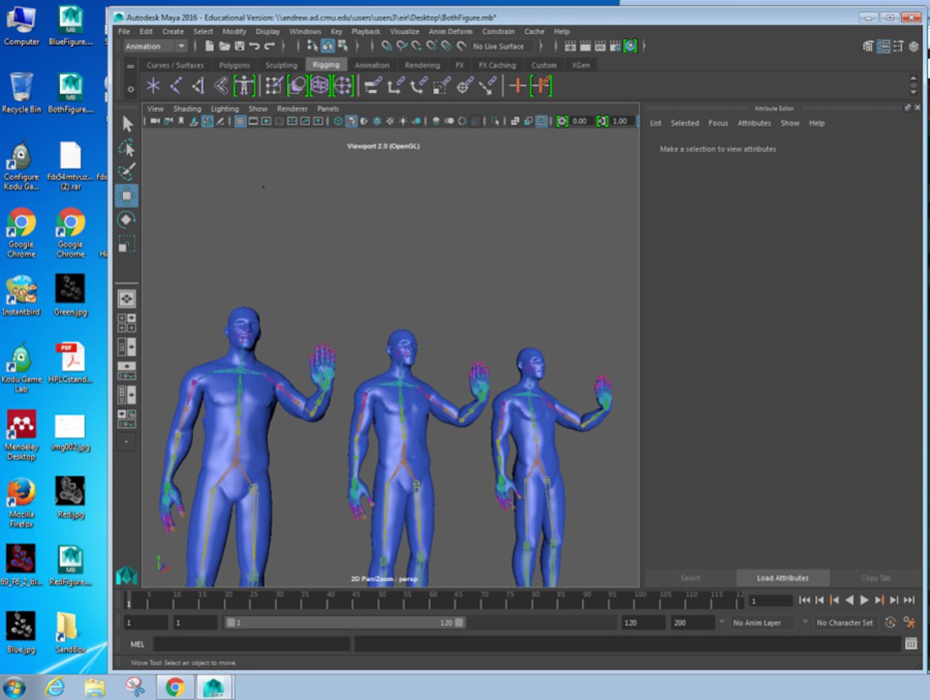
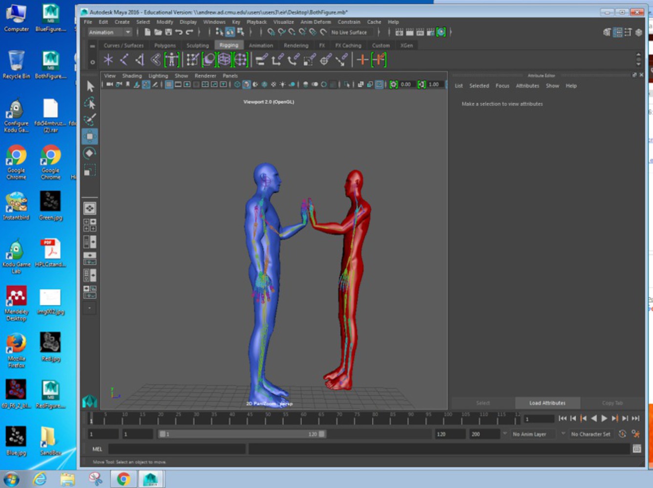
We started the visual component by trying to figure out how exactly we wanted to do the visuals. We had experience with Photoshop, but getting the depth perception right seemed challenging and editing images together did not seem to work as intended. We ultimately decided to create a 3D model of the scene in Maya.
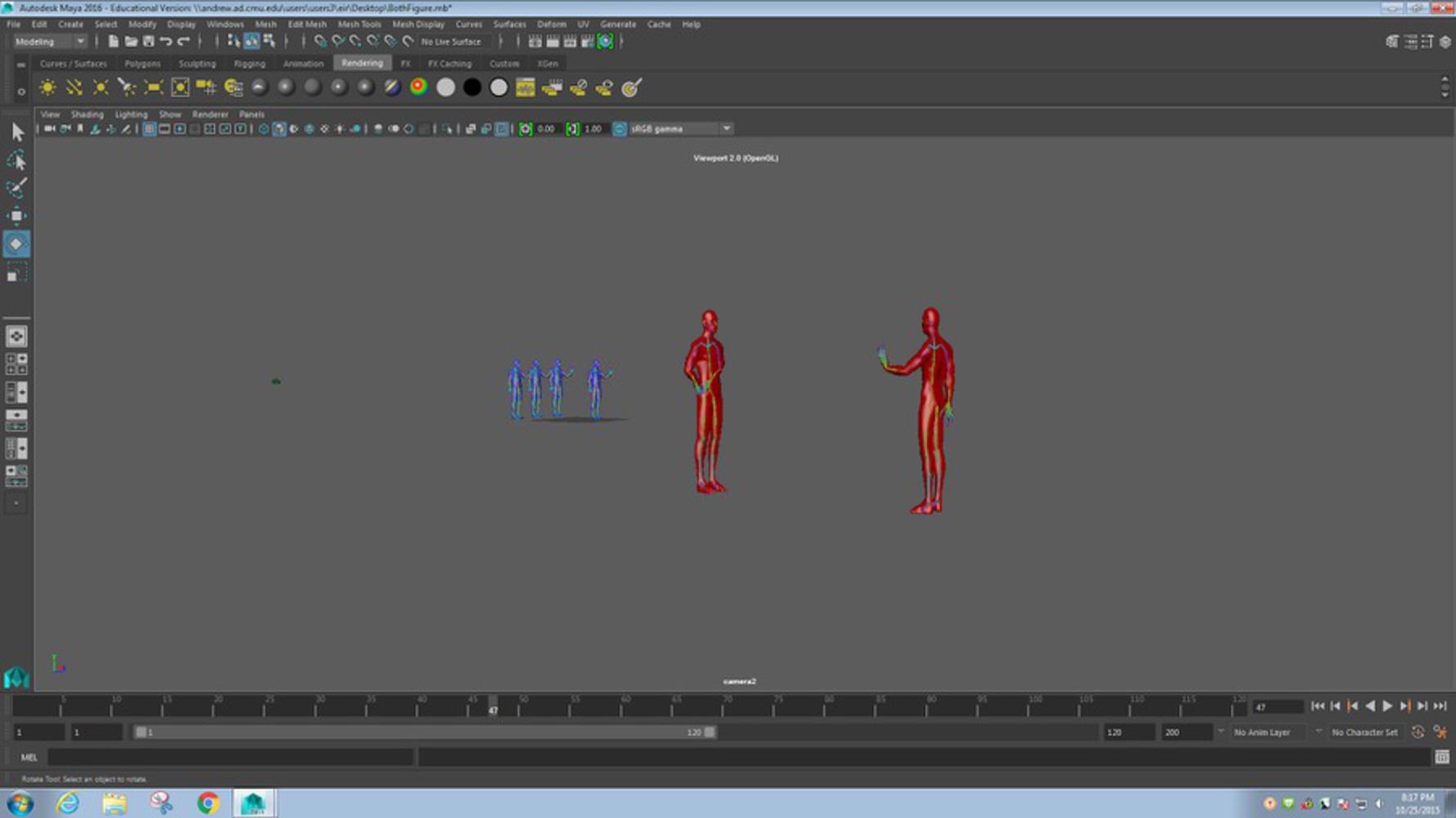
We started by downloading a 3D character model from the website TF3DM. It was confusing at first seeing that none of us had used Maya or any other 3D modeling software before. We created a skeleton rigging for the model and then bound it to the model in order to pose the character the way we wanted. We then textured them red and blue to visually show the difference between the two characters. Finally we set the actors in the scene and created a camera that we set in various places and saved in key frames in order to create our animation.
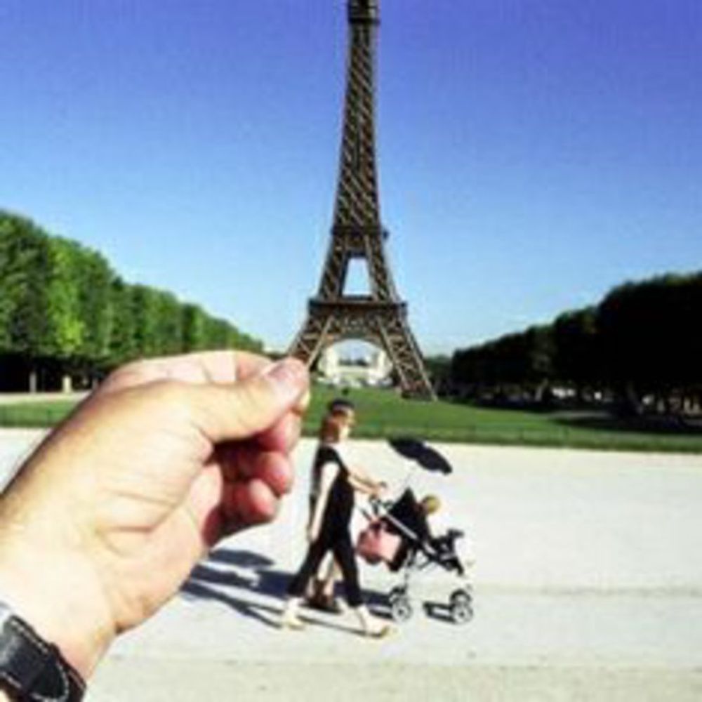
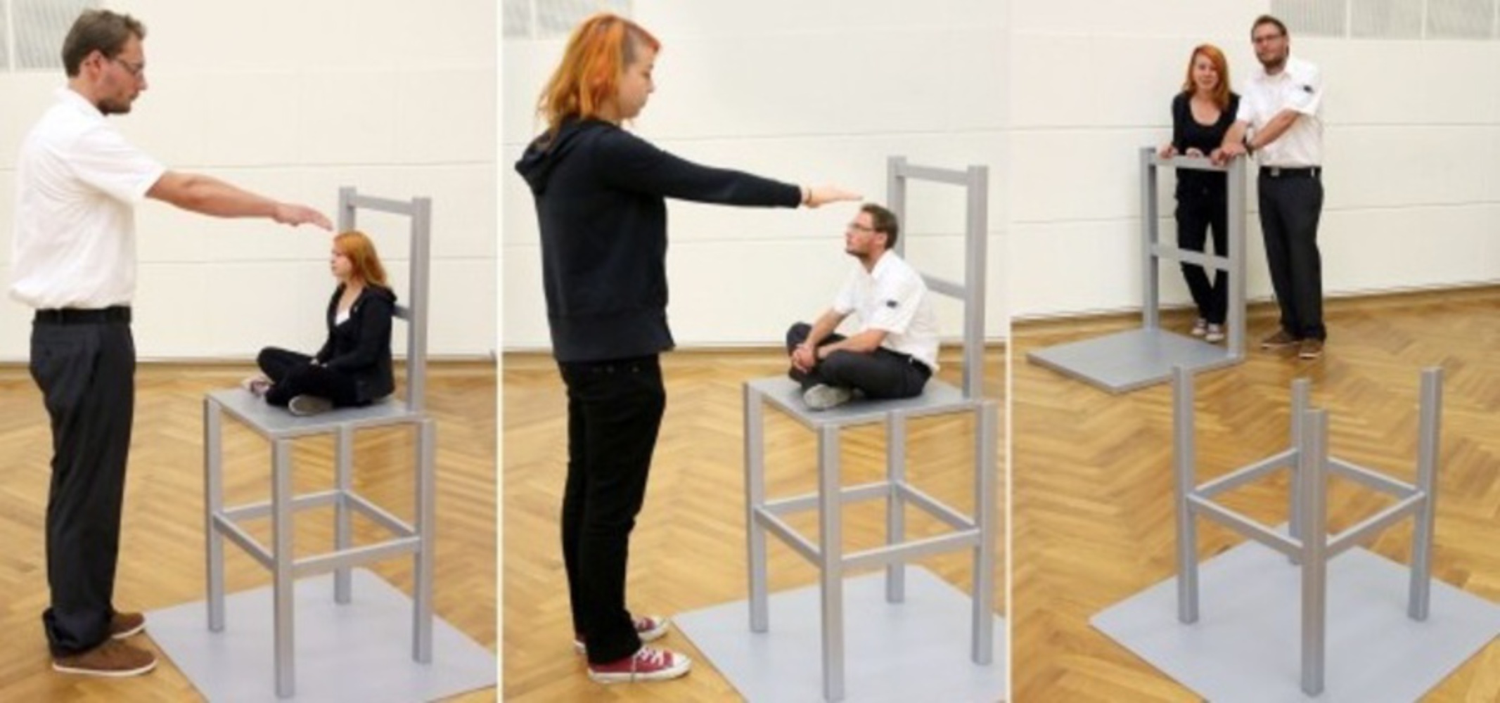
We are using a forced perception illusion. This illusion causes the viewer to believe that two objects are farther away/closer to or larger/smaller than they actually are. It works through the use of scaled objects and the viewpoint of the camera. Based on the way that he subject it interacted on by the environment from the viewpoint of the camera, the audience's perception is forced to make the subject seem larger or smaller. A common example of this is when tourists go to famous landmarks they orient a photo is some way to make them look like they're holding or hugging it or sitting on it. Because these landmarks are so iconic, the observer quickly realizes that the image is an illusion, but for a split second they see someone sitting on the Arc de Triomphe or snogging the Sphinx. In our project, because it looked like the red and blue man were high-fiving, the image tricked the audience into perceiving the two as the same size.
What's interesting about our project is how different the size distortion is from other pieces that use this illusion. A lot of the time, the illusion makes a "normal" sized object look smaller, e.g. a person stands far away and in a manner that makes them look like they are being crushed under a closer person's boot. Our project makes the subject seem smaller, but in our project the subject is large and the illusion makes them seem "normal" sized. In most pieces that do this, the subject is normally building or monuments, and thus it was important to see how perception forced them to look smaller based on the environment and the subject-environment interaction, especially in cases where the audience knew the subject was larger than depicted.
Originally we started off with two project ideas. One was a depth perception illusion involving a revolving ballerina; we wanted to make her appearance obscured from far away, and play low classical sounding music. As the project begins to close up on the ballerina, her appearance would be revealed to be flawed, as well as the music which would become louder and choppier the closer we got to the ballerina. We had some problems deciding how the ballerina should be flawed and how to animate a ballerina spinning.
Our second idea was to utilize the color perception illusion; we would take a image that intentionally distorts the audience's color perception so each individual may see a different color (the most recent example of this is the dress picture). Each of us would then take the color we see from the image and interpret the emotion it evoked in us (for example, one of our group described midnight blue as ominous while another thought it was calming). The emotion would be translated to sound and we would play the varying sound over the image. Eventually, we don't this project was simultaneously too simple and too high concept for a casual viewer to interpret.
In the end, we settled upon a variation of our first idea, where we would depth perception/size perception illusion, where we would make two subjects look a similar size while in reality one was much larger than the other.
Overall, we were satisfied with the product. We think that it is interesting and creates a perspective, causing the audience to think critically behind the forced perspective and reveal. Additionally, we feel as though it looks and sounds pleasing, and works well together, with use of body positions, instruments used, and lighting. We think the piece created a successful forced perception illusion and was visually entertaining in the manner it revealed the illusion. Additionally, with the effort required in learning and using the programs, we feel as though the product looks and sounds cohesive and the reveal was successfully evident. That said, we think the scene is a little bare, and that the sound doesn't loop as seamlessly as it could.
Overall, we enjoyed working together and collaborating. We learned a great deal in terms of the programs used to make these assignments. Much time was spent learning new programs, especially Maya. In using Maya, we learned how to place and manipulate objects so as to generate a forced perception illusion. We also learned how to rig character models with a skeleton to pose them and learned how to light and render the scene.
We did think that the scene was a little bare, however, and if redone we'd probably add a background to the piece. We would add walls in the background with words implying the separations of the two teams and add more factors to the visuals.
In using MuseScore and Audacity, this project was the first time that I used both. I was able to write music and then create a more fitting environment, which lessened the digital quality of the automated sounds in MuseScore.
We also found it difficult to shorten it to 5 seconds. Our initially idea would have taken longer than five seconds, so we chose a simpler idea. Then after that, getting the music down to about 5 seconds was difficult especially while trying to add two different parts (before and after reveal).
Somethings we would do differently include having it loop better. The audio loops seamlessly on the Audacity and Premiere Pro programs. However, vine automatically blends the two together. With a lead-in note at the end of the song, it created a less-than-seamless loop. We would in the future work more closely between Audacity, Premiere Pro, and Vine, to loop the audio seamlessly.
Reference any sources or materials used in the documentation or composition.
1. Autodesk Maya 2016
2. MuseScore
3. Audacity
4. Human Character Model: http://tf3dm.com/3d-model/male-base-mesh-6682.html
5. Premiere Pro
6. Vine
Forcing depth perspective can lead to deception and not seeing the whole picture.