Kasmir Malevich
Made by Laura Lodewyk, Brian Li and Judy H
Made by Laura Lodewyk, Brian Li and Judy H
Created: November 19th, 2014
Black Square
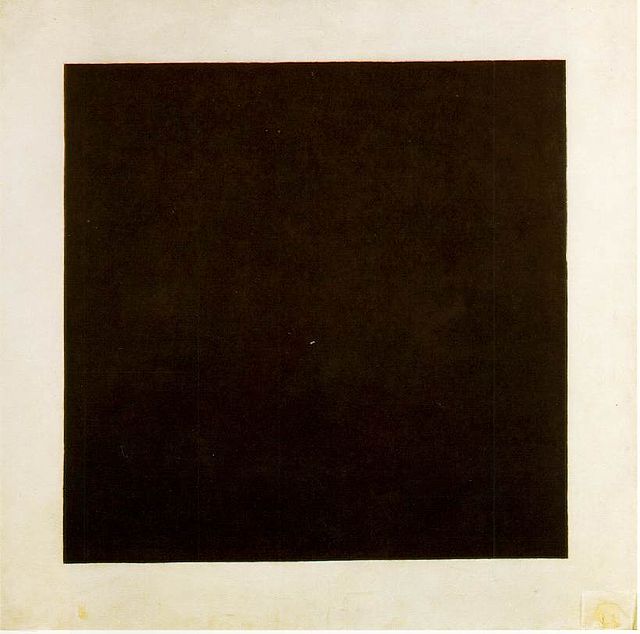
This is probably Malevich's most famous piece, and the painting that started the movement which he fathered: Suprematism. The main idea behind Suprematism was to try to distance art from the material world. In the past, art had been used as a tool by religion, by the government, and by the rich to portray what they wanted. Even in the same time period, there were others who saw art as a sort of functional skill, where artists were also engineers. However, Malevich instead simply wanted to capture the pure feeling of an artist. He wanted his art to become a pure expression of his creativity. This piece was considered to be so radical, as it was so different from anything else that existed at the time, even within modern art circles.
Since there was a belief at the time that modern art should be very flat, many of Malevich's work did not have any sort of depth or much shading work at all. For his works of Suprematism, he painted only geometric shapes: lines, rectangles and circles. A lot of the works were about the negative space as much as the positive space, as the contrast between the vibrant shapes and the white empty base gives his work a very dynamic nature. As he was trying to move away from the material world, he did not portray anything that could have been something real. He simply wanted to evoke some sort of emotion.
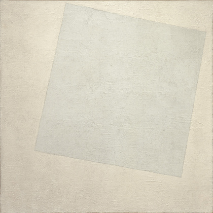
Kazimir Malevich originated the suprematism art movement, which focused on basic shapes painted in basic colors to show pure art that doesn't try to replicate objects. By creating works that were not influenced by the outside world, he felt he was creating true art. Overall, I feel like the similarity in the two whites is so much that it is hard to see the square as separate from the canvas. The shades are only distinguishable enough that you can tell there is a white square on a white background., which I think makes it seem less like a square on a canvas, and more like they are connected. Compositionally, the square seems like it is floating towards the top of the canvas, and creates a sense of freedom. I think because the square and the canvas are so similar in terms of color, the viewer focuses on the differences between the two, which boils down to size and placement. The smaller square seems to be a part of a separate world, since unlike the canvas, it is not aligned perfectly with the vertical and horizontal constraints we place on our environment. This small distinction makes the viewer see it as something different and possible foreign. But fundamentally, the viewer doesn't have to 'see' something such as an object in the piece, but instead focus on obtaining the pure feeling that only pure art can give you.
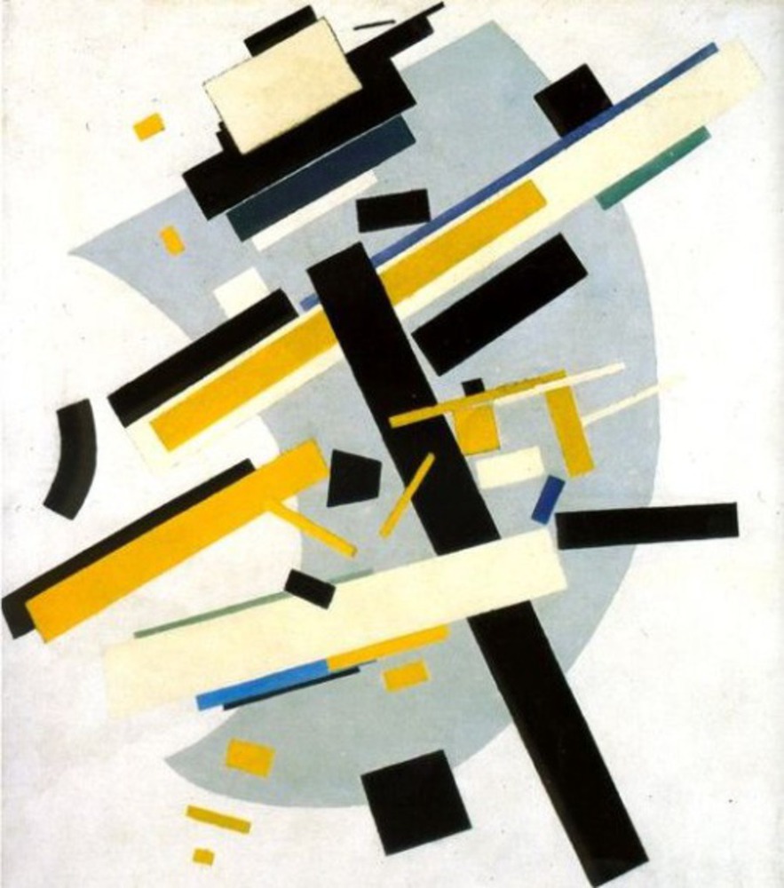
Malevich's Suprematism movement focused on basic geometric shapes. His Supremus pieces were reduced geometric shapes that were stripped of meaning and did not refer to representation objects in an attempt to understand the "primacy of pure feeling in creative art". Because none of the pieces were meant to be representational of objects - or anything for that matter - his work can be interpreted as an exercise in composition. Through his numerous Supremus pieces, we can see his experimentation with different shapes, sizes, colors and, in my opinion, most importantly, the placement of those shapes. I cannot pinpoint a specific technique or direction that his pieces followed since they seemed to be more experimental than purposeful. Some pieces are vastly empty whereas other may be complex. In some instances, the shapes are defined closely and tightly in one space of the canvas whereas in others, the shapes are grouped far apart from one another.