Pittsburgh Healthy Neighborhood
Made by Ankita Patel
Made by Ankita Patel
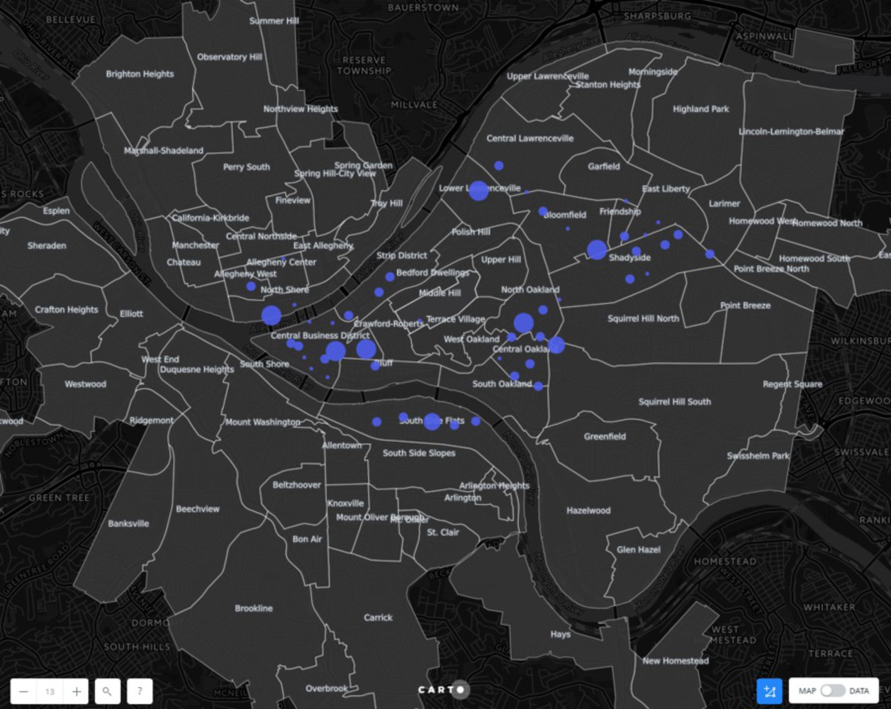
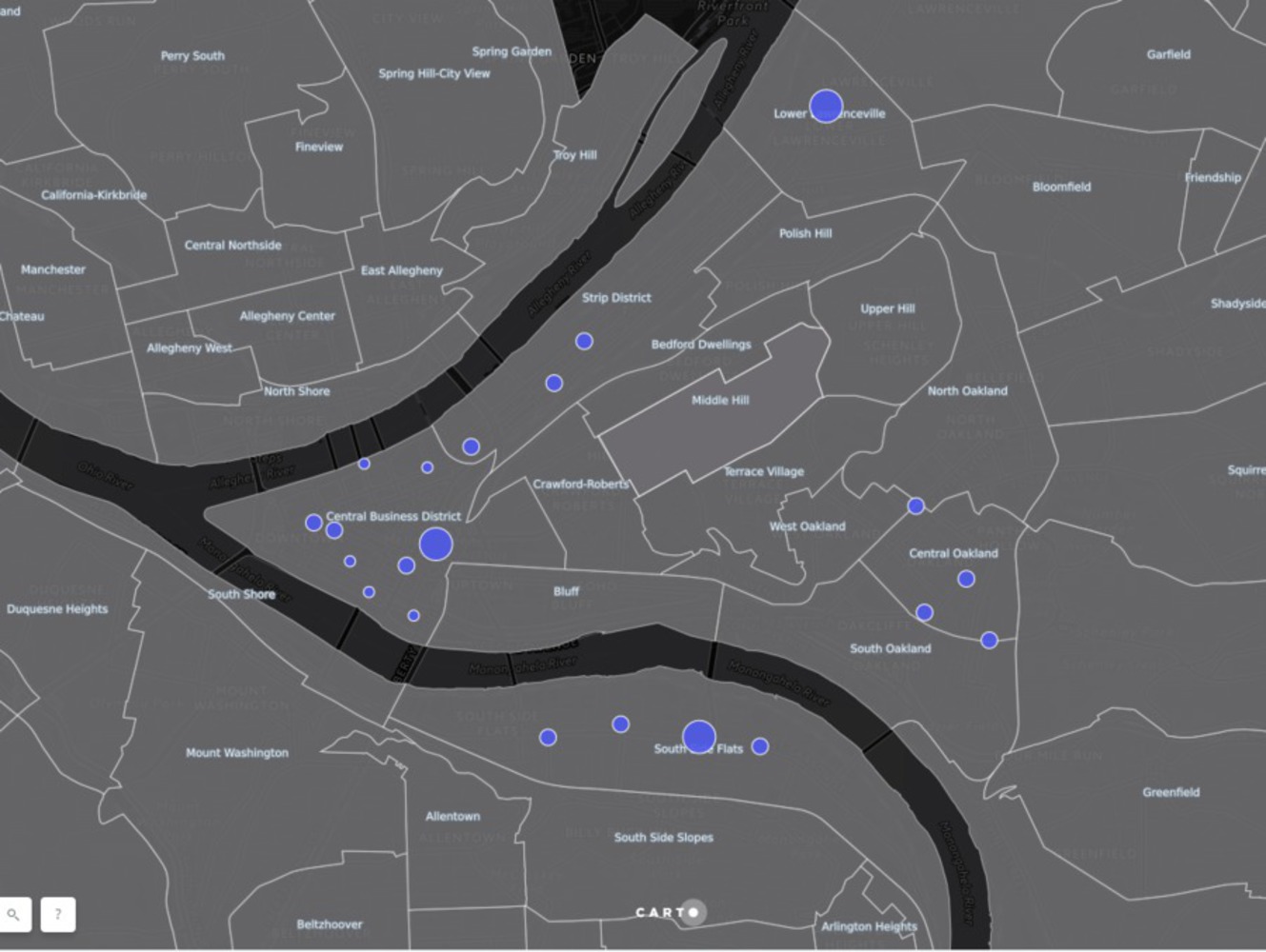
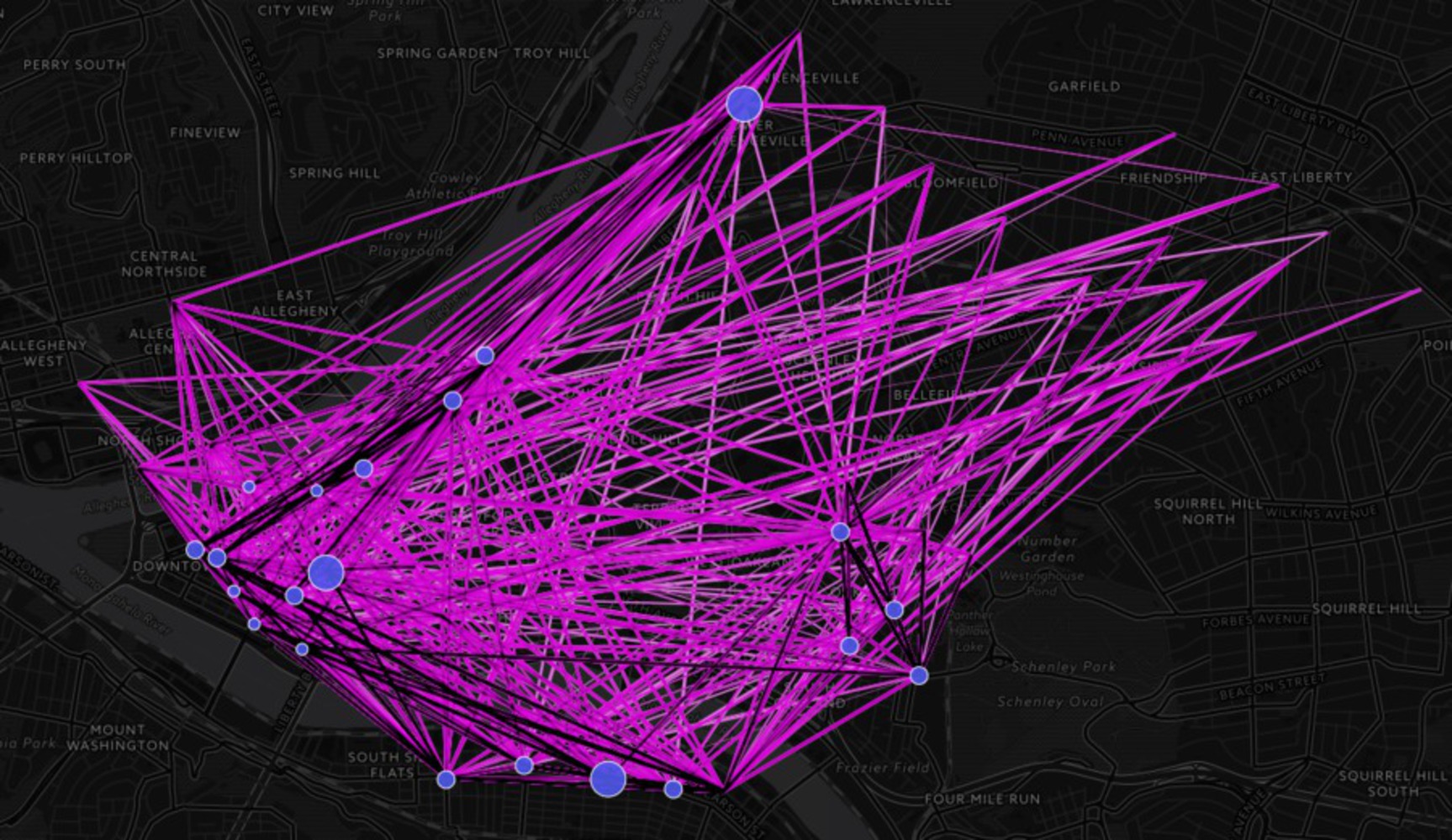
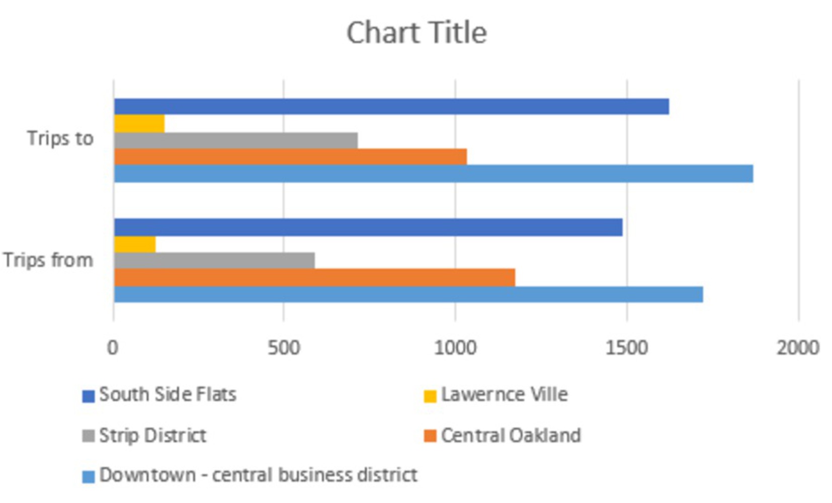
The Goal of this project is to identify the neighborhood which uses the Healthy bike ride the most.
Created: November 25th, 2017
The Goal of this project is to identify the neighborhood which uses the Healthy bike ride the most.