Nutrition Facts

Made by Judy Mai

comparing McDonalds and Burger King nutrition facts in a misleading way

Created: November 1st, 2015

0

Product

Detail what you created. What did you create, how, etc. What methods or techniques did you use? What tools and technologies were involved? Include images, code or video.
0

I created a graph using circles of different radii to compare the nutritional values of a Big Mac from McDonald's and a Whopper with Cheese from Burger King. At first glance, we have:

0

Instantly you would think McDonald's is more unhealthy: the circles are clearly larger in Burger King, and there's essentally just more of everything, calories, fat, sugar, you name it.

I used Paint Tool SAI to create precise circles with specific radii and Microsoft Paint to get the letters.

0

Intention

0

As soon as I heard that we had to "lie about data," I instantly thought about fast food restaurants. They certainly have a lot of incentive to lie about their nutritional values and make them seem better than they really are.

My goal was to skew the nutritional values of McDonald's and make a graph with misleading data. By comparing McDonald's data with Burger King's, a similar fast food restaurant, we can enhance the emphasis of how much "better" it is.

0

Context

Describe what informed your ideas and your outcome. How does your outcome relate to other work in the field? What are the precedent projects? Situate your ideas relative to work you've seen in class, or elsewhere
0

My graph (or bubble chart, rather) is slightly inspired by Kandinsky's Several Circles work. I changed the radii based on the numbers, and that's sort of emulating the work from http://bost.ocks.org/mike/nations/, where the size of the circles in the graph is based on the population of the nation.

In general, I really love the d3.js examples: https://github.com/mbostock/d3/wiki/Gallery

I think that using the size of a circle, or any shape to represent how large a number is is a very clear and easy method of expressing or exaggerating something.

0
Several Circles
Severalcircles.thumb Wassily Kandinsky
0

Process

0

First I looked up the nutritional data. I wanted to exaggerate any values to make them larger or lower than they really were.

0

At first glance, it's obvious that the Big Mac is "better" than the Whopper. It has less calories, less fat, less sugar, etc.

However we instantly see a slight issue with comparing them by graph.

A Big Mac has a serving size of only 214 grams whereas a Whopper with cheese has 312 grams, so naturally since the serving size is different, the nutritional values will be off scale as well.

So I decided to scale the values to the same serving size by multiplying all of the Big Mac values with 312/214, which would scale the Big Mac to a servig size of 312 grams...and lo and behold:

0

In fact the Big Mac has WORSE nutritional values compared to the Whopper with Cheese once scaled. There are more calories and significantly more cholesterol and sodium, though slightly less fat...

Because the original data had a smaller serving size, it was very misleading and initially made it seem like the Big Mac was "better," when in fact it's worse. I wanted to highlight this in my graph.

My result was:

0

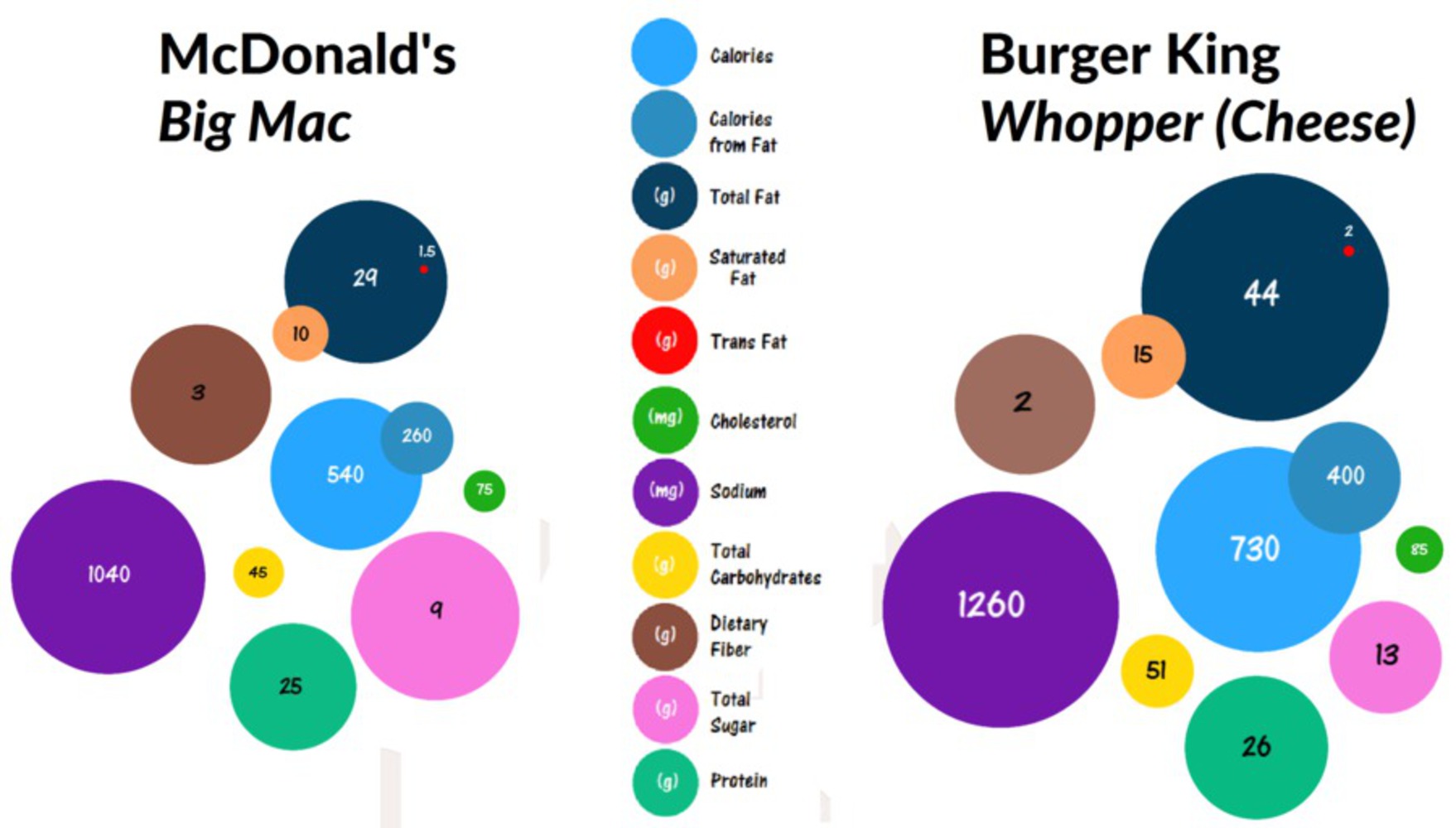
There are various things wrong about this comparison, though at first glance it appears that the Big Mac is "better" as intended.

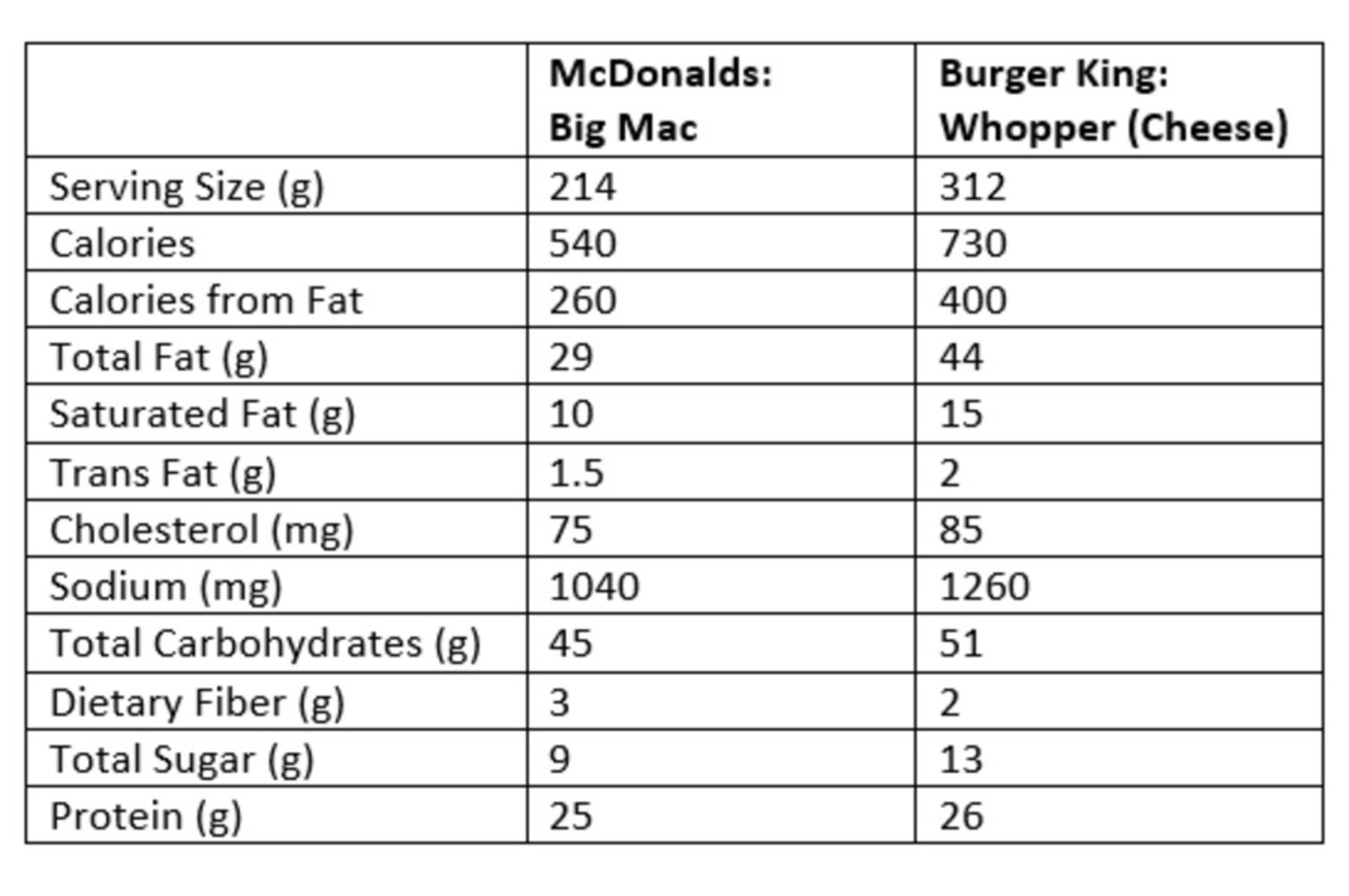
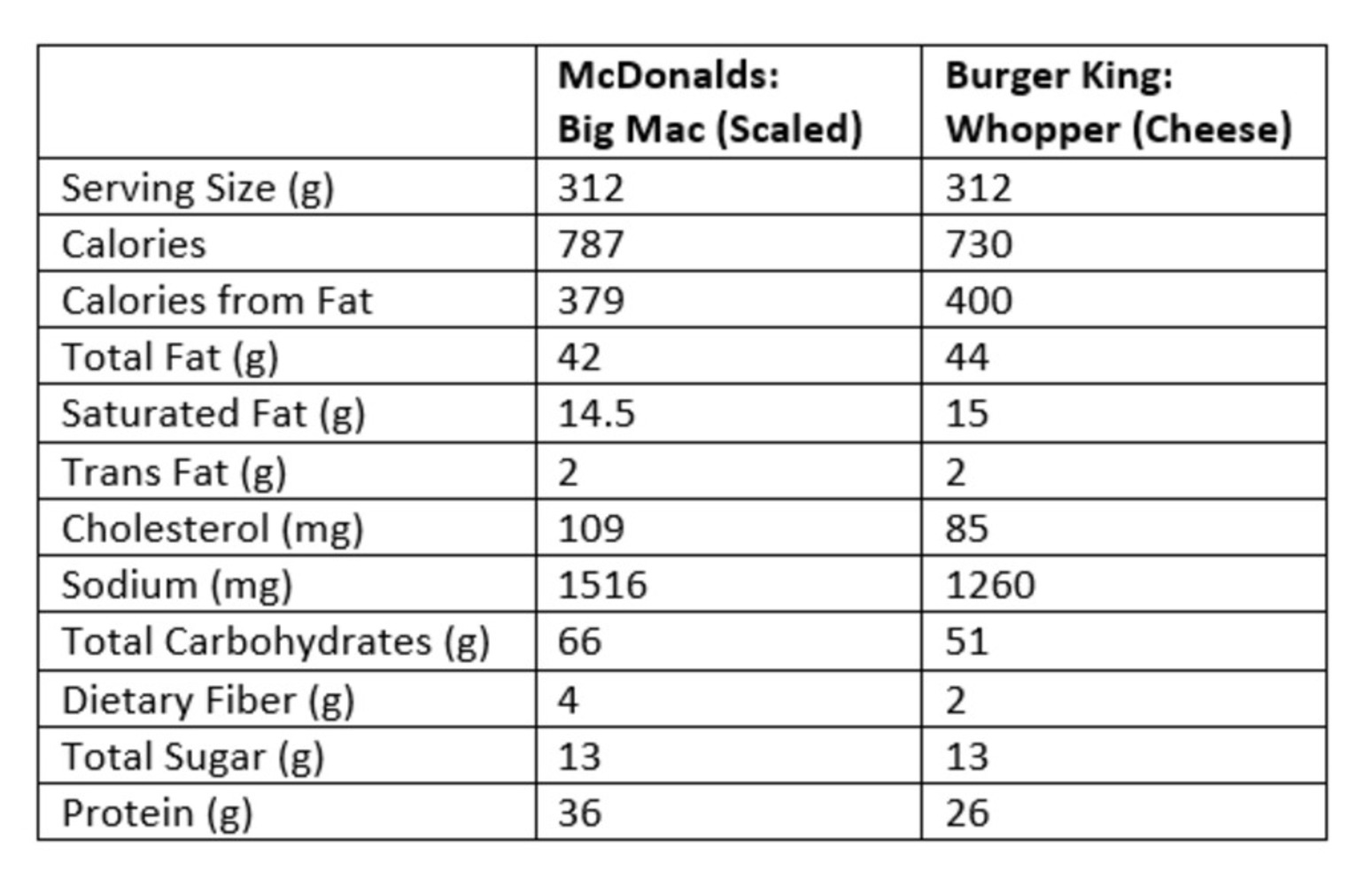
First of all, the serving sizes are not scaled properly (though it isn't shown), the graph is according to Big Mac's 214 gram serving size, so the values are already lower to begin with.

However, we also don't account for the differences between grams and milligrams. Note that cholesterol and sodium are measured in terms of mg whereas everything is in terms of g, which is also factually incorrect, because everything is scaled to look like grams, so milligrams should be minuscule.

Looking at just McDonald's, the circles are also scaled incorrectly.

There are 29 g of total fat (navy) and 9 g of total sugar (pink), yet the circles are nearly the same size--if anything, pink is actually larger. Also comparing cholesterol (green) and sodium (purple), cholesterol is only 75 mg and sodium is 1040 mg, so the green circle should be super tiny, or the purple circle should be huge, but they are off scale.

The entire graph is filled with precisely (but incorrectly) scaled circles, there are many more intentional inconsistencies.

0

Reflection

Reflect on the process of making this project. What did you learn? What would you do differently?
0

I learned how important it was to double check data to make sure that it was relevant and not just be fooled by what the graph may simply appear to be. It's really easy to skew data to make it seem like something else, but we must keep in mind of purely what the data is showing.

If I could redo this project, I would probably try to make the composition of the nutrition facts a bit more clear and unified. I was kind of inspired by Several Circles from Kandinsky, and sort of emulated that, but the key makes it really hard to distinguish what each circle represents--it's confusing to look at the giant purple circle and then the key to see that it's sodium, and how the tiny red circle is trans fat. It's also confusing why some are overlapping and some aren't--I was trying to connect the groups together, such as total fat, saturated fat, and trans fat, but it wasn't very clear.

However, I do feel that the graph itself is appealing to look at, though difficult to analyze in depth (which is what makes it so misleading because no one will really bother to check the facts and see that it is skewed).

0

Attribution

x
Share this Project


About

comparing McDonalds and Burger King nutrition facts in a misleading way