William Tell Overature

Made by Laura Lodewyk

Created: December 5th, 2014

0

Prelude(Dawn):

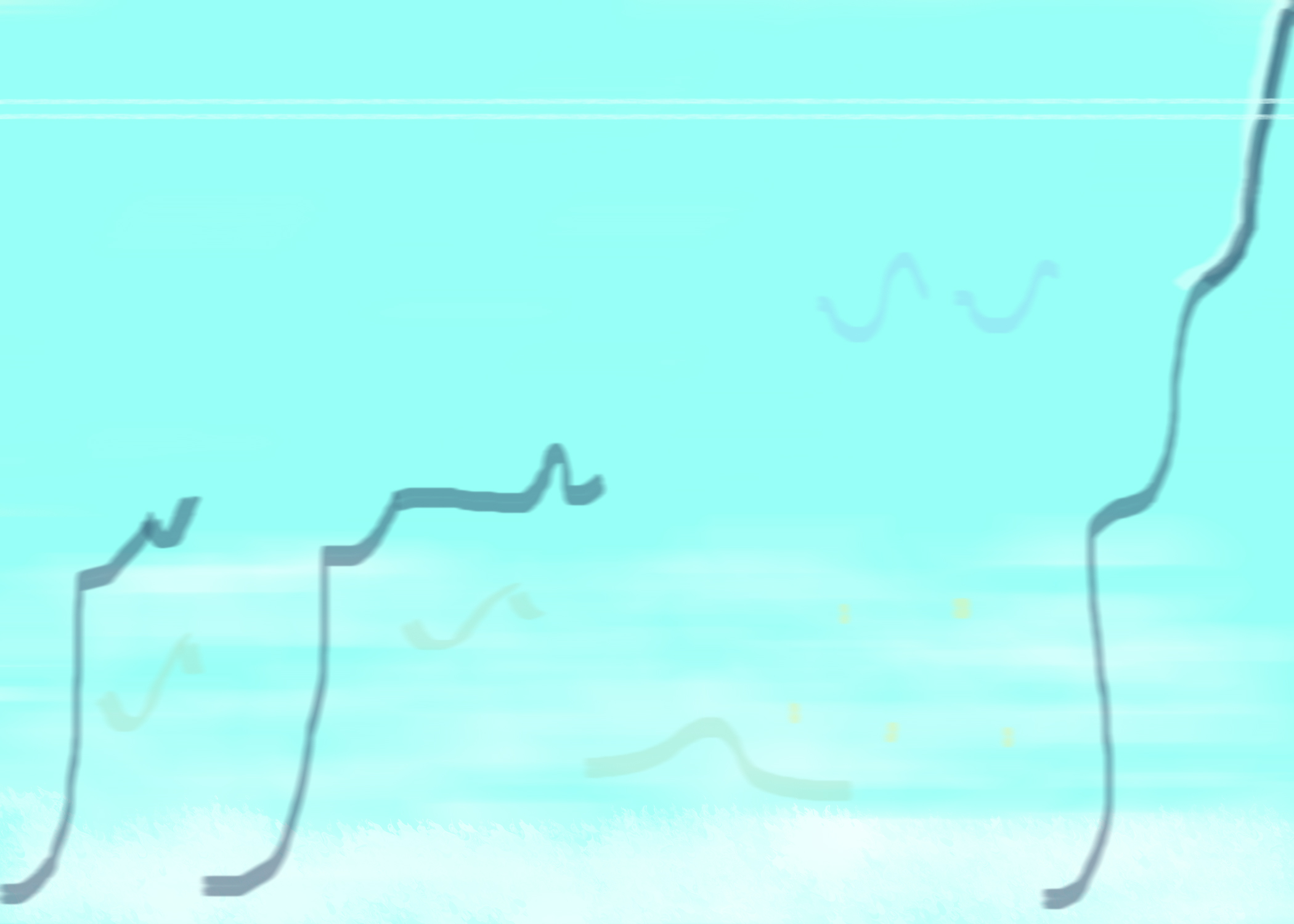
Dawn is a very liquid part of the piece, when the background seems to flow and blend as it the cello solo glides above it with the melody.  Everything blends together  in a misty dream-like state, and I really wanted to capture that in my piece. I selected all cool colors because the piece feels very watery and fluid, and the shades of blue have a calming effect.  The cello solo is represented as an unbroken line that dips and travels in an upward direction out of the frame. This represents the cursive feeling of the solo and how it leads up and out of this part of the piece. The  undulating shapes at the bottom represent the background orchestra.  I feel that they are always reaching upward towards the floating solo, and their melody ebbs and flows like water. The supporting melody is composed of many different  separate parts that layer over each other, so I felt that the blue and purple shapes should also overlap and blend together like the supporting melody does.


Dawn

0

Storm: 

Storm is much more chaotic and deep than dawn, so I created  a dark swirling background to pull the viewer in. The melody as a white line is also drawn into the vortex and represents the falling violin phrase that repeats almost throughout the entire section. This is contrasted with the brass line, which is represented as the rising and falling  purple line. While in a much lower register, the brass dominate, and provide a frame for a very strong beat, which is represented by the light blue. The colors are in sharp contrast to represent their presence in the melody and the cacophony present in the piece.


Storm

0

Ranz des Vaches:

Meant to signify the calm after the storm, this part of the overture is very light and airy and features a duet between english horn and flute. This part feels very warm and fluff, so the background is a mixture of light pinks and purples to create a soft environment.  The duet is represented by the two interweaving lines, the melody, again in white, and the complementing flute in pink. Underneath is the pizzicato of the violins, represented as bubbles as they follow the winding paths of the melody. The melody flows along the bottom, since this is the softest and subtlest part of the overture.

Daybreak

0

Finale(March of the Swiss Soldiers):

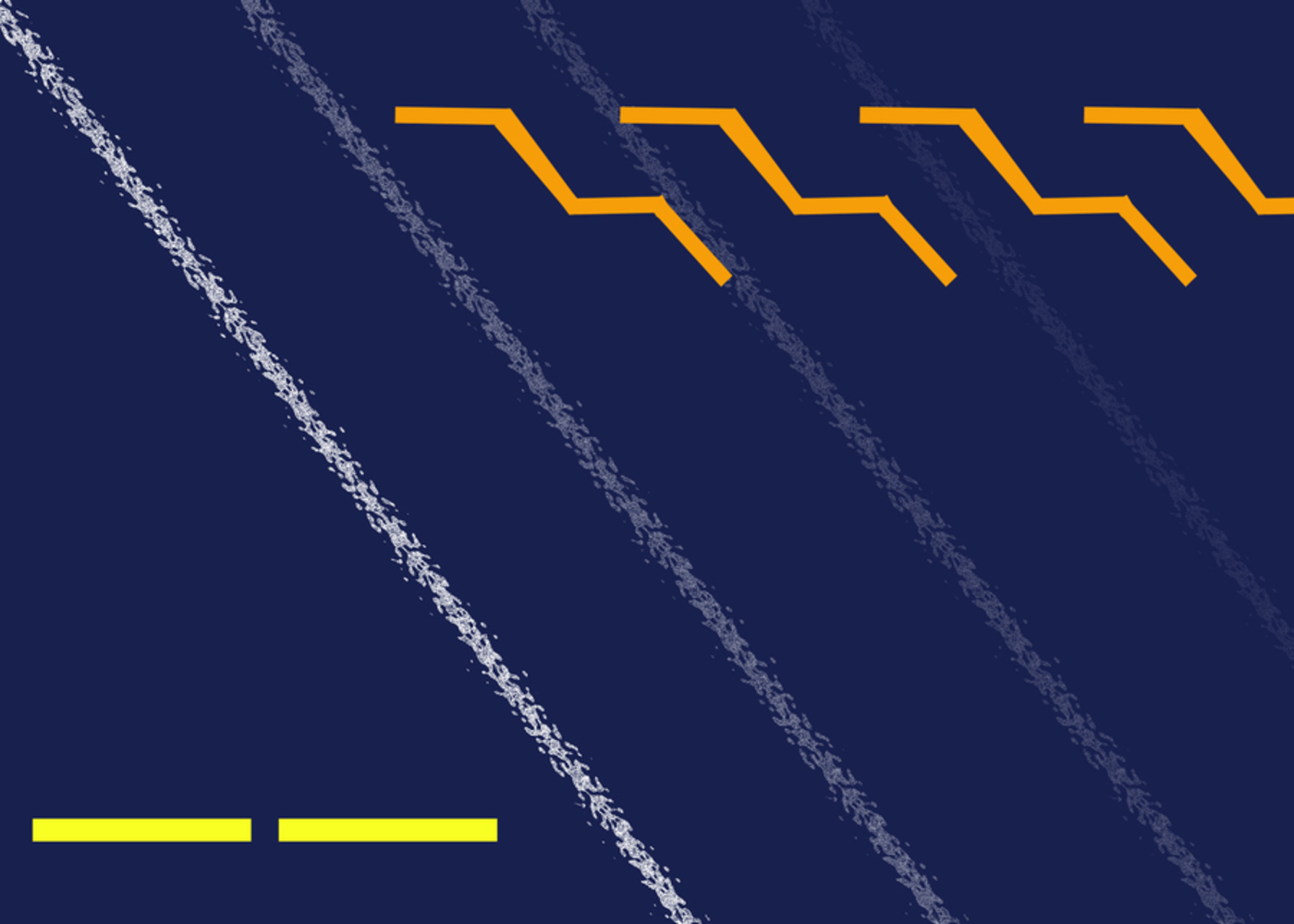
The finale is the most iconic part of the overture, and also the most lively. The white line represents the melody and travels upward to reach the end to the piece.  Since there is lots of movement and the tempo increases during the finale, I chose to represent the beat as strong vertical black lines getting closer together as the eye progresses from left to right. The brass in this section push the piece to its conclusion, represented by the blue triangles. In the last few bars, the entire orchestra comes together, represented by the blue bars, and finally a completely white section, representing the melody being played by the entire ensemble.

March

0

Curatorial statement:

The William Tell Overture, by Gioachino Rossini, was first premiered in 1829 for the opera William Tell. It consists of four parts; Prelude(Dawn), Storm, Ranz des vaches, and Finale(March of the Swiss Soldiers). It is intended to describe life in the Swiss Alps, and give a brief introduction to the opera's setting.  The overture has been described as a symphony in four parts, but unlike a normal symphony, where the movements are separated, the overture's four parts are played without a break. 
This piece looks at the four different 'movements' of the overture, and presents a visual representation for each of the different sections. In each, the unique personality of the movement is reflected in the shapes and colors used. 

0

Account of the process:

I enjoyed Kandinsky's work Several Circles, and was inspired to try and use a similar style in my pieces.  Above each piece I have included some information about what into the composition of that particular part, but here I will talk a little bit more about the set as a whole.  I had originally intended on creating one piece, but as I worked more and more on the project I realized how distinct each movements is, and felt that each should have its own representation. Then, my challenge was finding a way to show how well they are combined together, since Rosinni's transitional phrases are very subtle and clean. I struggled with this for a long time, and a lot of my feedback involved finding a way to show that even though they weren't completely the same they each are a part of the greater whole. I felt that since white was the combination of all colors(in light), it also could represent the combination of all the different moods in the overture.  I also felt that it was mutable enough to be incorporated into all the different pieces in its own way. While each movement has its own feel to the melody, they are all interconnected and flow together to create a cohesive whole, which I felt was very important. Overall, the movements rise from left to right, to represent how the overture builds upon itself to reach its dramatic conclusion.


I went through lots of changes during this project, and at various points there have been lots of different versions on gallery (in case you look at comments and feel like they have no connection to what is now shown). This feedback really helped reign in some of my wilder decisions and made my style a little more consistent from movement to movement. I now wish I had kept the original few concepts, but I saved over them and I am not sure I want to look at them again. The two drafts I showed in recitation on Friday for the Prelude and storm are at the bottom, and I am really glad I made changes to them. The feedback I received was very helpful and helped me change the way I thought about the project as a whole.

0

Reflection:

I don't think my piece is successful in expressing the intended feeling. I think the actual overture has a lot more depth and is much better connected than I was able to convey.  I think each individual movement is to disassociated from the others, and it does not make for a cohesive piece. I think I changed too many variables to tie them together. Perhaps if I kept all the backgrounds the same and only changed shapes and positioning, that might have created a more connected feeling. Individually, I like each of the pieces on their own. I think I might have done a better idea of considering each feeling separately, and since I created them separately that might be why it was so hard to integrate them into a single piece.  I like the way my eye travels over the piece though, and I think its at least visually interesting.I really wish I had more time to work on this, because I really enjoyed the project, but felt that I couldn't iterate to a solution I was happy with without a little more time.  


Before this class I probably would have assumed that this was something involving the seasons and kind of stare blankly at it.  I would have liked the colors though, and could probably have found something good to say about it for the sake of politeness. I have learned to consider the way things make me feel more, and how choices were made deliberately to create a feeling.  Before, I would have assumed the artist randomly added whatever they felt like.  Now I understand the intentionality that goes into making a piece of work. I used to only consider what something looked like, and now I have begun to think of what it could represent.

x