About
Create a composition (audio or visual) that is based on data, presents a forceful perspective, but lies really well.
Share this Pool


Discussion 64
-
The Cheese of Truth: Cherrypicking just some of the things
 Roger Liu
I really liked how you took a creative approach towards this project. The abstract really made me laugh, and I think it followed up really well into the subsequent data visualizations that you did. Having seen the abstract, I really wish that you made a product that was done entirely in that style, but on the whole I think you did a good job highlighting the absurdity of the claim with your data visualization
-
Obesity and technology
 brandonx
I actually did a very similar project to this, relating incidences of cancer to number of immigrants, sorted by State in the US. Very cool project. I think it was interesting how instead of how I was trying to prove a falsehood, you were instead trying to paint truth as false. I do think though that your method is a bit less striking, because most people won't think much when they are told there is no correlation between two quantities, even if there actually is.
-
Justice Frimpong - Lying With Data
brandonxInteresting project, pretty aesthetically pleasing. However, I wasn't entirely clear on what exactly the lie was. Was it that new Facebook friends aren't the best metric of measuring social behavior? What was the distortion in the Donut chart? Simply that the exploded view causes one to misjudge the relationships between the quantities? I also wasn't entirely sure what the idea behind changing the width of the bar graph was. Was it just to make it seem as if there was more of a difference between year 1 and year 6?
-
Eat More Dessert
 Jessica Liu
You've made a legit lie. When I first see your graph I'm pretty shock by the amount of sugar in fruit rather than in candies, although at a second glance I noticed you didn't mention what amount of food are you considering in each bar. I really like and agree with your claim that people tend to consider sugar simple an unhealthy part of food.
-
University Statistics
 Ricardo Tucker
I think that this project does a good job of highlighting a mistake that is quite common when people look over data statistics. Data can very easily be taken out of context to come up with fake conclusions, which is exactly what your project does. Because of this, many "official" sources (like Fox, for example) can misuse statistics in ways like this to make claims that perhaps are not necessarily true. Your project might be simple, but I think it drives the point home clearly enough. Good job!
-
Best-Selling Video Game Genres
Ricardo TuckerI'm not sure if this is because the particular genres happened to sell around the same amount of copies of games, but some of the genres seemed to have very similar levels of applause and it was a little hard to distinguish which one actually had a higher number. I would imagine this is more a weakness of representing data through audio rather than something wrong with your project. I liked the idea behind the project though, good job!
-
Who's Better for the Economy?
 Cloud Tian
Well... The bar chart is clear enough to see the data and the comparison between those bars. The lying part, however, is something I can't see. I don't quite understand what you are lying about the data because the way you are presenting the data is not misleading. And... I think there is a more creative way to present your data and make the presentation more interesting.
-
"CMU is Very Diverse"
 Katherine Martinez
Your graphic is definitely very misleading. It took me quite a while to figure out which parts of it were actually lying. If you're already playing with the circle dimensions relative to percentage, why not make the native/Pacific islander circles more visible? Also, the sneaky choice to ignore those who did not list their race made the graphic a bit stronger I think - it really added to the sense that the viewer was seeing a full representation of CMU. Loving the relevant topic and strong visual execution.
-
Myers Briggs
Katherine MartinezI think your decision to use bar graphs to represent Meyer Briggs distribution was a great idea. Im not so sure how I feel about the complete lack of numbers on the graph as its so vauge that it almost feels like clear misleading? I also wasn't terribly struck by the bars heights. I think playing with y-axis representation might have been a good way to combat that. Visually, your graphic is very appealing though! Solid project.
-
Nutrition Facts
 Christine Lee
Nice catch about the scaled number of calories actually making McDonalds worse than Burger King! I didn't even notice until you pointed it out. I think overlapping circles was fine because you kept them all consistent with each other (locations were exactly the same for the two sides). I think something to think about would be just making the graphics seem as though they would actually appear in an article comparing the two fast food chains. But other than that, it was a really believable graph. Great job!
-
"CMU is Very Diverse"
Christine LeeYou had me fooled that CMU is actually more diverse than it actually is. I feel like there are a lot of moral dilemmas that come from skewing graphs, which I think you kinda went through when you were deciding how big you wanted to make the little bubble. I thought it was a good lie, so I'm not sure what exactly I would change other than perhaps making it seem like something you would actually put into a CMU brochure you would hand to prospective students in the future. Pretty enough to catch their eye, skewed enough to make it believable.
-
FCE (Faulty Course Evaluation)
 Henri
HenriHahah I really like the addition of the increasingly not-smiley smiley. And of course, extrapolation is always funny. The project especially interested me because I too was feeling frustrated about the disconnect between units of a course and the actual amount of time/difficulty of the course, making the recent bout of schedule planning rather annoying. I also like the zooming out feature as the extrapolation grows. Cool!
-
University Statistics
HenriI agree that maybe a bit more subtlety with the 100% acceptance rate would've been good, but otherwise I think the intention is pretty clear. You already told me about your idea so I don't have much more to say. Nice use of the 3D, don't know if you could've exaggerated it more, although actually I'm not sure why you've want to exaggerate it anyways since the intention isn't really to make one university appear more or less likely to accept an applicant.
-
Data and Reality
 Fred Qiao
The music is very beautiful and I really enjoy it. Also, the data you present quite follow the truth and obviously, your intention is not to fool the viewers but to give them truthful data. It is quite clear that you did it. For me, I am just a little bit confused why you are choosing the music associated with data. I think you might want to make your intention clearer. The other documentations are great! I saw your notes, data analysis... Such a nice work! If I were you, I would not focus on presenting data in a truthful way. Instead, I will try to lie to the viewers and use more beautiful and complicated chart. Also, I would make the intention more clear.
Great work! -
Graduate with Scottie
 Lucy Tan
I think the charts are a fun concept! Unfortunately, the backgrounds appear to be black for me, and I cannot see any black dogs at all, which doesn't seem intentional according to your documentation. I don't think the graphs were particularly misleading, since they were presented in a disjoint manner, so I didn't really think about how each group related to the whole. If I had to make revisions, I'd probably begin by grouping the different ethnic groups more closely together. Perhaps placing them all into one grid, with each group placed in a square exactly the same size as others. The grid would be intended to represent the entire population of the school, and since each group has the same amount of screen real-estate, it would give the illusion that the minority groups are larger than they actually are.
-
BTS: Billboard Ranking vs. YouTube views
Fred QiaoI think you did a great job here. The data representation is very misleading and confused me a lot. Also, the idea to add photos of real people is very brilliant and the chart is very beautiful. What I am thinking about is that if you can have a more complicated data, instead of a single line, the whole chart might be more convincing and look more beautiful. A single line might not be enough to represent your whole data set and a single color is a little bit boring to viewers. However, I really love your represnetation. If I were you, I would add more lines and charts in this visualization.
-
"CMU is Very Diverse"
 Dominic Liu
You did a good job making something that was misleading and visually appealing. I can definitely imagine myself glancing over your image and thinking CMU was much more diverse than it actually is. I wasn’t really sure what “multiracial majority” and “multiracial minority” meant, but I don’t really know what you could do to clarify that. Other than that, there aren’t any noticeable improvements I can think of.
-
BTS: Billboard Ranking vs. YouTube views
Dominic LiuI thought your topic was pretty interesting, since misleading data representations could very effectively mislead someone unfamiliar with the k-pop scene like me. Still, there are some improvements that could be made, many of which you mention in your reflection. I wasn’t sure what the connection was between the variables you used, and I actually completely missed the point of the band members around each point. Maybe you could find different, more correlated statistics to look at, which would allow you to manipulate the data to present a more convincing misrepresentation.
-
Secret Underground Weather Machine
Lucy TanI'm personally completely on board with this myth. The times I've hosted a student have seemed to be nicer than most other days, and when I came to visit myself as a senior in high school, the weather was remarkably pleasant, especially compared to the other schools I visited. I like how the graph looks, though it's a bit confusing. It was hard to understand what you were trying to convey based on the graph alone. If I had to make revisions, I'd begin by clearly label which days were sleeping bag weekends and which were not. Perhaps providing a color key directly on the graph itself would facilitate this.
-
Studying > Sleep when it comes to GPA
 Judy Mai
Good job! Your documentation is clean and your graph definitely shows skewed data in a clear way while still being "accurate." Your project highlights how important it is to consider the size of the data set and that one high schooler within 31 people makes a huge difference in the results. It's good that you compared all of the data and isolated the few key points, GPA, sleep and studying, to emphasize your intention, and even more shocking that sleep has no effect (according to your data at least).
-
Less is More Better
Judy MaiWow, it's really curious how you managed to do this! The sheer amount of views alone is shocking. There was just so much data manipulations with the page and the HTML/CSS that I was just genuinely confused because it was fake "real" data.
To improve your project, I think you need a little bit more documentation as said in the outlines with regards to Context and Process, but great job on your Intention and Product! -
Auditory Data
 Marie Shaw
I think it was done well in that just like you said, it was hard to tell what the differences in sounds were so I had to listen to what you said and I just accepted that as the truth. I think if you had some sort of opinion or viewpoint that you said the data backed it would have been more interesting and impactful.
-
Currency Rates
Marie ShawI think the graph conveys the message that there was a crash in currency rate (larger than there actually was) very well. However, although I got that you wanted to do something that related to your life for the project, I couldn't really figure out the intention behind wanting people to think that the currency rate dropped a lot. Other than that, I think your project is really well thought out and your graph has a strong visual impact.
-
Mortality and Lies
 eir
eirI liked your use of the circle graphics to represent your data; as you said, the circles can be very misleading, especially when they express straight up numbers instead of percentages. That said, in your product section that a lot of varying data and I was confused at what was the "main" product. I think you could have focuses on one of them and then had the others as examples or be somewhat more related to the "main" topic.
-
Eat More Dessert
eirI really liked the representation of your graph. When I first saw it I did question to what extent were you measuring the sugar in the volume (per serving size? per volume? etc.) but at a glance it does make it it seem that fruit on average has a higher sugar content. If I was revising this myself, I'd probably looking for a specific dimension that fruit has more sugar than candies in, to make the data more convincing.
-
University Statistics
mzhong1I thought this was a very clever graphic. By taking the actual statistics from universities and manipulating them properly, you were able to show how the data given by universities actually gives a false impression that given 10 applications from one person to 10 universities, at least one would accept them. I think it was a very subtle and clever means of manipulating the information, though I agree with Ming that your intentions were not quite so clear until you read the documentation, but that was rather the point I think -to hide the fact that university acceptance isn't all it seems and the data given by universities is biased via careful manipulation. I think if I were to change your project I would change the title in your chart so it doesn't have the = 100%. It's much more subtle when you don't slap in people's faces that the data implies that acceptance is 100%, unless that was what you were aiming for.
-
Should State Sizes be Reduced for Energy Efficiency?
NathanInteresting chart! I would have loved to see some labels on the outlying states just for points of reference -- it seemed a little weird how all the states were jumbled together (and I don't think that it would have taken away from the overall effect). While the effect itself is very apparent, I didn't quite understand your explanation (and it might just be because I haven't taken a statistics class); how does per-capita reporting skew higher as the population taken into consideration gets smaller? I would assume that it would vary more, but not always get higher...
-
Mortality and Lies
NathanDon't be disappointed with the outcome of this project at all! I think that you hit the nail on the head, even if you didn't get fancy animations like you might want; your circle graphs are very convincing and worrying. Without the hard numbers presented, as you said, you managed to make it seem like a lot more people are dying than actually are. It looks good!
-
UP TO 70% OFF !
 Everi
EveriI like the topic you chose to focus on because it is something we can all relate to. I'm sure we've all seen ads similar to the one you were emailed. However, I feel that your graphic actually exposes a lie rather than creates a lie. Perhaps if you only included the items that were actually 70% off or more you could convince customers that they were receiving great deals. This is something I did for my project on making sweets look healthier than fruits, and I think it worked out well. Choosing to use only pieces of the dataset conveys a lie while still using actual datapoints.
-
Secret Underground Weather Machine
 Aliya Blackwood
I do like the design of your graph. Although I am a little confused as to how to read the graph. I understand that it is supposed to be misleading, but I am still not sure how to read the story properly. A bit more detail in documentation would also be helpful.
The concept was very interesting and fun
-
uh, i think that's called...sleeping
mzhong1I thought this was a really amusing and creative graphic! The relation to confirmational bias is a great one, and someting I didn't really think that much about. I agree with Sarah that a way of improving this piece would be the make the increments of hours smaller to appear more realistic, which would then be extrapolated upwards until it hits an absurd curve. Also, maybe keeping the font uniform, because that just gets a little confusing to look at, and also slightly jarring, which I think draws attention away from the data being presented and the rest of the graphic
-
The Politics of Cancer
EveriI like how you combined two really unrelated subjects to create your lie. It shows how an official looking graphic can suggest something about data even though no correlation actually exists. I assume this is one way Fox convinces viewers of something- as a well known media source, viewers most likely just believe whatever they see because it looks so official. In fact, that's something we should all be aware of in a society when anyone can easily put official-looking information online.
If you wanted to make the "correlation" more believable, you could choose which states to include to emphasize your lie. Of course, this is not an honest thing to do, but it would create a better trend without making up data points! The map at https://wiredcraft.com/blog/data-visualization-mapping/ did something like that when they leave Hawaii, Alaska, and D.C. off the map.
-
Less is More Better
 sxv
sxvI am genuinely intrigued by this project. I look forward to the inevitable explanation we get tomorrow!
-
Currency Rates
 Jonathan Merrin
Hey,
I like the bounds on the graph! It gives it the illusion of a HUGE crash, though the percent change is tiny.
Good job, overall. I was duly alarmed when I saw the graph, and can imagine this spreading panic. Way to go!
-
Same-Sex Couples in the US
Jonathan MerrinHi Lucy!
I like the way you decided to read the data. It was a nice way to misrepresent absolutely true data in a way that will mislead and frighten those who are not comfortable with same-sex marriage. The almost linear progression makes it seem like there's some kind of contemporary cause for it, or else a lack of resistance.
Keeping Fox News in mind, yeah, I think they would use something like this.
Great job!
-
yijingc--Assignment 9
 Yijing Chen
You two bring up very valid suggestions for ways to improve the data visualization. Given more time and energy, I could make such improvements. There is a hacky, glitchy way of making every year easily visitable, though!
In the JavaScript code, replace these lines:
.on("change", function()
{
label.text("Year: " + this.value);
update();
})
;
With:
.on("input", function()
{
label.text("Year: " + this.value);
update();
})
;
This change makes the graph change every time the slider moves, rather than every time you release the mouse. You can drag the slider and see the years fly by, or you can use the arrow keys or page-up/page-down/home/end to increment the slider year-by-year! I say that this change is glitchy because the animation stutters if you change years faster than the animation runs. -
FCE (Faulty Course Evaluation)
 Nazli
NazliGreat project! I think this was a great idea. I really would've loved to see your first idea about how the units and the hours actually spent correspond but I don't know how the distortion would be in that case. I like your current project a lot! I especially like the face being upset as time passes, I think that has a huge impact on people viewing. Seeing two graphs and their axis and figuring out what the slope means is much more difficult than just looking at the face in the middle of the screen and understanding it gets sadder. So the face keeps the attention to itself, possibly making people miss details on the graphs and putting a judgement in people's mind about the graphs before looking at them.
-
Secret Underground Weather Machine
Yijing ChenHey, don't feel too bad about this assignment. In a way, the poorer the data is presented, the more it fits the assignment's intentions! I can take it as Poe's Law that the bar chart depicts data poorly. There is no shame in using Excel for data visualization--I didn't even know that Excel could do 3-D bar charts with that aesthetic!
I think any criticisms I might have you would have acknowledged already, and I hope I'm not drilling them in too much.
• Even if the data presented is twisted, a title and axes labels may be helpful for understanding the image, without the context of the documentation.
• I'm curious about where you got your weather data and how you twisted it? Documenting that would be informative.
I do agree that your choice of statistic to show is remarkably creative, so I give you kudos for that. :) -
Myers Briggs
Aliya BlackwoodYour project is very interesting and I like your idea of using the qualitative Meyers Briggs as a topic for data. It would have been easier to understand with visual aids such as your cover photo used in the post so that we could understand it better.
-
Mislead to Discredit Game Design
swilhelmI agree, that this is a unique format, and that it's a very convincing argument. I liked the graph in the reflection, it was definitely the quickest to digest. More graphs like that would definitely add to the immediate visualization of the data. A good next step would be if you added a fake "trend" in the data as shown on a graph.
Very thorough analysis, well done. -
Professor evaluation
Rachel GuI really liked this project. I like the use of size of the triangles as well as the spinning motion. The visual aspect really draws away the viewers attention from the actual data. The only thing that I would change is that sometimes the triangles would go into the professors' names. This is a small detail, but it did start bugging me at the end. Other than that, everything looks great :)
-
Global warming is a lie
Rachel GuI like your use of the double negative on the Y-axis, as it makes the visualization very misleading. I agree with your conclusion that your product turned out really well, and the only thing I might consider changing would be the gradient. It seems that you have a gradient on the entire graph, not just the line, from top to bottom, but the gradient on the line goes from left to right. I think you could make the gradient on the line also top to bottom, though I'm not sure how you added the gradient, and the orientation of the line will still make it a left to right gradient. The only difference is in the small valleys and peaks in the graph, the color would better represent the temperature, that is, the valley would be bluer than both of the mountain peaks next to it.
-
Professor evaluation
swilhelmThis project is really well done! Definitely the data lies really convincingly. I especially like that you included courses that the professors do not teach. One thing you could do to improve this project going forward is labeling the triangles. It was a little confusing for me to decipher what they stood for. I think one of the important things about visualization is that it presents the data immediately. The visualization looks really nice!
-
Secret Underground Weather Machine
NazliHi! I have been a host for sleeping bag weekends for every weekend last year and I can confirm that it is just as you said: The weather is always nice when the prospective students are over. I think it's well done that you showed the days right before and right after the days of sleeping bag weekend. This makes it easier to understand how much of a change there is. And from the results, I would say your theory is true! I really like your idea, it's very original. Great project!
-
CMUWS Lineup Statistics
ashleyleHello!
I'm really impressed that you decided to code your own data visualization instead of using online resources that would do it for you. However, it does make the graphs seem a bit basic. While I do like the minimalist vibe, it does seem a little Comic Sans-esque with the big, cheesy titles and primary shapes/colors, so perhaps you could select a different color palette and font. Other than the aesthetic considerations, I think that your intention was executed very well, and I really appreciate that you added reference graphs of what the data actually looks like without bias.
-
Myers Briggs
ashleyleHello!
The concept behind your project is really cool, and really lends itself to our human tendency to buy into statistics/surveys that reveal something about ourselves (horoscopes, anyone?).I think providing some background on what Myers-Briggs is would be really valuable, however. Your graph also clearly shows distortion, but I'm not sure that your message was really clearly displayed, since the majority of the personalities seemed to dwell around the middle.
-
CMU weather
 Kaalen Kirrene
So first what exactly does it mean by school days? I do not actually know what the numbers mean within the Scottie dog. Also did you account for summer school? Finally isn't precipitation rain and I feel like rain makes it a bad day. If i were to change anything about your project I would have a better explanation of what the data actually is. Also maybe rethink including precipitation
-
CMUWS Lineup Statistics
Kaalen KirreneI really liked you project as it really captured the idea of misleading data. You probably could have even made the circles actually to scale and it would still have made the sophomores seem impressive. In terms of aesthetic I would maybe have chose a more graphically pleasing way to represent the data as it is not all that interesting to look at. Maybe add a background and have a legend with interesting fonts or something.
-
Should State Sizes be Reduced for Energy Efficiency?
jfrimponI feel like the graph along with the documentation hit the nail right on the head. It does a very good job of showcasing your point and exposing a problem. I would've liked to see the visuals a bit more 'beautiful' though, maybe through the use of an online tool like amcharts.com?
-
"CMU is Very Diverse"
Roger LiuThe "misleading point" which you were trying to communicate was done really well, and it really made the distribution of students seem more diverse than it really was. Even though the percentages differed by a lot, the large text sizes and the use of circles really obscured how lopsided the diversity actually was. I don't know if there is anything I would specifically do to revise this work, but I wonder if surrounding the smaller spheres with the larger spheres would be better suited to convey a false impression of diversity.
-
Mislead to Discredit Game Design
Roger LiuI think that your project did a good job at illustrating how intentionally mis-representing data can lead to misleading conclusions. The Super Smash Bros melee community did a similar thing when looking at the results for the EVO fighting game tournament https://www.reddit.com/r/SSBM/comments/3dr5vb/character_distribution_in_top_32_of_evo_2015/.
If I were to make a revision to the work, I'd introduce more graphical elements, as it both would heighten the point I was trying to make while obscuring more data. That said, I really like the format of this study, where you "make" a convincing argument in the post.
-
The Cheese of Truth: Cherrypicking just some of the things
jfrimponI like how you continued off of your previous project, especially because Donald Trump was the subject. Obviously immigrants causing cancer is an outrageous statement, but I actually might believe it if it were stated on Fox because...it's real data right? Your play on the whole matter does poke a lot of fun on the subject.
I agree though that the visuals were not as aesthetically pleasing as others, but I personally feel that the outcome heavily depends on how much exposure/experience one has had with these tools. Next time, maybe you can try out something like amcharts.com?
-
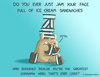
uh, i think that's called...sleeping
Sarah BienI really like your angle and humor on using extrapolation to distort the data. Also, I agree with your reflection that it does take some deliberate and skilled Fox News effort to lie to viewers using data. I think some steps you can take to further your piece would be to take even more data points to make your graph even more "realistic". Something like slept 3hrs, 3.1, 3.2, 3.3......5.5hrs that gives the illusion of a lot of time and increase, but it really is only a max difference of two hours.
-
yijingc--Assignment 9
Sarah BienI like your project and especially how you allowed the viewer to interact with the data visualizer. We both utilized the misleading element of the donut graph representing percentages that seem to take from the same 100%. I think some things you could improve on would be to make it a little easier to select certain year ranges so the effect could be much stronger. In addition, maybe including percentages of the federal budget for other sectors of the government to further mystify the viewer.
-
Less is More Better
 Jeffrey Bradley
I don't like being manipulated, thank you very much. However, you definitely drove the point home. It is easy to manipulate data by lying or, in this case, by force. I am interested in how you caused all that to happen on the page, especially the forced applause. However, it's probably some coding stuff and that's beyond me.
-
Nutrition Facts
Cloud TianThis is quite an interesting idea to use the radius of circle to present the data. The whole graph is beautiful as you use a lot of color and randomly place them in the space. Also, your form of representation gives me an incorrect understanding from the first sight(for example, the brown circle of 3 and green circle of 75 on the lefthand-side).
Also, I was wondering why you are overlapping those circles. If I were you, I would arrange them in order or place them in a misleading way or form a beautiful pattern.
But, overall you did a great job and I like your graphic! -
Eat More Dessert
Jeffrey BradleyYou seem to have put a great deal of thought into crafting your lies, taking those rules of data representation into account and deliberately violating them. As a result, your outcome convincingly and "honestly" conveys misleading data. I wonder if you could have gone even further, taking serving size into account and showing a square millimeter compared to entire fruits. That may have been too much. Regardless, I feel you did well creating your work.
-
yijingc--Assignment 9
 Mingquan Chen
This is an interesting project. The ways you twisted are both implicit and explicit. I saw how the angle and the radius changed, but since it was a gradual change, I didn't expect the area changed so quick. When explicit things and implicit things are put together, it is more difficult for people to get the implicit parts. That is quite cool. Maybe you can consider these ways to improve audience experience:
1. Since you put a long time period into your data sheet, it was really hard for me to select every single year. Maybe you can create a button to go to the next year instead of letting audience keep clicking. Also, they may miss some important parts (like how the circle gets larger) if they don't click really carefully.
2. I think you can put 2 graphs in your project. The first one is only graph, but the second one is a graph with data (your current one). Audience can guess how much NASA spent every year, and then find out the truth (which may be surprisingly different, as your graph is misleading enough!) If people know the data, they may not care about the graph too much, or cannot notice the subtle difference.
In general, it seems that you know how to lie very well! It is really a cool project!
-
University Statistics
Mingquan ChenThis is a wonderful idea of showing illusion (or lie)! Because as the stats show, if someone applies for more than 10 universities, no matter how selective they are, he will get into at least one, which is not the truth. (I know a student who got rejected by all since all he applied are highly-selective universities) But to be honest, I did not really understand your intention until I saw your documentation. I was quite confused by the donut charts and the way it could be deepen or adjusted ( just like only a toy..) Some improvements can be made about the graph itself, because it is not intuitive enough. I didn't notice what the percentages represent and why you combined them in a donut chart at the beginning. But the idea is awesome. I like it.
-
University Statistics
Sarah BienThank you for your response! I'll definitely look into those points you mentioned. I had some difficulty really articulating my motivation, and I'll try using the 3-D element to heighten the effect. :)
-
University Statistics
Yijing ChenWe seem to be on the same wavelength for using donut charts to imply percentages where there shouldn't be! :)
There are two parts of this project I thought could be improved (at the time of this writing, these projects aren't final, so there's still that chance):
• Given that you're using a donut chart with a faux-3D element, you could have gone into detail about how misleading 3D pie charts can be. The Codepen example you gave allows you to adjust the angle and depth of the chart, so it can make slices look proportionately smaller or larger, which can be further misleading. Maybe it gives the impression that Stanford accepts more people than Yale because the bottom of its sector is larger. I referenced this page on 3-D charts in my writeup, and I thought it might be useful to explain a source of misinformation.
• I feel that your intent goes the opposite way of what you say is your product. You create the impression that there is an overall 100% chance of getting accepted by one of the listed universities, which seems the opposite of being selective and stressful. If I looked at the graph alone without the documentation, I would not have discerned your intention. -
-
Less is More Better
Christine LeeBruh, I am so confused. How the heck did you make it so that anyone who clicks your page automatically applauds you. Your project is crazy.
uh, i think that's called...sleeping
I thought the data set you chose to extrapolate was well chosen and humorous, and I really liked the various graphical elements you used to highlight how you extrapolated the data. The piece was clean and cohesive, and presented very nicely. I personally would have liked to see some motion in the piece, but barring that I think that everything was done excellently.