About
Beg, borrow or steal to make a work of art from which you think you could make money.
Share this Pool


Discussion 70
-
An Endless Battle
 Kaalen Kirrene
Digimon is better. More popular because the games were better but in terms of story digimon blew pokemon out of the water.
-
I am Dr. Frankenstein and Photoshop is my operating table
 Fred Qiao
I really like your idea to choose the target audience first because it's better for marketing. And this is a truly commercial art. I also think your photoshop skill is very cool and final product is very nice. The thing is that I don't think know what kind of thing you are specifically marketing. If you can do some true marketing after you make your product and see what's going on later, I think it will make a better project.
-
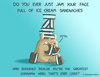
GAMERSKY
Fred QiaoI really love the idea that you use game boxes. Also, the hanging part seems very fun. I can tell you spent lots of time figuring out what to do this for this project. I think both your form and presentation capture Andy's idea. I also really love your reflection, with which I have similar feelings. I also think the copying is art just in some particular sense. I also think your documentation is clear and nice.
-
jalouie - beg,borrow,steal
 mmzucker
I agree with you that the color choices in your final product could have been chosen better to look more pop-art, but I think you did a really good job of synthesizing two distinct artistic styles into one.
-
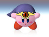
Super Yayoi
 Katherine Martinez
This project is such a cute idea! I'm a big fan of Kusama's work, and it's cool to see pop art and gaming get mashed up. I don't think it matters so much that your player sprite doesn't look exactly like her, since low-res pixel art never really clearly looks like anyone. Given the context that this is "Super Yayoi", I think the intent about the character comes across. I thought the use of "Mushrooms" was a great choice and really ties together the theme. I would probably suggest making the dots a little big more prominent and also probably hand drawn? I feel like one of the interesting parts about her work is that the dots aren't really perfectly gridded, they're all different sizes and a little bit chaotic. I also probably would suggest more dots on things, but I'm not sure how crazy the visuals could theoretically get before the game loses playability. In any case, like Rachel said, this would make a cute mod for Mario and would totally be marketable. Great job!
-
Watch Me Watch You
 Janine Louie
The piece looks really great and is something that I can definitely imagine seeing somewhere. I think you really did capture the idea you were going with as the piece reminds me of how many cameras there are hidden in plain sight all around. I think the idea to put it in a flower field instead of a vase was a good idea because to me it comments more on the prevalence of cameras if the cameras are hidden among a flower field. I think my only comment would be that while I like the idea of using different cameras I think the piece would look more cohesive had the third camera been the same as the first two. To me the first two cameras blend in better with the type of flower you chose. Also I think to get the right corner busier you should try and repaint the right corner flowers into a darker color and then threshold since Photoshop turns yellow and white into white.
-
Falling from the Sky
Katherine MartinezThis is a really cool project! Great job thinking out of the box, I was definitely impressed. Appreciated the research you put into it, as well as using the drone to take pics. The only criticism I would have is that I'm not sure how you would sell this? maybe paying for admission to see the project. However you might decide to market it, you did an awesome job creating an interesting project.
-
Snowden
Janine LouieI really liked how you incorporated street art and pop art together. I think the final piece actually looks nice and like Paola said above that it has a sense of pixel-ation that you would see in an old television or computer which I find really fitting. My only suggestion would be that Pop Art tends to be more colorful but I can see how the three tones of colors fit well into the pixel vibe.
-
Falling from the Sky
 ashleyle
Your project is really impressive! The amount of research and effort you put into creating the intended effect really shines through. I'm not sure if I would make the connection between the fallen silhouette and "Walking to the Sky," however, so perhaps some additional considerations with placing the silhouette or maybe reconsidering your representation of a "fall from grace" (another silhouette at the top? Hanging from the top of the pole (perhaps too morbid)?) would rectify this issue. However, that does not retract at all from the fact that the message is clear and probably resonates strongly with your target audience.
-
He Can Do It (In One Punch)
ashleyleAs usual, your artwork is really refined, and the composition is very true to (both) original(s). I don't really know the character either, but your description still makes the image intention pretty clear. Overall, the premise of your entire project really reflects your sarcastic wit, and you did a great job fulfilling the purpose of the assignment.
-
American Profpic
 Judy Mai
I love how you threw in a modern twist to this old work. Both are nearly identical, except with just this one switch that completely changes the atmosphere and meaning of the painting. I particularly liked your critique where you pointed out that in the past, people valued hard work, whereas now people focus more on their appearance. I am curious to know what this could've looked like had you had more time to modernize it. What clothing would they be wearing? Women of the modern day show noticeably more skin compared to before, which would raise another modern change. As the other comments mentioned, the orientation of the "selfie-stick" is technically incorrect but it's possible to take a photo this way as well, so I don't really mind because it highlights that element of the photo. If anything I would have tried to make the iPhone look more like a "paint-y" style rather than obviously Photoshopped in. All-in-all, great concept of displaying changes in time periods.
-
Eat That Apple
Judy MaiHow creative! I really like this concept of the apple being eaten. It definitely gives off a modern vibe with Apple's simple black and white logo and it was done in a really sleek unique way. I really appreciate the thought you put inside this composition, such as specifically using Apple's logo to "tear it apart" and by using Warhol's method of duplication. It's definitely eye-catching and at first glance I was already intrigued and ready to take a second look. Your ideas of rejecting consumerism definitely throw in extra meaning to this work :)
-
Beauty
NazliI really like this project.
First of all, this is not related to the art you have done, but I just wanted to say that that video was a great entrance. It was short, so doesn't need a long attention span, and it is directly related to your topic.
I like your art a lot. I agree with the addition of the girl in the middle, and I loved how you chose a girl that was facing straight forward. It gave me a feeling like she was looking at me, with the background girls in her mind. I think you were able to convey what you wanted to show. -
A CMU Student's Day
 Lucy Tan
The game is fast, sort of generic, but that's understandable considering time. The music was nice, and I thought 15-150 warranted a chuckle. It's rather black and white at the end. I guess it is sort of controversial in that it makes me disagree with its notions of what a good student is, but I think this game could have explored some interesting topics regarding school life. Your message didn't really resonate with me. Would I pay for it? Maybe if it had a whole semester's worth of content and more activities than just going to class ;P
If you make another game in the future, perhaps consider including a video with an overview of the game? I don't know about anyone else, but I frequently use my phone when I'm looking at projects, so I can't play any games built for computers.
-
Cold as a Bullet, Baby
 Sienna Stritter
I think your project is super impressive, especially considering you had no experience with this type of thing before! I thought the mash up sounded really great.
Your documentation is clear and interesting. I especially liked your comment "When you get so invested in a project it is easy to miss the big errors in it because you have become used to it. Taking a step back and have others look at my work is incredibly helpful." I think this is a really interesting commentary on the process of creating art. -
Pokemon @ CMU
 Cloud Tian
I think this is good as an intention to mix pokemons into real life photos and make it a world just as the one in Pokemon. However, I think what you did was a little too simple. Although the pokemons fit into the photo without any PS traits, they are not mixed into the photo. By saying this, I mean the pokemons and people in the photo are not on the same level even though the pikachu is running towards the girl. The three products just gave me the sense that the producer simply PSed them onto the picture. I think you can do better if you change the environment in the photos to a more Pokemon like world. In that way, the pokemons may not be on the different dimension as they are now.
-
He Can Do It (In One Punch)
Sienna StritterI also have no idea who this person is, but I still really like the project. I immediately recognized the "We Can Do It" poster and I thought your execution and the artwork you made was really, really impressive. All the little details you critiqued yourself on were things I didn't even notice!
I especially liked your comment in the discussion that "Nothing is really truly new; just a fresh structure built upon years of thought." I thought this was a really insightful note to make about to reuse and appropriation of existing art forms. How else does your product draw on the ideas in pop art or street art? -
American Profpic
Lucy TanReally interesting take on a famous old work! Reminds me a little of some literature mashups that have been popping out recently. Just changing the pitchfork changed the entire tone of the image. I think the selfie stick is in an awkward position though. Normally, wouldn't the phone screen be facing the people taking the picture? It threw me off a little bit. Other than that, I thought it was great. Even though you wanted to maybe modernize the rest of the painting, I think keeping the rest of the image old-timey increases the contrast between the past and the present.
-
xkcd and Greek Myth
 Jonathan Merrin
This is hilarious. So so funny. I laughed. There was laughter.
It was a nice use of the man in the hat, and you totally captured the character. I agree with the above comments that I don't think this can be sold, but I certainly think it can be appreciated, albeit by a niche crowd.Niche crowds tend to go over well as webcomics, but stealing the style of an established webcomic generally does not. I think you'd need to find your own aesthetic to market the idea.
-
Cold as a Bullet, Baby
 Christine Lee
Wow, definitely a smart choice in picking songs that were in the same pitch. It sounds so much better than mine. ;_; Like something that you might hear on the radio. The mixing was done very well. The only problem I had with picking less than three sounds was that it would be overwhelmingly the other people, and wouldn't really have my own self in it. Also, I totally feel you. Sound is hard. The good ones all sound (ayyee) effortless, but if one thing had changed, the entire piece would be ruined. This is great though. :)
-
He Can Do It (In One Punch)
Jonathan MerrinI have no idea who this person is. That makes me unbiased!
And still, this project is awesome. I agree with the other two that I have no idea what's going on, but you really captured the image of the "We Can Do It" poster, and what I can only imagine is the ridiculousness of One Punch Man.
The execution was really good, and though I miss the point of the piece, I still think it's an awesome blend of media. -
A CMU Student's Day
 Mingquan Chen
It is quite interesting. After you started your project I kept tracking your stuff, since I was wondering what kind of life you are going to show us and let us play. The beginning of the game is attractive, and I really really like the music. But I still expected more contents of the game. For example, you only give course content to 62-150. Maybe time is a restriction factor. It shows our common feelings, so I feel really good about this project. Awesome job!
-
-
DOLPHINS AND SOUNDS
Kaalen KirreneOk! I totally understand that. Working with audio is super difficult (My project was tough to) so I can respect how you went about it. I think this is an awesome first attempt and can only see things getting better from here
-
I am Dr. Frankenstein and Photoshop is my operating table
Kaalen KirreneI think that is incredibly cool that not only did you make something that fit the project description but that it also served a practical purpose AND helped out a friend! I also I really like the title of your project. Its edgy but not in a stupid internet way and its clever. The only thing that kinda messed with me was that it did not seem to have a super coherent theme. If the streamer friend also stream Mario then it makes sense but coming from watching twitch streams I would say the more cohesive the better.
-
yijingc--Assignment 6
NazliHi,
I really liked your project. I was very confused in the beginning and had no idea where you were going to do. But I think that was your intention, so good job! Even though I don't know it very well, I've heard of Touhou a lot but I have never seen the character. However, I was still surprised when I saw what you came up with. Even though if you describe one of these arts, yours and the original, the description will match the other perfectly even though they are very different and give very different feelings to the viewer. -
xkcd and Greek Myth
 mzhong1
I thought you did a good job in this piece of expressing your idea of questioning whether or not anyone would bother doing something like pushing a rock up a mountain if in the end it amounted to nothing. The idea itself matched the kind of humor you tend to see in xkcd, and you did a good job of reusing the character, but I think if you want to sell this you would have to find a way to simplify your work into one or two panels. I agree with Roger that you would probably have some difficulty in selling this work, but regardless of it marketability, it is otherwise an interesting choice of work.
-
Minions
 swilhelm
I liked your concept. I thought it was unique and took on a creative perspective. I thought your intention was clear, and I could see it a bit in your product. However, I agree with your critique that the expressions don't match the intent. I think that the one minion with the expression that doesn't care fits best, as the deaths are light-hearted and don't carry the weight they should. I also agree that the stencil of the minions would look great, and the high contrast would add severity to their aesthetic. Overall the intention was very clear, and matched very well with the prompt.
-
He Can Do It (In One Punch)
Christine LeeTHIS IS SO GREAT THOUGH. Because if there's anyone who can do it, Saitama definitely can!! Not sure if One-Punch Man has become mainstream in the west yet, but the blending of the two concepts is definitely on point. I do agree that people who don't actually know about OPM probably won't understand, but I guess the whole point is that he's the type of dude you would underestimate. Most people in the manga don't see him as anyone special anyways.
-
DOLPHINS AND SOUNDS
Christine LeeThe pitching was because I pitched some of Shia at the beginning and then copied from there. And then there were too many clips, so I didn't know which was which, so I just loaded in a new unpitched one. It wasn't a design choice, more of a I suck at Audition kind of thing.
I thought that Double Rainbow could be like "achieve your dreams!" kind of thing. Like, make something that seems impossible possible.
-
DOLPHINS AND SOUNDS
Kaalen KirreneI liked it a lot :) It was a cool way to incorporate something that was not yours and change it up in some way. I was just wondering how you chose the sound clips to change the pitch for? I noticed some of them were a little weird sounding almost as if they did not fit and I kinda lost the feeling that it was still shia la boeuf singing it. All in all though its impressive that you put so much time into this project! good job!
-
DOLPHINS AND SOUNDS
 Everi
EveriYour song is so funny! You definitely achieved your goal of making an amusing piece of art. Why did you include the Double Rainbow video? Is it just because it is something we would recognize? The Double Rainbow "lyrics" don't have the same message as the "just do it" parts, so I was just wondering.
-
Gatorade Pop Art
swilhelmI too like the product. I thought you did a nice job recreating the style of Warhol, while stealing the Gatorade logo. I thought that the description of your process was thorough, but that you could have included more about your intent, and the meaning behind choosing this logo and style in particular. In this way, it was hard to see if your product, or my reaction, matched your intent.
-
Minions
EveriAlthough I haven't seen the Minion Movie, I think this is a cool idea because you're right, death is surprisingly common in children's films. Looking at your work, I wondered why you didn't replace the middle minion's guitar with a weapon? I think Mr. Brainwash did something similar to Elvis in Exit Through the Giftshop, and I think it would add to your dark message.
-
Snowden
 Paola Aguilar
I like the effect that the pop art brought to the Snowden street art in your final piece. The pop art effect reminds me of the close up of a television with its RGB pixels. And so I felt this further emphasized the meaning of the original piece. I also liked how you chose to imitate a piece with which you had a personal connection as it made your documentation more interesting.
-
Creative Assignment 2.3: AND HIS NAME IS TRUMP CENA
 Jeffrey Bradley
This piece makes me think of both Trump and Cena as jokes in their respective fields and that's just what I'd expect from pop art. It's funny with a slight meaning to it, not to mention topical thanks to Trump's laughable run for presidency. I'd definitely buy this image on a mug or t-shirt.
-
Disney @ CMU
Mingquan ChenWe have similar ideas... oooops But we have different focus (which is good!!) Yours seem pretty awesome, and those characters blend into the environment pretty well. Also, I think you really make good pieces (especially the fence one) and they are amusing enough for people to buy. Awesome job! (I begin to worry about my project now lol)
-
shut up about banksy
mzhong1Hey, I think you did a great job with conveying your thoughts and feelings on the matter at hand. It was very well-expressed, if explicit. I think actually your use of quotes, despite the wording, gives off a very genuine feel, and I think it is very relatable for the people who do graffiti and have problems with "street art". However, I find myself agreeing with Azer that this might actually alienate a large audience portion, specifically the white middle to upper class. Because you use strong words that specifically target that audience as being over-privileged, that audience is not likely to give much stock to this type of art. Definitely people with neutral or similar opinions I think you love your artwork, but I don't think it would change the minds of too many of the white middle-upper class audience, who are really the ones I think you are trying to talk to. I really love the set-up by the way. It really explained why you were making the artwork, and really helped me understand why you used such strong language and contrastive colors in your works. I think the best and most important part of your piece is really the introduction. The art itself was very simple, crisp, concise, and the techniques you used, bolding and italisizing certain words for emphasis and using different colors to express different opinions and the type of feeling exhibited by the speaker was brilliantly elegant I think. The simplicity of your work makes it simple to say, put on a T-shirt to display or share with others. I think that your best works were the ones with fewer words though. Reading through the paragraphs of conversation, while illuminating, is not quite as attention-grabbing as a couple of sentences with emphasis on a few words that pop out. All in all? I think with was a wonderful work! Good job!
-
Gatorade Pop Art
Paola AguilarI really enjoyed your project - your documentation makes it very easy to follow the artworks from which you drew inspiration and to understand the reasoning behind your design choices. Your final piece is vibrant with fun, striking colors. Although I recognized the Gatorade logo, my eye was first drawn to the repetition and contrasts, which means that, in my mind, you successfully isolated the logo from company and it stood on its own as art. I also thought the white outlines/imperfections were are an intentional attempt to imitate the 'flaws' that occur during screen printing processes. My only suggestion: perhaps you could have talked briefly about the meaning of such art pieces that involve household items or celebrities. What do the Campbell soup cans (or Gatorade logos in your case) express?
-
Disney @ CMU
 Aliya Blackwood
The puns!!!! I love your use of a very familiar place to all of the students here and integration of the familiar disney characters. Tying in these two worlds is a very clever way to make a meme, but I am not exactly sure about selling it unless you mean digital copies. Great job regardless.
-
The line between commercial and art
Yijing ChenI think you did a really nice job fulfilling the technical parts of the assignment! I was motivated to respond to this project in particular because of the 'extra credit' you fulfilled on top of the process you described. The reflection in your piece shows nice insight, coming from someone who has produced personal art, commissioned art, and volunteer art.
I have several pieces of advice for your assignment:
1. The blurb for the assignment cuts off, so I would recommend it be shortened so other people can read it fully. Perhaps summarize it in one to two sentences.
2. Your Reflection section seems to cut off at the end. Did you have something you meant to type?
3. I get what you are trying to say, but it would be useful to review your assignment so it is free of English mistakes. It distracts from the substance of the article. -
He Can Do It (In One Punch)
Aliya BlackwoodI like your choice for the piece. I am personally a fan of the manga Onepunch Man and find it hilarious. I like the use of the recognizable figure (for manga fans) and recognizable poster that seems to bring two cultures together.
-
Watch Me Watch You
Vicki LongI enjoy the aesthetic appeal of your final piece. However, it is a little unclear as to why you chose to include flowers into your stencil. I think it might be because Banksy decided to place a surveillance camera on top of a flower stem, and you chose to make something similar to that. I like how the flowers and cameras blend together, so that it isn't immediately obvious that there are cameras in the field of flowers. Although we aren't aware of them, they are always there.
-
Watch Me Watch You
 Rachel Gu
I like the way the cameras and the flowers go together in your final product. When they are up close, it is easy to see which one is the flower and which one is the camera, but I didn't notice the other cameras until you pointed it out in the critique. Though you seemed uncertain, I think the image does convey the themes you want it to. Some of the flowers are a little difficult to see, because it is Photoshop's threshold tool, but overall, I think that helps the cameras blend in. After seeing all of the cameras, I would advise you to maybe integrate them more in between the flowers, or something of the like, but I didn't notice them at first anyways. I'm curious as to what other flower pictures you were considering, but I do like the image you chose.
-
He Seems Like A Nice Guy
Yijing ChenIt looks like you've handled the 'provocative' side of this week's assignment quite well. That aside, though, this assignment doesn't seem to match the expectations listed in the writeup. I am trying to determine where in the documentation you speak of making a profit through your art--and the closest part I can find is the section between your first and second images. Headers would be useful to guide my eye. Otherwise, everything blends together and sounds like one long rant. :/
-
GAMERSKY
NathanI like the boxes hanging from the wall; it's definitely something I've never seen before! In the inspirations for your project, you talk about how they seem intentionally-placed while still seeming natural in their positions. Your project clearly involves placement purely intentional in nature -- do you think that there is a way to arrange the boxes, maybe not in the form of words, such that you could get that specific of a message across without being so explicit in placement?
-
Super Yayoi
Rachel GuYour product looks like a pretty interesting game mod for Super Mario Bros. You mention that the character does not look like Yayoi Kusama, but rather a polka-dot Mario, which I think could be fixed if you chose a newer version of Super Mario. I would like to hear more about the art styles, potentially from class, that influenced you (it seems to be Space Invader). Also, is there anyone else you might have chosen? Or did you just go for Yayoi Kusama? In any case, while I may not buy your product, I would consider downloading it for free, because I'm poor, as a mod for a Mario game.
-
Mega Glalie is Literally Hitler
brandonxThis is potentially incredibly offensive. I love it. I like that you had an idea, and you stuck with it to the end, which is essentially what happened with my project. I especially like the context with which this was made, in that you were procrastinating with Pokemon shuffle, while frustrated by it, yet art sprang from that. I any case I think it may have helped if you have included some captions that indicate exactly why Mega Glalie is frustrating, and can thus be compared to Hitler, as the image itself doesn't tell me much. Possibly in an angry looking font, typed in a manner imitating a german accent.
-
American Profpic
NathanI really liked this! I know that you mentioned that there wasn't much of a difference between the images, but I think that's what makes it so interesting. The whole image seems different, and while the phone has to be in a strange orientation so that you can see the couple on the phone's screen, I think a comical (and slightly sad for someone who hates selfie sticks) message definitely comes across. At this time, it doesn't seem like your documentation is fully fleshed out, so I may be asking too early, but what was your motivation for this? Is there a message to convey with changing times?
-
Creative Assignment 2.3: AND HIS NAME IS TRUMP CENA
sxvI love the simple creativeness of this project. In short, it's just Trump's head on Cena's body, but sometimes its the simple things that stick. While both of them are quite recognizable, they are completely different in terms of lifestyle. I think something like this would do well by selling it as a shirt or similar product. Also, I think you did quite well with the Photoshop, posterizing the image was a great way to hide the inevitable seam that would show when placing Trump's head on Cena's shoulders!
-
GAMERSKY
sxvI really like this approach to making art out of other works of art. The fact that "Gamer Sky" is made of many different game boxes reflects that a gamer (and producer as you mentioned) has gone through many different stories and experiences. They all merge and are interconnected to influence their personality and perspectives, yet they are still unified to create a greater whole.
-
Falling from the Sky
brandonxSweet project. Your use of the drone and projection bombing was very unique, and I think fits the spirit of both the assignment and this course perfectly. The fallen man gives a sort of morbid feeling that I think really meshes well with your feelings towards the piece. However, I actually really liked Walking to the Sky, and i thought of it as a representation of people thinking and acting in a different dimension than others, all enabled by education and whatnot. Very nice job :D
-
An Endless Battle
Cloud TianCompletely agree with eir! Pokemon and Digimon are two things that enriched my childhood while not confronting each other, so I don't know much about the battle between Pokemon and Digimon. Your product did make me laugh, for seeing Augumon and Pikachu on the same page is something I've never imagined. It also evoked a sense of nostalgia inside of me and I can feel the childish feeling that " children are always a little vitriolic when debating franchises, and I was tapping my inner child for this one" which I was the same when I was a kid. Your piece is very provocative in the way that it can evoke a lot of empathy and memory. However, I think you could have done the battle scene a little bit further by creating a move selection interface and simulate the battle in pictures. In that way, you can evoke even more feelings and your product will have the form of comics which is on a higher level. But in general, I like you work!!
-
LOVE
Jeffrey BradleyIt definitely gives the same feeling as the original. However, it may do this too much. Between the words and colors, the only thing that appears to have changed is the language.
Regardless, it is well made in that it is visually appealing. I wouldn't worry too much about the upper right drawing too much attention. The eye may wander there, but it does not detract from the work. -
Minions
Cloud TianI'm not a fan of minion but their dummy and cute figures are well planted into me. So, to be honest, at the time I read your intention, I didn't expect to see what you produced and the moment I saw your product, I was shocked and, a little bit, disgusted(no offense). But then I thought your approach is quite interesting and subversive because the bloody minions completely break the yellowish dummy in my mind. So, from my own experience of your work, your product is very successful and it matches your intention. I like this one.
-
xkcd and Greek Myth
eirI have limited experience with webcomics, but from what I have heard of them and read, I think your attempt did a pretty accurate job of recreating their feel and humor, as well as their subversive nature. However, while I believe the comic is subversive to the subject matter (the Greek myth of Sisyphus), I don't think you used the art you appropriated to subvert the source, which is I feel the intention of StreetArt. I do think, though, the because the piece properly recreate the feel of the character's webcomic, that this would be a fairly simple to promote work.
-
An Endless Battle
eirI can completely empathize with the intention of this project. Like you, I was a huge fan of Pokemon when I was a kid (I still am now), but I was also a strong fan of DIgimon as well. I remember the debate of which franchise was better; it wasn't I was too involved in as I just enjoyed the two franchises separately, but I know there was animosity between the fandoms, even at that age. The image you created to invoke this was perfect, bringing up nostalgia for fans of both Pokemon and Digimon (though obviously biased towards Pokemon). I'm intrigued by the fact the fact you chose a subject for whose potential buyers would be so limited. Not that the fandoms for either franchise are small (I'm fairly certain it's the opposite) but this piece for is people who can remember the franchises battling and get some sort of emotional response to that. While I'm not sure this is something I would buy (though that's more a result of my personal policy on buying artwork), this is definitely something I can appreciate.
-
Falling from the Sky
 Marie Shaw
I thought that the method you used was creative, and using the drone to get the pictures made it look pretty cool. i also really liked the meaning behind your piece, because I agree with your sentiments about Walking to the Sky. However, I don't know if people would pay for it. Although there are probably students at CMU who would pay you to vandalize it, that's against the project constraints so I can see why you didn't do that. Maybe temporarily vandalizing it would have passed?
-
Creative Assignment 2.3: AND HIS NAME IS TRUMP CENA
Marie ShawThis project made me and my friend I showed it to laugh, which I appreciated. I do agree that placing Trump Cena in a setting Trump would be in now as a presidential candidate may have carried more meaning, but I also think that the current image you have give more direct humor and impact. As for the aspect of making a piece that would sell, I think certain people may be willing to pay for something with this image (like a poster or a birthday card), although many people would probably be confused.
-
Missing the point
Mingquan ChenRoger this project is sooo awesome! I didn't know what you mean at the beginning, so I played the game. I found I cannot be attacked (woo-hoo!), as well as cannot attack others. I went through every layer (it really took me some time to understand the space structure and your meaning), and then I was totally amazed by the project and the idea. I don't think this is actually a game. (if so, how can I win the game :( )But it is more an artwork. You use a different way to show the space as a whole and it is really attractive! I love it so much! (and I like the "peace" pose lol) Amazing project.
-
Censored
 Henri
HenriI got a laugh out of the artwork, but beyond that yes, I agree there are some questionable double-standards-stuff going on in mass media, especially when it comes to censoring sexual content depending on the gender or sex in that content. Like you said though, the artwork might be just a bit broad for the audience to really get at what you're trying to show without also reading through the writing. Perhaps the message could be narrowed down if there were a few other examples, or a series of censored/uncensored artworks depending on the content? Viewers would then be able to guess the alternative standards of censorship you're imposing, and glean the meaning from that.
-
Justice Frimpong - Beg-Borrow-Steal
 Roger Liu
I was confused at first as to what exactly the pictures you used to frame the comic were, but after a bit of investigation I realized that they were the pictures from the HONY page.
Overall, I agree with your critique that the image you created worked symbolically. The use of different colors gave good contrast between the mean responses in the comments and the inspirational nature of the photograph. Artistic gripes aside, I feel like the work could have been improved by drawing more attention to the comments, as the comic on its own kind of dominates the shot. That said, your intent and execution of that intent were pretty good and led to a well thought out work. -
xkcd and Greek Myth
Roger LiuI thought you did a good job in this piece in capturing the essence of the character you appropriating. You're rendition of beret guy was on point, and the scenario you came up with was very xkcd like. I'm curious however as to why exactly you chose xkcd as the work to copy? Given that you're intention was to make a piece of work that could conceivably sell for money, I feel like webcomics are on the low end of the spectrum with regards to marketability. In addition to that, the work seems to be more of a recreation of the work rather than an appropriation. In any case, you did a good job in achieving the goals that you set for yourself in this project.
-
Missing the point
Christine LeeROGER YOU'RE SO COOL. I like how you sent the game to me with 0 context, so I opened the .exe and sat there firing bullets like an idiot thinking, "Roger why you give me broken game." I guess at that point I then decided to check out the other controls of the game (i.e. pressing "shift to understand"). Very trippy, I love how you used the different perspectives to achieve your goal. I almost "missed the point," but thankfully I got to experience all the layers. ;) Also the circuit board view. I think you put just enough information about the controls (vague but concise enough to get the point across) so that anyone playing the game would know that they should try messing around with the control. (y) Awesome job.
-
Missing the point
jfrimponI thought your project was really different because you used the medium of a game as opposed to a drawing, photo, or video. Further more, I'm sort of glad that the dialogue idea didn't really work out (at least for this specific project) because the perspective idea was really interesting. At first, I was a bit confused by what you meant, but as I played the game (I didn't look at the meanings of the perspectives beforehand...I swear), it was incredibly clear.
I think you accurately captured what you wanted to capture using the camera 'shifts' (ha ha, cus like you press shift to change the camera view....) so overall it was a great project.
-
Creative Assignment 2.3: AND HIS NAME IS TRUMP CENA
jfrimponWhile I agree with you, in that there's not much behind your product, I have to say that this is simplicity at its finest. It looks really good and provides the audience with what it's meant to provide: humor. I actually think that this is hilarious. Trump Cena >.
I also agree with your reflection when you said maybe you could've added a little to the back end of this by placing Trump Cena in the setting of a political debate. Now that would've spoken numbers.
-
shut up about banksy
Katherine MartinezHi Azer,
Thanks for the in-depth feedback, I just kinda wanted to respond a bit even though I'm not quite done and I'm planning to address some of what you mentioned.
First off, this work is definitely not meant to sway someone with a more neutral standing. I also intentionally left the writing very standoff-ish I was admittedly a little angry after reading some of the articles and figured I would have time to tone it down later. Again, pretty important to note that this isn't a final iteration at all.
Also, I'm pretty limited on space for a lot of meaningful discourse about this subject, though I'm considering adding a small document that takes a more explanatory stance. Given the space constraint, I opted to try to convey the emotional experience I had while working on it.
You were actually 100% correct that my discussion expands far beyond Banksy (who I would absolutely argue is white, given what we saw of him). Titling the project "fuck banksy" was definitely more of a personal reaction than the rest of the work as I personally don't like the content of Banksy's work, but that does seem to be relatively unrelated to the message I was trying to send. I might yet change it to reflect a more accurate picture of what I was trying to achieve.
Admittedly, this project is growing in scope a bit, though the actual work (the 6 images) are probably done. I definitely want to shift the focus of my first couple sections to discuss more about the effects of street art in the style of Banksy and Fairey as a form primarily practiced by white artists on traditional graffiti as a subculture that spans class and race lines, but is generally percieved as a purely the work of poor kids of color. I've been doing a fair bit of research thanks to a friend who has ties to the NYC graf scene, and it's clear to me even looking over my written work this morning that I'm not presenting this information the way it deserves.
Regarding the Bushwick article, some quick backstory is that the director/organizer/person in charge of Bushwick Flea had a self-described street artist put up the yarn mural on the wall of a black man's home, with the justification that the wall had been very ugly before and he was doing them a favor, but in the process provided a clear look at the entitlement of white artists feeling that they're doing a service to the black community members. Between the girl painting on her own paper and this story, I think I more wanted to provide two ends of the spectrum - a brown woman painting legally but being percieved as a vandal by cops and facing serious legal ramifications for it, and a white man vehemently arguing that the illegally placed artwork is a benefit to the community and not facing any sort of life-affecting consequences for it.
There's definitely lots of discussion to be had here, and I really hope that I get to present! Glad to hear I helped you speak out more in your work as well! :) -
shut up about banksy
Henri(and we're back!)
Sorry for how long this is getting to be, by the way - it just doesn't seem like the kind of topic you can say a few words about and then move on.So generally speaking, I'm not sure if the project is as Banksy-centric as the title suggests, and if it was meant to be more so, I think a more detailed illustration of his transgressions against less privileged races in the graffiti/street art scene would have been helpful. It would also have been great to see some examples of graffiti and street artists you feel are underrated, and do a quick comparison of their work against Banksy's (or any other artist you dislike for apparently earning undeservedly good reputation among the masses/privileged). Even a bit would be good, it would depict the unfairness in greater clarity and objectivity than just claiming it is so. Not many have an educated and strong opinion on the graffiti/street art scene, and at least I think I would have benefited much more from reading this if given more show over tell. Short case studies on the transgressions, for example with King Robbo, an explanation of how racial divide fueled this conflict. Something more digested and and processed than just the screenshots of conversations with others. I know this isn't a project on illuminating the audience as to how racial privilege has skewed graffiti/street art, but with just those tweaks I think the intent and presentation of the project could be better understood and appreciated.
I'm recommending this project, since I'd like to hear you speak more on the subject. Thanks for making this! It inspired me to air some of my own grievances with the media I encounter.
-
shut up about banksy
HenriI think you conveyed the anger and frustration of the graffiti artists you wanted to represent very well, but if you were trying to sway the opinion of more neutral audiences (with a superficial appreciation for "white street art" like those done by banksy), I think there's room for improvement. I mean, I can entirely believe that racial privilege has helped white street artists screw over their less fortunate counterparts (like it does in every other facet of society), but on the whole the writing seems more focused on venting than explaining and convincing. Which is fine, you know, I just think the latter purposes would have helped understanding of your work better.
As it is, I'm not entirely sure what the main focus of the project is. The description up top says it's to show the "pass" given to white street artists on account of racial privilege, and that's clearly done in the artwork you made, but the writing in the project seems more nebulous on that front. Starting with the title, it sounds like a more specific hate on Banksy. After reading the description, my understanding broadens - perhaps Banksy is the epitome of racial privilege in graffiti/street art.
After the first two paragraphs, however, I'm starting to wonder if it's not so much "fuck Banksy" as it is "fuck the racism prevalent especially in graffiti/street art. It's frustrating to see others cruise by on things like race and heritage, but to actively hate on those who benefit passively from it seems rather strong. Perhaps Banksy has actively harmed other artists and is getting away with it on account of their race? (Which I'm just slightly confused by, since I thought Banksy's identity was supposedly anonymous. I mean, you can say this or that about skin colour from the footage but that seems itself somewhat ironically racist to me.) I read on.
So, it seems there are the following gripes against Banksy..
- he achieved fame doing things others have done before, and presumably these others are of a more disenfranchised race and therefore Banksy's success seems built on racial privilege. This could be true - but the writing simply states it rather than show why. It's not inconceivable that other artists' work and Banksy's work while, sharing the same message, were delivered differently. And that Banksy's work was better-received for reasons other than "he is probably white". It could even be that "Banksy is white, and this has helped him make the messages in his works more palatable to the rich/authoritative/privileged audiences that have the social and economic power to elevate his status as a street artist.
- he doesn't respect the historical lineage of graffiti. I'm not too sure about this one - not being a huge fan of needless following of tradition myself, I don't exactly understand just yet why this is so important. There's a graffiti culture out there, sure, with its history and traditions, but if some person wants to put up a work on public property I don't see why they have to buy into the existing group known for doing such things in order to do it.
- reading the phone chat, I might be getting a clearer idea - maybe white street artists are experiencing less risk in their graffiti/street art sprees, and hence the less privileged artists have a disadvantage when a fight breaks out over painting over each other's works? This seems to have expanded into more general discussion on race and less on Banksy specifically. I find it slightly amusing considering defacing public property isn't legal exactly to begin with.
- the discussion segues into some lady's stunt in bushwick. I'm definitely kind of thrown as to the direction of the writing at this point, but maybe hating on Banksy specifically was never the main point to begin with?
- Banksy messed up someone else's graffiti. Is this based on racial lines? It's not immediately apparent from the conversation.
(OK this has gotten kinda long I'll just end it here for now)
Disney @ CMU
I love how you blend two elements that people are familiar with and create something brand new and eye-catching. See disney characters on campus is definitely a great and idea. I think your works can be made into posters and there must be a lot of students with an inner child want to buy them.