Behind the Art
Made by Kai Kuehner
Made by Kai Kuehner
A gallery displaying the works of the fictional artist Tim Oren, a digital artist who combined classical paintings with corporate elements
Created: November 29th, 2016
We've seen the art, but what about the artist? "Behind the Art" is an exploration of the life of Tim Oren, a fictional digital artist who combined advertisements with classic paintings. The art is examined from two perspectives: that of the artist and that of the critic. Each piece is accompanied by a short blurb that discusses the concept and execution. The creation and criticism of the art is just as much a part of this project as the art itself. Its intention is to make the viewer consider not only the edited images, which deal with the effects of corporations on society, but also who created it and whether or not he was effective. The last image, an edit of da Vinci's "The Last Supper", is connected with the artist's death, completing his body of work and adding a sense of finality.
The full project can be found here: http://kai.bvk.nu/artist/works.html
I created a webpage containing a selection of works from the fictional artist Tim Oren. Each work blends traditional art and advertisements in some way, and is accompanied by a brief analysis by a critic (also fictional). The works are:
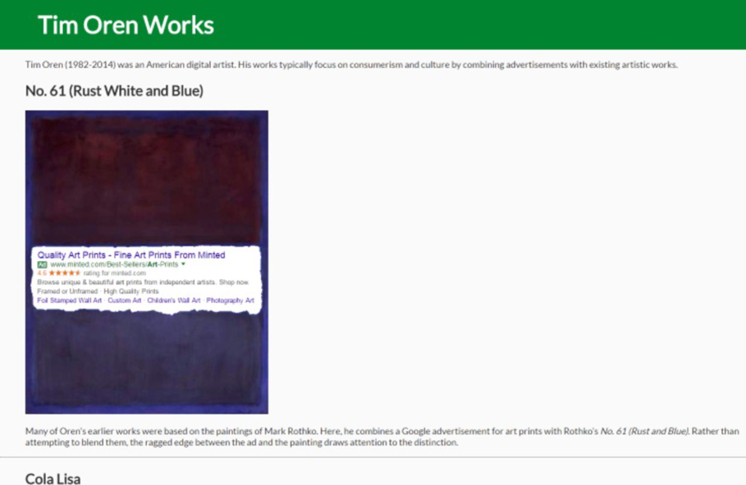
"No. 61 (Rust White and Blue)"- a Mark Rothko painting edited with an ad for art prints
"Cola Lisa"- the Mona Lisa's face is torn away, revealing a model drinking a bottle of Coke
"Campbell's Soup Cans"- Andy Warhol's famous print with photographs of real soup cans over top
"Orange, Red, Tan"- a Rothko painting with a Verizon phone ad
"Basket of Apple"- a Cézanne still life of a basket of apples, with everything but an Apple logo desaturated
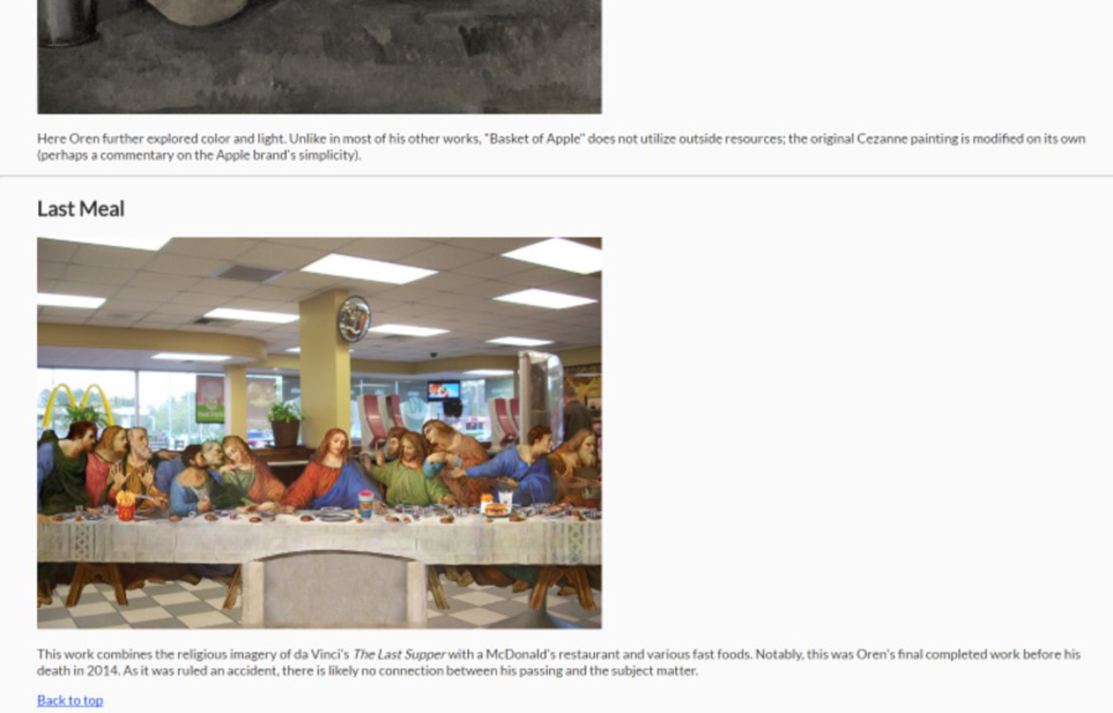
"Last Meal"- The Last Supper set in a McDonald's restaurant, with various fast food items on the table
The works themselves were created with image editing software (Paint.NET) and pictures from online. Two of them were made for my Module 1 project, and the rest I made in a similar style. I coded the website with HTML and CSS.
I wanted to create something interesting that inspired discussion. My original Rothko-based works from Module 1 looked neat, but they did not have much of a message beyond generic "corporations are evil" themes. I added the layer of a fictional artist who "created" these works to make it more of an exploration of artists and critics rather than just the themes they discuss. The people involved in the creative process are part of the creative process too, even though they are usually ignored save for providing a bit of historical context. Here I wanted to place the spotlight on the characters.
The artist having recently died was an intentional decision I made early on. I felt like if he was still alive, his body of works would be incomplete, and they would not tell a full story. I mention his death briefly in the introduction, again in the third work's analysis (the soup cans), and once again in the last work, which is more obviously about his death. In-universe, there is "likely no connection" between the painting and his passing, but really I chose The Last Supper as a death-focused work to conclude Oren's story. It also makes it a little spooky, because it raises the question of whether Oren knew of his impending demise, and I intentionally leave this open (I never say how he actually died, and "it was ruled an accident" is suspicious).
When I came up with the name "Behind the Art" I hadn't thought of the fictional artist yet, but it does work well as a double meaning. The advertisements appear literally behind the art in most of the works, but Oren is the man figuratively behind the art, as he is the one who supposedly created it.
A big inspiration for the critique sections was the documentation I did for this class. I got a lot of practice explaining the themes behind a work in a few sentences, and that really helped to make it seem like a virtual gallery run by a fan of the artist. Some of the readings were also helpful:
Lethem's "The Ecstasy of Influence" addresses the topics of appropriation and plagiarism, which are relevant here. Tim Oren, were he to exist, would strongly agree with the ideas Lethem presents.
Shahn's idea of the inner critic also comes into play. Here, I made my inner critic an outer one, and analyzed the works as though I did not create them. The relationship between Oren and the gallery owner is similar to that of the artist and the inner critic that Shahn describes. Perhaps if the gallery owner had been more critical, Oren would have been compelled to create better works.
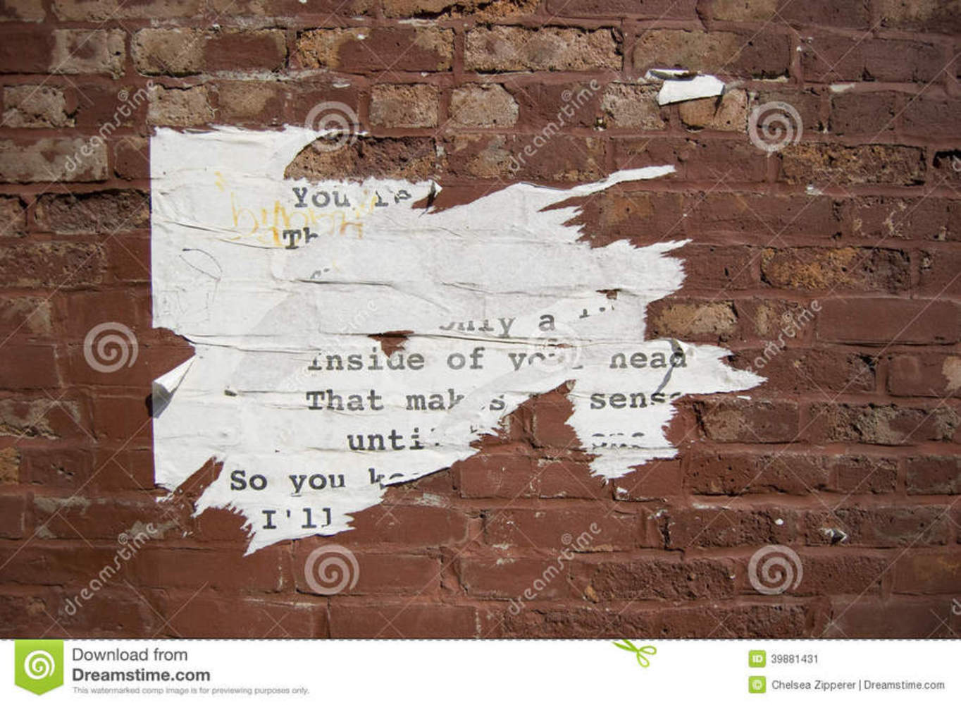
"Brick Wall with Torn Paper" - Chelsea Zipperer
I referenced this photo while creating "Cola Lisa". The paper is torn and shredded along the borders so it creates an interesting, dynamic boundary between it and the wall. I tried to do a similar effect between the painting and the ad, and I think it came out well. I used large strokes for the general area, and small jagged cuts for details, like the paper shown here has.
"Mark Rothko Paintings" - Admin (on markrothko.org)
http://www.markrothko.org/paintings/
This was the inspiration for the webpage that hosts the art. It is a long scrolling list of individual paintings, and each one has a small amount of text identifying it by name and a short description that analyzes the piece. The graphic design of titles, images, descriptions, and line breaks are all based on this Rothko gallery.
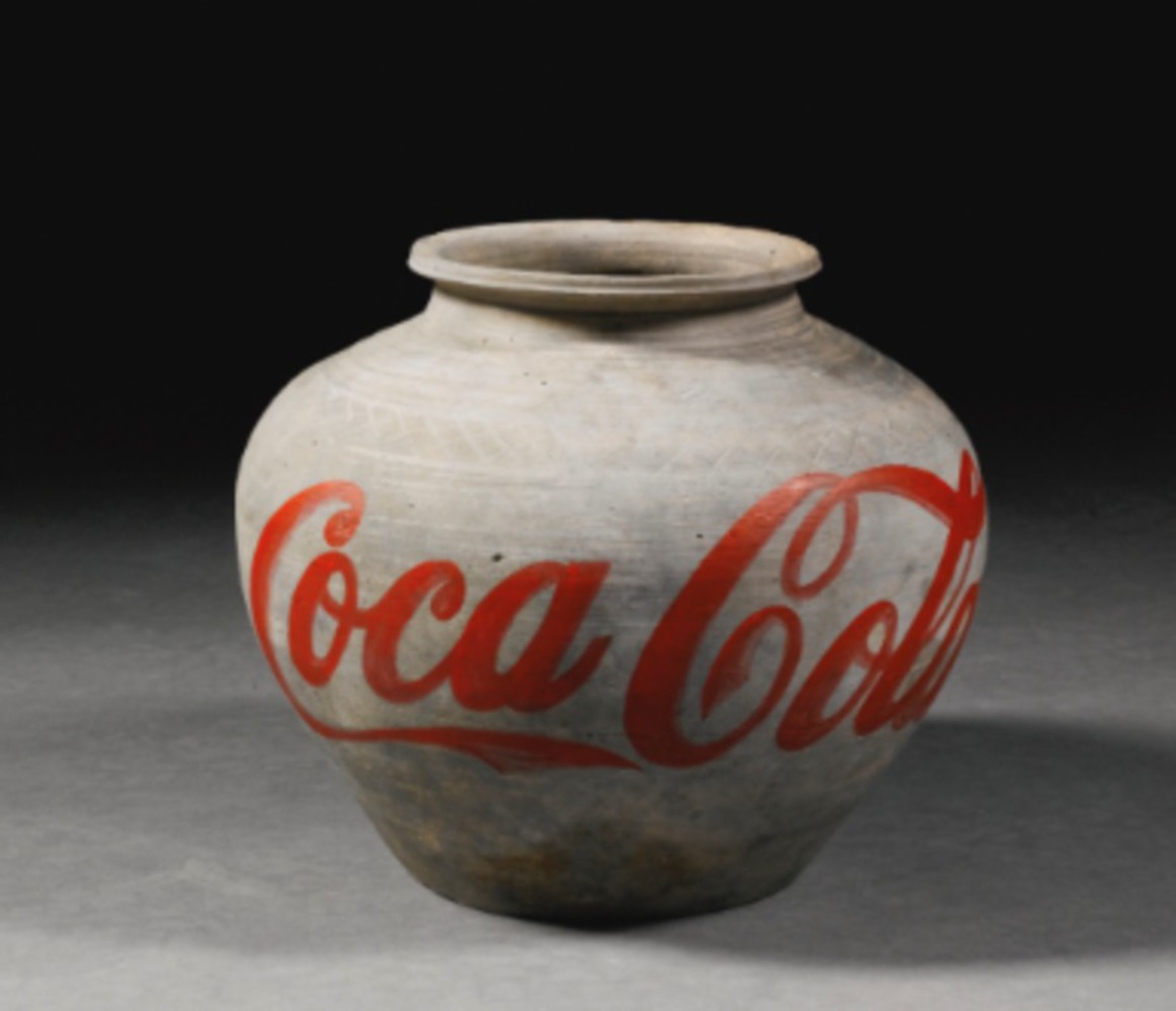
"Coca Cola Vase" - Ai Weiwei, 2011
This piece is the inspiration for the themes behind this project. By painting the ubiquitous, modern "Coca Cola" logo on an ancient Chinese vase, Weiwei asks us to compare the two worlds. Advertising can influence our thoughts and behaviors, but most of the time we do not notice it. With this work Weiwei forces viewers to confront advertising's influence, and question what kind of an effect it has on art and ourselves. The Coca-Cola logo on its own would not be thought-provoking, but when combined with the vase, both are recontextualized. This is the same sort of idea that the pieces in my work have.
"Exit Through The Gift Shop" - Banksy, 2010
This provided a lot of inspiration for the character I created. He is pretty similar to Thierry Guetta, who is inspired by Banksy and creates popular works derivative of other art, but does not seem to put much creative thought into them. I tried to be less judgmental in my project than "Exit Through The Gift Shop" was of Thierry (at times it seemed like it was making fun of him), so that the audience is left to come to conclusions for themselves.
Death of the Author (literary theory and 1967 essay by Roland Barthes)
This is a fairly popular school of thought in art and literature criticism, and I am not a big fan of it. I agree that the writer's biography should not be the be all and end all of analysis and criticism, but I also think that it is important to consider in the context of the work. Art is not created in a vacuum; someone made it for a purpose that they believe in based on their past experiences. Part of my goal in creating this work was to bring attention to that, combining the artist's biographical information with his works and making it impossible to ignore. The fact that the character of Tim Oren is literally dead is kind of an ironic reference to this.
This project began back in Module 1, where we appropriated other's works in a way that could make us money. I edited Mark Rothko paintings so that it looked like they had holes in them with advertisements showing through. I never really felt passionate about the themes there, and I also thought that there could be a better way to combine the two pieces into one coherent work. Initially for this project I planned to just make more edits in that style, but then I came up with the idea to add the fictional artist who "created" them, and that way I didn't necessarily have to feel as passionate about the corporate themes of the original. Instead it's about the artist, and he's the one who thinks Jesus would eat at McDonald's.
Coding the website was pretty simple. I based it on the style of my personal website, which I had spent a lot of time getting to look nice with the fonts, colors, and layout. After that, I made several edited paintings. It was difficult to come up with ideas for this part, because I wanted them to be easily identifiable as classic works, while also having some obvious change to be more corporate in some way. I made an effort to use different techniques for each one- particularly, the Apple one uses only brightness and saturation to evoke the logo, and I think that is visually one of the strongest works. The paintings are accompanied by small analyses that discuss techniques, themes, and aspects of Oren's life.
I feel that I met my goal of creating something interesting. The two biggest problems with "Rothko Advertisements" to me were: 1) it didn't look like much effort had gone into it and 2) there wasn't much I had to say about it. The first problem I solved by creating a bunch more works in a similar style. It doesn't have the same "wow factor" as some other people's projects, but it is possible to spend several minutes just looking at the images and text. (Interestingly, most people at the exhibition skimmed over the text, which I was not expecting. I tried to keep it short, but people still greatly preferred to view the images.)
The second problem I addressed with the creation of the fictional artist and critic. The theme at the heart of this work is the dialogue between artist and critic, which is usually outside the scope of a piece of art, and happens next to it in the curatorial statement or analysis papers. I brought that into my piece, so it is sort of meta-art.
Module 1's theme is appropriation, and I follow that with the edited images. There is also a sort of reverse-appropriation here, where I take something that I did actually make and then claim that someone else did it. I am not really a fan of the edited images, and I think they are kind of shallow and don't provide meaningful commentary. I was surprised that some people actually did like the images- several people in particular thought "Last Meal" was funny, which I did not intend at all.
I did not have a clear opinion I wanted to convey with this work, and I think that is a weakness in some ways. I wanted to leave it vague and open to interpretation- people can think Oren is clever or just a cheap Banksy knockoff, the critic is insightful or just stating the obvious, the artist's death was connected to his final work or not, etc. This allows for more discussion, and to some degree makes it more interesting, but there is not much of a "thesis statement" in this work. The analysis sections also do not add as much as I had hoped, and were I to redo this project, I would use them to explore Oren's personal life in more detail. As it stands, the work does do a good job of inspiring conversations about art and the artists who make it, so I am happy with the end result.
Mark Rothko- No. 61 (Rust and Blue)
Leonardo da Vinci- Mona Lisa
Barbara Palvin- Coca-Cola Ad Campaign 2016 http://celebmafia.com/barbara-palvin-coca-cola-ad-campaign-2016-528681/
Andy Warhol- Campbell's Soup Cans
Various sources- Campbell's soup photography
Mark Rothko- Orange, Red, Yellow
Verizon phone advertisement
Paul Cézanne- Still Life with Apples
Leonardo da Vinci- The Last Supper
Ryan- McDonald's interior https://www.flickr.com/photos/ryanrules/3504862541
Unknown- McDonald's fries http://www.eonline.com/news/463762/our-definitive-list-of-the-best-and-worst-fast-food-french-fries-burger-king-s-new-satisfries-not-included
Unknown- Smoothie King https://s-media-cache-ak0.pinimg.com/originals/91/f5/5a/91f55a3d65c13becb7da210105406155.jpg
Unknown- Kids Meal http://burgerking.s3-website-us-east-1.amazonaws.com/sites/default/files/Men%C3%BA-Kids-Cheeseburger_2_4.png
New creative industries are empowering new modes of collaborative consumption, creation and reuse of media. This often relies on successful collaborations between cross-trained artists, designers a...more
A gallery displaying the works of the fictional artist Tim Oren, a digital artist who combined classical paintings with corporate elements