Rothko Advertisements

Made by Kai Kuehner

Overlaying tacky advertisements on Mark Rothko paintings

Created: September 7th, 2016

0

Intention

Mark Rothko's works are famously open-ended and invite the viewer to bring meaning with their own interpretation. I plan to overlay advertisements on some of Rothko's works so that instead of interpreting, the viewer is distracted and unable to focus on any deeper meaning. These advertisements will be flashy and tacky, contrasting with Rothko's thoughtful colors and careful brushstrokes. Money could be made from this from advertising revenue and/or in galleries as a commentary on our consumerist society (ideally both, to maximize both revenue and irony).

0

Statement

For this project, I focused first on the "making money" aspect. A common way to make money off of viewership is through advertisement, so I decided to combine advertisement with something else. Rothko's works are a natural choice for two reasons: they are composed of rectangles, leaving a natural space to fit the advertisement in; and they are minimal, so the inserted ad will be very obvious. The "big idea" behind this project is to subvert Rothko's abstract, aesthetically pleasing works into tacky pieces with an obvious meaning: buy stuff.

0

Context

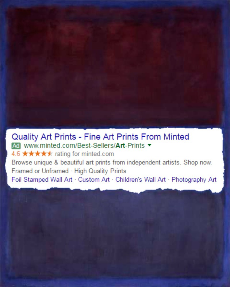
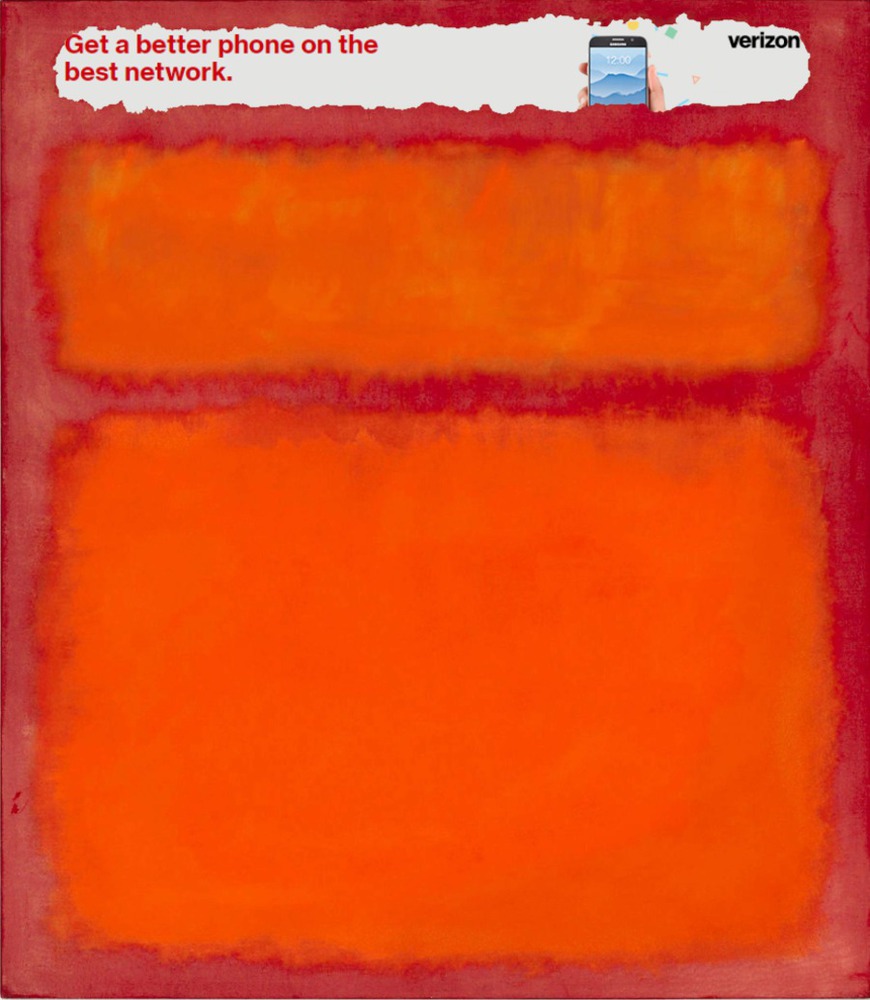
The idea of "tacky corporate imagery over beautiful art" is obviously not new- Ai Weiwei's Coca-Cola urns are just one example of this:


Other similar ideas are present in many of Andy Warhol's works, such as his famous Campbell's soup can, which despite being a famous work of modern art is also great advertising for the soup company.

I was also influenced by my earlier Rothko-inspired project, where I recreated one of his works digitally. That had helped me understand the subtleties of his paintings,  and realize they were not "just rectangles." Because of this, I was more careful to preserve the irregularities of his originals, and not just blindly paste perfectly straight lines over top, which would have looked out of place and boring.

0

Process

I did not have any themes in mind going into this project; they arose naturally as I solidified my idea of what I wanted to create. After coming up with this idea, I then had to create several implementations of it (I feel like it works better with multiple pieces in the same style, so that the overall message present in all of them is clearer). After the idea, the most important thing was which Rothko pieces and advertisements to use. I searched for Rothko paintings that had wide, short rectangles in roughly the shape of a banner ad. Finding ads was harder, since I usually use Adblock and didn't know where to look. One of them I got from Google by searching for "art", and another was a phone ad I got from Amazon.

0

Product

At first, I just took a Rothko painting and pasted an advertisement over it, but it did not look very interesting. I got much better results when I remembered that Rothko's works are not composed of perfect rectangles, but are imperfect and have uneven borders. I used the "magic wand" tool to select and delete a portion of the painting by color, which preserves these borders. Then I found advertisements and pasted them in a layer underneath the painting so that they showed through. This created an effect as through there is a hole in the painting, which is visually interesting and promotes interpretation (perhaps the advertisements were "behind" the painting all along...)

0

Critique

The end result is pretty much what I envisioned when I started working on it. I feel like it is not super "high effort" compared to some of the other projects, but at least it can hold the viewer's intention for a while. In particular, the area separating the painting and the ad is something that is interesting to look at. It was sort of present in the original work, but by applying the magic wand algorithm to it at a specific tolerance, I was able to create the tear-like appearance.

My final project is composed of two separate works. One is darker with cool colors and has an advertisement for art prints. The other is bright warm colors and has an ad for phone service.  I like both of these in different ways, since the art prints ad is more relevant to the likely audience, but the Verizon ad is clearly just faceless corporate advertising. They send a different message- the first is more subtle, and the second is very obvious with the theme. I made a third, but it was also an art advertisement, and didn't really add anything beyond the first one, so I did not include it.

0

Personal Reflection

While making this I felt kind of bad, like I was ruining Rothko's nice paintings with the ads. This was basically the theme of my project, so I continued anyway and I think the result conveys the theme I was going for. Next time I will try to do something that requires more effort, since to some degree I feel like I should have spent more time on this. I couldn't think of how, though, and short of scrapping my whole idea (which would have been very difficult) I wasn't sure where else to go with it.

x
Share this Project

Courses

62-150 Intro to Media Synthesis and Analysis

· 28 members

New creative industries are empowering new modes of collaborative consumption, creation and reuse of media. This often relies on successful collaborations between cross-trained artists, designers a...more


About

Overlaying tacky advertisements on Mark Rothko paintings