Eugène Atget
Made by Anna Tan
Made by Anna Tan
Created: November 12th, 2014
Part 1:
Eugène Atget (1857-1927) spent his photographic career documenting the old Paris before modernization made its mark all over the city. He took photos of architecture and street scenes characteristic of the traditional French working-class culture; rarely did he take photos of famous landmarks in Paris. To produce these photographs, Atget used techniques that were considered antique even in his time. He used long exposure times, which increased the amount of details for stationary objects, blurred any moving objects such as people on the streets and made him to often take his photos early in the morning to control the light level. Many of his street photographs are wide angled to create space. To correct perspective in his photographs, Atget employed a tilt-shift technique where he repositioned the lens relative to the plate of the camera, resulting in vignetting of many of his photographs. He did not use filters and made the prints himself, staying true to the beauty of the old Paris.
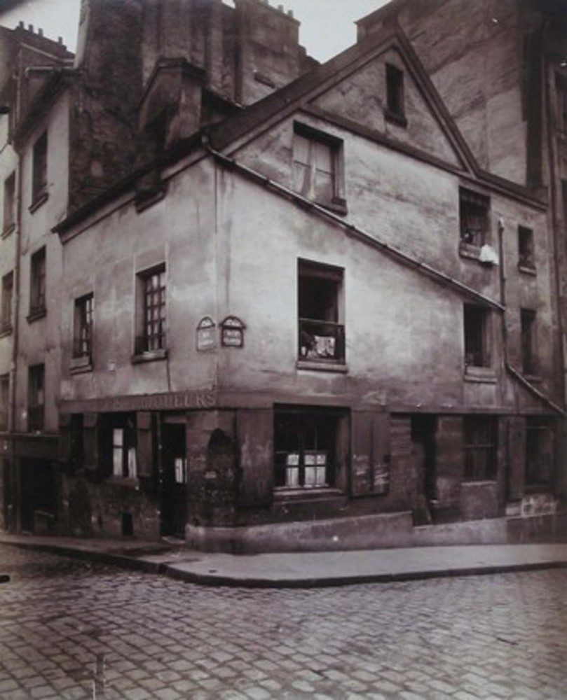
Vieille Maison, Rue Clopin (1923) is a photograph of an old house on the corner of a street in Paris. The photo captures the street, the sidewalk and the old house with a liquor store in the foreground, and more buildings and the sky in the background. The corner of the street is positioned about midway through the photograph, as well as the building's corner. The two sides of the photograph are similar but not entirely mirrored. The old house does not have a complicated structure, leaving a lot of white space on the photo. The photograph appears to be taken from across the street. There are no people in this photo, characteristic of many of Atget's photographs.
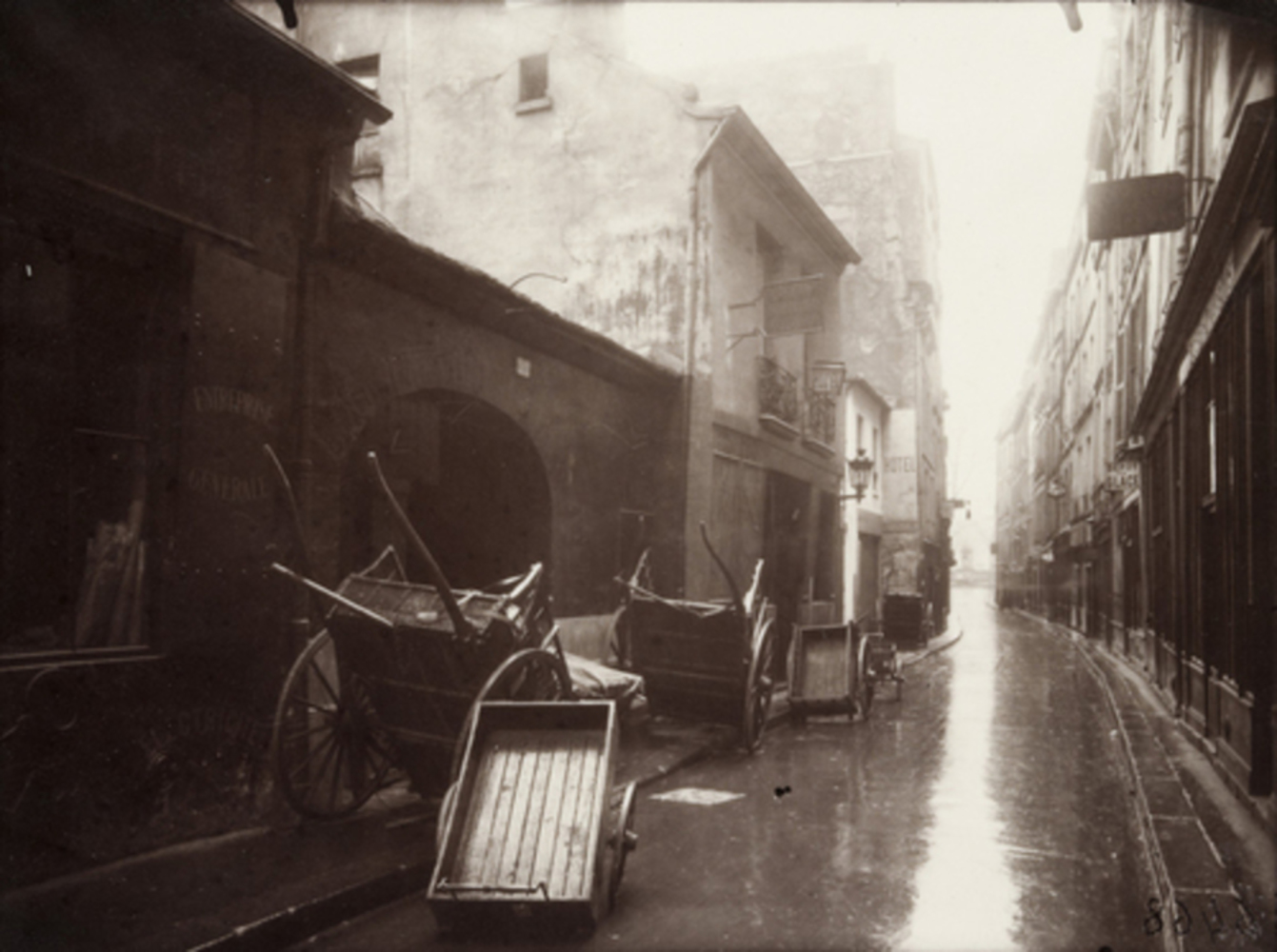
Coin de la rue de Bièvre (1924) is a photograph of another street in Paris. It looks like it was just raining with the reflection of light off the ground. The overexposure of the light on the ground and the sky give off an energetic and lively feeling. In the foreground are wooden carts on the sides of the street. The background contains the buildings on the sides of the street. The messy placement of the carts also suggests livelihood despite the lack of people in the photo. Instead of placing the street in the middle of the photograph, Atget has the street more towards the right, allowing more space for the carts to become the main subject.
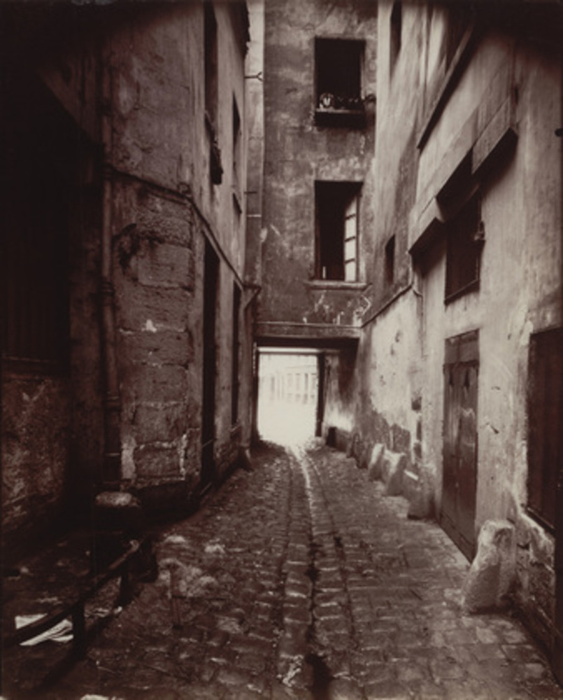
22 rue Cuincampoix, cour (1912) is a photo of a street in some kind of yard or alleyway. The photo is framed by the two buildings on the side, creating a sense of balance along with the street running in the middle of the photo. The foreground is the street, whereas the background is more or less the buildings on the side and beyond the doorway. My eyes are directed towards the doorway because the buildings converge and the street seems to end there. The photograph is simple in that it does not have too many objects, but it makes me feel like I am there on the street.
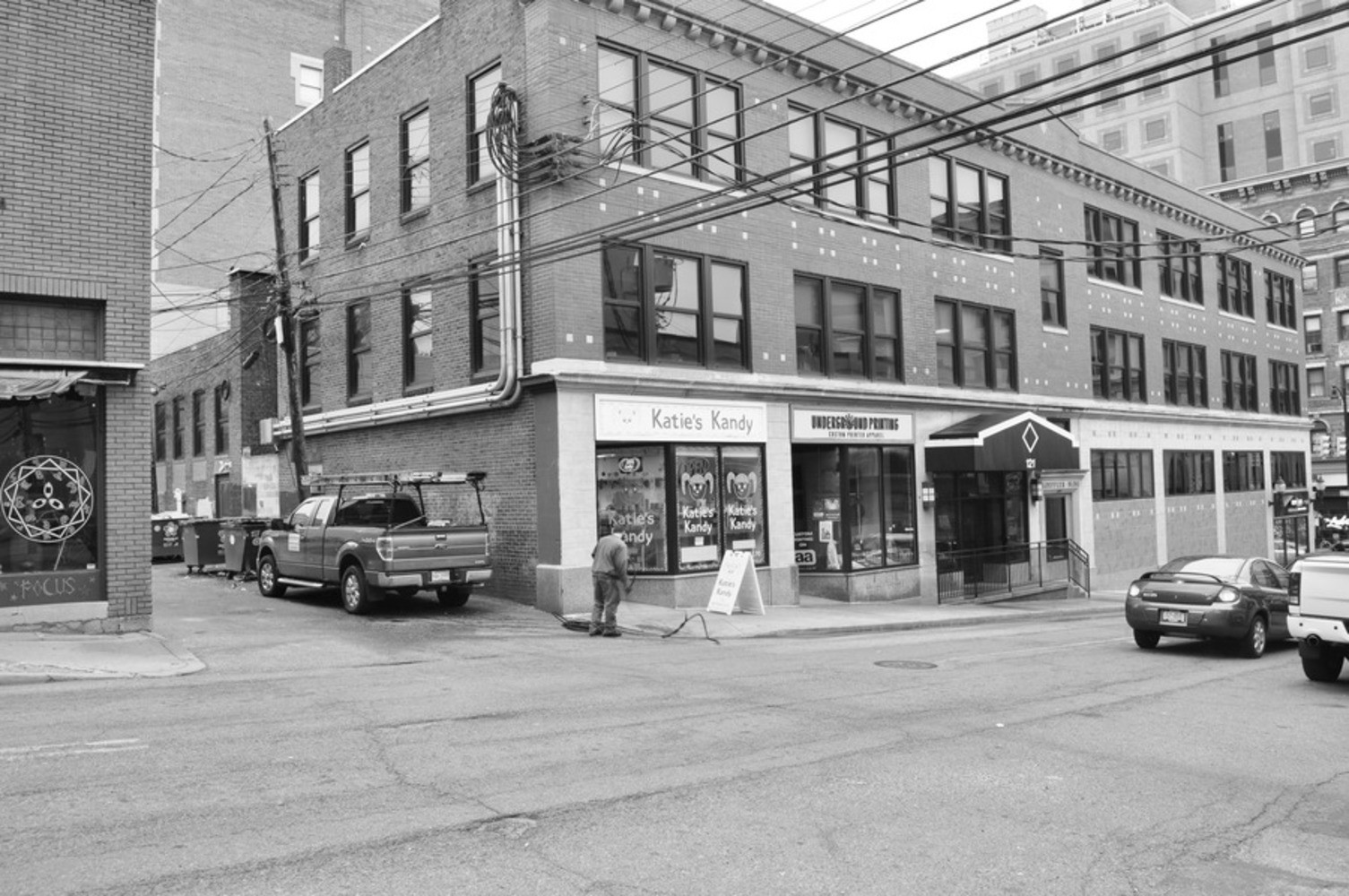
When I walked around Oakland to find good streets to take my photos, I became increasingly aware of how difficult it was to find a place to photograph the extension of the street. Almost every street was full of parked cars blocking the view. It was very hard to find good vantage points that can showcase Pittsburgh's traditional culture without capturing a few automobiles in frame. Instead, I mostly walked into alleyways between buildings that are not necessarily streets. It made me really appreciate Atget's idea of preserving the old culture before modernization. The fact that the sky was completely cloudy with no sight of the sun also made choosing the right settings difficult. I had to play around with shutter speeds and apertures to find a good balance between exposure and detail. It was also not easy to emulate how Atget uses exposure time to create fine details; when I took photos at exposure time of more than 1 second, they tend to turn out blurry and overly bright. Overall, my photos are not as strikingly beautiful and serene as Atget's. I wish that I could spend more time on the streets looking for simple beauties that I might have passed by but Atget would pay attention to. I also wish that I would try out different points of view; most of the photos I took end up being very centered and balanced by the midline.
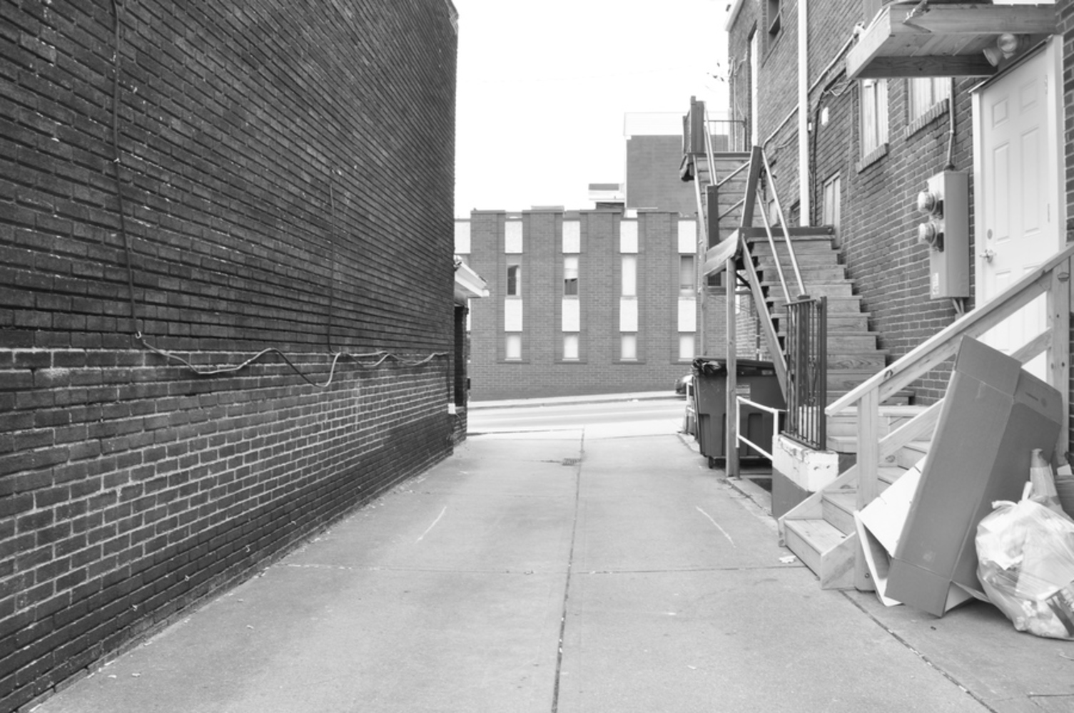
In this photo, the subject is the alleyway itself. The foreground consists of the brick wall on the left, the alleyway, and the building with stairs on the right. The background is another brick building, which creates an enclosed feeling in the photo. However, the path was large enough that the photo does not feel restraining. When I found this alleyway, I was very interested in the texture of the building to the left; Atget's photos, especially the third one from Part 1, are also focused on bringing out textures through contrast. From what I saw, a lot of buildings in Oakland have features involving bricks. I tried to use this photo to characterize what I saw as an architectural style of Oakland, similar to Atget's intent. I tried using different settings to best capture the feelings of the three brick walls, which were very different in terms of depth. I felt that this image best captures this difference. The texture of the wooden stairs and the door on the right also are significantly different from the rest of the textures. I really liked the contrast between the complexity of the right side of the photo and the simplicity of the left; while the photo is balanced in the middle in terms of the bigger structures, the difference forces the viewer to look around the photo. Unlike most of Atget's photos, this photo does not give the street photographed a sense of extension; rather, I felt like the street that runs horizontally beyond the foreground is given that sense despite the closeness.
In this photo, I tried to emulate the first photo of Atget in Part 1. This photo captures a building that has a relatively simple geometric shape as well as a distinction between the top half and the bottom half. The photo gives space for the road itself on the bottom, prompting the viewer to look at the building. The other buildings in the background are taller than the building in focus, framing the central building similar to Atget's photograph. I found it very interesting how the power wires cut through the photograph, creating tension that did not necessarily exist in Atget's photo. I spent a lot of time standing across the road trying to capture the building with minimal things around, but it was difficult as the traffic light is very close by and caused cars to block my view every 40 seconds or so. Because of all the extra stuff in the photo, I feel like the photo did not have the same impact as Atget's photo, which is very simple in terms of subject matter. I also found it challenging to put the entire building into my shot, which was my original intent. I had to make a tradeoff choice between the detail I want to capture and the frame of the photograph.
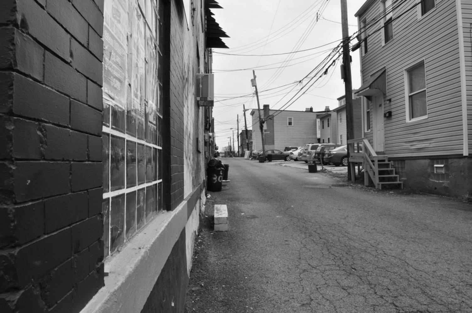
I tried to emulate the second photo of Atget with this photo. I attempted to show the extension of the road and avoided taking the photo in the dead center of the road. It was not a successful emulation in that I did not quite get the same effect as Atget's photo - the light shining through or the road curving towards the middle - but I really like how the electric wires and the cracks on the road work in this photo in giving the road a feeling of extension. They both have directions pointing towards the far end of the road, emphasizing on the dimension of the subject matter. Unlike Atget's photos, I was leaning very close to the building on the left, resulting in its brick wall becoming the most prominent part of the foreground. I think the photo can be better framed; there are a lot of extraneous objects such as cars in the photo that I find distracting.
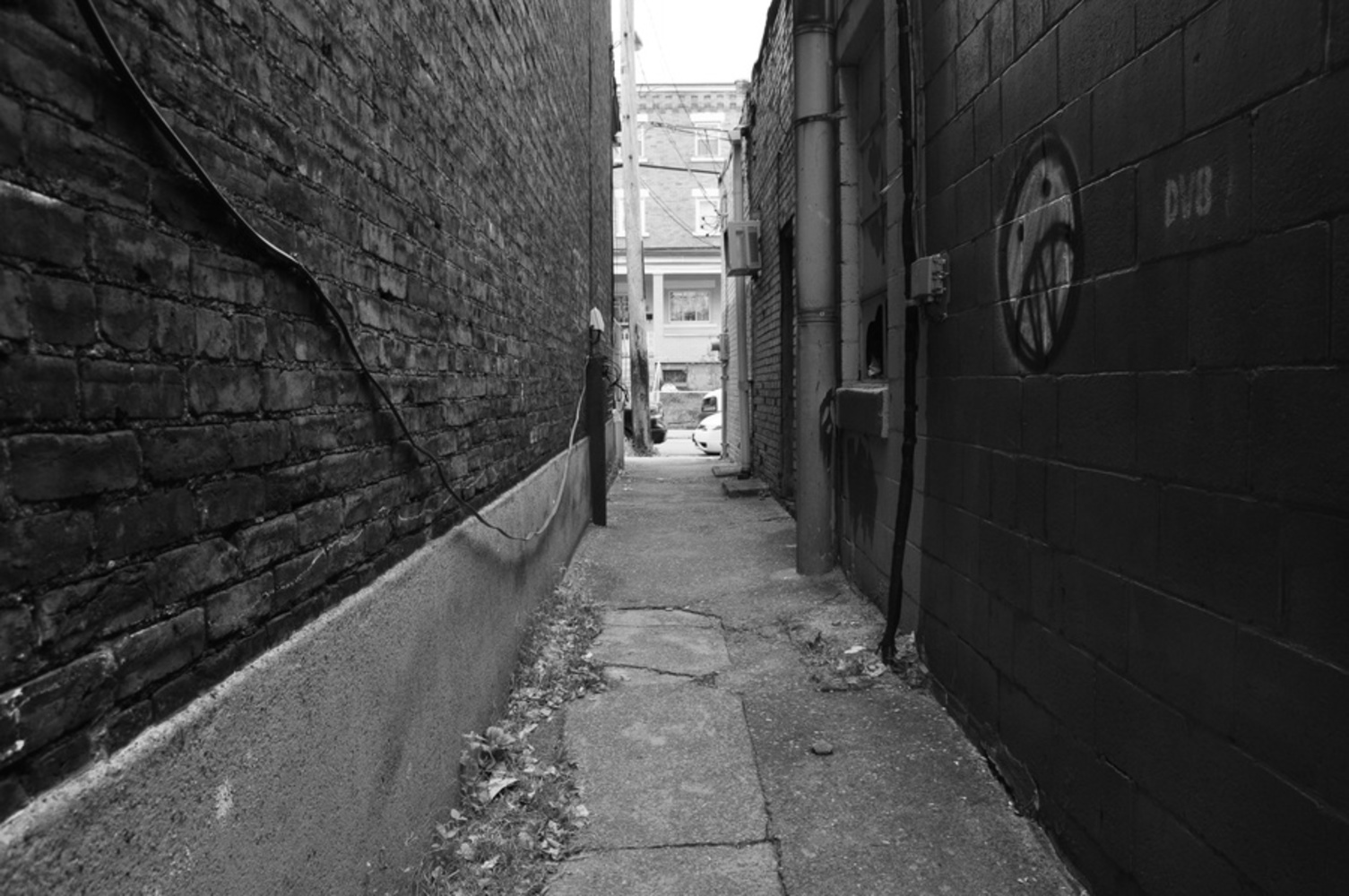
When I got to this dark alley, I was very intrigued by the dark walls in contrast with the lighter buildings passed the alley. The left wall especially has changes in shades that made it appear old, reminding me of Atget's photos of Old Paris. The graffiti on the right wall was also something I saw frequently as I walked around in central Oakland. One of the main differences this photo has from Atget's photos is that it feels very narrow, whereas Atget's frames are wider. This photo does not leave a lot of room for space and feels anxious; Atget's feel more serene. While I feel like it was asuccessful photograph, I don't think it was successful for an emulation of Atget's work.
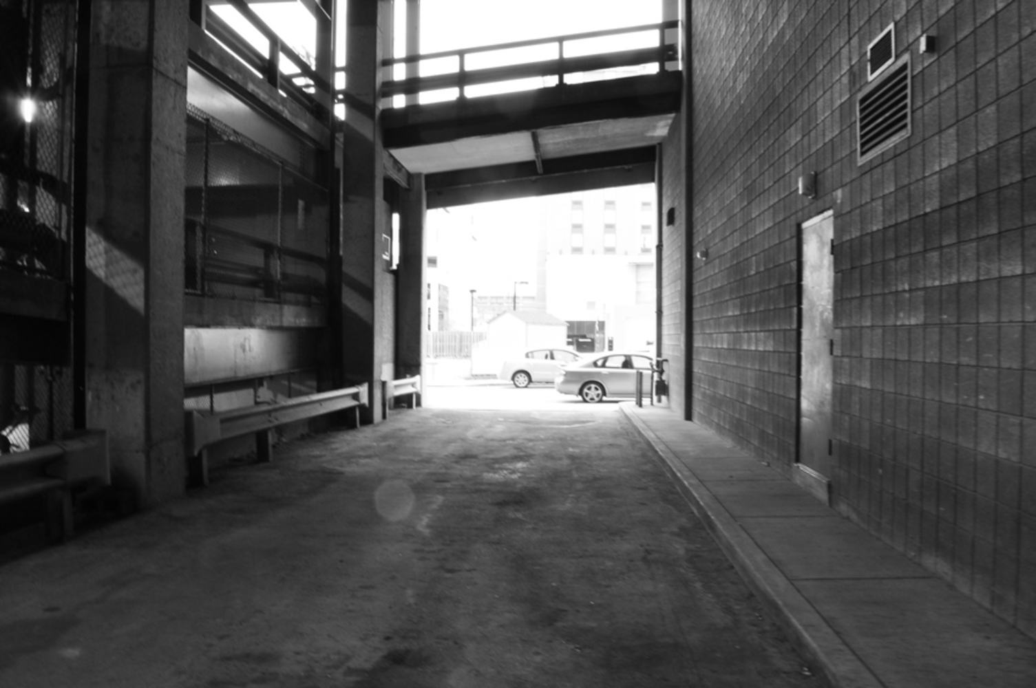
In this photo, I tried to emulate the effect of light pouring into the image in the second and the third photos of Atget from Part 1. This is probably my favorite photo I took during the session. I framed the photo around the two structure on the side and the bridge in the middle. The fact that the bridge is tilted breaks some symmetry in the photo, makes it more interesting. Because the road I was on while taking this picture was relatively dark, I spent a lot of time experimenting with the aperture to get good details on the foreground - the structures and the road. One thing I wish I can change about this photo is making the left and right edges of the photo darker to emphasize the brightness of the outside. In the end, the photo still came out somewhat blurry, but I really like the feeling of extension towards the brighter outside. I think it captures the Oakland culture fairly well - the modern, caged aspect of the parking lot on the left and the more simple, rustic bricks of the building on the right are connected by the bridge.