Dot, Line, and Shape Project
Made by Ariel Tian
Made by Ariel Tian
Created: November 24th, 2014
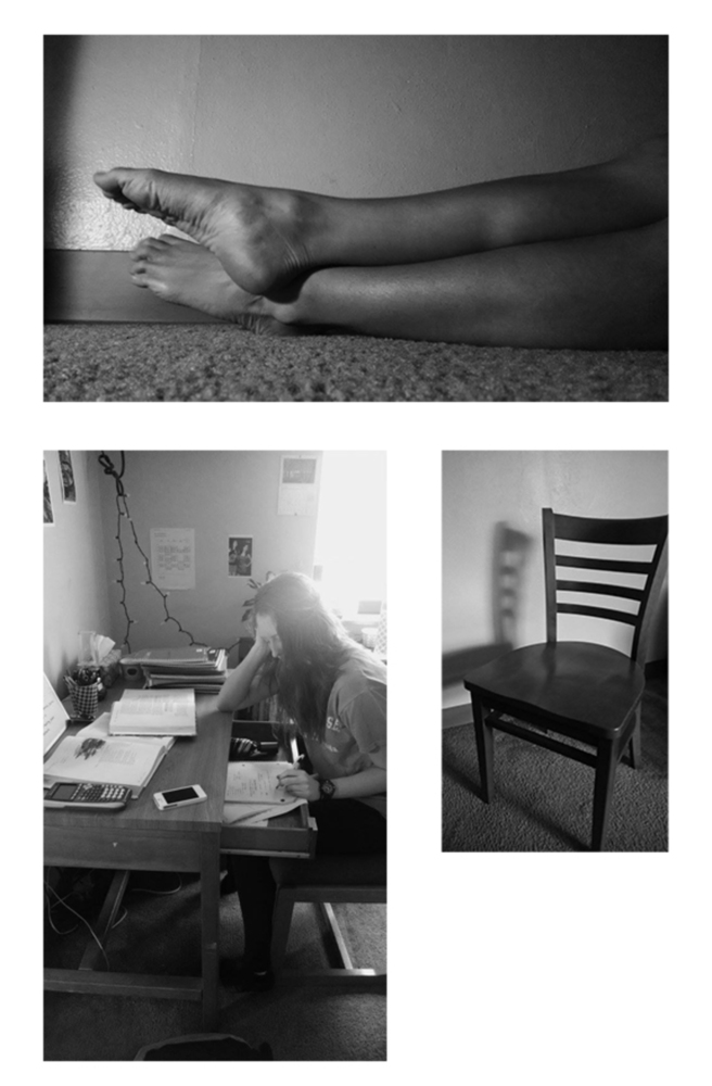
For this project, I decided to replicate these photos:
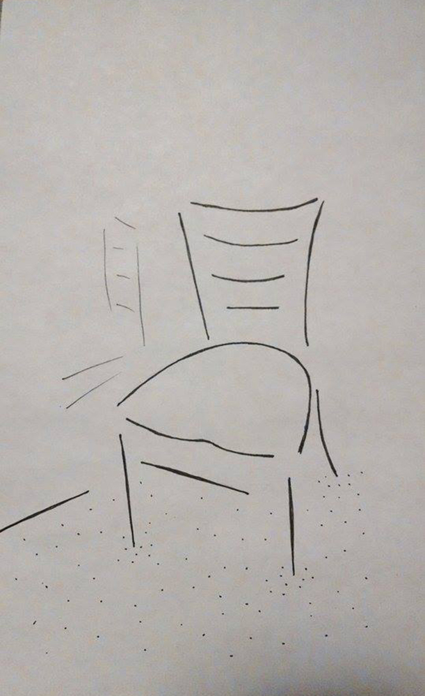
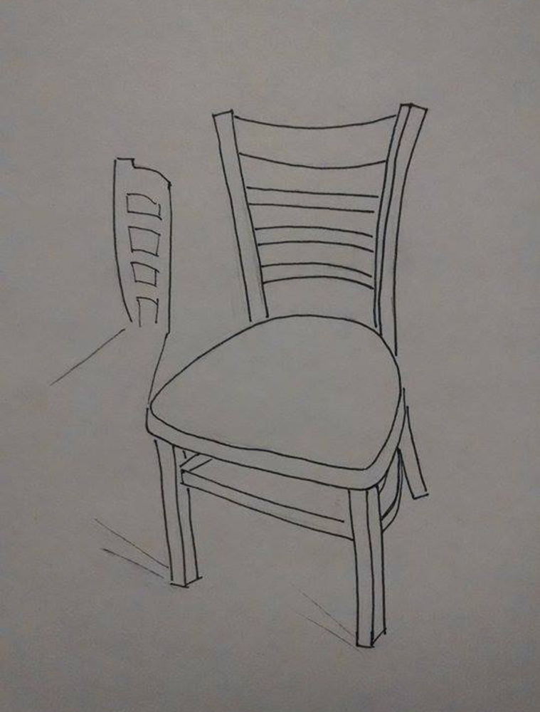
At first, I attempted to sketch this chair using only straight lines, since thinking about a chair made me think of a rigid, straight, man-made structure. However, upon closer examination of the photo I realized that at this angle, almost all of the lines (which are straight and perpendicular on the chair itself) appear either curved or angled. Because of this, I soon realized that the difficulty in drawing simple man-made structures, like this chair, is capturing the exact proportions and angles of the lines, since we are so familiar with chairs that any error in this sketch would appear very skewed to our human eyes. I had to make a few revisions to this sketch before I finally found the proportions that made the chair seem most "normal". I even went as far as measuring the proportions from the photo with my fingers so I could figure how long and how angled each line should be.
I also had considerable difficulty representing the shadow. Even in this final revision, I'm not totally pleased with the shadow since it looks too solid and its edges are too defined, in my opinion. However, I am pleased at how the carpet turned out, as it does portray the idea of a warm fuzzy carpet using the least amount of ink possible.
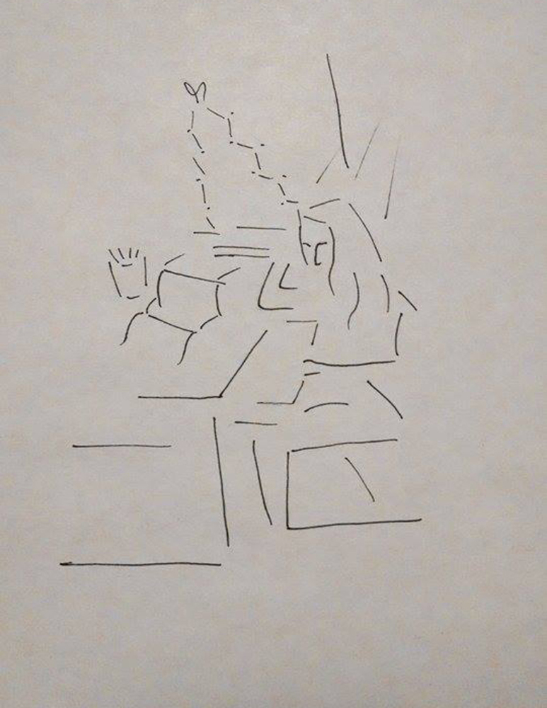
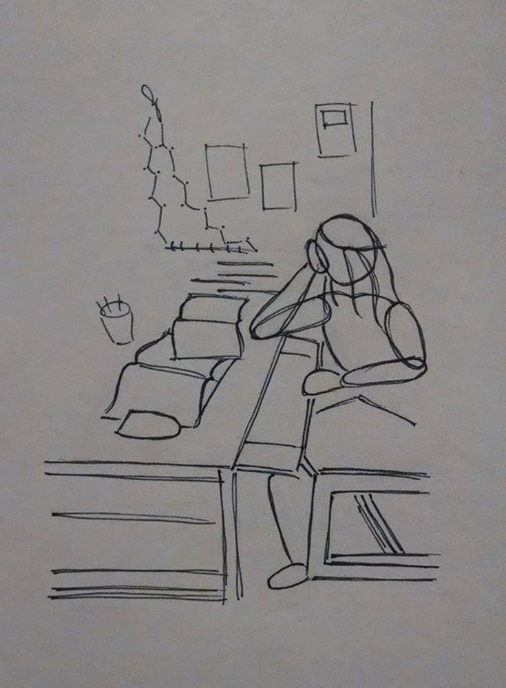
This sketch was interesting as it combines man-made structures with organic structures. To distinguish the two, I decided to make the lines on man-made structures straight and hard (except for the books) and the lines on organic structures curved and soft. I think this decision was influenced by Kandinsky's reading, in which Kandinsky associated certain lines with certain temperatures. Using this technique, I decided that the curved lines gave off a softer, warmer feeling while the straight lines seemed hard, cold, rigid. This was intentional, as organic structures, like a human body, give off heat while man-made structures don't. This is especially important in this sketch, because I wanted to portray the emotion of "stressed". I think portraying the desk and chair as harsher, colder objects definitely helped achieve this goal, because it places this one warm, organic figure in a cold environment, which in turn makes her seem alone, overwhelmed, outnumbered, and thus stressed.
I also experimented with the connection of lines, since Kandinsky stressed the importance of angles made by lines. For example, the subject's elbow is the only place where I have chosen to depict the angle between two lines, and not the lines themselves. I think this decision gave the elbow a much softer look, since the angle is rounded and acute (as opposed to a sharp, obtuse angle that appears disconnected and aloof). I would conclude that this experiment with angles was a successful one, although I wish I had used it more on this subject.
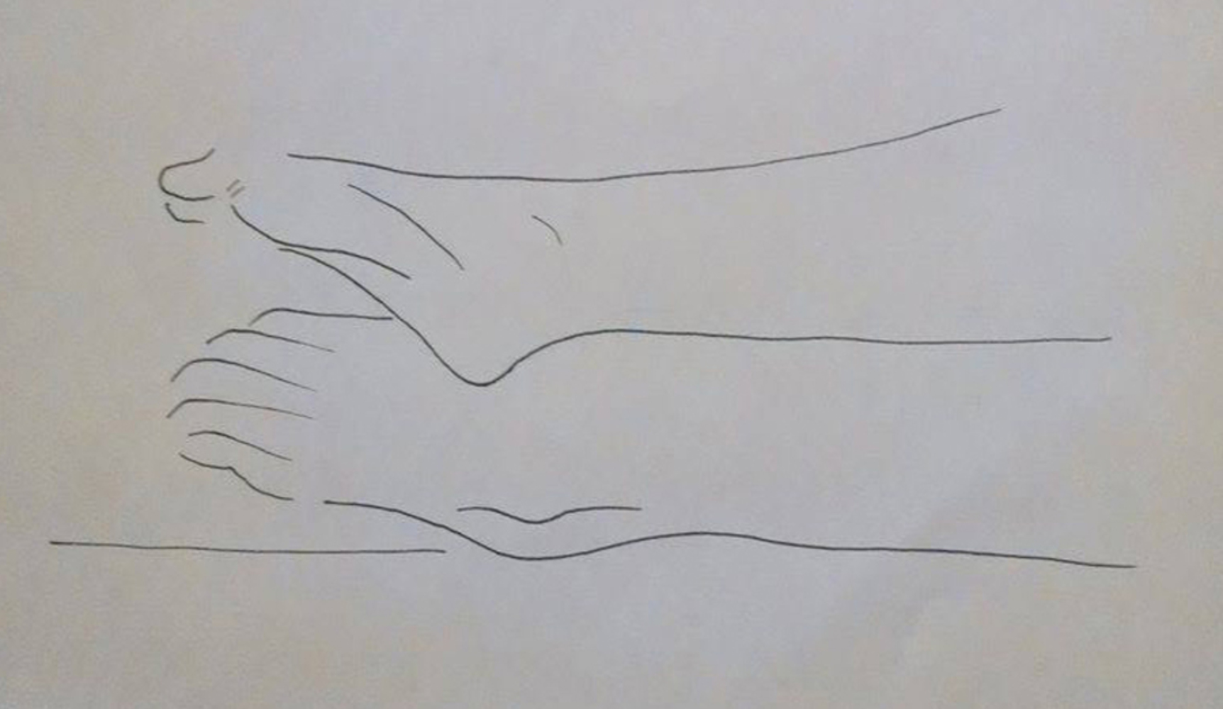
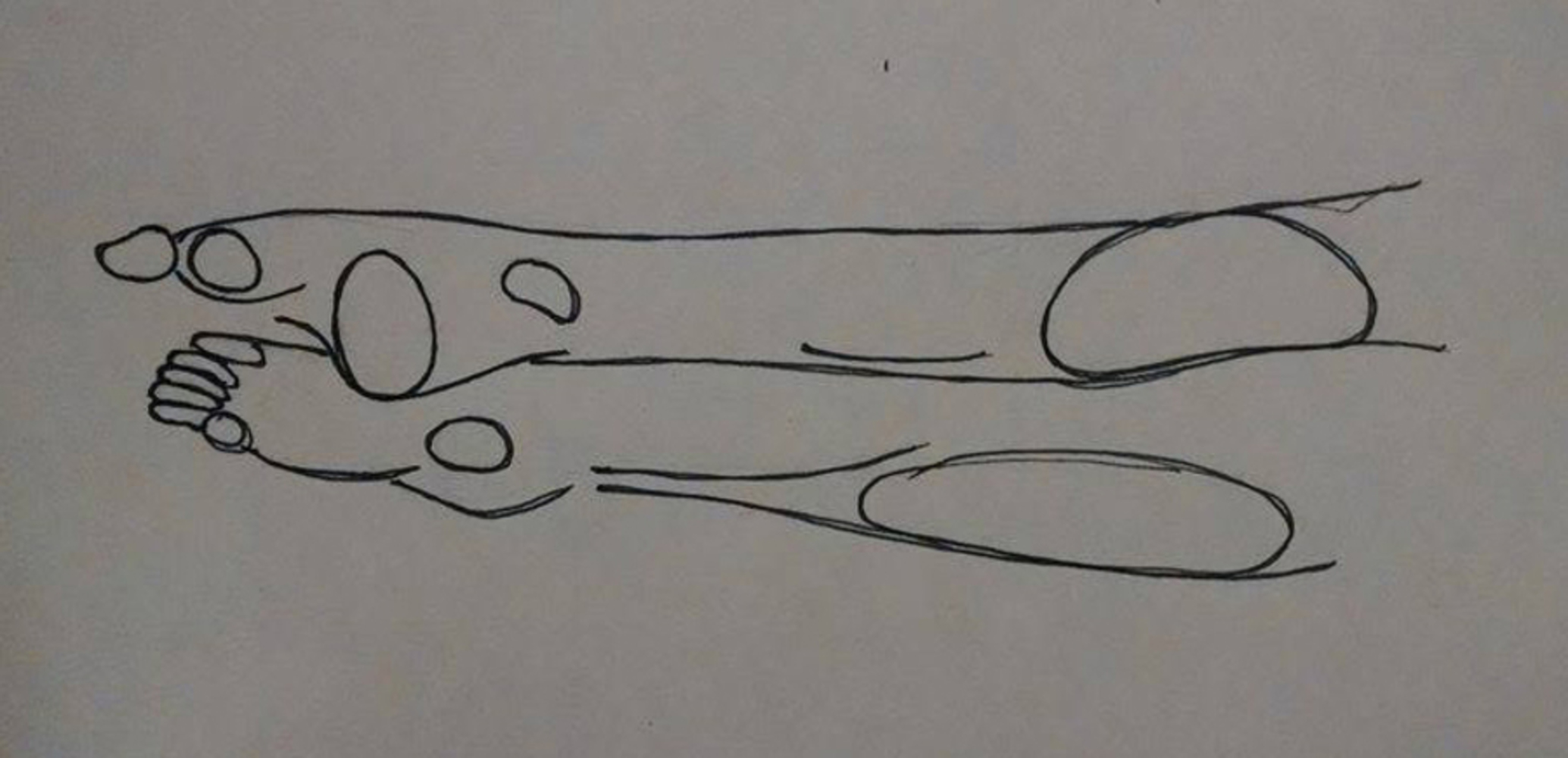
This sketch was tough because of the way the legs were supporting each other. I think drawing with only lines helped determine the proportions for each component of the photo, and it may actually be the hardest part of replicating the photo. Another challenging dimension to this sketch was that I had to put some thought into the muscular structure of the foot before starting to sketch. For example, the foot on top has a defined muscle running from the big toe to the center of the arch, and leaving out this muscle would make the foot look very unnatural. In addition, the ankle bones on both feet were outlined lightly, since the feet looked very naked and much too smooth without them. In retrospect, I think I could have added even more lines for the wrinkles in the original picture, as I left many of them out.
I also paid more attention to the orientation of my lines, as Kandinsky put much emphasis on differentiating between horizontal, vertical, and diagonal lines. Clearly most of the lines in this sketch are horizontal, which, to Kandinsky, implies that they are black and "inwardly unquestionably cold" (Kandinsky 71). Although I may not understand what Kandinsky means by black, I do agree that this sketch seems a bit cold, most likely due to the number of horizontal lines present. This is a bit disappointing, since the original intent of this photo was to show human motion. However, I am glad that by using Kandinsky's techniques, I have discovered why the original photo seemed to feel cold and stagnant when it should have portrayed warm and moving.
This sketch seemed to do a much better job nailing the proportions of the chair. By using shapes, I could also portray the third dimension. However, I still struggled to get the shadow right, since it still looks just as sharp and solid as the previous one. An approach I could have tried is using lines to represent the directions in the shadow instead of representing the silhouette of the shadow. (This would be analogous to drawing a bunch of diagonal lines in the shape of a square, instead of drawing the outline of a square.) This approach would emphasize the content of the shadow instead of the outline of the shadow, which is exactly what I would have wanted since the outline of the shadow is supposed to be hazy and undefined.
One area of improvement is the consistency in the dimensionality of this chair. Some lines are two-dimensional (ex. the planks wrapping around the bottom of the chair) while others are three-dimensional (ex. the seat of the chair). Although having that third dimension definitely enhances this sketch, it would have been more aesthetically pleasing if every plank were three-dimensional.
The major change in this sketch is the way I portrayed the human subject. While the previous sketch focused more on defining the outline of her body, this sketch focuses on the components of the human body and how they interact with each other. This is allows me to give some depth to this sketch. For example, the crook of her right elbow, which was represented by two angled lines in the previous sketch, is clearly has some depth because you can see how the lower arm overlaps with the upper arm, just as you can see how the hand overlaps with the head. I think this was a big jump from the previous sketch, which seemed much flatter.
I also added depth by sketching objects in the background with less detail. The stack of notebooks, for example, is merely a pile of horizontal lines. The photographs on the walls were reduced to rectangles. This focuses the audience's eyes on the subject which was drawn in much greater detail, a feature that was not quite possible in the original photograph (unless I had opened the aperture much wider).
However, I am not a huge fan of how some of the rectangular structures turned out. The drawer, for example, seems to be at a weird angle. The wooden plank on the bottom of the chair also seems to be too acute. I think my next step would be to practice more with the angles between lines.
What I like about using shapes is that I can depict the internal anatomy of a subject in much greater detail. In this sketch, I tried exploring the anatomy of the foot further, even extrapolating shapes where there were none in the original photograph. The circle to the right of the big toe (top foot) for example was extrapolated but still based on the contours of the photograph and on knowledge of anatomy. Some of these extra shapes really made the foot come to life, for me. I particular like the large circle that outlines the heel of the top foot. I had trouble defining the heel in my previous sketch, and I think this shape really did the trick.
I also think the proportions in this sketch look much closer to the actual photograph. The upper part of the bottom leg looks a bit off, but besides that the feet and ankles look surprisingly accurate. I think there is room for improvement in the way I drew the toes on the bottom foot, however. The toes seem too detached from the foot, most likely because they are enclosed ellipses instead of open ones.