Striking Midnight - Cinderella
Made by Judy H
Made by Judy H
Created: December 5th, 2014
For my final project I chose the song "Cinderella" by Steven Curtis Chapman. It's about a father singing about dancing with his daughter and how he knows that she'll be growing up sooner than he thinks.
https://www.youtube.com/watch?v=nrWMBC6yoME
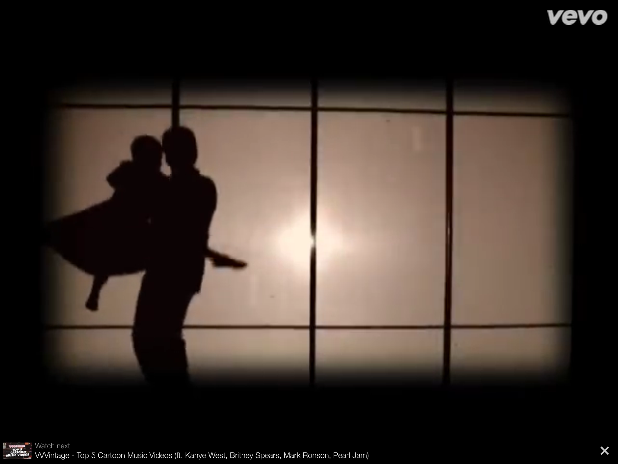
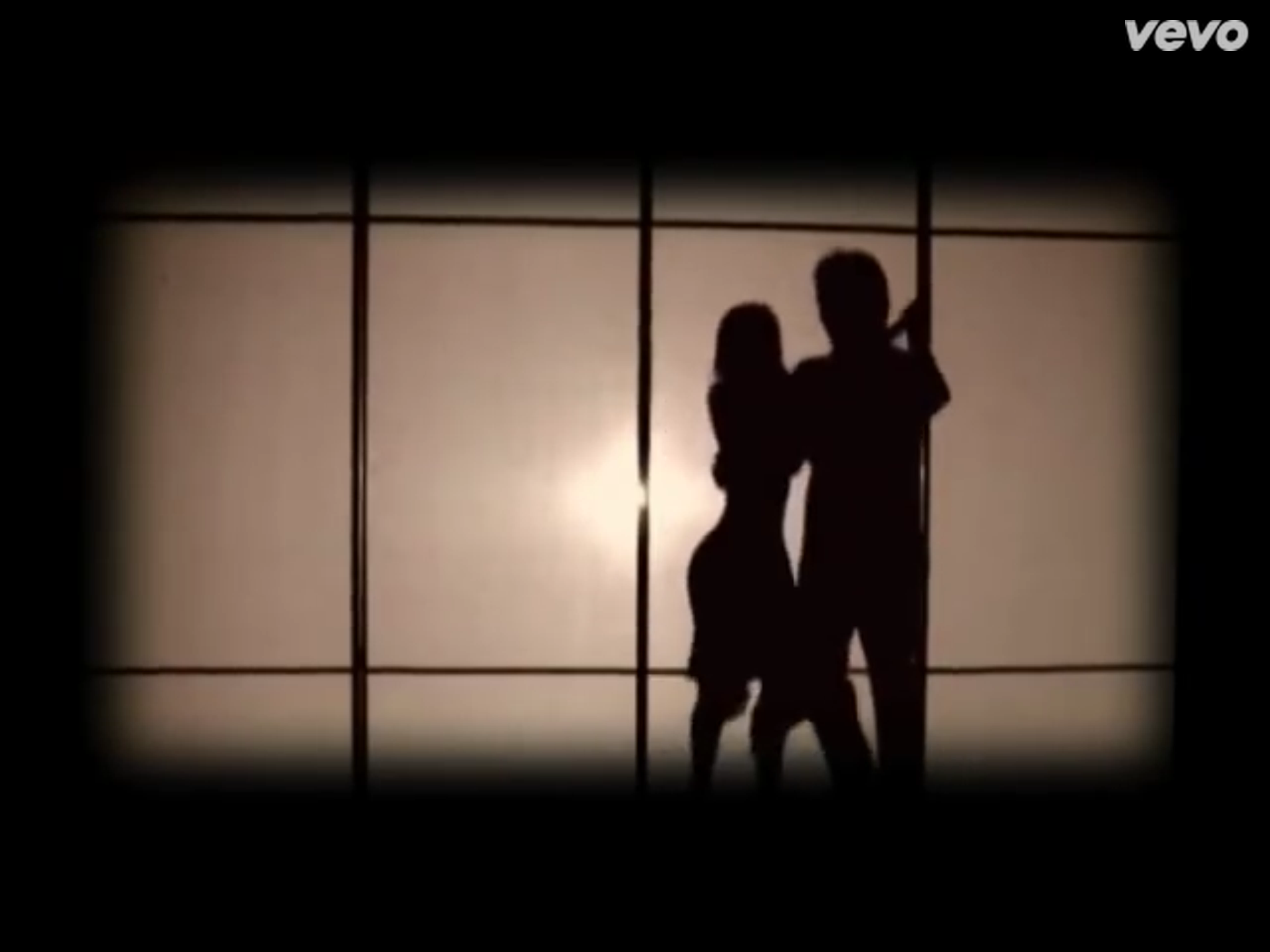
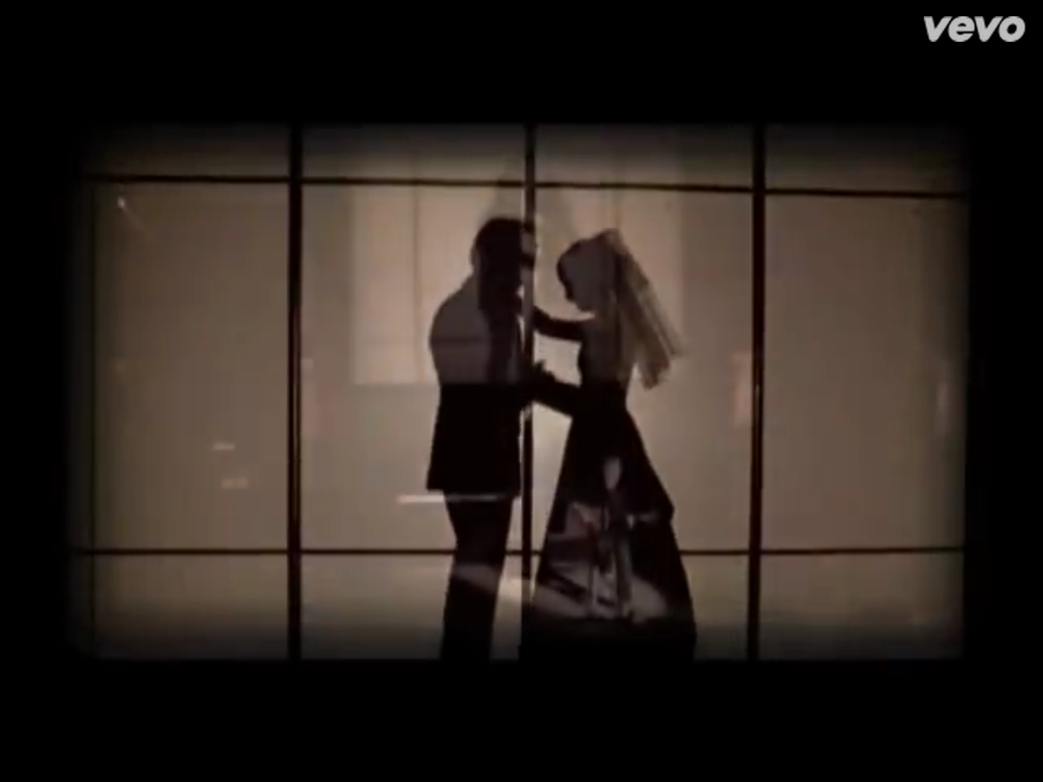
My inspiration comes from the music video itself, where in the background, the silhouettes and shadows of the father dancing with his daughter through different stages in her life can be seen.
My goal is to create a sequence or set of images based on these silhouettes. Initially I wanted to create a set of three separate works to serve as different stages in the daughter's life but instead I think I want to create a longer single composition so it will give the impression that the daughter is dancing with her father from one stage to another.
I'm a bit hesitant about working in color because it adds another element of complexity to the project and also because personally I'm not very adept with color theory.
However, if I were to work with color, I've always been fascinated with minimalist Disney posters that I've come across on tumblr. Here are a few examples:
https://www.behance.net/gallery/7872865/Disney-Princessess-Minimalist-Poster
https://www.behance.net/gallery/Negative-form-in-Disney-minimalist-poster/5581915
https://www.behance.net/gallery/Disney-Minimalist-Posters/8354101
If working with color, I want to create a gradient from more pastel/childish colors in the background to heavy tones in the ends. The gradient will add to that idea of transitioning between different stages in the daughter's life. If I decide not to work with color, I would probably add more details to the silhouettes, similar to the following: https://s-media-cache-ak0.pinimg.com/236x/e5/fb/07/e5fb07d12bec92ad9555cce844656e65.jpg
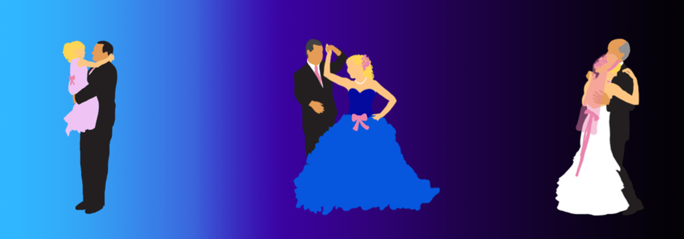
Inspired by Steven Curtis Chapman’s contemporary song “Cinderella”, Striking Midnight attempts to capture the fleeting precious moments between a father and a daughter. Inspired by the dancing silhouettes in the video, the artist, Judy Han, uses a minimalist approach in depicting these moments, using colors and shapes as representative properties in the piece.
The color pink in the father’s tie and in the daughter’s accessories is used as a repetitive element across the three moments to represent the growth of their relationship. Even as time passes on and things must eventually come to an end, the bond between a father and daughter is constant and unwavering. Similarly, the father is always depicted in a black suit to represent however things may change, her father’s love will never change.
The color gradient in the background is used to represent the passage of time. In the beginning, the pastel blue is used as a childish color commonly found in adolescent playthings. It is also the color of the sky at the dawn of the day. Later on in the day as night falls, the violet is representative of the night sky and the maturity of the daughter into womanhood. In the very end, the black is the pitch dark of midnight. Here, the daughter in the brightest element while the father fades into the darkness. This is to show that not only must the father come to terms with his daughter’s independence but also that the daughter can no longer cling onto her father to grow.
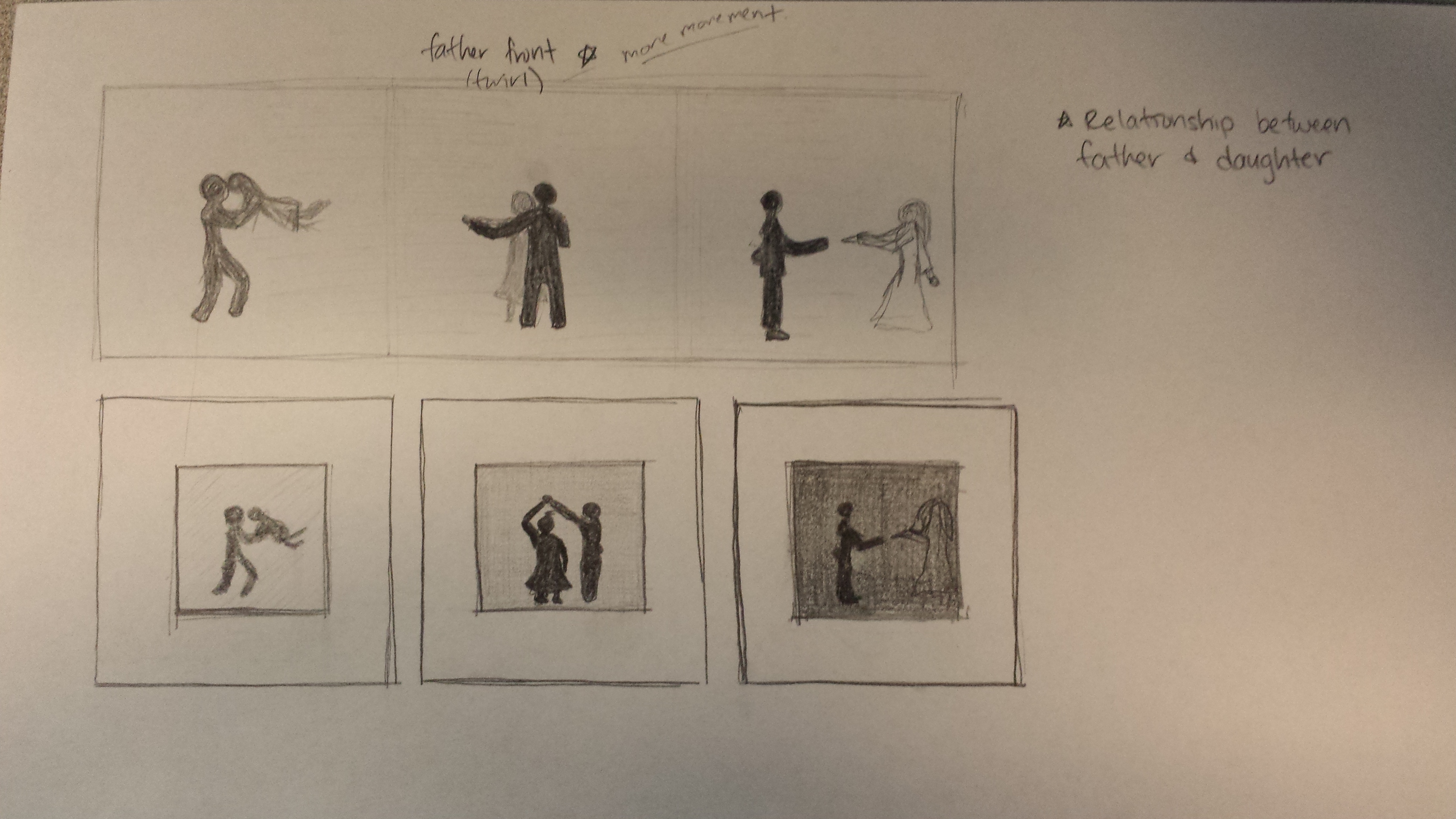
After listening to the song, I wanted to incorporate that idea of “dancing through life”. In this case, the father and daughter would be dancing through stages in the daughter’s life. In order to depict this, I drew up to quick prototypes of my compostion – one where there was a single composition of three different moments between the father and the daughter, and a second in which I would have 3 different compositions but which would be exhibited as a collective set.
In the end, I chose to have a single composition because after looking at my prototype, separating the moments allowed each composition to be able to stand on it’s own. While they would have been juxtaposed next to each other, each composition in it of itself told it’s own story rather than having the story moving from one composition to the other.
After the initial ideation, I received some feedback and critiques from my peers. After discussing the advantages and disadvantages of working in black and white or color, I was challenged to create a color composition. I knew that some factors I would have to consider were the overuse of colors or using too many colors and choosing a fitting color palette.
Kevin suggested that I look to Kara Walker for inspiration in how she tells a story with her silhouettes. After doing some research, while I particularly enjoyed her pieces, the way she integrated different characters and elements together in a single composition gave me the impression that there were a multitude of stories going on at a time. In one corner two people were interacting intimately as someone else watched on from a tree that another person was sitting under and so on and so forth. Her pieces had such a rich scene happening simultaneously while I simply wanted to capture and preserve shared moments in time between the father and the daughter.
One comment I thought was really useful was to somehow show or represent the relationship and the love between the father and the daughter over time. Initially, I only had silhouettes of the father and daughter dancing together which would show that the daughter was growing up but it didn’t speak much about the love that the father felt for his daughter. It would help to show this because when the viewer gets to the end of the composition, they would understand the bittersweet feeling of letting your daughter grow up.
From that comment, I came up with the idea of having some kind of constant accessory that was present in each moment. For example, the father would have a pink tie and the daughter would have a pink bow. The issue with that was that there would be too much focus on the bow and people might treat the bow as a “cherished object” rather than representive of the love and relationship between the two. Instead I chose to add onto the pink accessories each time to show that the father continue to give more and more of his love to his daughter. In the second moment where the daughter is a young woman, she has the addition of a pink hair accessory along with her original bow and in the final moment, her wedding veil is the same pink as the rest of her accessories.
Another comment that was made was about the use of color gradients and because I was debating between keeping it black and white vs. in color, if I should transition from black and white to color to show that time was passing.
I definitely wanted to have some kind of color gradient in the background, but rather than going from black and white to color, I went from color to black and white. The reasoning is that I felt that the colors should fade away at the end of the composition (in this case they don’t fade but there are no longer any pointed colors besides the pink) because that is when the relationship would fade in the sense that the daughter is no longer his little girl.
In terms of working with colors, I knew for the adolescent stage of the daughter’s life, I wanted to use pastel colors to represent a childish demeanor which is why the background is a pastel blue and the dress is a pastel pink. For when the daughter is a young adult, I thought about a high school prom or formal and how it usually takes place during the night and so I chose a dark purple. For when the daughter is getting married, I saw how I had gone from a light blue to a dark purple and so I experimented and tried to continue going darker. In the end, I was happy with the result because I saw that the father’s black suit had began to fade into the darkness leaving the daughter in her white wedding gown as the standout in the moment. I thought that this was an effective tactic because I was so focused on how the father loses his daughter (because that is what the song was about) but seeing this made me think of how it goes both ways – the daughter is losing her father too. I also made the father’s hair become grayer through the composition
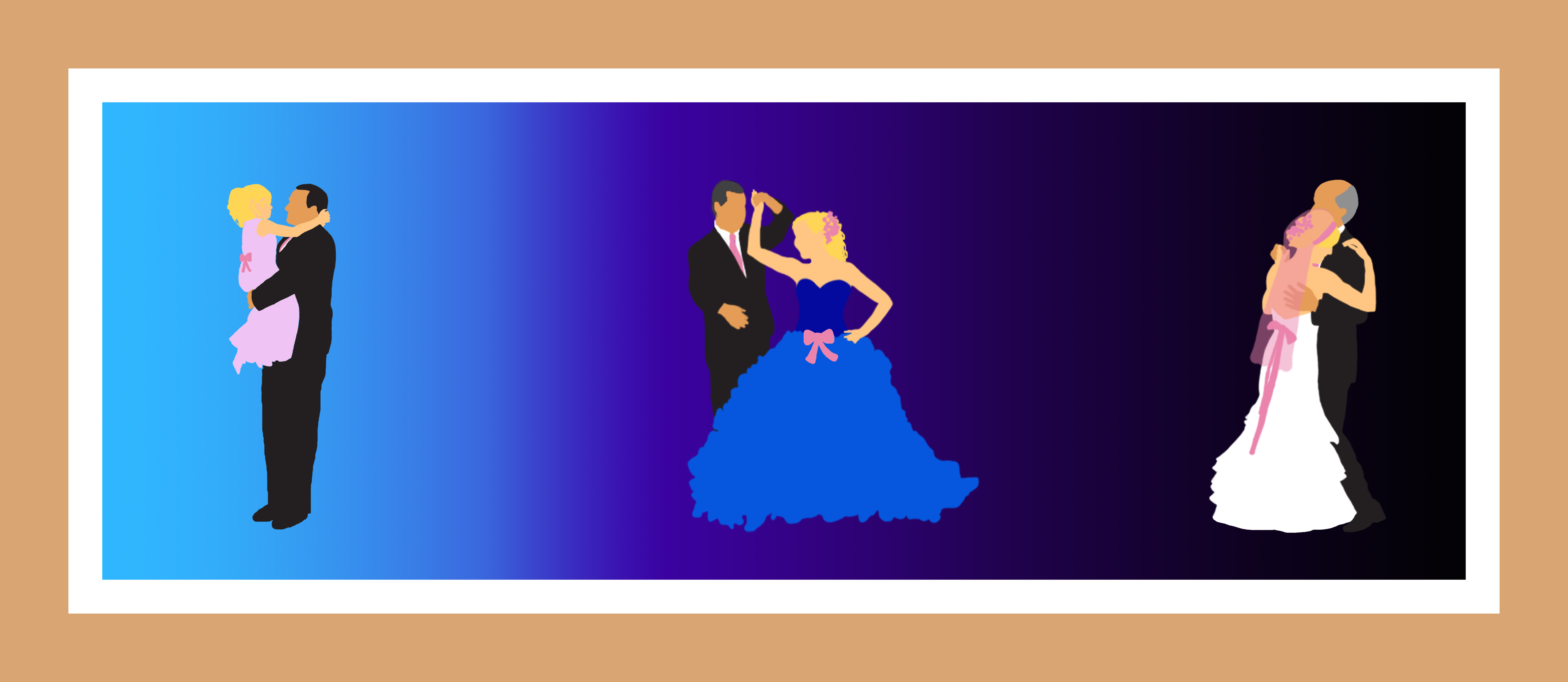
The result turned out like the following:
After looking at it, I felt that it still wasn’t complete. It seemed too much like pictures just stamped onto a gradient but at the same time, I liked the reasoning behind my choices. Because they looked like just moments stamped onto a gradient, I considered going back to my initial idea of separating them into three compositions as a set which gave me the idea to try framing the composition. The point of framing it was that it would seem like they were moments that were captured and preserved intentionally rather than 3 moments in time just stuck together. I was a lot happier with the result after I had added the frame and also decided to remove the necklace in the center because it made for too many elements in the composition and because it was drawing attention to it.
Here is my final composition again:
After spending some time looking at it, I’m beginning to wonder if I had to be so literal with the piece. What I mean by that is, from my explanation and analysis, it seems like I’m relying heavily on colors and motifs to get my meaning across so it might have been possible to strip away the forms and the human shapes while still carrying the message across – at the same time, the act of dancing is special to me so I would still want to keep some kind of representation (perhaps not so literal) of dancing intact. Also, I listened to the song again while viewing the piece, and I’m beginning to wish I had chosen a warmer color palate. With all the blues and purples throughout that piece, while is has a intimate feel to it, it is a lot of just pure cool colors. Having a warmer palate with more reds and yellows would have complemented the song itself better because the song has that sentimental warm feel to it.
Before this semester I think I still would have appreciated it to some extent. I definitely wouldn’t have cared much for the colors in the piece but I would have probably thought it was “cute” and then quickly moved on. From quickly looking the piece over, it’s obvious to see a little girl, then an older girl and then a married woman so I would have quickly formed the idea that the daughter was growing up and moved on. Because it’s not as abstract I wouldn’t have really spent time looking at it because I would think “ok, I get the idea, let’s move on”.
