Dot/Line/Shape Compositions
Made by Kim Lister
Made by Kim Lister
Created: November 24th, 2014
I took three of the photographs from the previous assignment--one of a manmade structure, one of a human body in motion, and one of a human emotion--and for each one distilled the composition to an arrangement of lines and dots, then an arrangement of lines, dots, and shapes.
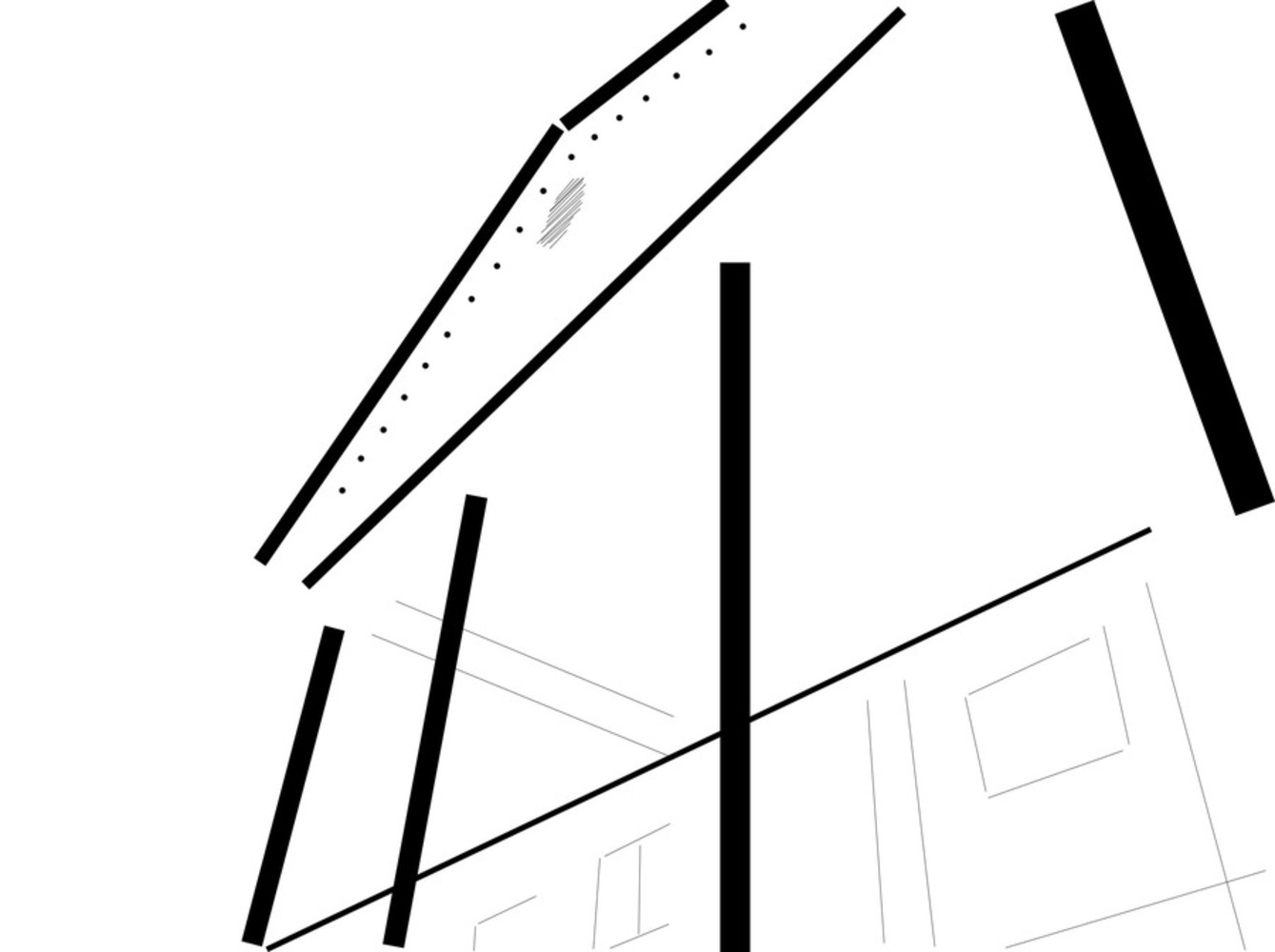
Structure, line and dot
In this composition the columns were the most dominant form, so I made sure to emphasize them with thick, dark lines. Overall the entire picture was very linear, with the walls, windows, and roof all at neat right angles, so I added bold lines for the foremost edges that were most prominent, and then thinner ones for the various other edges that comprised the image. The notched edge of the triangular face at the top didn't really have components long enough to form an obvious line in the overall image, but they did provide some texture, so I marked them with dots to create a similar visual effect. Ultimately I think this strongly evokes the source image but I still think both are rather plain.
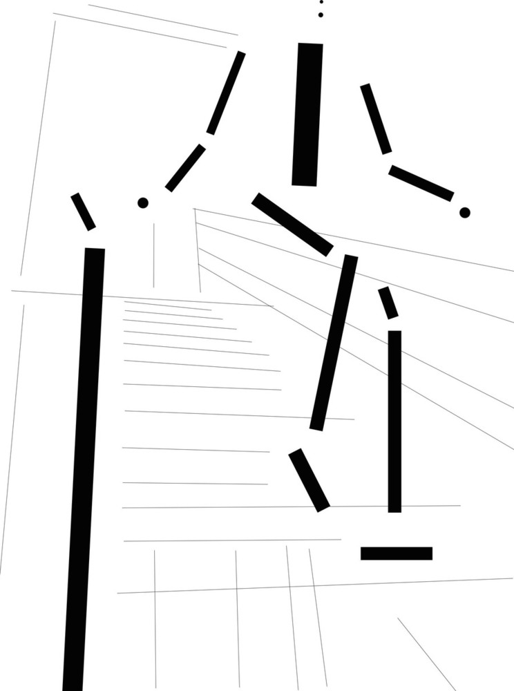
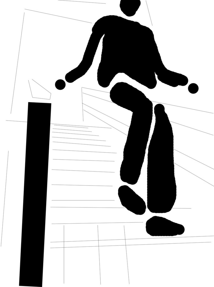
Motion, line and dot
The human figures were harder to translate because straight lines don't turn up much in organic forms. I ended up mostly breaking them down anatomically, with lines for upper and lower limbs and one for the spine/torso. Since the main content of the image was the person, he was depicted with bolder lines. The left railing was also prominent, so it got the same treatment. Dots were used for the hands, since he held them mostly curled, and for the impressions of his nose and mouth, since his whole head wasn't in frame so those were the noticeable features. As in the previous photo, the structural elements were very linear, so thin lines give the impression of the stairs, porch, and building. Looking at it now that it's complete, I like that the railing echoes the right leg, emphasizing rather than competing with the body's shape. I think this translation was successful because it captures the same effect the original had with the lines of the staircase emphasizing the subject's motion.
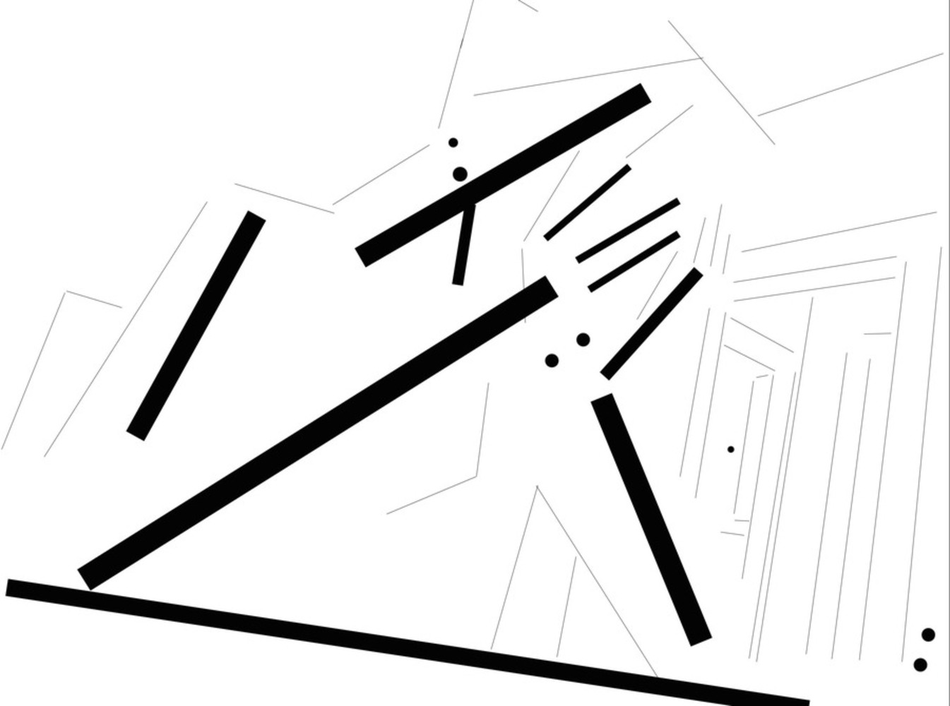
Emotion, line and dot
It's not immediately (or possibly even eventually) clear from this translation what the original shot depicted, but of the first three translations this is my favorite. Of the bolder lines, many are pointing approximately the same direction, but the fact that they're clearly not exactly parallel makes them seem a bit more natural. There's also the two that are almost perpendicular, providing some contrast but also propping up the other forms. That element of support is certainly reflective of the source image. I also like the variety of dots in this composition. Most of them occur in pairs, and most are fairly large, providing a strong counterpoint to the many lines. The translation also makes it easier to see how the "busier" portion of this composition was kept in the rightmost third of the frame, with the less cluttered but more complexly shaped human form in the foreground taking up the majority of the space. My main problem with the composition as a whole is that it feels too happy, given the subject matter. The dots feel bubbly, and the bold, disorderly lines seem loud, which isn't appropriate for the emotion being conveyed.
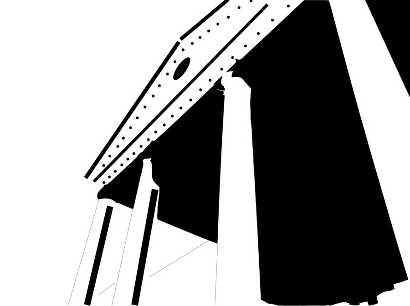
Structure, shape
I wanted to use the black shapes to capture the strong shadows in the original image, and I like the effect that gave me. Like the translation with lines and dots, this corresponds closely to the photograph it was adapted from, and both are fairly simple compositions. Unfortunately making the shadow into a shape takes it from being a kind of negative space to seeming like the focus of this picture. The huge black blob really dominates the image, taking away from the strong presence the columns had in the other two, so I don't think this was probably the most effective translation of the photo.
Motion, shape
Again, the human figure was the focus in this one, so it gets shaped out in black chunks while most of the background is in faint lines. The left railing is still prominent enough to merit a shape. I was very intentional with the divisions between the different shapes; each shoe got its own outline, and each leg, while the shirt and arms are a whole. I felt that the way the body was oriented in the photograph, each leg seemed like its own form, but that wasn't the case for the arms; likely this is because the legs are moving in slightly different ways as he's stepping down, but the arms are just hanging out perfectly symmetrical and at rest. I like the line and dot translation for this one better because the jaunty, angular lines feel more kinetic than the rounded blobs seen here. That lower foot looks like it's slumped on the step like a beanbag, not poised and ready to spring forward.
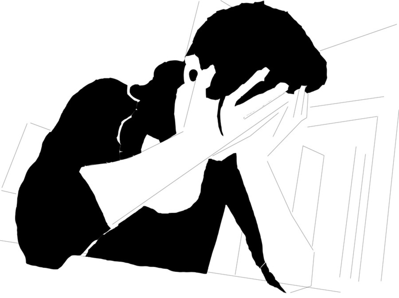
Emotion, shape
The human form is much clearer in this translation than in the one with only lines and dots. In contrast to the "motion" compositions, rounded shapes suit the slumped, defeated tone of the original photo better than straight lines, and the uneven edges make her look a bit shaky and torn up, which also fits the mood. In that sense it might be a more effective translation of the source, but I don't find it as interesting as the other translation. I also don't feel it adds much to the elements presented in the original photo. Overall I feel I should have used simpler shapes for these last two, to better capture the essential forms rather than their actual shapes.