About
The goal of this exercise is for you to practice: finding good subject matter; finding the best vantage point (perspective on your subject matter); and considering the composition
You should take a series of photographs for each of the following:
An egg;
A landscape;
A man made object or structure;
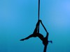
The human body in motion;
A human emotion
See more at: https://docs.google.com/document/d/1wbwPMe0-M59BMv-FJPOtkXDnp4CWgLCfQeKlvWvL-NQ/edit?usp=sharing
Share this Pool


Discussion 4
-
Compositions
 Kevin Ramser
Your egg picture is so great! It's so weird that they print the expiration date on each individual egg. Love it. Your asymmetrical composition is really well-balanced, it's lit gorgeously, your shallow focus is nice and shape right on the bright edge of the egg, and the rough texture of the blanket looks great paired with the smoother texture of the egg. You did a great job making a boring object visually interesting.
I think that the egg photo is the most striking in part because it has the biggest range of values (i.e. bright and dark areas.) Work on replicating that in your other photos. The long exposure of Mauricio typing is nice, but it's a little greyed out. It's nothing some Photoshopping can't fix, but it's better to get it in the original shot if you can. It's just hard to get a broad range of values if you're shooting in a low-light environment like the one in which you shot Mauricio.
-
Photographic Composition
Kevin RamserMy favorite image is the little robot guy. He's well lit and focused against the dark, blurry background. The central composition and bare surroundings are working well because they're reinforcing the sterility and artificiality of the subject. In the other photos (the egg, the smiling girl, the landscape) the central composition isn't working as well because it's not really (for me, at least) contributing to the meaning or really relating to the subjects. I'd challenge you to look for other ways to frame your subject. Try getting up high/down low. Try framing your subject at the edge of the frame or getting super close or tilting the camera at an unusual angle just to see how that changes the subject. You started to do it in the photo of the hands typing. Just push it further.
Btw, thanks for including the shutter speed, aperture, and ISO you used in your photographs! It wasn't required, but is helpful.
-
Compositions
Kevin RamserI think the image of the bench and the image of your friend and your pet mouse are the strongest. I like the angle and shallow depth of field you used for the bench.I think you're right that the balance is a bit off with that big patch of grey on the right hand side, but otherwise the photo is pretty visually busy, so it's sort of a nice place for your eye to rest. I think that you could remedy that just with some dodging and burning (changing brightness of parts of the image.) Same with the image of your friend with the mouse. I think that it's the most well-composed, it's just really dark.
Photography Basics
I'm not really getting "nervous" from your emotion image, but I think it's your best photo nonetheless. I do see some of that tension in the hands, but overall I think the image gives me a sense of calm, maybe anticipation, but not really anxiety. The soft backlighting is nice, especially on the folds of the shirt, but the tradeoff is that your subject is really dark. It would be nice to have a little more brightness or contrast on his torso to draw the eye there. Right now my eye is more drawn to the arm rest on that chair, as it's the most high-contrast part of the image. It's nothing you can't fix in Photoshop, but it's something to keep in mind for next time that you're shooting.