Creating a hypertext adventure in virtual reality
Created: December 3rd, 2015
Intention
To design a hypertext narrative fiction through a virtual reality environment; to learn the best practices of incorporating text as the main storytelling element in VR.Context
Hypertext fiction might be more recognizable these days as Twine games, which are made with Twine, an "open-source tool for telling interactive, nonlinear stories," quoted directly from their website. The tool has been on the rise over the last few years among independent game developers who make nonlinear narratives but have neither the technical nor graphical means of doing so. These games, while close to text adventure games, have no real user input other than clicking links designated by the developer. The links might provide different text descriptions, expanding the player's knowledge or changing the player's experience of the story, or it might link to branching paths. Some are extremely experimental, while others tell rather linear and standard stories.With Oculus Rift hitting the market soon, there might be a rise in projects made by these experimental developers playing around with text and VR. As many VR developers know, text in virtual reality is generally regarded as difficult to implement successfully. Therefore, this research project aims to identify the best practices in incorporating the elements of a hypertext fiction game into a VR environment. Embedded in this project is defining different methods (animation, timing, placement, size, etc.) for displaying and presenting text in VR to maximize legibility, comprehension, and narrative engagement.
Product
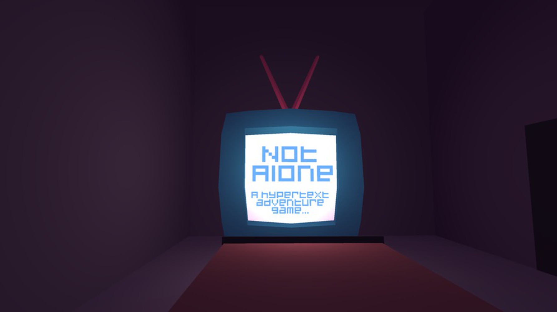
This is a 3D game within Unity to be played on the Oculus Rift, though mouse + keyboard version exists for testing and accessibility purposes. Player input consists of the position of the player's gaze and a single button (spacebar). There are sound cues and animated text to bring attention to the player, as well as classic narrative progression and/or branching narrative mechanics borrowed from Twine games.WEEK 1: research, mechanics discussion, concept development, story brainstorming
First, we needed sources of inspiration: we looked at games like The Stanley Parable, The Beginner's Guide, Horse Master, Thirty Flights of Loving, etc. all games that specialize in narrative and sometimes employ text in 3D space. We especially examined Twine games closely, looking at the various mechanics they used with hyperlinks such as: progressing through passages, flavortext, and switching descriptions. We also looked at VR examples that use text to see what best practices people have figured out so far.
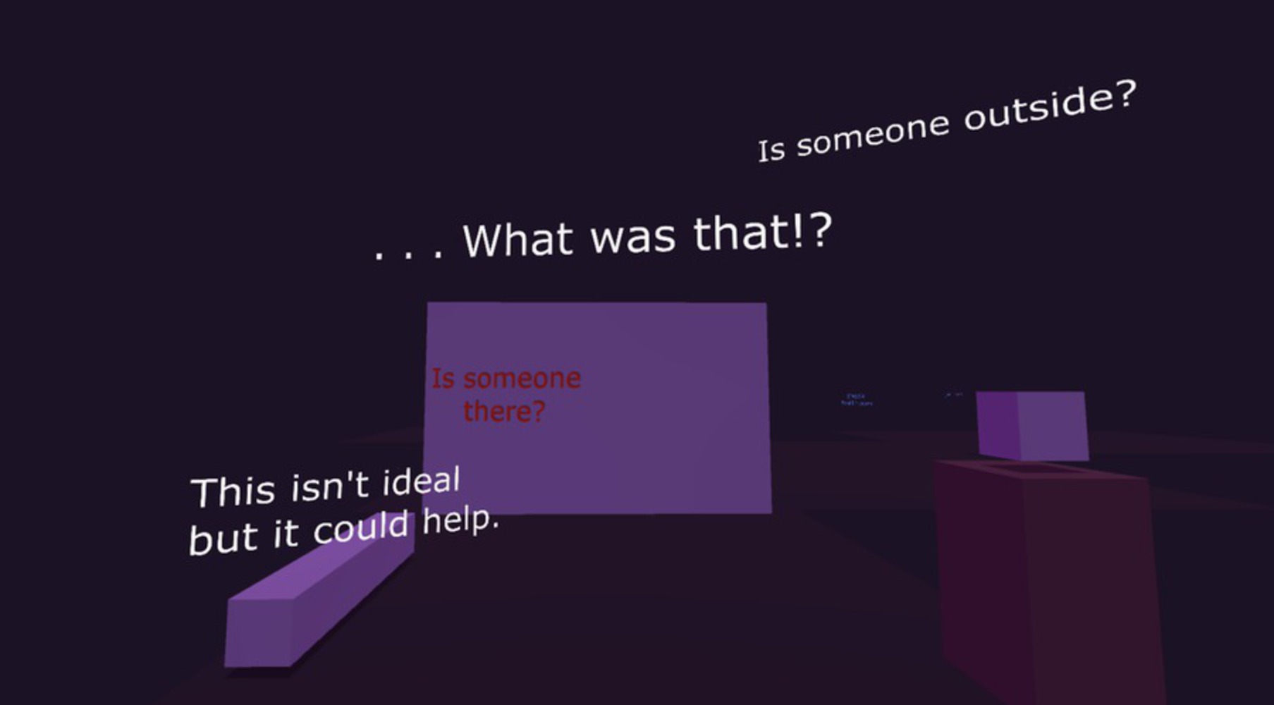
Thus we settled on these mechanics to play around with for now: 1) each "passage" is an environment/room, 2) hyperlinks can be "clicked on" with time of gaze, 3) hyperlinks can change the physical "description" of the environment a.k.a. the actual object, 4) hyperlinks can advance passages, branching or not, and 5) there will be text sprawled on the 3D landscape corresponding what the text is describing.
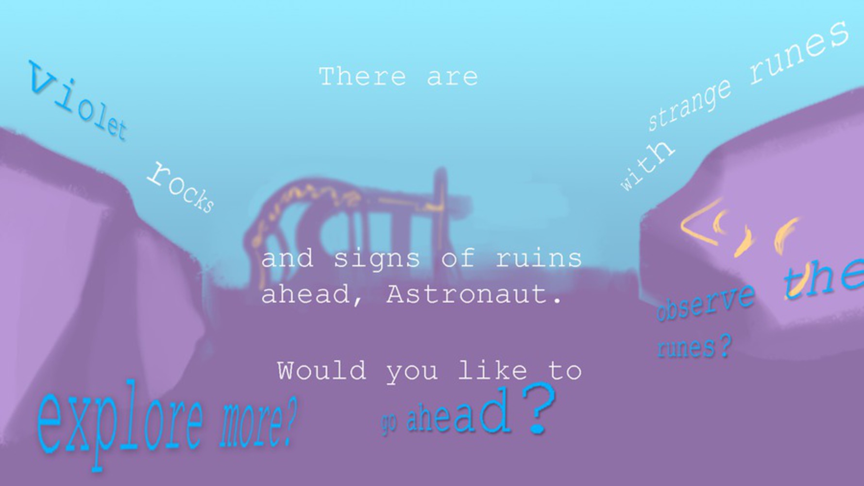
We started working on a story; the premise was the player is a space renegade on a mission to find the source of a strange, unidentified magnetic pulse on the distant planet of Marzuki. The idea was that an AI would interact with the player solely through text, navigating her through the plane. Based on this, we developed several concepts that visually conveyed our mechanics:
WEEK 2: Unity prototype, story determined, concept art
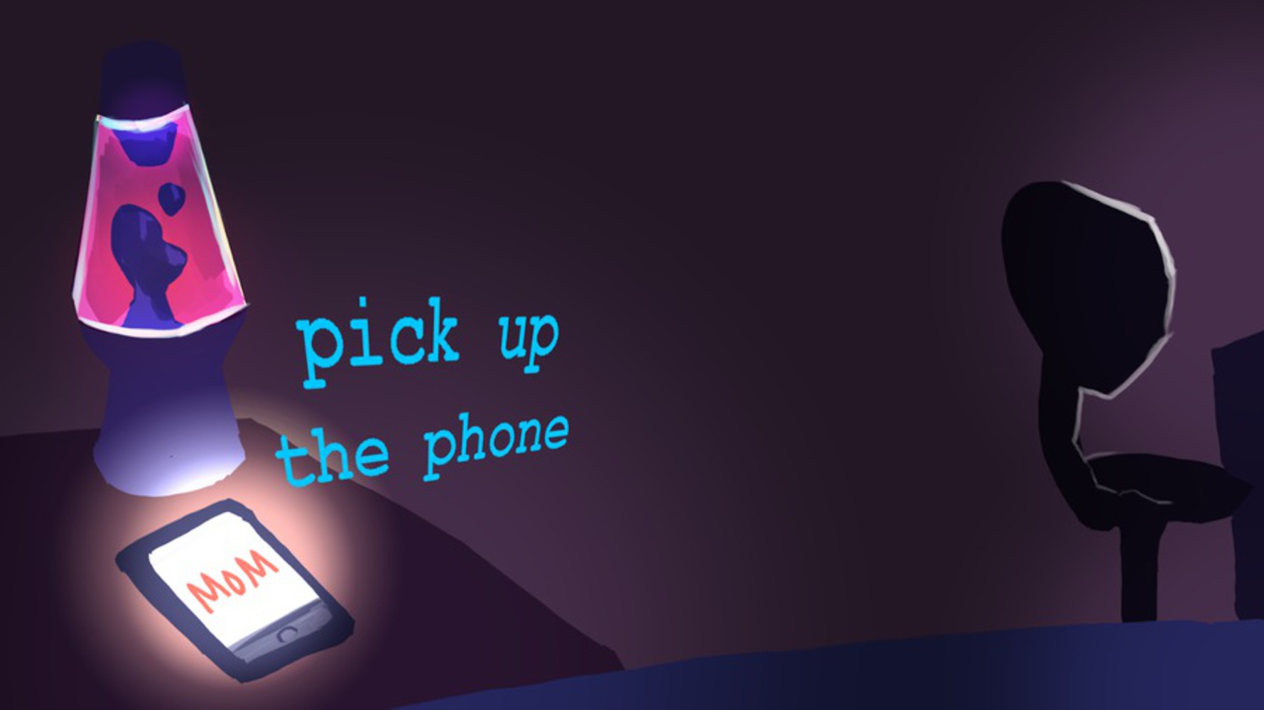
However, we received feedback on the space/AI idea that it might be too complex for text game in VR, especially to do in five weeks, because it dealt with several big topics such as artificial intelligence, truth and guise, unreliable narrator, etc. After a series of discussions and tackling different story ideas, we settled on a simplified story with a rather mundane setting to require less text density, one that explored other in-game mechanics to tell the story (objects, sound). The new story's premise was that the player is home alone, and something supernatural might be happening in the house. We wanted to play with horror tropes and eventually end on a comedic note. We found this type of weird, easy acceptance of the magical/supernatural quite the common trope among Twine games, so we thought it was appropriate.
We abandoned time of gaze as a mechanic, as the player would end up waiting for the narrative to happen instead of being engaged. Instead, the player would look at a hyperlink and click on it with a single button to interact with it. We also determined that the player should be static instead of being able to move with a controller, as the latter would not only introduce too many unknown elements, but also cause disruptions in the level design because the narrative would be designed with pace and player gaze in mind.
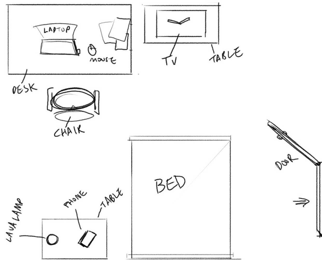
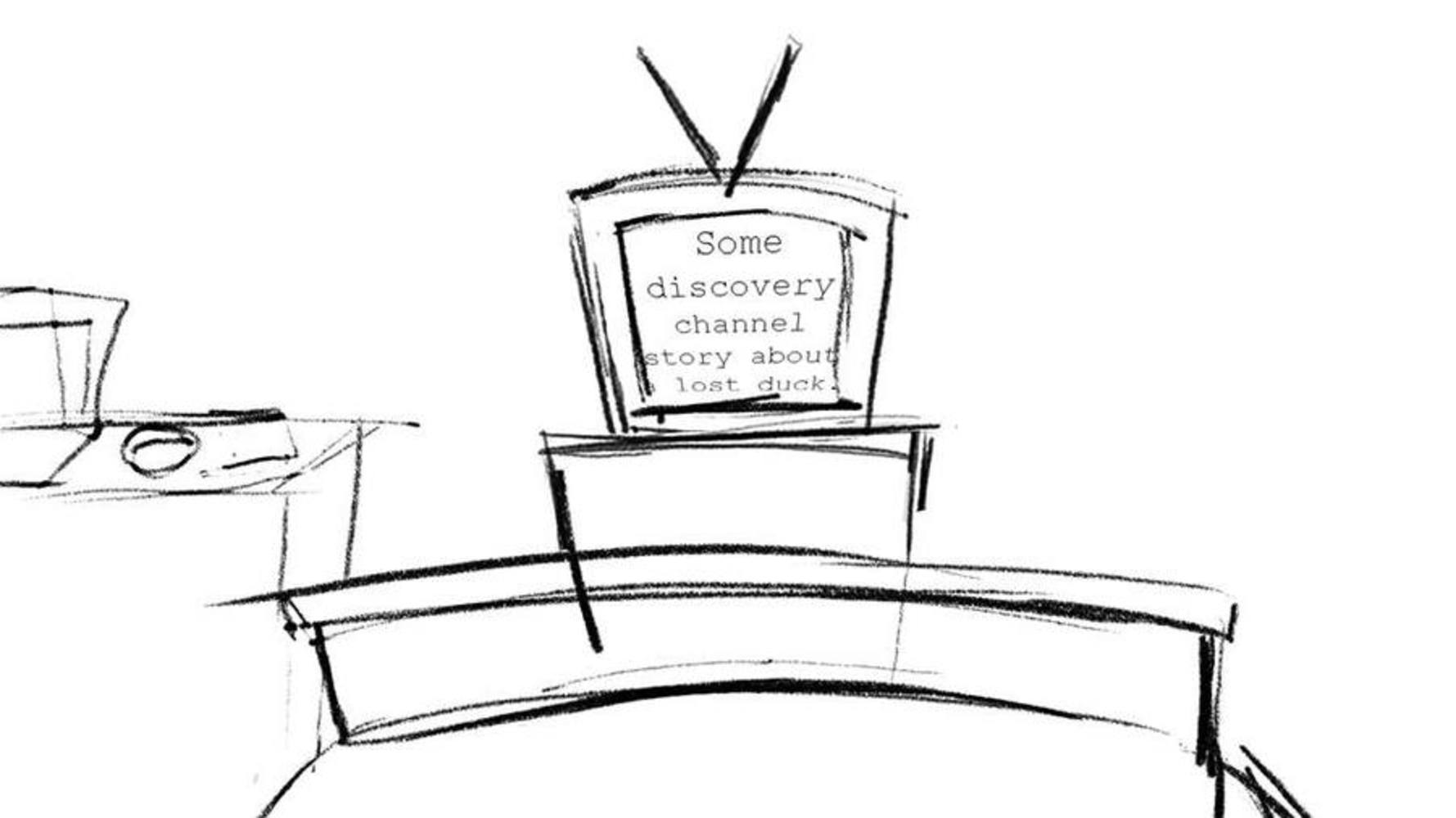
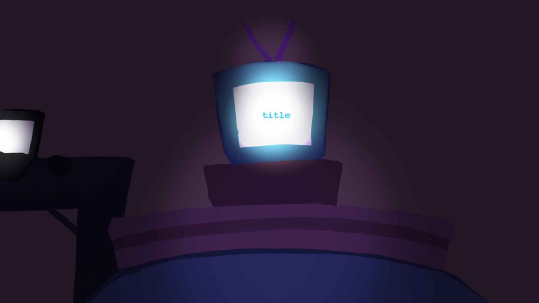
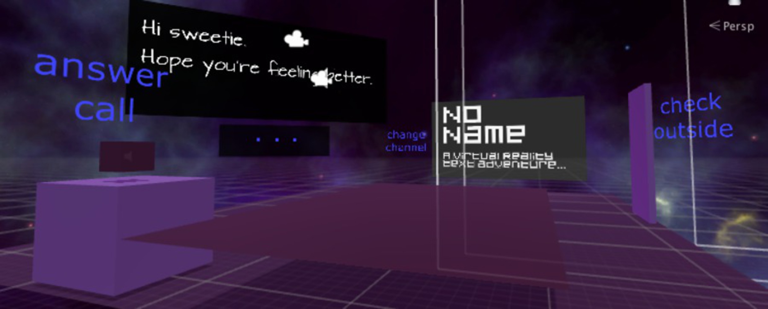
With these decisions, we went forward with setting up the first room, structuring the room layout and designing the level with Oculus:
WEEK 3: alpha; story draft, some art assets
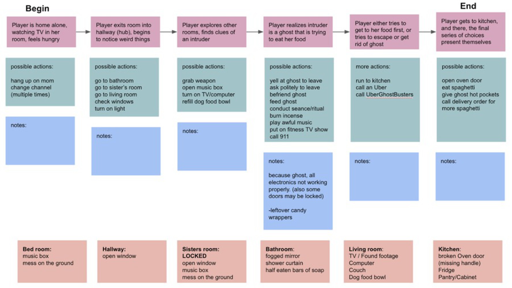
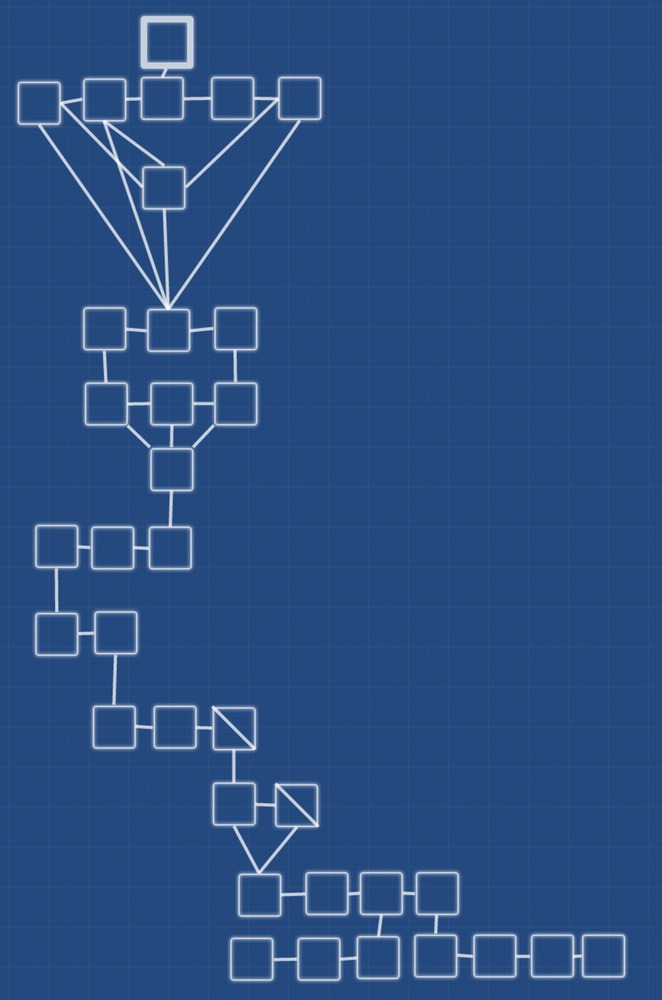
The story was shaping out nicely. We drafted different passages, each a room in the house, and the possible actions that could happen in the room. As we found out in subsequent weeks, the story was still too big of a scope, but because it was such a straightforward story, it was easy to cut out parts where it was unneeded for the plot. Then the draft was written in Twine, acting as our "script" and, technically, prototype. It became a good reference point for the programmer as well because it would point out all the cues that would happen because of a hyperlink.
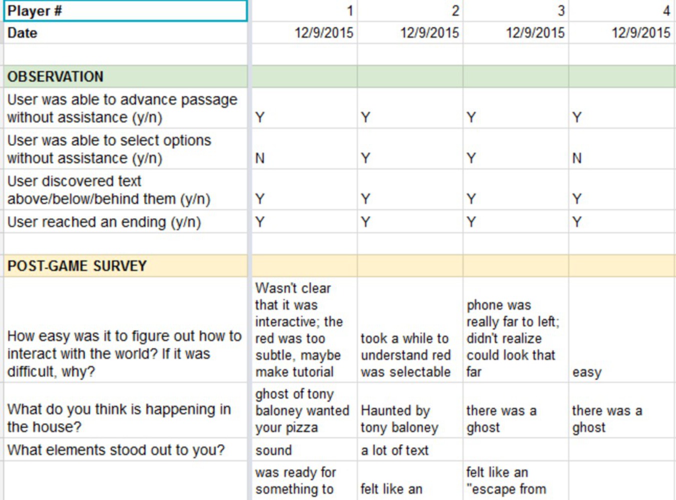
We began light playtesting to see if our base mechanics were working as intended. Here's the build our first series of playtesters played:
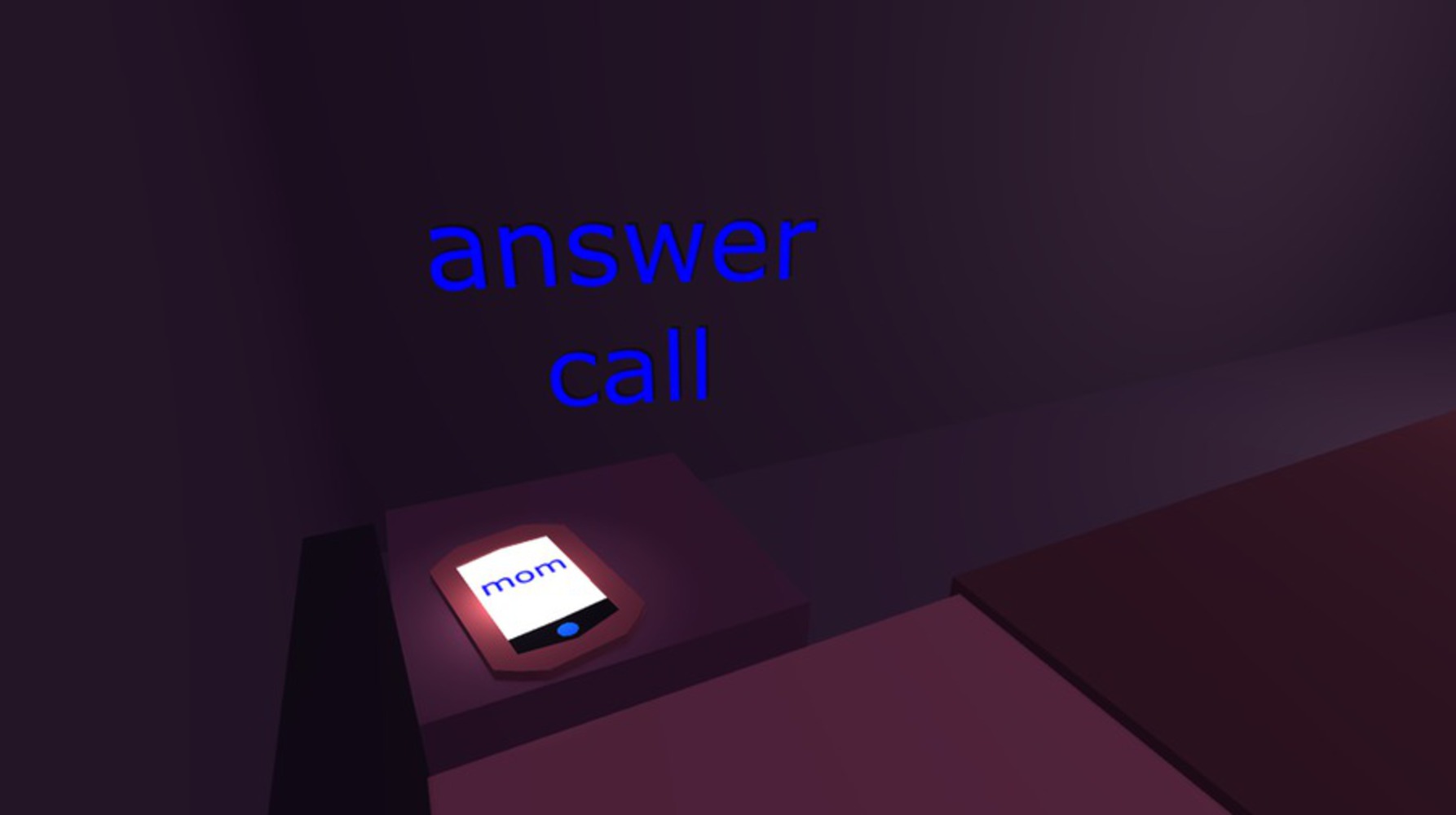
We found out the controls were simple enough that people could figure out how to play without our explicitly holding their hand, although people who were not used to VR or technology at all had trouble playing, as expected. We learned that text placement was crucial (even if we understood this, we continuously had to relearn the concept), as the slightest adjustment could spell comfort or extreme discomfort for the player. For example, in the first iteration, when the mom is talking to the player, the hyperlink choice to progress her speech was placed in such a way that the player would have to constantly move her head up and down in order to look at mom's speech and advance the narrative. When we were constructing this portion, we thought it trivial because the text and the link was "close enough"--turns out it wasn't.
This meant that we had to pay close attention to every text in the game, as even slight amount of misposition could mean breaking of immersion. Unfortunately, due to time constraints, this was simply not feasible, but being mindful of this in the long run helped in not making gross mistakes in text placement.
Another element that was brought to our attention was the sound. Sound effects were huge in player reactions; they were the first things players noticed and remembered when asked what stood out to them. This would eventually result in our decision to add a sound effect to most of the hyperlink elements, such as a toilet flushing sound when opening the toilet lid.
WEEK 4: beta; playtesting, revised story draft, most art assets
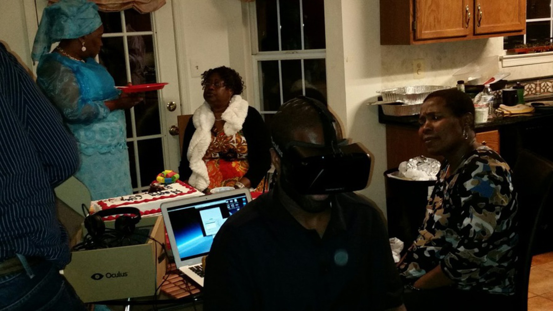
This was the beginning of intensive playtesting. One of our members took the Oculus and the game back home for Thanksgiving to have access to an audience we rarely have at CMU: the young and old who are not familiar with VR, nor video games in general.The results were quite enlightening; people who just weren't used to this kind of interface had a lot of trouble figuring out the controls that we perceived to be extremely simple (gaze, single button input). While we considered these data points as outliers, as our main audience is likely ones who already had some experience with VR, we still refined our introduction scene to be more explicit about the controls, even adding a pseudo-tutorial.
As we playtested even more, the story went through even more revisions
to lessen first-person narrator presence and to emphasize player voice, something we would struggle with even in the last few days of the final build. With the first draft completed, our programmer was hard at work implementing every little thing in the game. We also added a new mechanic: text appearing when the player was looking at a location or object of interest. The game felt more natural as a result, when before the text would arbitrarily appear by the seconds.
By the end of the week, we had pretty much everything implemented in the game from the story structure to the art assets. We weren't relaxed at all though because we knew the daunting tasks ahead of us in the final week: playtesting, tweaking, and polishing.
WEEK 5: final; playtesting, tweaking, and polishing galore
Given our previous experiences with tweaking this game, we knew this was not going to be easy. Every little thing in the game had to be adjusted just right in order for the player to become and stay immersed. This meant continuously playtesting, brushing up the writing, and re-positioning things when necessary. Below is a snippet of a playtesting round with four people:
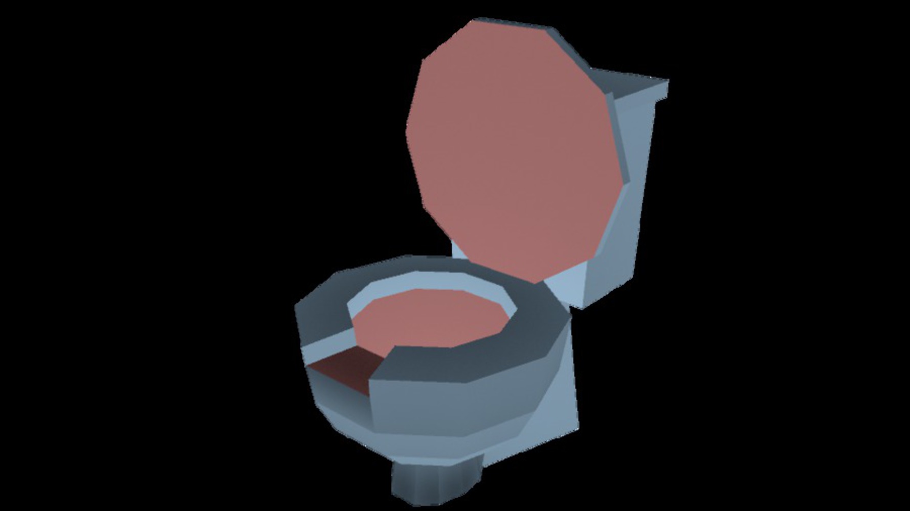
We still had a couple people who had trouble with learning controls, so we tweaked the pseudo-tutorial even more to be more straightforward. Other than that, it was the classic case of "time to re-position things because people are unpredictable, games are unpredictable, and people playing VR games are even more unpredictable." We also put some more flavor to the game, such as a pretty cool toilet that simply offered additional exploration options in the game.
Results
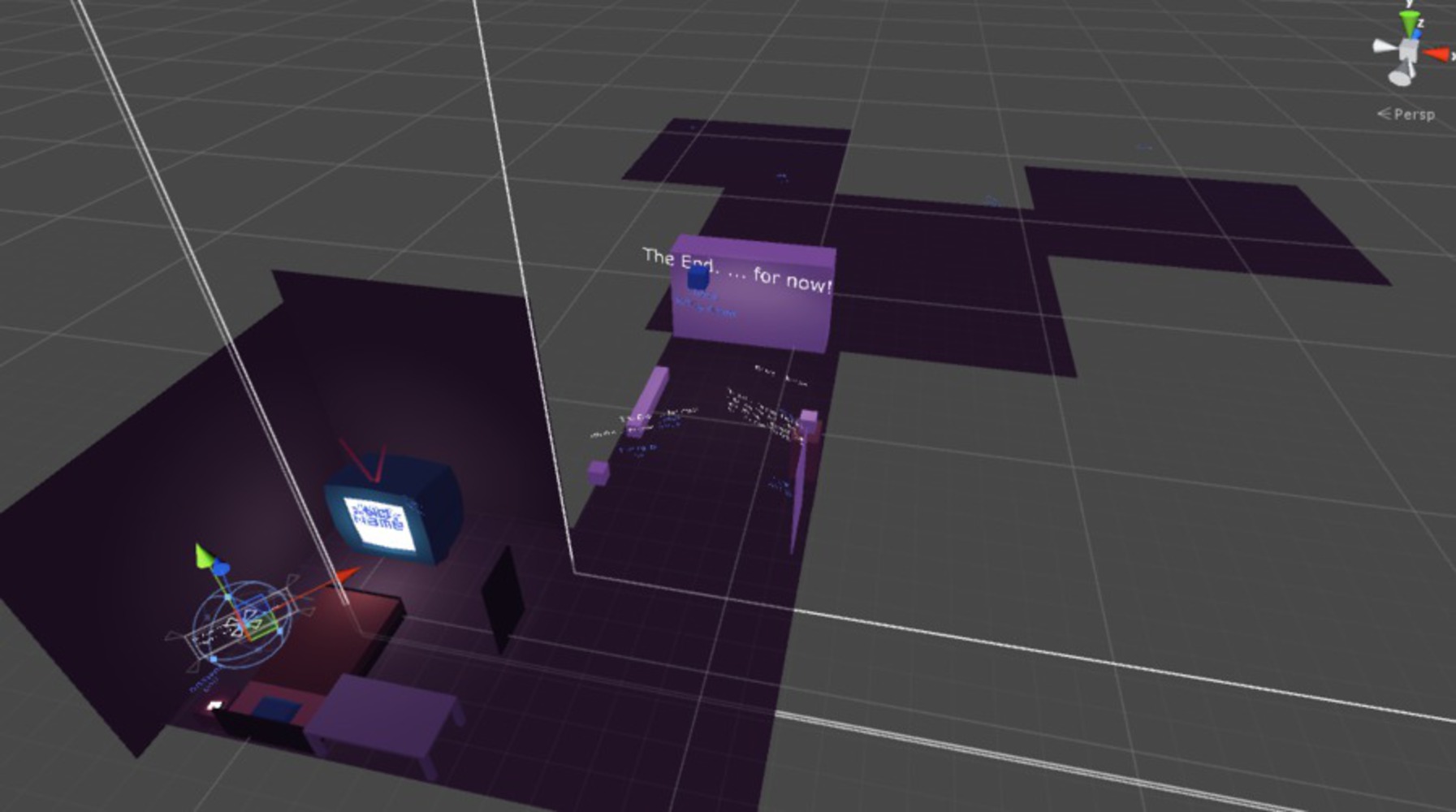
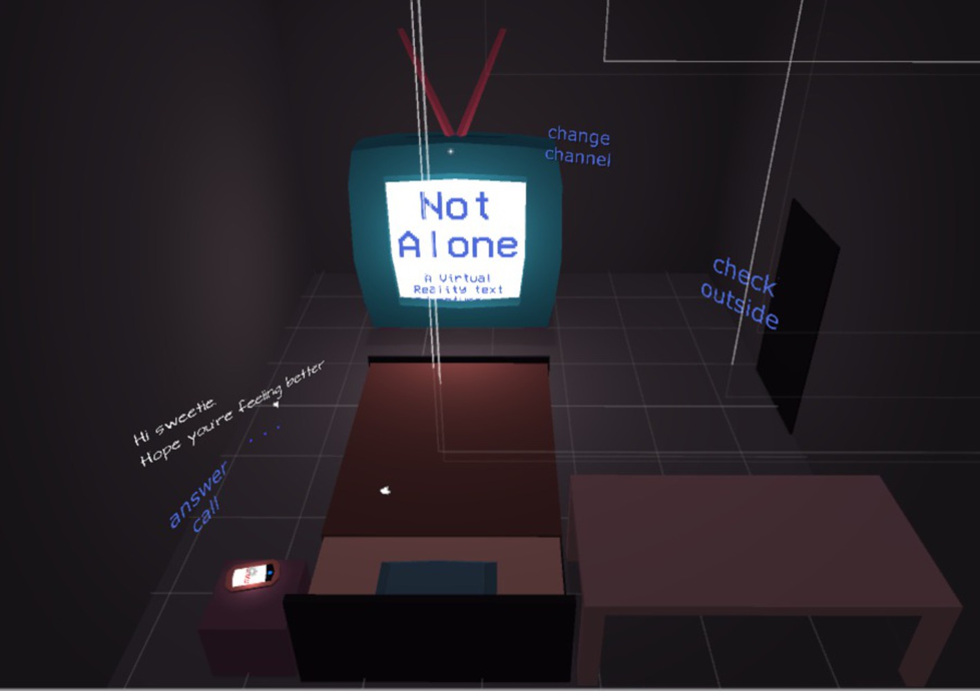
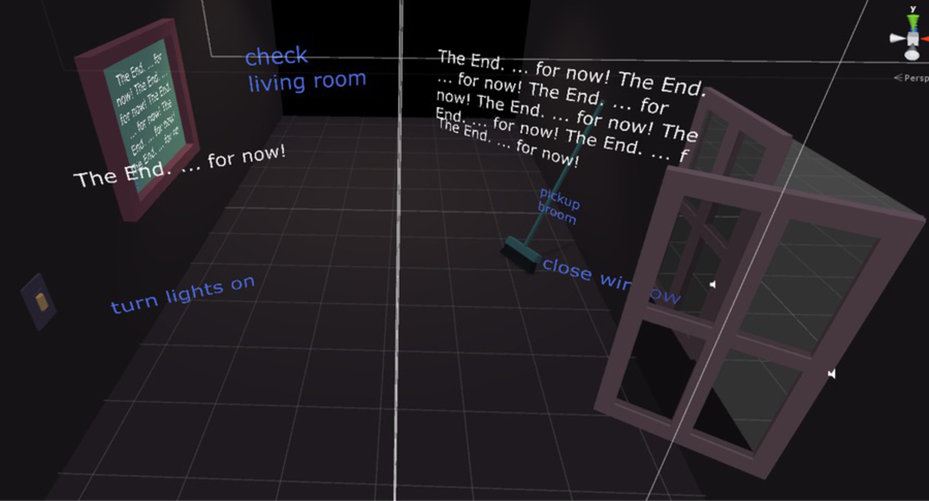
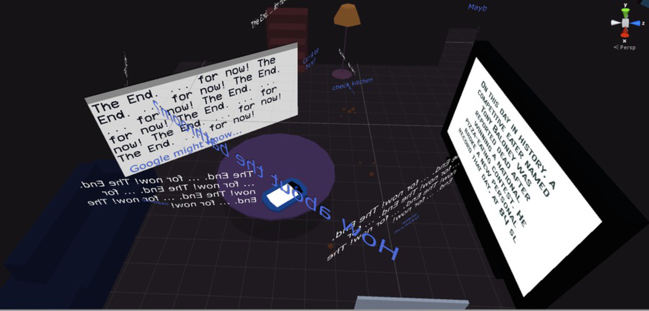
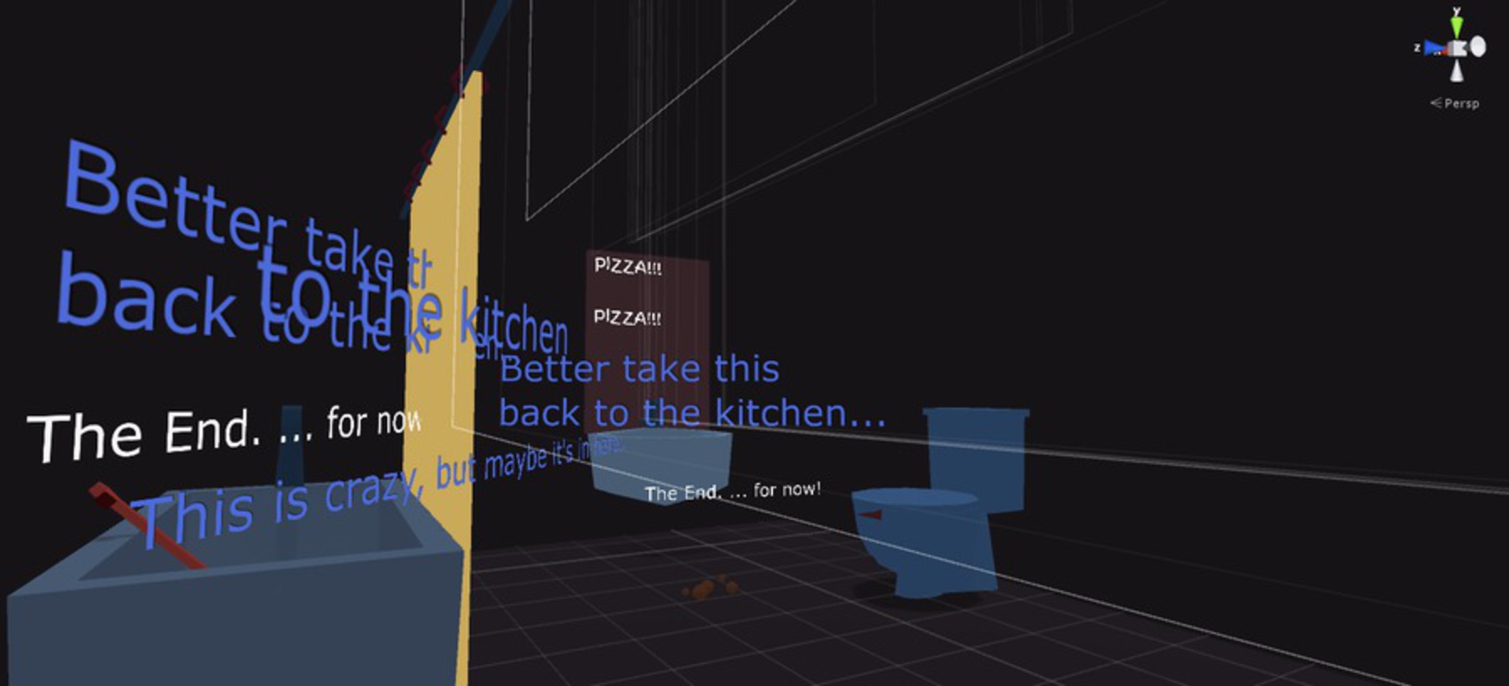
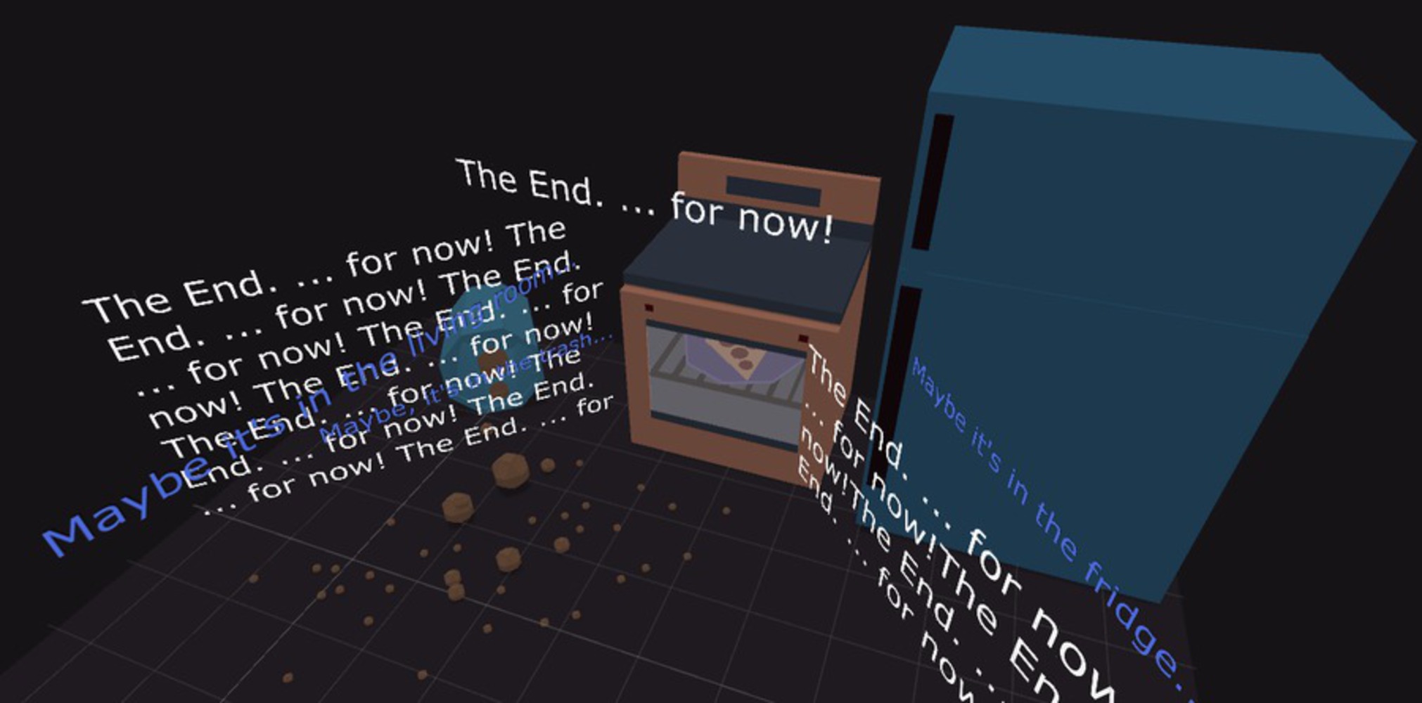
Text can be used successfully for storytelling in virtual reality in the vein of Twine games. Players demonstrate understanding of the story and what is expected of them in the game, and express the emotions that we intended them to feel, though it is debatable how much of that is our impressing emotions upon them vs the emergent emotions that occur from the narrative. Sound plays an incredibly important part in virtual reality, and a hypertext VR game is no exception; because the visuals rarely changed, sound gave the players a sense that they were influencing the gamespace, which is always a powerful and good feeling to have. It also increases immersion, and as Jesse Schell said, VR is all about immersion--some design elements may have to be sacrificed if only to uphold immersion.We completed five rooms overall. Enjoy these screenshots of the rooms as viewed from the scene editor below:
Reflection
Story is difficult. Writing is difficult. Game writing is very difficult, in a different sense from novels or screenwriting, as it has to account for player's own pacing and narrative understanding. What might be convenient for the narrative might not be convenient for the player, and how the narrative plays out might not match how the player plays out the narrative. Game writing in first person perspective with inner monologue in virtual reality is even more difficult, as you have to avoid all the pitfalls that could break immersion: first-person pronouns, emotional reactions that do not align with the player's reactions, etc. These issues became more and more apparent as more playtesters came in; one comment we got was "[he] felt brainwashed by the game, with little player agency."
This was something we struggled with. We had neither an experienced writer nor the time to dedicate our resources to writing, and thus, it suffered from inconsistency in both tone and style, in addition to offering very few branching paths. However, we were extremely mindful of these issues that came up over and over again, which is why the writing went through the most revisions throughout the whole project. Frankly, it could have been worked on more, and the game could really benefit from an experienced writer.
However, the conclusion we garnered from this project is that hypertext narrative in VR is doable; it's just really, really hard due to numerous narrative design problems virtual reality brings to the table.
Embedded in this project is defining different methods (animation, timing, placement, size, etc.) for displaying and presenting text in VR to maximize legibility, comprehension, and narrative engagement. Here’s what we learned:
#1: Interactive elements need attention-grabbing effects (sound, animation), especially during the exposition of the game
Early on, players expect to interact with real-life objects, not text. They might not also pay much attention to text. We decided to direct users’ attention to text by using directional sound or animations (such as changing color, slight movement). To make it clear that the text is interactive, we further animated the text when the user is looking at it. Finally, to train users to understand this, we began the game with a pseudo-tutorial which started the story.
#2: Exploit objects with high info density to deliver lots of information (either graphical or text-based)
A story is told by delivering information to the player, either through objects in the environment changing visually, or through text. Since our game primarily uses text to deliver information, and dense blocks of text lose interest quickly, we needed to find engaging ways to display text. We decided to use objects that naturally deliver large amounts of information in the real-world: TVs, computers, phones, radios, picture frames, etc, but replacing any images with text that describes the image.
#3: Manipulate text density for different effects
The amount of on-screen text can be controlled to create different effects on the player. Lots of scattered text throughout the scene caused confusion and built tension, while minimal text captured attention.
#4: Build in forced pauses to evoke player reflection
In normal hypertext fiction or even text adventure games, people tend to skim the text and click random links in order to proceed. The same holds for this VR game. This can be detrimental to storytelling. Subtle yet important story details might be overlooked, and players don’t leave time for themselves to react. To combat this, we built in forced pauses to make players reflect on what is happening. This improved our players’ understanding of the story, and also had a side benefit of adding comedic timing to the experience.
#5: Use fonts & sounds to give life to non-visual characters
Dialogue can get stale without a voice, a face, or even a written description of how a character spoke certain words. Because we don’t show characters visually, it was important to convey the identity and personality of our characters through other visual and aural cues, like using expressive fonts and sounds.
#6: Use gaze and clicks for different purposes
The two main input methods in our game were gaze and clicks, which naturally map to different actions in VR. As in real life, gaze is used primarily for information gathering and observing an environment. We used gaze similarly in VR, as a way to reveal information: text would appear when the player looked in specific places. Clicks, like other touch-based interactions in real life, were used to perform actions that affected the environment and advance the story.
#7: Lying to the player is hard in interactive fiction
If your story relies on an unreliable narrator providing inaccurate information, it may be unclear to the user that this is an intended part of the story. The player may think that the game is buggy, instead of concluding that the narrator is unreliable. To combat this, the player must have a way to figure out that the information is inaccurate, either through environmental cues, other information sources, etc.
#8: Don’t tell players what to feel and how to react.
Immersion is VR’s greatest strength, but also very delicate. Spoonfeeding reactions and feelings to players might contradict how they actually react or feel, breaking immersion. Avoid referring to the self (no “I” or “me” statements) when writing the story. Interactive text should be framed as suggestions, and descriptive text should be framed as objective observations.
#9: Give the player options for exploration, but make the core story elements that advances the plot apparent.
Giving players the power to explore an environment at-will is another important component for evoking immersion. Forcing players down a specific path is an easy way to break immersion. At the same time, it is important to leave clues to what needs to be done to advance the story, or else the player may feel lost or unsure of her purpose. Be sure to make game elements that advance the story apparent and easy to find.
#10: There is no “right” way to display text in VR.
Design decisions were always up for debate until actually tested in VR. This includes text placement, styling, animation speed and style, and punctuation. Legibility, comprehension, and engagement will change going from a 2D screen to VR, so always test your game in VR.
In summary, we realized while working on this project that many typographic techniques used in design, literature, and poetry are applicable to creating effective hypertext stories in VR. It is worthwhile to explore how writers use punctuation, proofreading marks, and typographical emphasis to create moods, evoke mental images, and control reader attention. These techniques are effective in print, web, and VR is no exception.
Share this Project
Highlighted Project:
Focused on
Tools
About
Creating a hypertext adventure in virtual reality

