About
Considering both ‘The Computer as a Mode of Mediation’, Sonic Imaginations, and in-class discussion of mediated representation create a composition or a composition story-board that tells a story (imagined or real) that includes a mediated representation of each member of your group.
Give feedback by visiting:
https://docs.google.com/document/d/1KQ3LW_m7tQmYvwsTDS0oI55pniUbl2mZ5xvZW6bwTpI/edit?usp=sharing
Share this Pool


Discussion 65
-
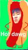
Visual Piano
 Teddy Lee
@Talia @Eric Well, to be honest, the reason we chose a piano key was we had a third member in the first class who dropped without telling us and our original plan was to create a video clip with the printed key being touched by one finger and with some music playing out of it to symbolize what our third member did, but that didn't happen because of them dropping the class, so unconsciously, the key became representative of what we could not do.
-
Visual Piano
 Talia Lesjack-Randall
I really like this idea because of its uniqueness and simplicity. I am wondering if there was a more personal reason why you chose a piano key? It is because of your love of music, childhood of playing, or anything like that?
-
In Our Shoes: A Video Collage
 Amal Sahay
This is a wholly enjoyable project! The idea of representing yourselves in similar but clearly distinct ways was brilliant, and I also like the song choice. One of the issues I have with it is the way the text is presented. I'm okay with the text being there, but the way it lines up with the song suggests that it has to be more spread out - maybe insert some transitions so that the relevant text is on screen at the same time as the song? The ending was wonderful - a sense of unity that demonstrates what brought you all together. This is a solid project, and I'm interested to see how you guys look to improve it!
-
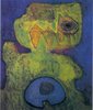
Divided We Stand
Amal Sahay@Kevin Lee Thank you for your criticism! It hits on a lot of reservations I personally had in the image. Regarding the gradient, I agree that it leaves a bit to be desired for the other half of the group. My rationale for that was that Brian and I in particular had very related representations, and thus the gradient serves to highlight the distinction in the way we selected our representations. I also completely agree with the criticism of the title. It was my intention with that to give the idea that we are distinct people but that we can be represented as a unit, and therefore I tried to reach for the familiar "United we Stand" and then swap United for Divided. Another idea for a title I had was Drawn and Quartered - each of us had our images created before Jacob split them in the way you see here. Is there some other title you might see for this?
-
A World in Motion
Amal SahayI think this is a wonderful example of how simplicity can convey a significant amount of information. On top of that, I quite enjoy the fact that each part of the image has a distinct feel to it. The violin doesn't feel as dramatic as the other movements, but even that makes sense considering the nature of the action. My only concern is that the basketball at the end moving to the screen seems a bit random - the other actions occur and then end. Perhaps (and I'm not sure how this would be accomplished) find a way to include moving each of the objects to the screen for a similar effect?
-
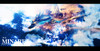
16-bit Slideshow
Amal SahayI appreciate the filters, as they do in fact evoke the games of my childhood. At the risk of sounding derivative though, I agree with the others that the images selected don't quite seem to match your theme. You've provided rationale for the character and the filter, but then you make a reference to a passion for computer science that isn't depicted in your picture selection. This seems more like a snapshot of your life - and if that's your goal, then you accomplish it! But if you're attempting to draw a picture leading to CMU and game design, I think there are probably better pictures to select.
-
In Our Shoes: A Video Collage
 Amber Jones
I really didn't expect the ending to be what it was! It was a very cute ending. I really liked the grid structure you chose, and liked how each member was adjacent to each other. It was also nice to see that you chose to represent each member in 3 specific places - in their homes, on campus, and somewhere else in Pittsburgh. My favorite part about the video was the transitions - the placement and removal of the clips at the beginning and (towards the) end of the video. I also understand that this might be a difference in cameras used, but the resolution of the leftmost member was different from the rest of the group. If they were the same, the piece would've been more structured.
-
In Our Shoes: A Video Collage
 Kristen Smith
I certainly like what you did at the 18 second mark in making the clips disappear to reveal the text underneath. It was an interesting way to emphasize the lyrics of the song in that moment. The text could have been made larger and more centered because it was the only thing on the screen after the video clips went away. On the other hand, you could have also made all of the clips disappear at once right before the lyrics that you want to emphasize are sung. Those technicalities being said, the project was still very creative and the medium of film was refreshing to see.
-
16-bit Slideshow
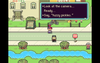
 Kevin Ramser
I love that you chose to make a video game for this project. However, while moving through your piece I didn't get the feeling that I was going on a journey, or that I wound up someplace radically different from where I began. I'd be interested to hear more about the images you chose and why you arranged them in this order.
-
In Our Shoes: A Video Collage
Kevin RamserI like your approach and the way you edited all these different videos together. Your choice to edit all of the videos into one frame generates a lot of visual interest, keeps your eye moving around the frame, and makes you want to watch it again. I think you could have done without the text at the end, since you can hear the lyrics in the song. It's okay to make the viewer work a little bit to figure out what you're saying, and often makes for a more interesting and rewarding experience for your viewer.
-
A World in Motion
Kevin RamserI think it was smart to focus on movement as something that unites the members of your group, and also a good choice to express that through animation. The basketball bouncing towards the center of the frame at the end is a nice touch. I wish there was a little more interaction between each of the four items. I also think you could have taken more care with the composition. The rule of thirds is a good one to keep in mind when composing objects in a frame: http://en.wikipedia.org/wiki/Rule_of_thirds
-
Divided We Stand
 Raisa Chowdhury
I love how well thought-out this project is. It looks simple, at first, but upon reading your reasoning behind what you did and why, it becomes clear that you put a lot of thought into every aspect of this project. I think the gradient shift from black to white is my favorite part because it's so simple but still acts in tying together all four corners of the image. The way in which the gradient creates a contrast between two seemingly similar objects is also amazing. Great job!
-
Divided We Stand
Kevin RamserIt's clear from your description of this project that you put a lot of thought into how you would represent yourselves both as individuals and as a group. It can be very challenging to produce one cohesive composition using so many different pieces of media, but I think you found a very elegant formal solution.
-
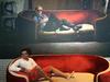
Baby I'm Stuntin Over Matter
Kevin RamserIt's clear watching the video that Brian Lai is really comfortable being on camera and performing, which was fun to watch. I'm glad you each chose a song for the video and that you showed the tools you each were using on the computer to realize this project. I wish that the video showed more of you all interacting with each other. Watching this, we can see what each of you is good at and what you contributed to the final product, but we don't get much of a sense of your dynamic as a group.
-
Visual Piano
Eric WangHow does the object reflect you guys? I get its a vessel through you showed fabrication and modeling, but why this object in particular? Just because it is unfamiliar?
-
Divided We Stand
 Anna Tan
I think this is a great way to show individuality and unity at the same time. Each person is clearly represented in the image, but each quadrant does not feel disjoint from the others.
-
A World in Motion
Anna TanThe video very clearly shows what each one of you is interested in. The simplicity of the video makes the video easy to follow. However, I didn't feel like the video tells a story - each part seems to be disconnected from the others. I would love it if you could somehow give it a storyline.
-
Identity Collage
 Daragh Byrne
The project is well considered - it seems like the group found an excellent representational strategy for mediated representation. While everyone seems to agree that the broad structure and intent of the representation is well formed, there's some division in how well it was executed. There is a lot of information presented - do you think that each 'individual' and the 'group' can be understood with the amount of visual material included? You can disagree with this perspective, but perhaps you might share some thoughts on your rationale for the content included?
Another aspect I think would be useful to discuss is how and why did you choose the images that are included? It mixes objects, group photos, landmarks, etc. Why are they composed using a variety of different styles of photograph and why did you feel it was important to include this diversity of representations rather than one or two illustrative images?
-
Visual Piano
Daragh ByrneDefinitely a unique approach to the brief, but it requires some more description. How is the C key a 'mediated representation' of you? In what ways does it reflect each member of the group?
-
16-bit Slideshow
Daragh ByrneThe relationship it gaming and games that are inspirations to you are clear, but what was the process by which you selected the images used as the backdrop? Is there any particular rationale for the ones your chose and the way in which they were arranged?
-
Visual Piano
 Christina Reimond
I like that this project draws attention to your technical skills, but wonder if maybe there is a way to draw more attention to not only each of your personalities, but also your similarities as well. Is there a way that this project does do this, but it isn't obvious to me as a viewer? However, I do love that you approached this project from a very different angle than most other groups!
-
Identity Collage
 Thanassis Rikakis
I like the use of formal principles for making the composition and the connection of those chosen principles to what you are trying to communicate. Based on the feedback you have gotten so far how well do you think the form and related communication is working?
-
Visual Piano
 Naomi Sternstein
This was a very unique idea. I think that the process which you used was useful in highlighted your technical background, which tells me a little bit about what you know as a group in regards to the type of design programs and tools that you are used to using. It is unclear though as to how this pertains to your personalities, individually or as a whole - I am not sure what part of yourselves you are trying to represent with this project, so I can't say exactly if you accurately represented yourselves or not. (Maybe an additional line or two in the description would help with this).
-
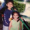
Identity Collage
 Francisco Rojo
The layout of three different countries that represent you as individuals and then Scotty as an amalgamation of the "selves" of the members of your group was clean and portrayed clearly. Displaying only pictures that were taken in their particular region was effective in making me see the differences between how the person was portrayed in their country/state of origin and in Pittsburgh.
Maybe with more time, it could make for a more effective presentation if the forms of the countries/states were blended more with the scotty dog. It could be interesting how this blending would inform the piece.
-
This. Is. SATIRE!
 Amanda Marano
I looked at the powerpoint after reading the description, and then after had to read the description again because I really didn't understand how this project related to your group at all. I think, while obviously this took time and effort, it relies a little too much on the description in order to get the message across that it is in fact describing a group instead of trying just to tell a joke that is, frankly, confusing and overly laid with detail that doesn't really make sense until you read the description.
-
A World in Motion
Amanda MaranoI appreciate how simple and straightforward your project is, but it seems a little bit divided because each part moves on its own. If possible, maybe make the video a little bit longer and include part where they all move together to unify each of the separate interests into one umbrella topic of motion and unify the group with one animation segment.
-
Divided We Stand
Amanda MaranoI think its very admirable how much depth of thought that went into the planning of this piece. Not only were each of your interests placed in the corners in a meaningful way, but each quadrant of the image was chosen for each group member based on home state. It brings a cohesiveness to the group project that really nails the purpose of this assignment.
-
Visual Piano
Amanda MaranoWhat were each of your personal media representations of yourselves, and is there any possible way of incorporating those into this project to make it more personal? Like maybe make image "decals" for the keys based on personal interest? Without that there is really no way to tell why this project was chosen over other possibilities.
-
16-bit Slideshow
Amanda MaranoI think the idea is interesting, however the pictures didn't really have any kind of narrative or coherence when it came to defining the group members as people, only in activities they did, and that made it seem kind of superficial in a way. The goal was to create a slideshow to incorporate the passions of game play and game making, yet none of the pictures included that, nor were the pictures organized in any noticeable way.
-
Baby I'm Stuntin Over Matter
Amanda MaranoIt seemed to me that the balance of incorporating the three group members was a little uneven, and only really focused on the dancing than what the other two were doing. That said I appreciated the inclusion of the music and album cover files being edited, as it brought together your passions and the end result.
-
In Our Shoes: A Video Collage
 Tonya Sedgwick
I, too, had trouble deciding which panel to look at at any given moment. I think if you timed things out differently, or made one of the panels larger than the others (like, when it's new, and then it could change sizes when there was a new one you wanted us to look at, etc), then that could potentially have helped this. It's just a little technical issue, though; the idea behind the project is pretty neat.
-
16-bit Slideshow
Tonya SedgwickI think that this was a good project because we, the audience, got to interact with it, which made it more interesting to us. I'm not sure how hard it was to make this functionality to happen, but assuming you had the time and other appropriate resources, it would have been really cool if there was more "game" activity, such as jumping and changing directions and collecting stars or something to move through the various pictures. But I could see how that could take a ton of time.
-
Identity Collage
Anna TanI like the idea of focusing on your homes and CMU, but there are too many pictures to look at on first glance. It would be nice if there are focal points in the image, for example some more prominent pictures, to attract more attention.
-
Visual Piano
Anna TanI love that you talked about discovering complexity in a simple object in your description, but I am not sure what your goal is - how and why do the C and C# keys represent you?
-
16-bit Slideshow
Anna TanI enjoyed the unique way you chose to present photos and show your interest in making games. I would have preferred more photos related to computer science and/or game making.
-
Identity Collage
Christina ReimondWe like what you were going for, but we think that maybe your home lives and CMU lives seem very separate. Maybe you could try to combine them more to show that your lives have become more unified since going to CMU? (Amanda and Christina)
-
Identity Collage
 Zach Halle
Definitely appreciate the hard work that goes into stitching so many photos together. But is there someway the presentation can be streamlined? Clearly home means something to all of you, but what? Can your presentation be set up in some way that makes this clear?
-
Identity Collage
 Abhishek Tayal
Focus on CMU was good because it was a common factor between all three people with all of the campus buildings and the shape of the scotty dog. It also showed who the people individually were with the shape of their home states or country. The background might have been a little bit overpowering of the collage, maybe something simpler like a solid white could have worked better. And maybe fewer, bigger pictures.
-
Divided We Stand
 Kevin Lee
The image itself was very eye grabbing and the main reason why I chose to analyze and critique this project over others. It think that the collage of items is interesting and does a good job of representing an aspect of each person. With these images and the explanations, I am able to get a general idea of what each person is like and what defines them. I would, however, try to derive some meaning to the elements that are in the middle of the color gradient or maybe even change it in a way so that it can represent all members of the group rather than just half. Also, the title "Divided We Stand" and the description gives me the impression that I am suppose to focus on the members as individual people while the composition of faces in the middle gives me a sense of unity and makes me want to see the group as a whole. Is there a way you could separate the members more to match the description or possibly show how to the group is in fact a union of unique and individual members.
-
Baby I'm Stuntin Over Matter
Anna TanI think the album cover is very interesting and matches your goal of showing a mixture of the 3 songs. I like how the video shows the similarities of your love for art, such as dancing, image editing, music making, etc. I do think that the weight of each person is somewhat unbalanced; most of the attention is given to the guy dancing, and it is hard to notice passions of other guys.
-Dan & Anna -
In Our Shoes: A Video Collage
 Laura Lodewyk
I really like how you choose to show all of your different videos at the same time instead of back-to-back. I think this helped enhance your idea that in one day everyone has different paths that are unique but also might intersect with others. I think focusing on your shoes was nice (instead of just focusing on your path) because it connected each persons videos to their other videos. Just like your shoes, each one of you is unique and has their own character.
-
In Our Shoes: A Video Collage
Eric TeruiI really enjoyed the way you approached this project. Your description shows that you have a clear vision of what you are trying to convey. However, it feels a little like your description conveys more than the video itself. It almost feels as if the video relies on the description a little too much.
-
Baby I'm Stuntin Over Matter
Amal SahayI like the visual depiction of the audio file during the video - it's reminiscent of a behind the scenes, which helps explain the design process you guys used. I also like the transitions you guys used. On the other hand, the other visuals (of yourselves) weren't necessarily the clearest way of showing "snippets of who [you] are". Maybe including some scenes of you all in your daily lives? Overall though, I thought the project well composed. It's a strong start!
-
Visual Piano
Kristen SmithDid you choose to do this to represent yourselves because you both like complexity and delving into unfamiliar territory? I'm still not entirely sure how these keys represent the two of you and why you chose it.
-
A World in Motion
 Ariel Tian
We loved the use of color on a dark background because it drew our eye to the four objects. Our only critique is that there isn't enough motion in the piece to convey the goal above, since only one object is moving at a time. We would suggest a few frames where all the objects are moving at the same time, especially since this project was about integrating the group members in one piece.
-
-
A World in Motion
Naomi SternsteinI like how you took a simple concept like motion - and showed how it related to each of you in such a different and characteristic way. It represented each of you under a unique umbrella topic.
I immediately understood what your goal was, and was not confused at all. -
In Our Shoes: A Video Collage
Jacob SloneThe idea is great, but the video becomes a little hard to follow when some people are beginning to look up while new shoes are still appearing. Bringing more focus to a single frame at a time, or synchronizing the frames so they all raise the camera at the same time could make the video a lot easier to follow. Love the project, though!
-
Visual Piano
 Brian Walsh
The sketch is helpful in understanding the process of design. I still find the C and C# keys an ambiguous choice for both of your self-representations. Were the letters chosen due to your programming backgrounds? Perhaps you could build on this in your description.
-
-
Baby I'm Stuntin Over Matter
 Rikky Roy Koganti
I like the album cover. After listening to the songs, i can relate to how each one is reflected in the cover. In the video, i can tell that dance is a major part for at least one of you, but what about the other two? I wasn't completely sure what their interests based on the video. Do the other two interests lie in sound and visual design?
-
Divided We Stand
Rikky Roy KogantiReally good photo editing there. The arrangement of the items, the contrasts between the gradients, and the 4 corners of the faces all go together really well.
-
Divided We Stand
Rikky Roy KogantiReally good photo editing there. The arrangement of the items, the contrasts between the gradients, and the 4 corners of the faces all go together really well.
-
Divided We Stand
Rikky Roy KogantiReally good photo editing there. The arrangement of the items, the contrasts between the gradients, and the 4 corners of the faces all go together really well.
-
In Our Shoes: A Video Collage
Rikky Roy KogantiThis is a pretty cool theme. As a fan of basketball shoes myself, i agree that the shoes you choose really become a part of you. For sports shoes, when you look at them after wearing them for a couple of months, each and every mark on them shows just how much effort you put into training over those few months.
-
Divided We Stand
 Dan Cheng
It is very creative and interesting, I really like the idea of putting four faces into one. And all faces have different backgrounds that tell us something about each person.
-
16-bit Slideshow
 Kim Lister
Making the photos 16-bit was a cool way to contribute to the theming! It would have also been nice to also include some particular games or game systems that inspired you.
-
-
Identity Collage
Christina ReimondVery well presented! I like how each of you had your own collage, and also the scottie dog collage that combined pictures from all of you. In this way we could see your differences, but also your similarities.
-
-
Divided We Stand
Christina ReimondVery interesting to look at! I really like how each of you has a quadrant, and parts of your individual faces were put together to form one. It seems that every little detail was planned a great deal (even the gradient).
-
Identity Collage
Brian WalshThe Scotty Dog shape was a smart way of displaying what brings you all together. It's also great how that can branch out to the entire university in that it's a thing that connects us all together.
-
16-bit Slideshow
Brian WalshThis was wonderfully creative, and provided an interesting medium for us to tour your photos with.
-
Divided We Stand
 Mauricio Cano
I love how each head had your individual interests extruding from it. It's creepy (but good).

16-bit Slideshow
Thanks for the feedback. In response to photo selection, we chose our pictures in an attempt to encapsulate our entire life, rather than just elements relating to our passion in game design. Alas, many moments of my life were poorly documented, so it was hard to choose the best defining ones. That said, if I had a better selection to choose from, I would go back and pick ones more relevant to game design.